UnitedHealthcare
is the nation’s largest health insurer valued at $400B. We led the rebrand of their visual design system and guidelines.

BRAND REFRESH
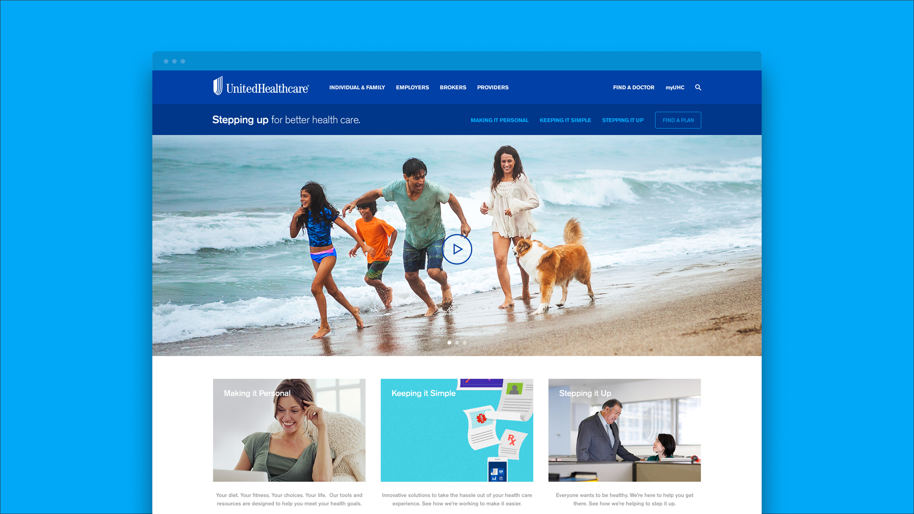
The primary objective with the brand refresh initially was to update the digital design system. We recommended making the brand holistically cohesive across digital and non-digital platforms and applications.
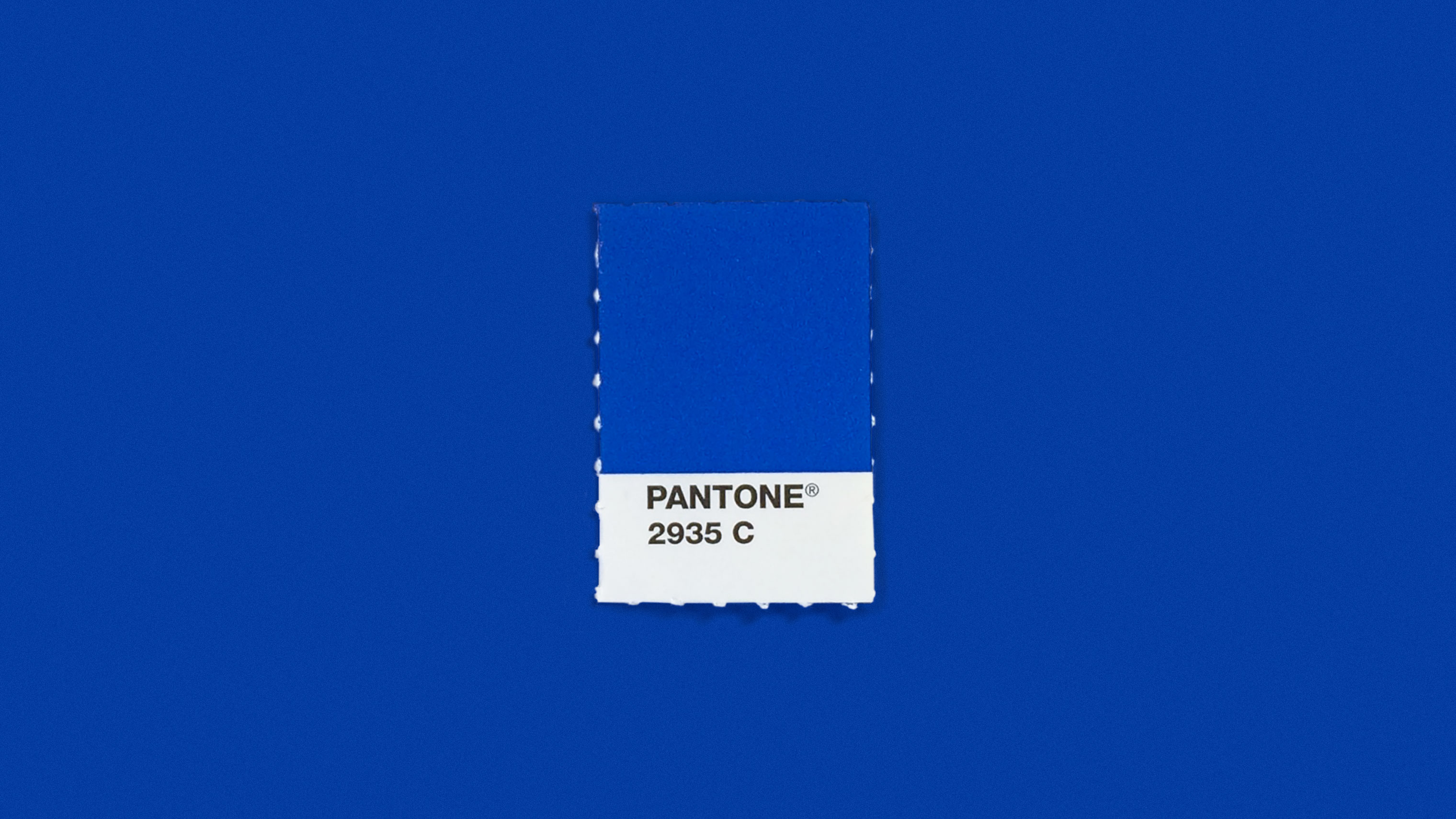
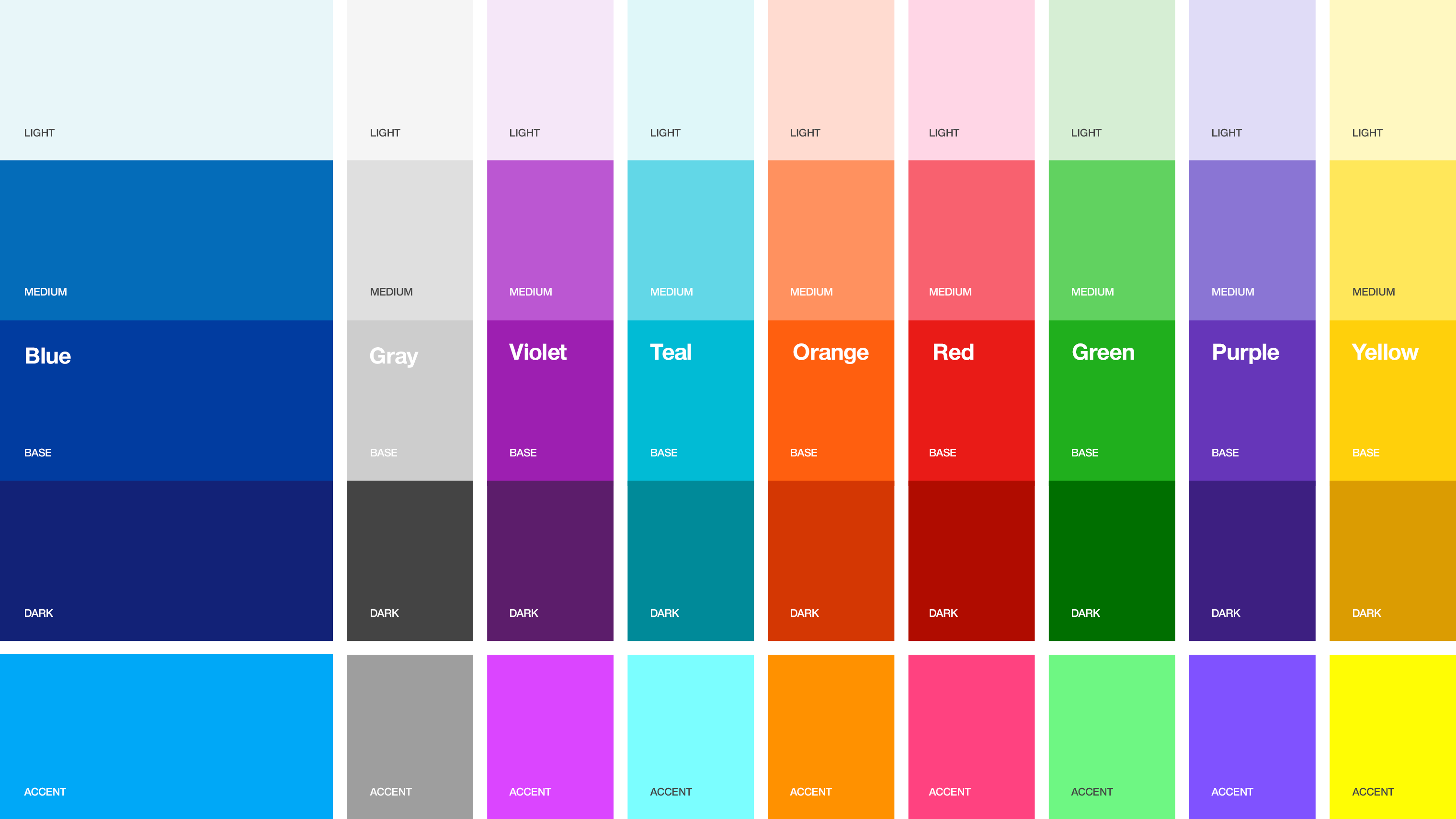
We set out to make the brand more approachable and friendly while also increasing flexibility. The existing UnitedHealthcare brand used white as the predominant color with a few accent colors used sparingly. Our approach was to embrace color and become less sterile. We expanded the color palette and updated the primary UnitedHealthcare blue to have more vibrancy and energy.
We also updated UnitedHealthcare's parent company UnitedHealth Group's brand. The goal was to differentiate from UnitedHealthcare and show examples of how the child companies could coexist with each other. View the UnitedHealth Group case study.
TYPOGRAPHY
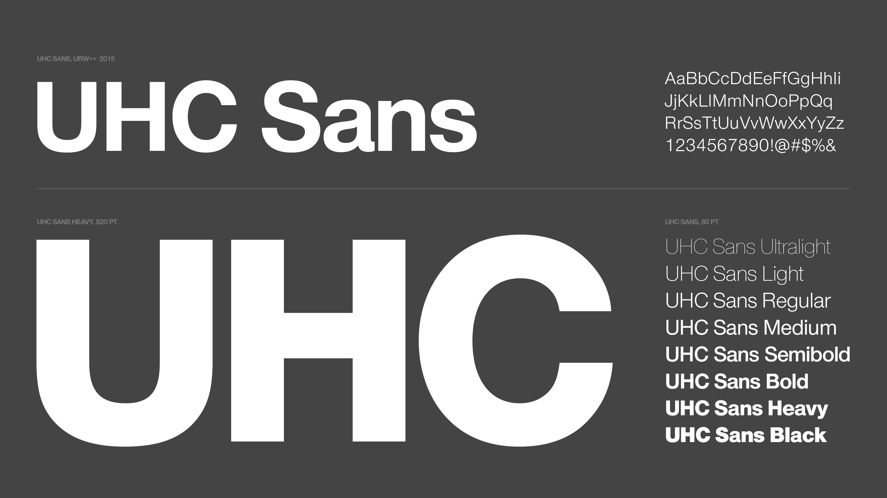
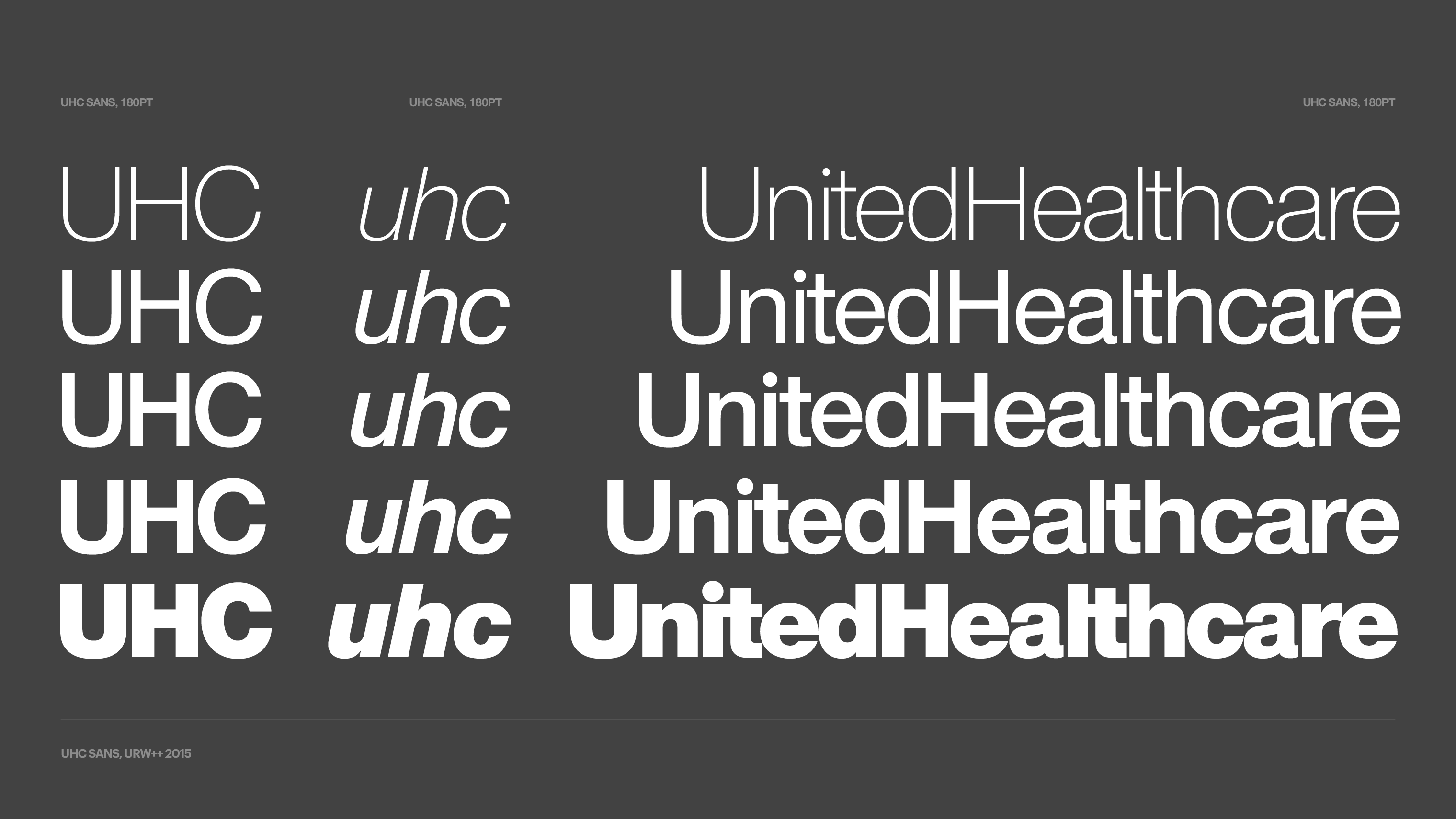
We collaborated with URW++ to create a sans-serif typeface that had legacy elements of the past typography selection – Akzidenz Grotesk. The UnitedHealthcare brand team wanted to retain familiarity and simplicity within the new sans-serif typeface, making it more approachable. Additionally, the goal with typography choices was to own licensing rights for both digital and print applications, which was lacking with the previous brand guidelines.
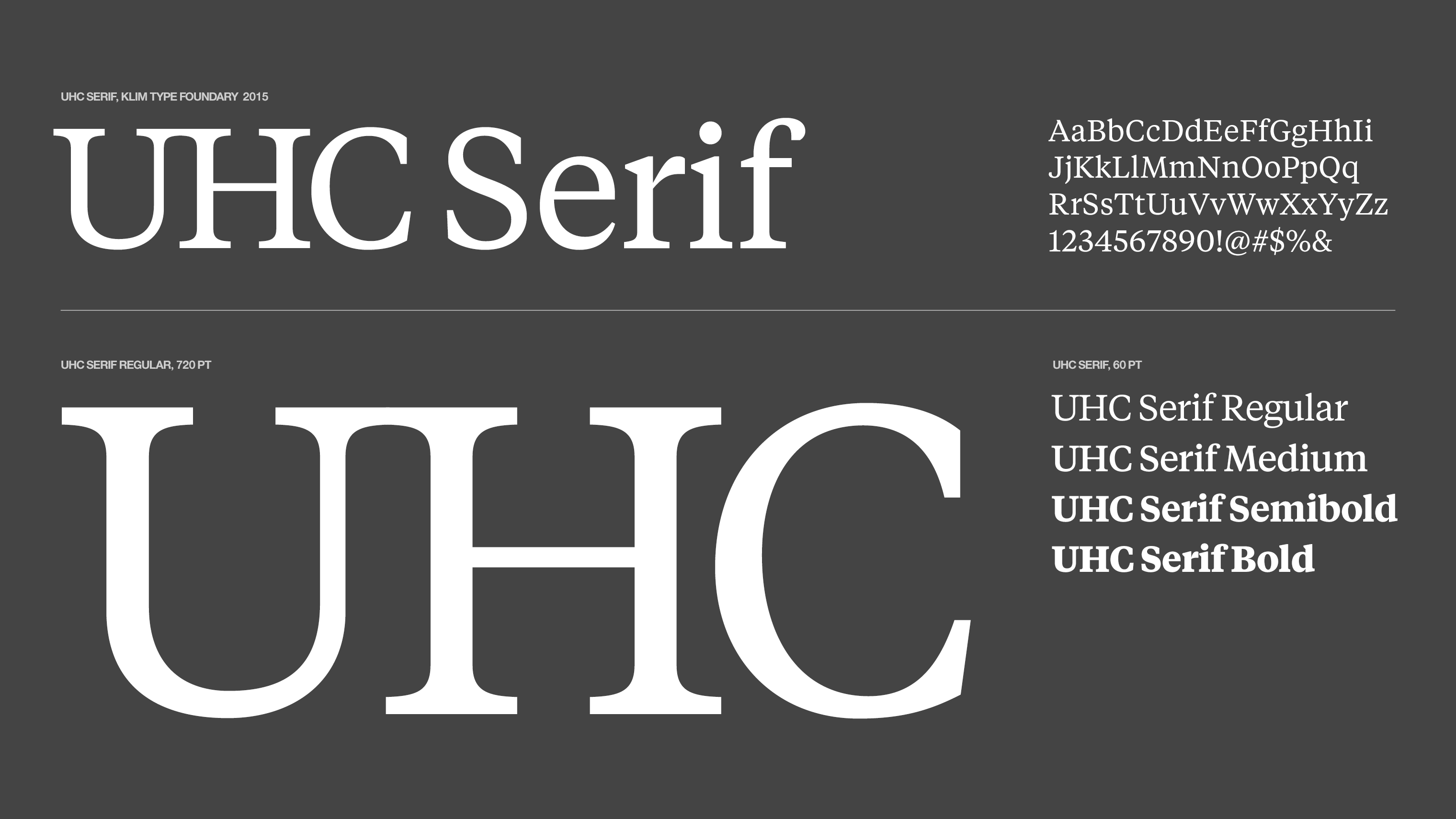
We also partnered with Klim Type Foundry to add a serif typeface to the brand. While the serif typeface was meant to be used secondarily, the added typeface helps extend the brand for greater flexibility when you create literally thousands of designs pieces a year.
ICONS & ILLUSTRATION
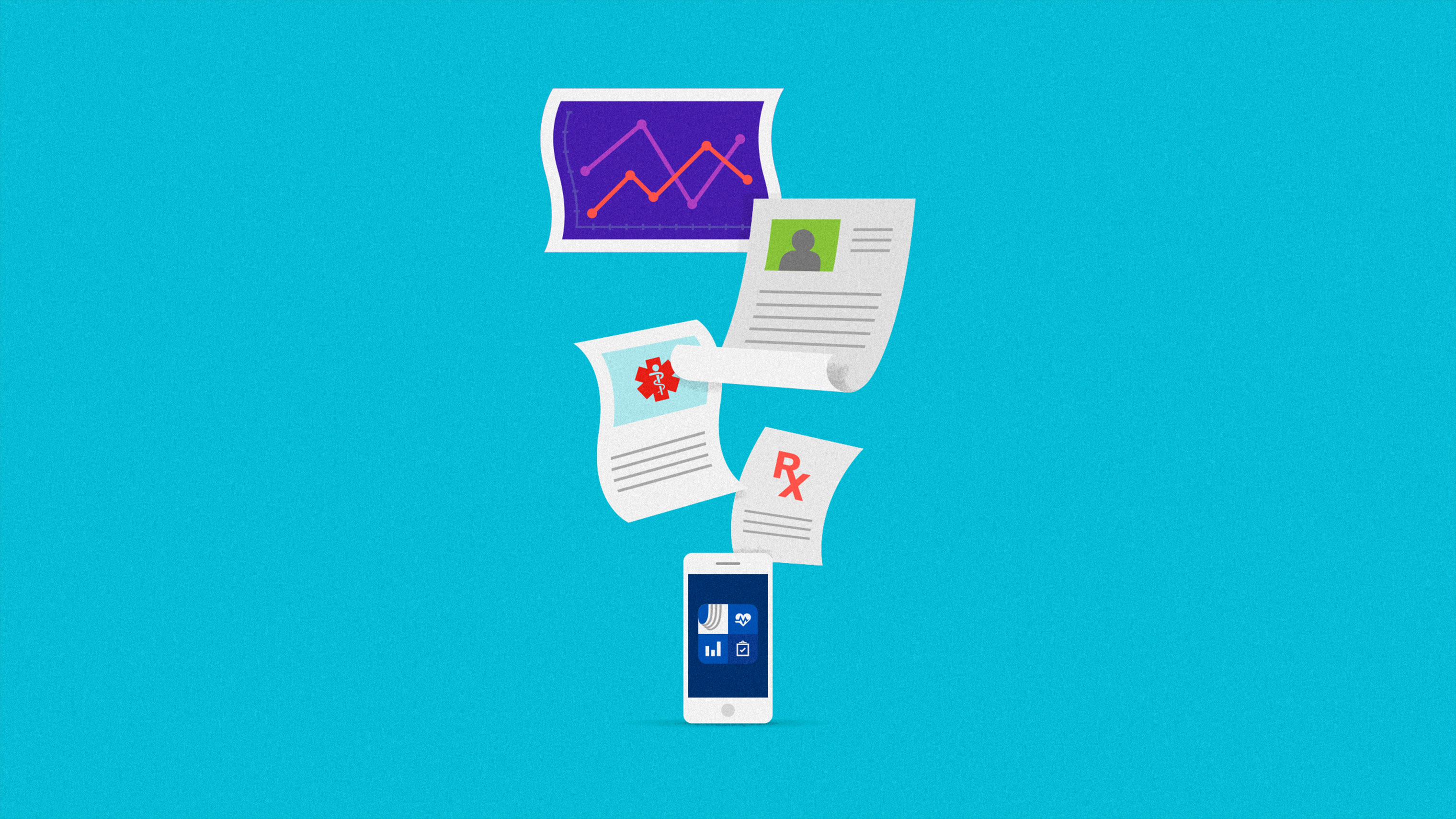
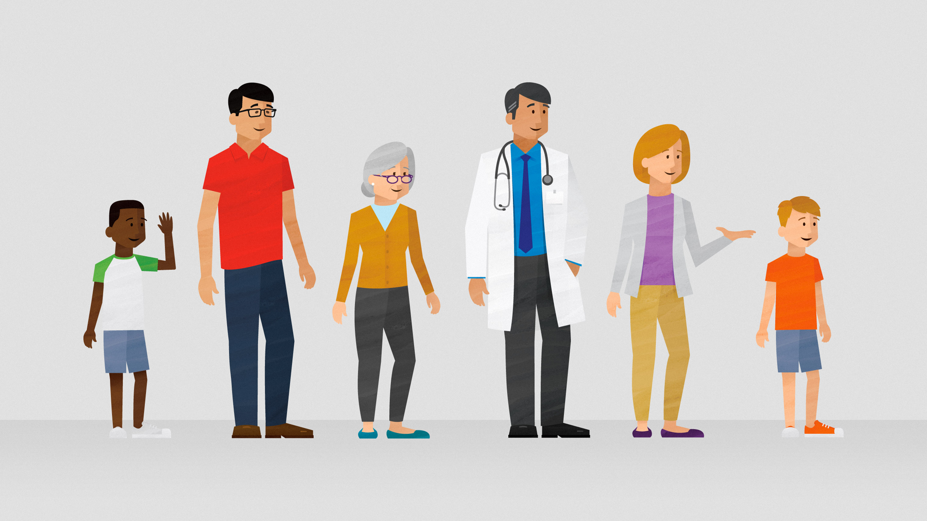
The brand refresh set out to extend the design language with a set of new icons and an illustration style to add visual interest and greater clarity in storytelling. The iconography set consists of over 100+ created icons designed with a templated grid system to allow future icons to be created with greater consistency. An illustration style didn't exist in the previous brand guidelines causing confusion and inconsistency. The new illustration style was designed to add depth, texture, and personality.
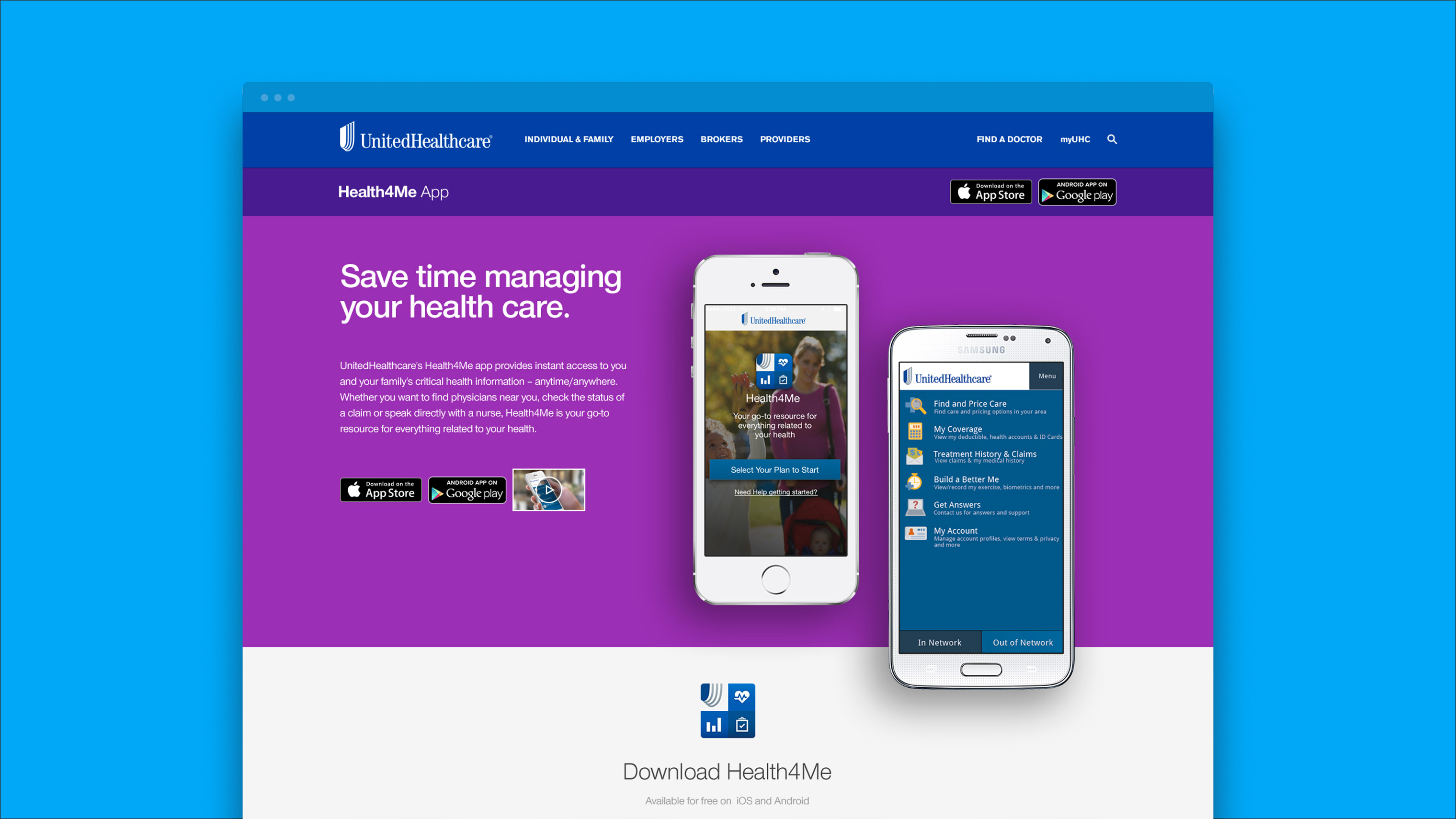
DIGITAL DESIGN
The entire project was started to unify the digital design system. This led to the holistic brand getting refreshed to make it more contemporary, consistent, and flexible. We updated the digital design language to be cohesive with the new brand elements and design language. We designed a UI kit to extend the brand into digital product design with examples of usage for websites, emails, and native apps within the UnitedHealthcare ecosystem.
Skills
- Brand Strategy
- Brand Design
- Brand Guidelines
- Iconography & Illustrations
- Photography
- UI/UX Design
- Brand Campaign
- Product Strategy
Details
Team
- Garrick Willhite
- Nick Coldagelli
- Kelly O'Halloran
- Nikki Meyers
Client
- UnitedHealthcare/Periscope
Project
- UnitedHealthcare Brand Update
Year
- 2016