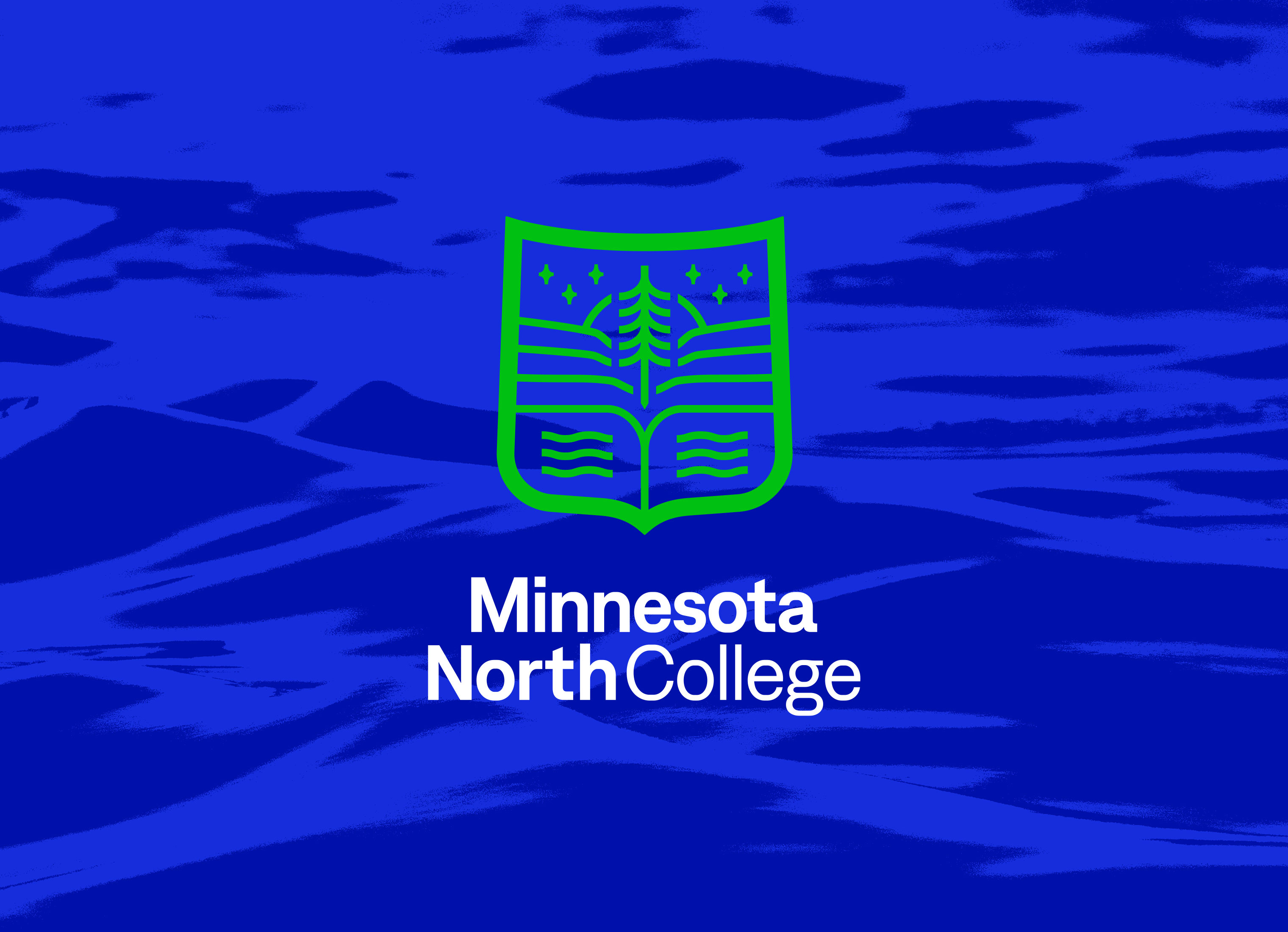
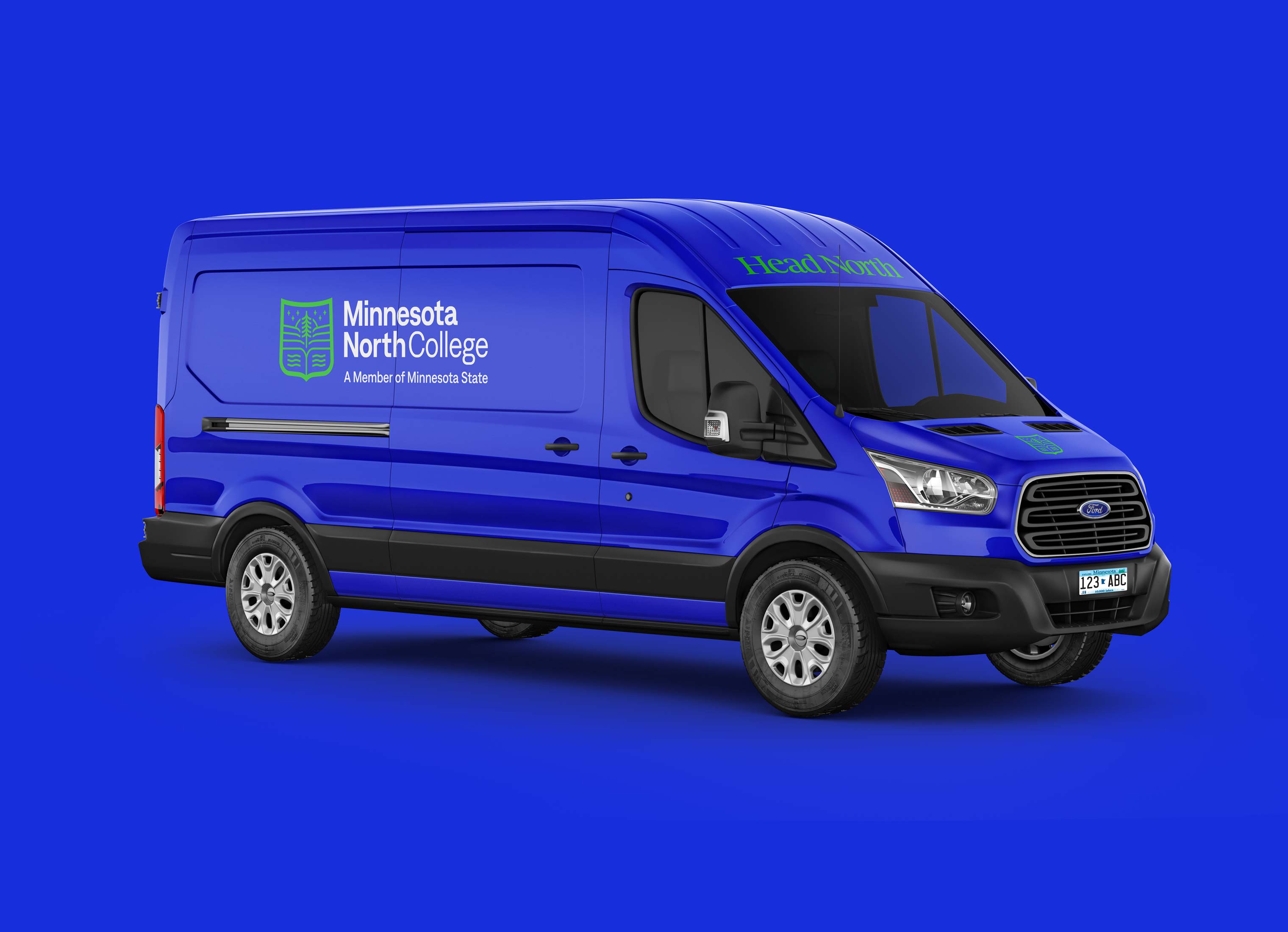
Minnesota North College
is a newly created college made up of six campuses in Minnesota. We designed their visual identity and website.
ABOUT THE PROJECT
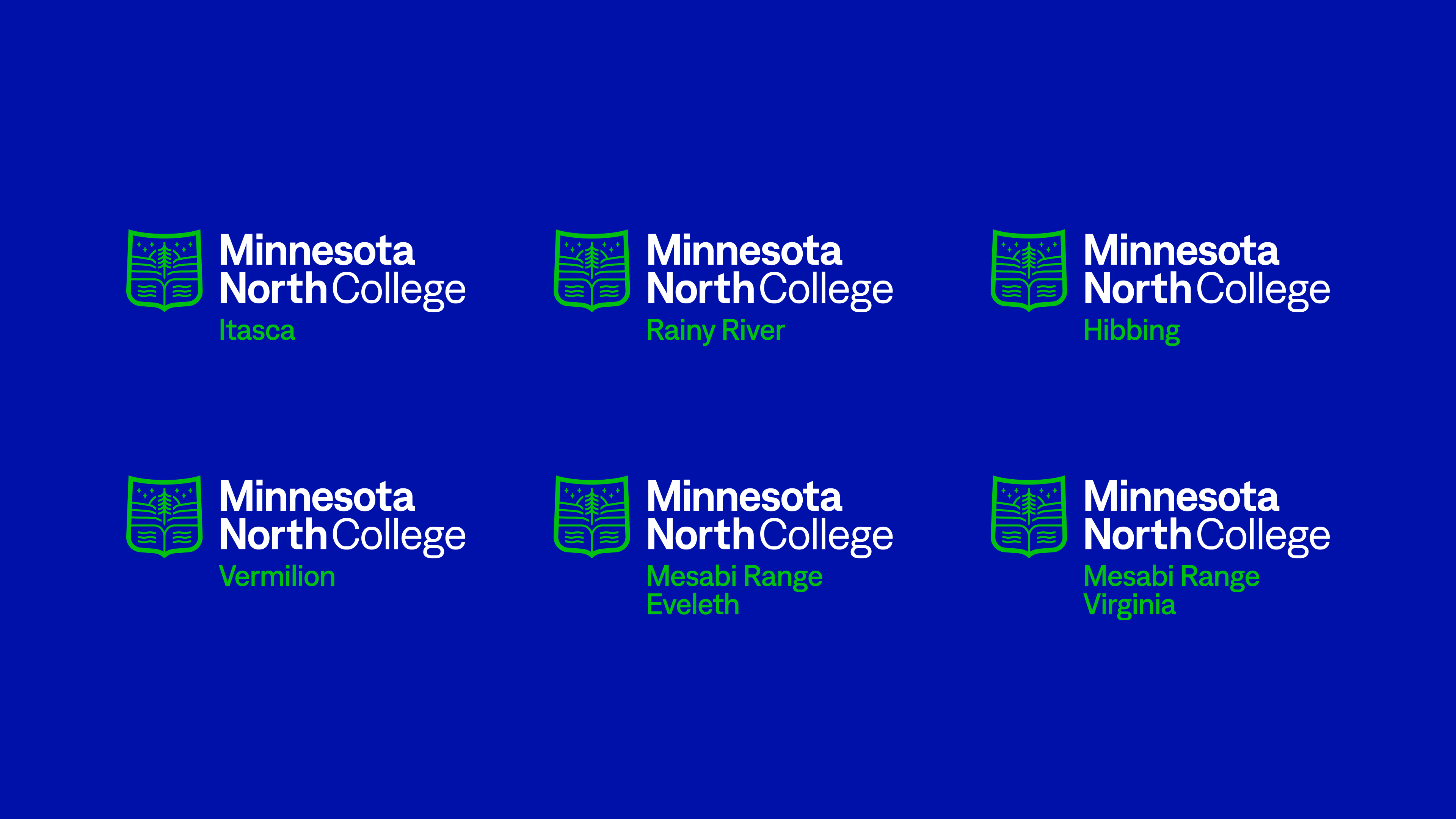
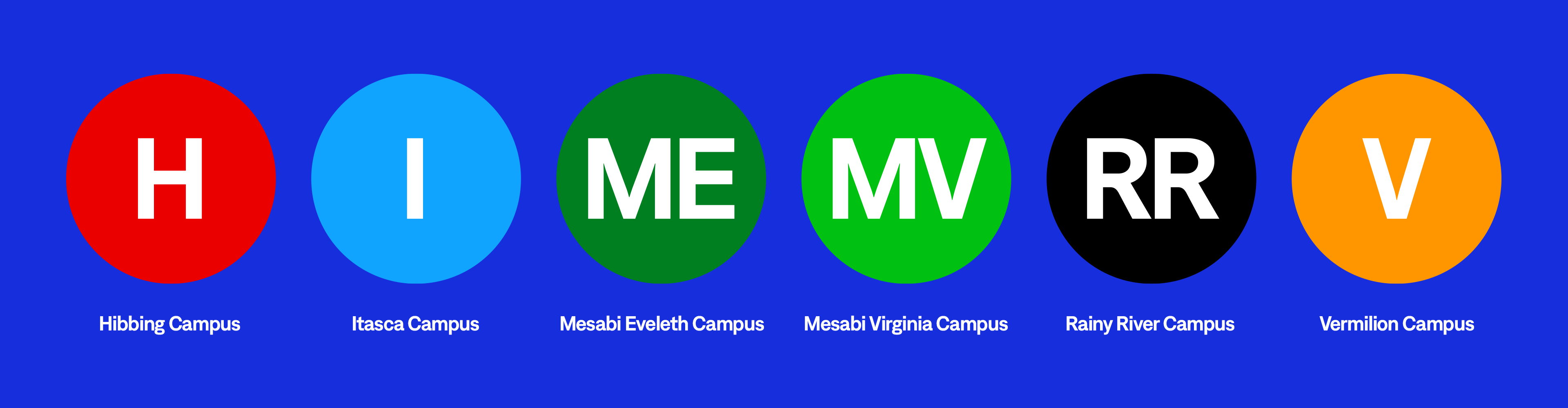
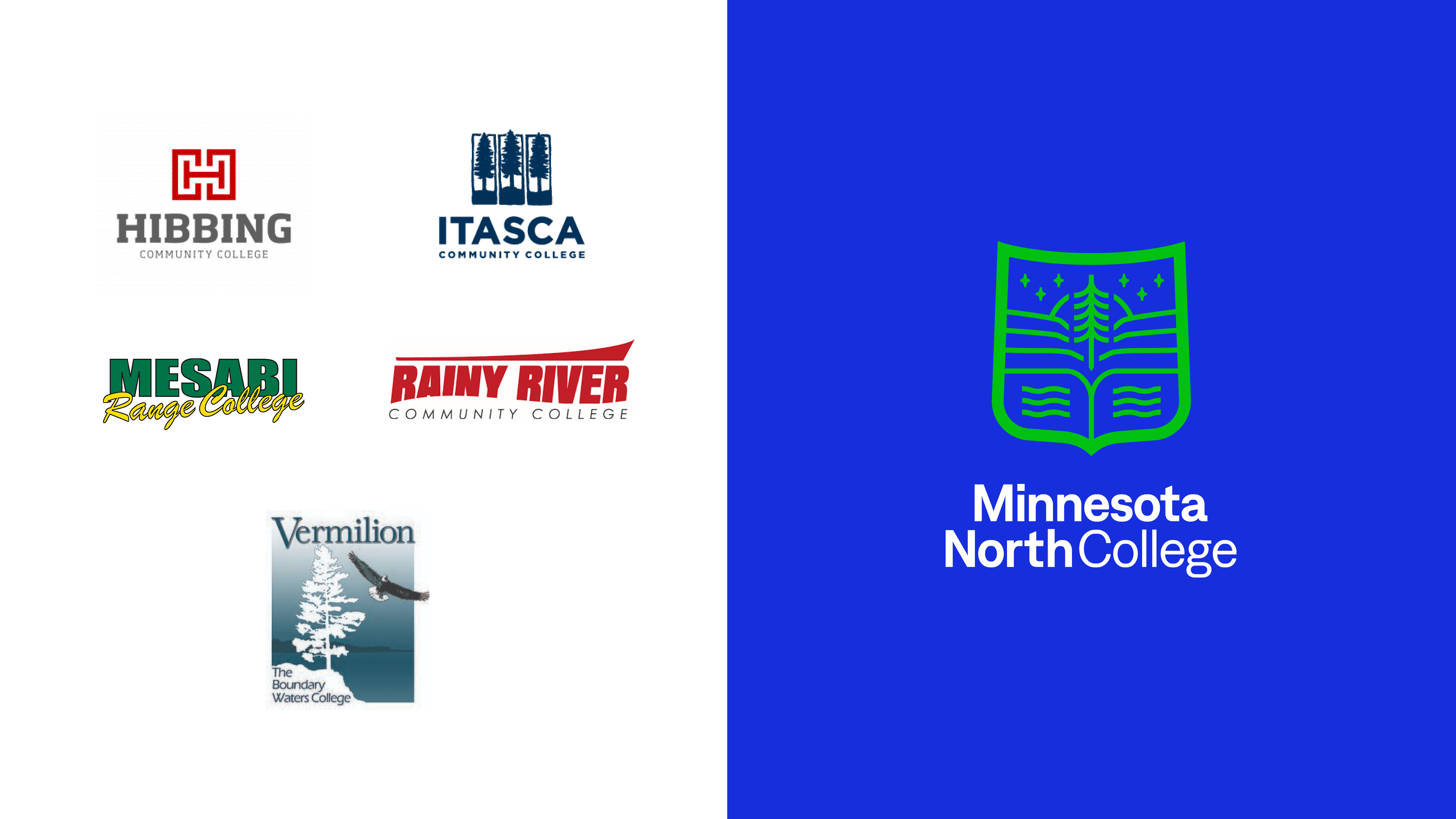
Northeastern Higher Education District (NHED) was a collection of five colleges: Hibbing Community College, Itasca Community College, Rainy River Community College, Mesabi Range College, and Vermilion College. NHED and the colleges decided to become one institution under the same name and brand – Minnesota North College.
We conducted a brand discovery phase including focus group sessions, stakeholder interviews, surveys, audits, and ongoing discussions. We heard from faculty, staff, and students that they wanted a brand that reflected the region. With northeastern Minnesota being a destination for the outdoors, adventure, and beautiful scenery, we create a brand that highlights these regional traits.
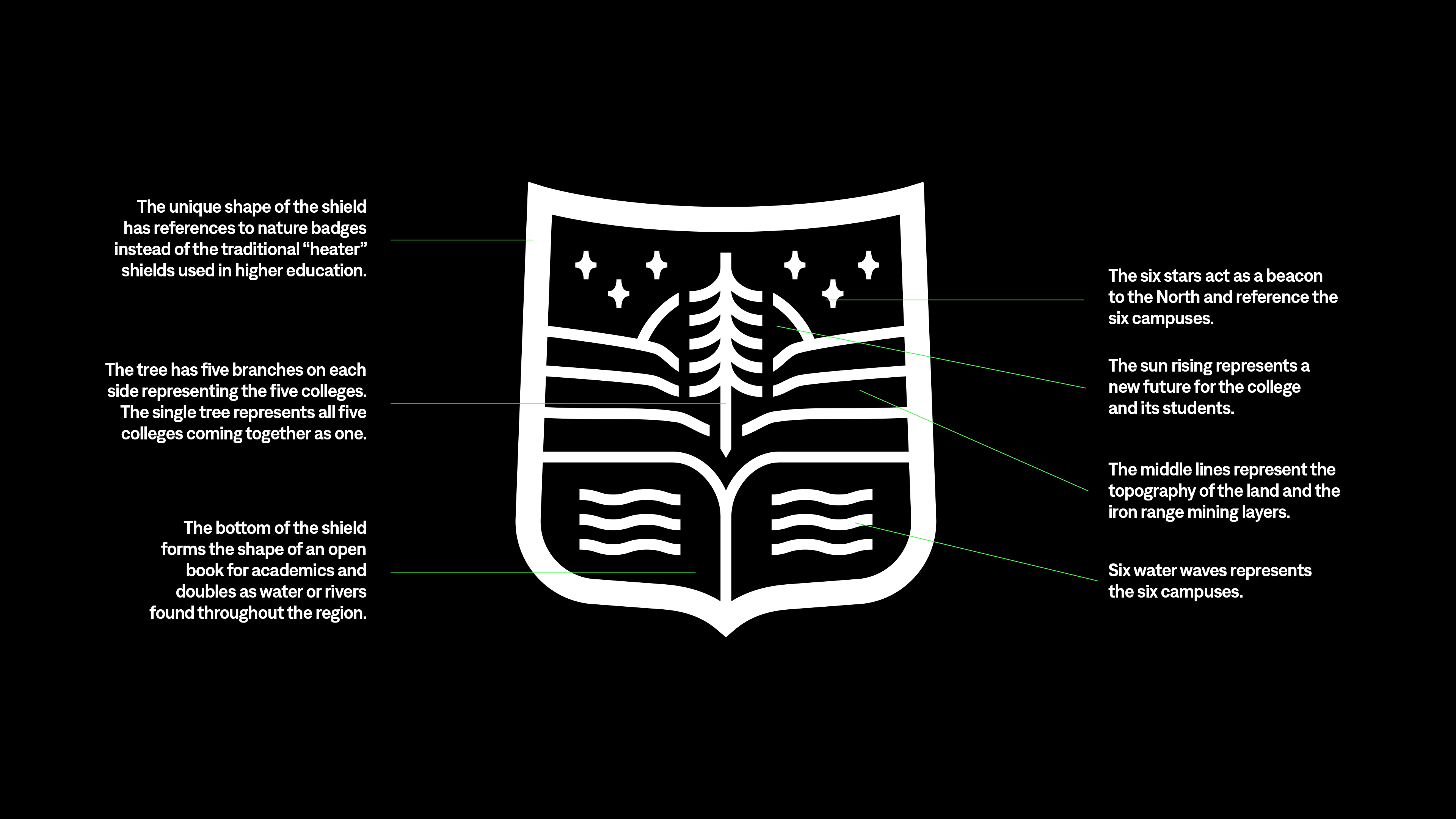
THE SYMBOL
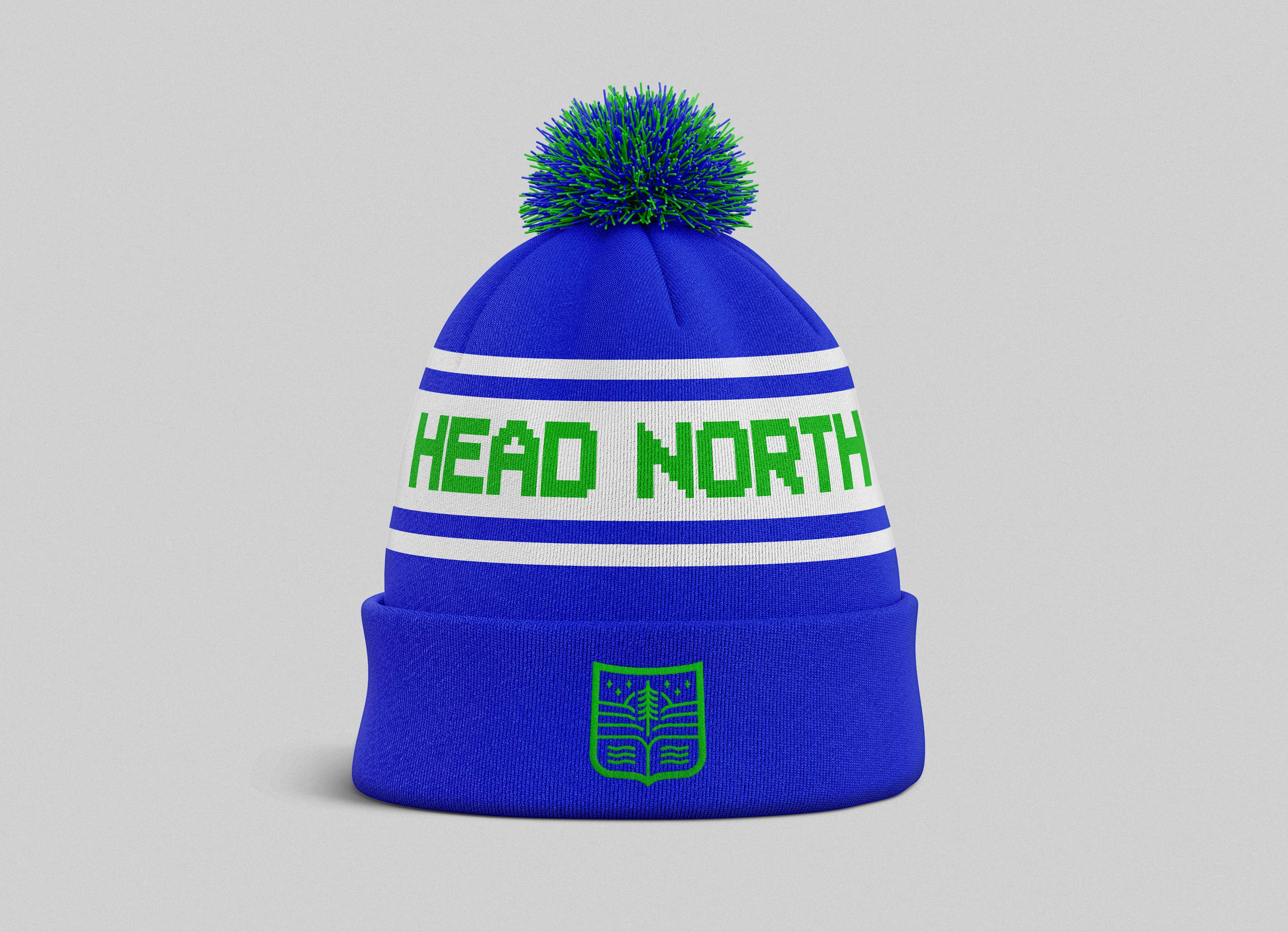
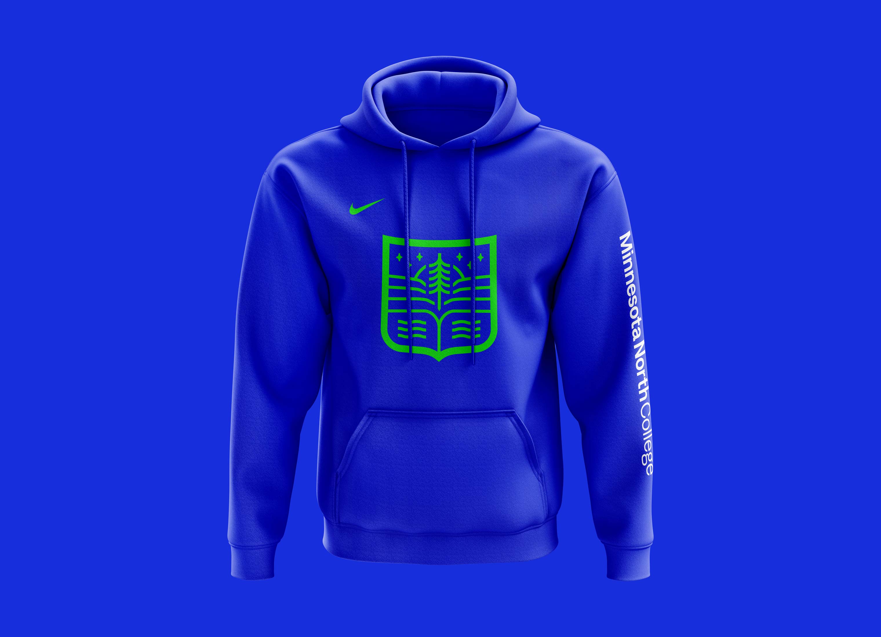
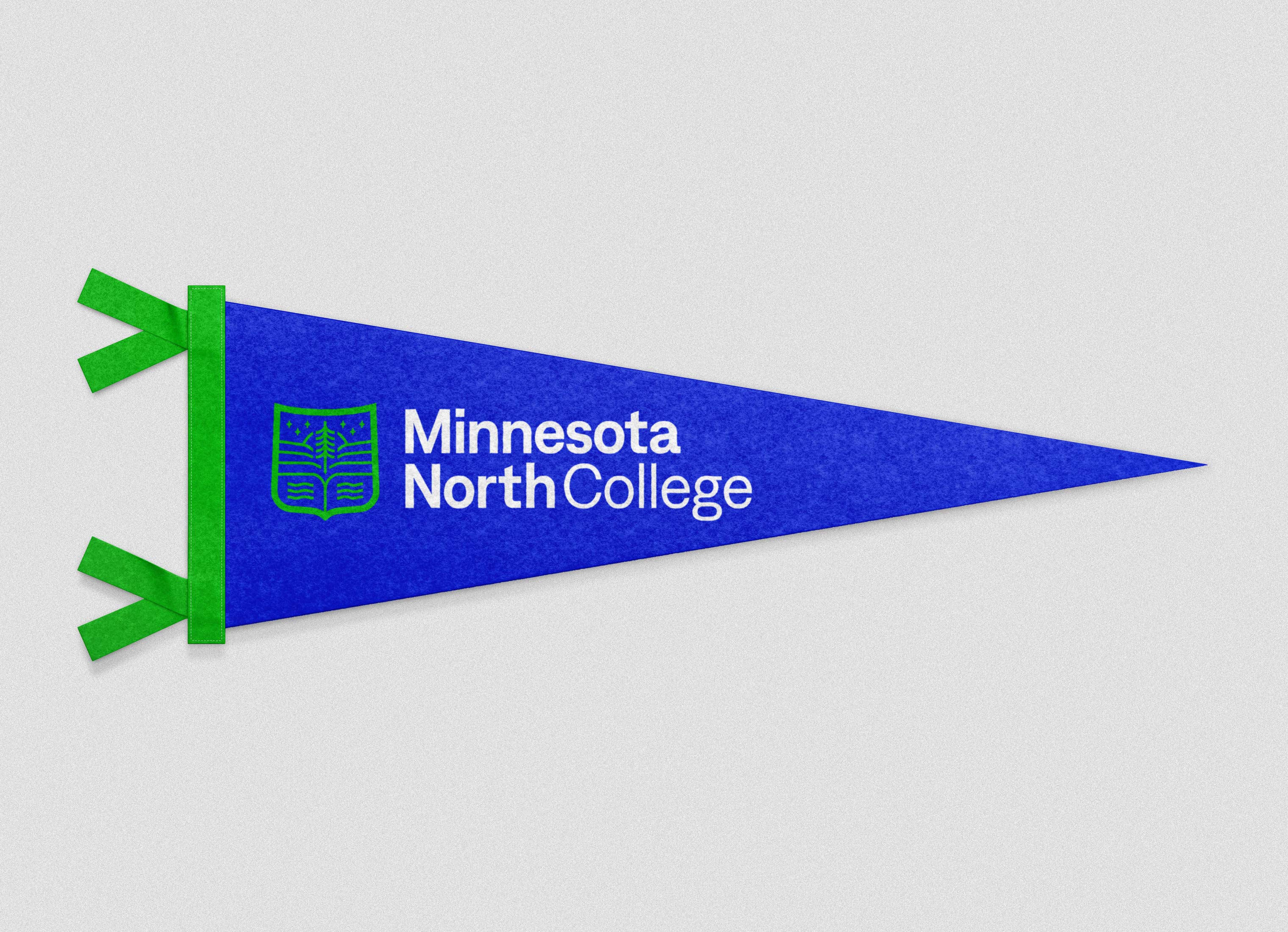
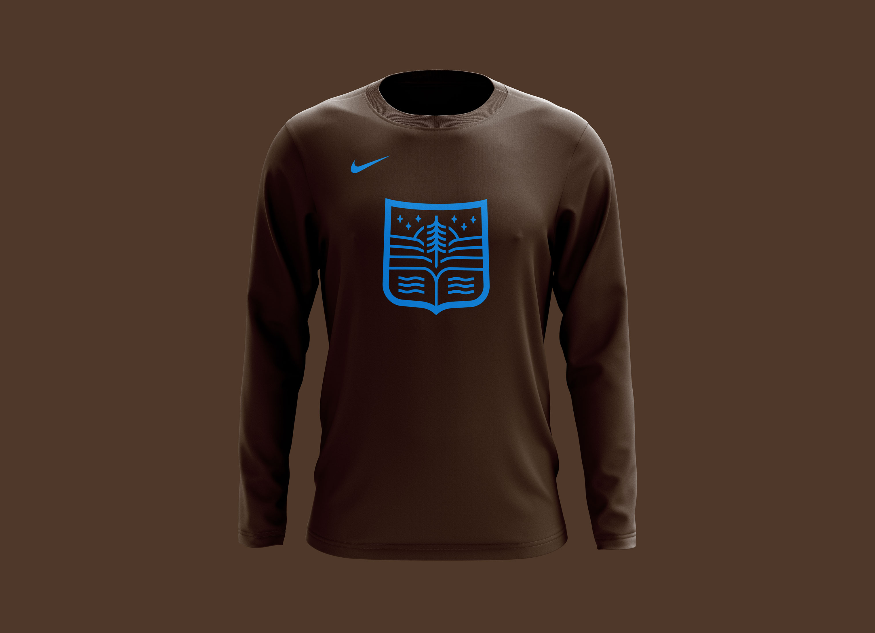
One piece of feedback that consistently came up no matter what group we talked to, was the desire for the new logo to reflect the region and establish credibility. Instead of creating a monogram, which has a crowded space with colleges trying to own the letters "M" or "MN" in Minnesota, we created a crest. The crest allowed us to include regional elements shown inside the shield. The use of a crest also has visual connotations to higher education and is commonly used in prestigious universities with a deep history of credibility. No other college within the Minnesota State system of 37 colleges uses a crest.
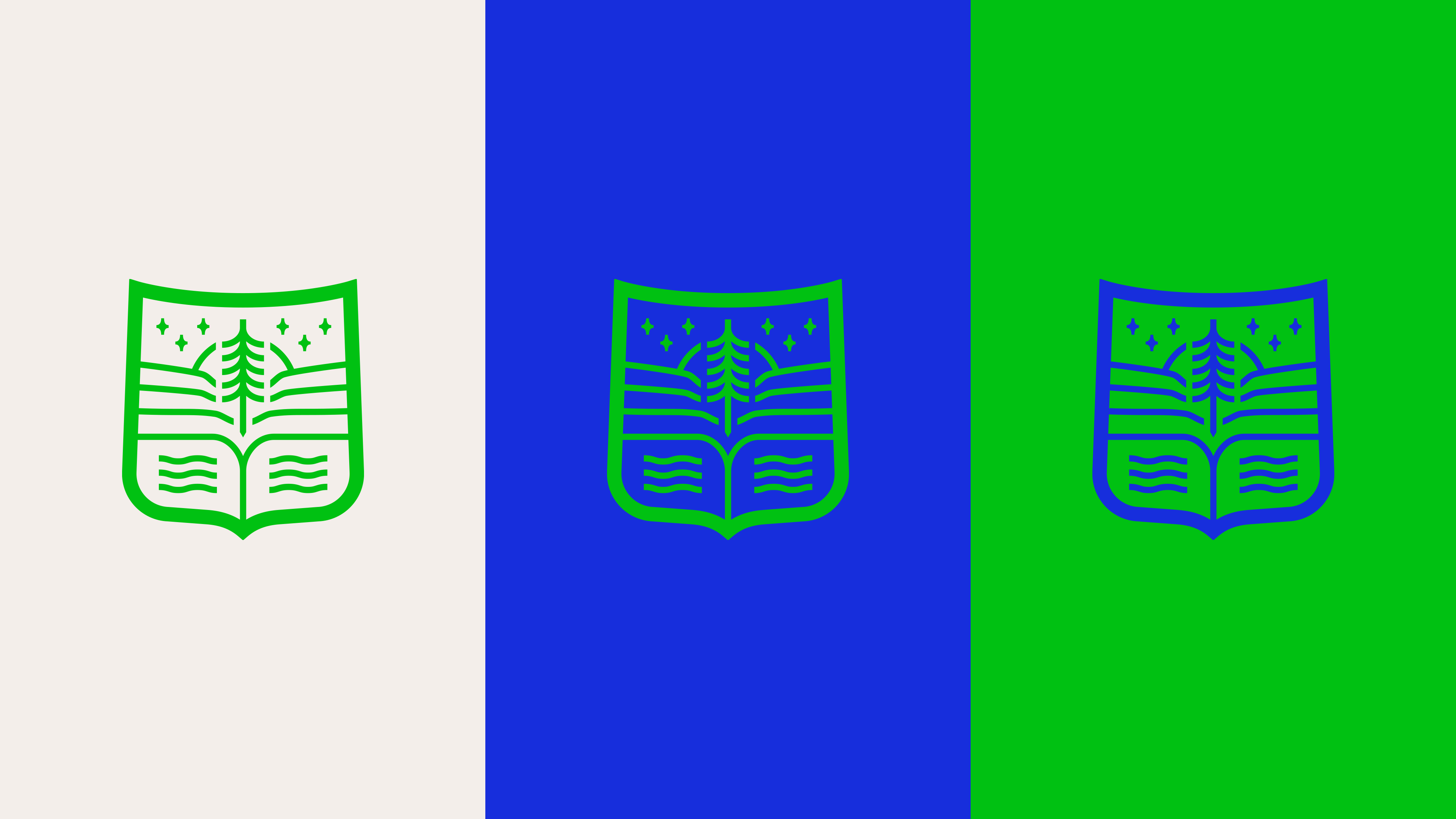
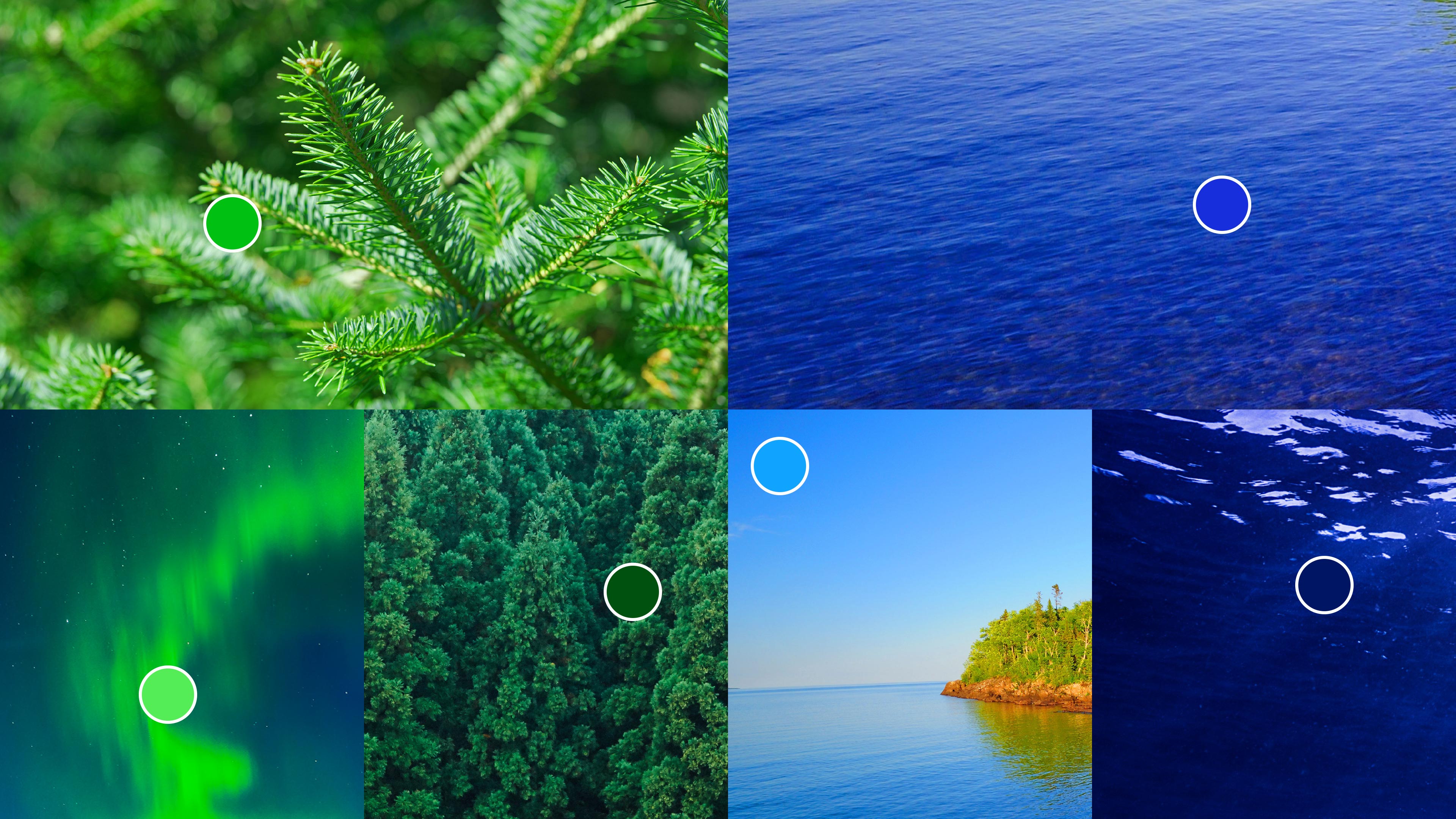
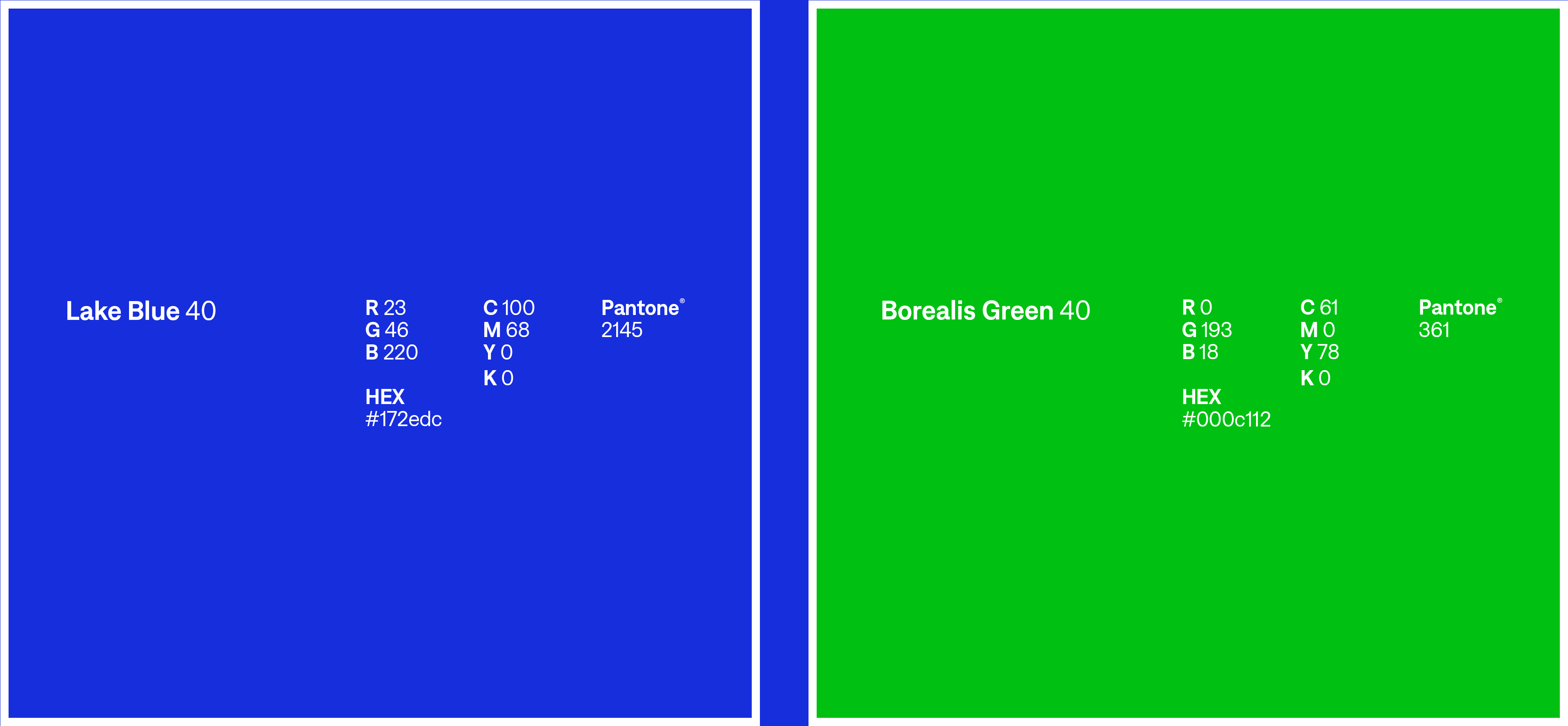
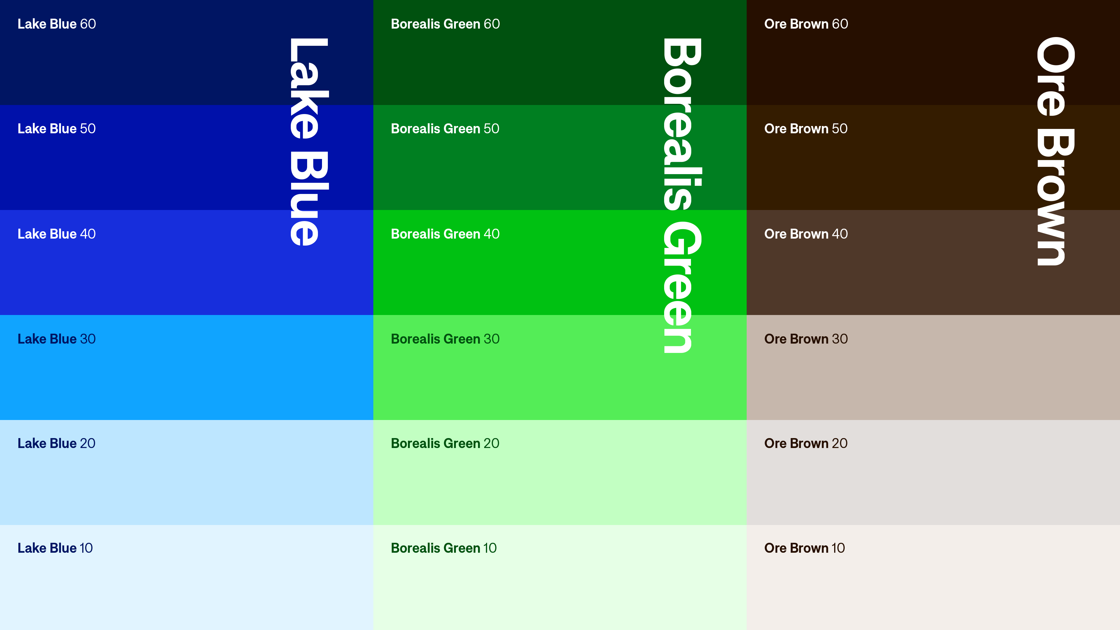
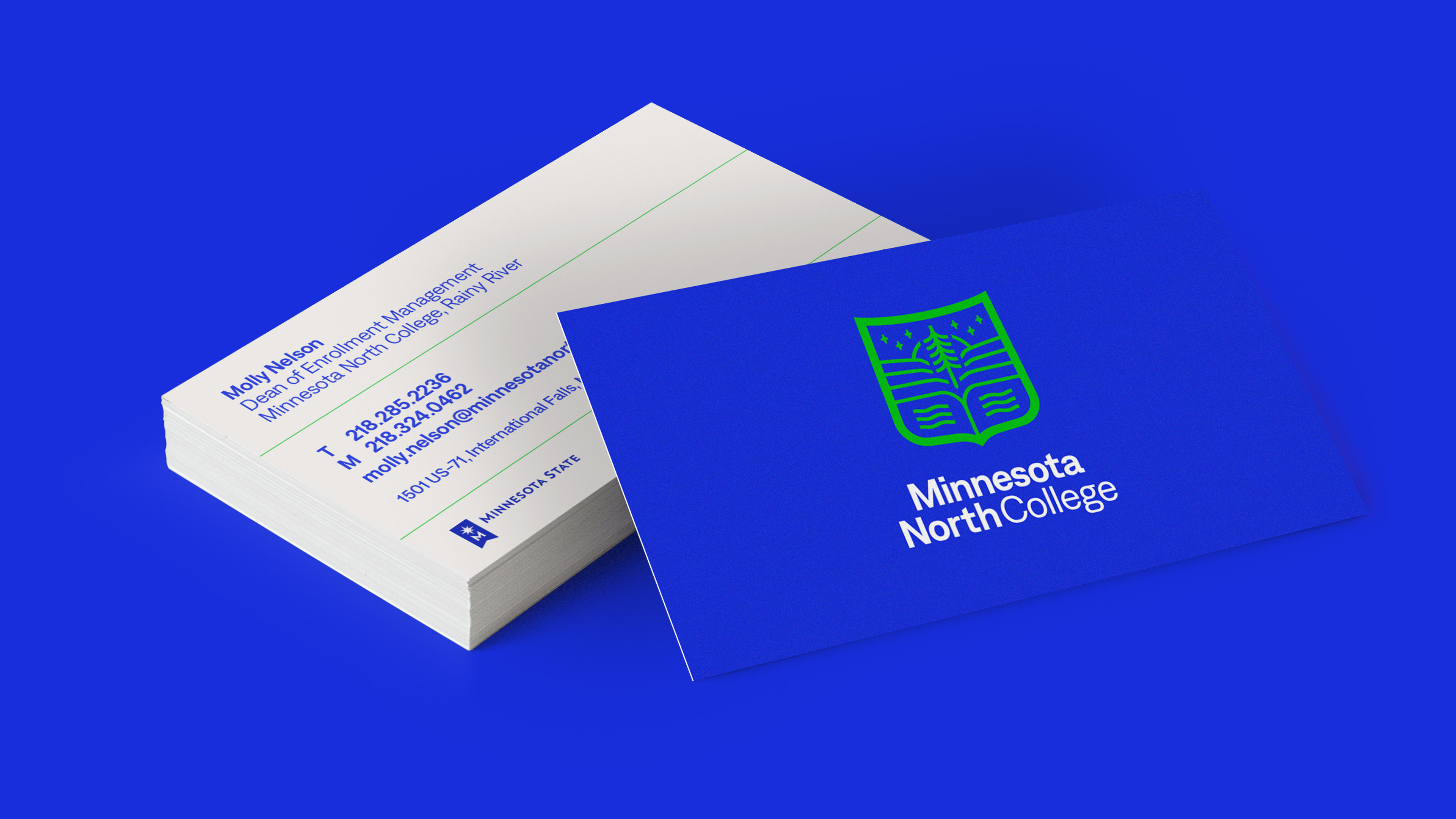
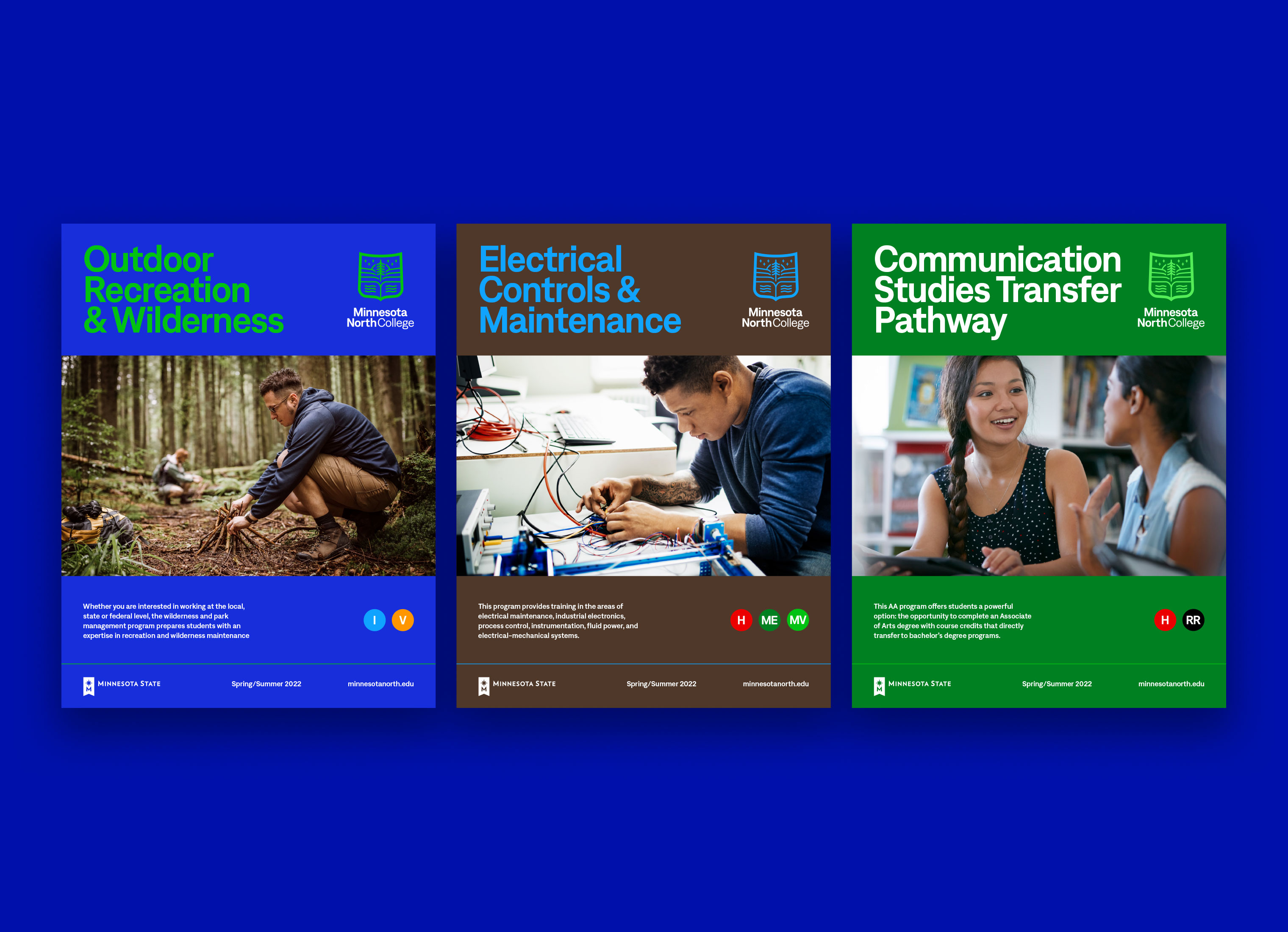
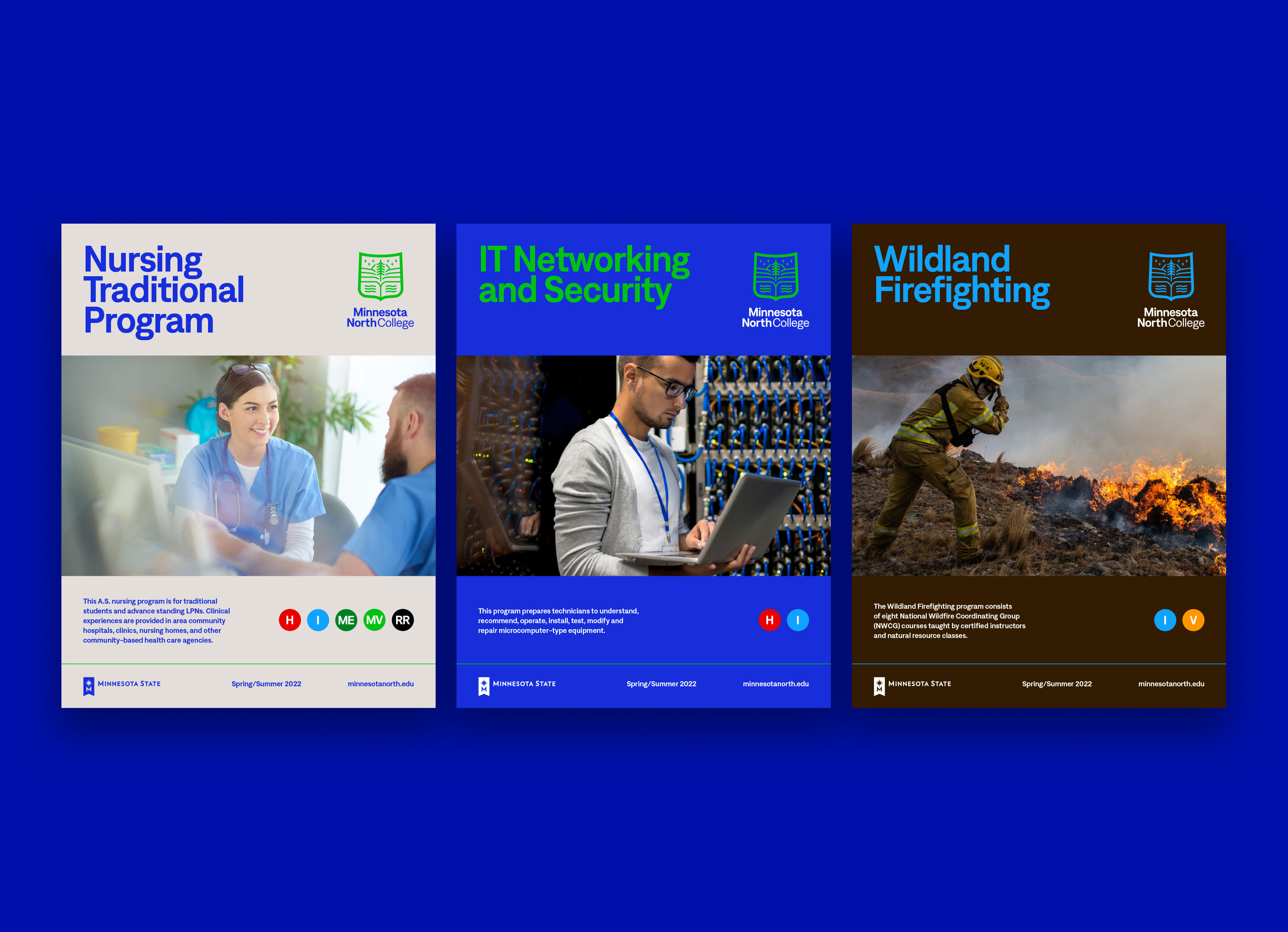
COLOR PALETTE
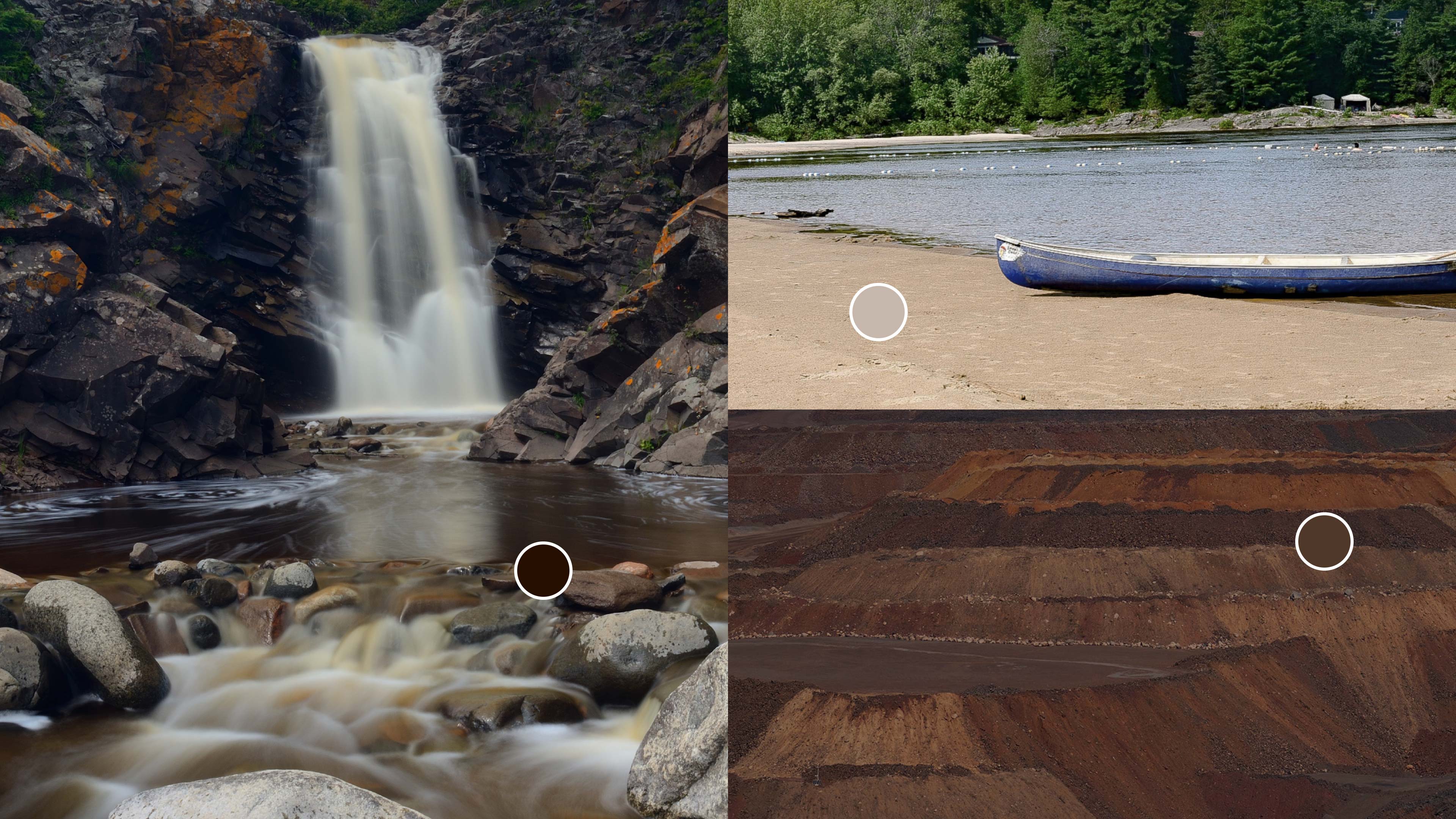
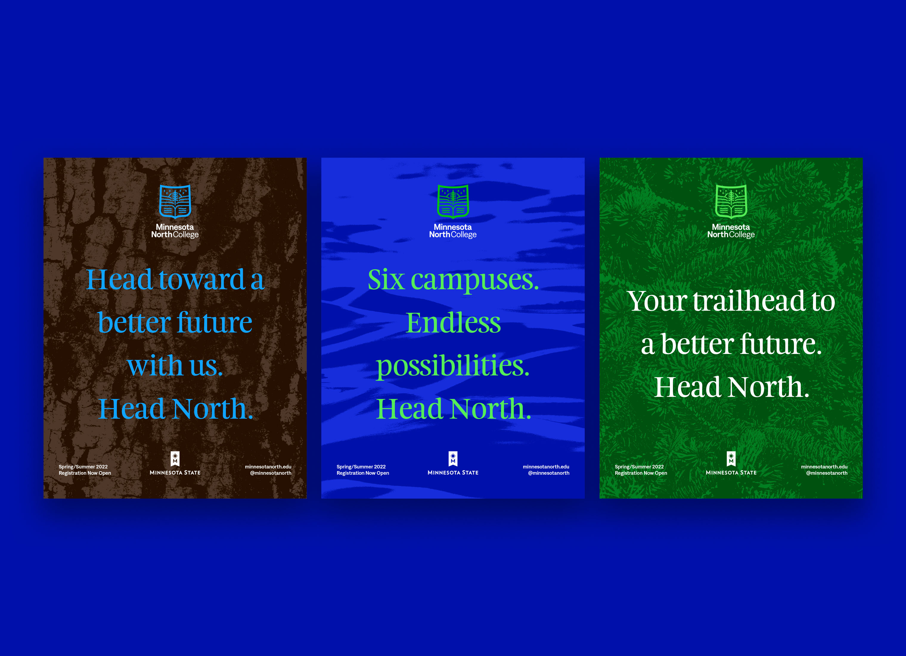
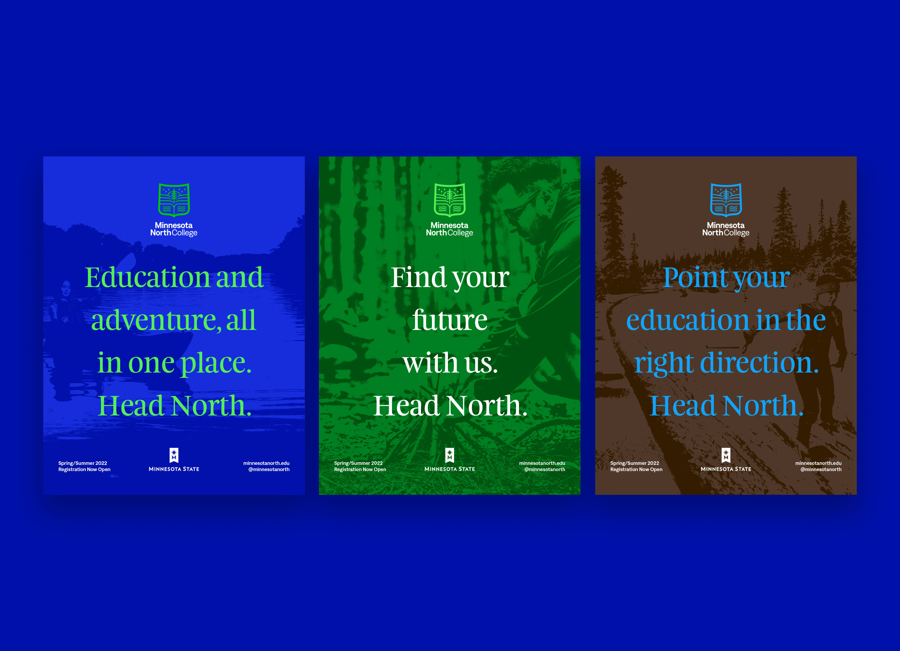
Northeastern Minnesota is rich in natural elements. The college's two primary colors are Lake Blue and Borealis Green. We selected greens from native plant life and the lights from the Aurora Borealis, which are only seen in the northern hemisphere. Minnesota is the land of 10,000 lakes, which was used as another natural reference in selecting the color Lake Blue. We also wanted to add a tertiary color group for flexibility. Ore Brown was selected from iron ore and mining which is a major industry in the region.
GRAPHIC TEXTURES
Another brand element for Minnesota North is the use of graphic textures. The textures come in three different content types: nature textures, student textures, and people textures doing activities outside. The textures are used as patterns or background visual elements.


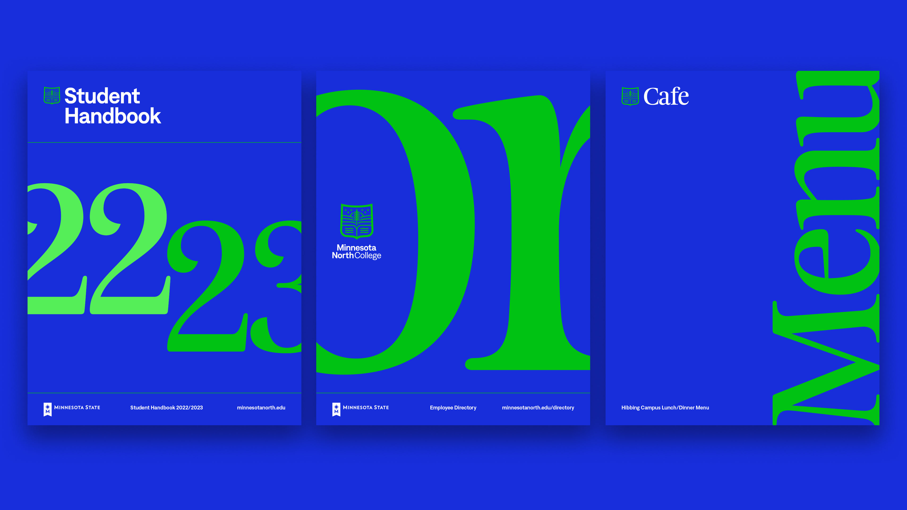
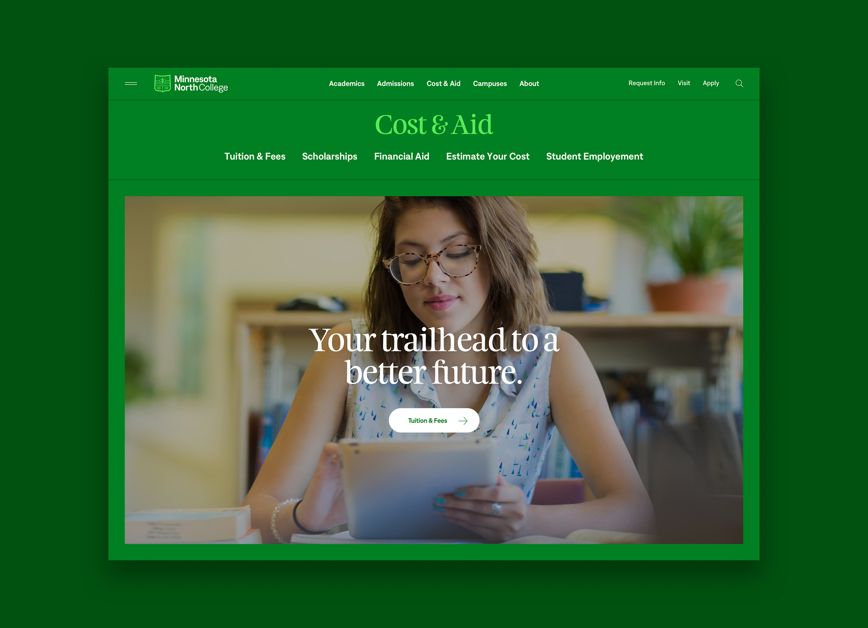
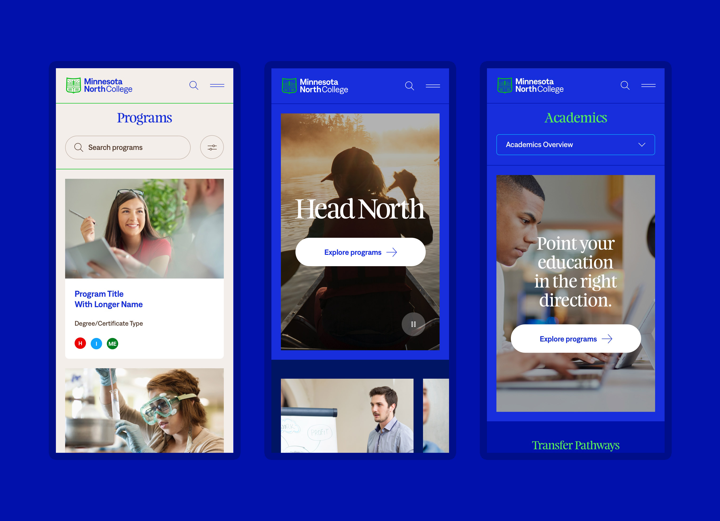
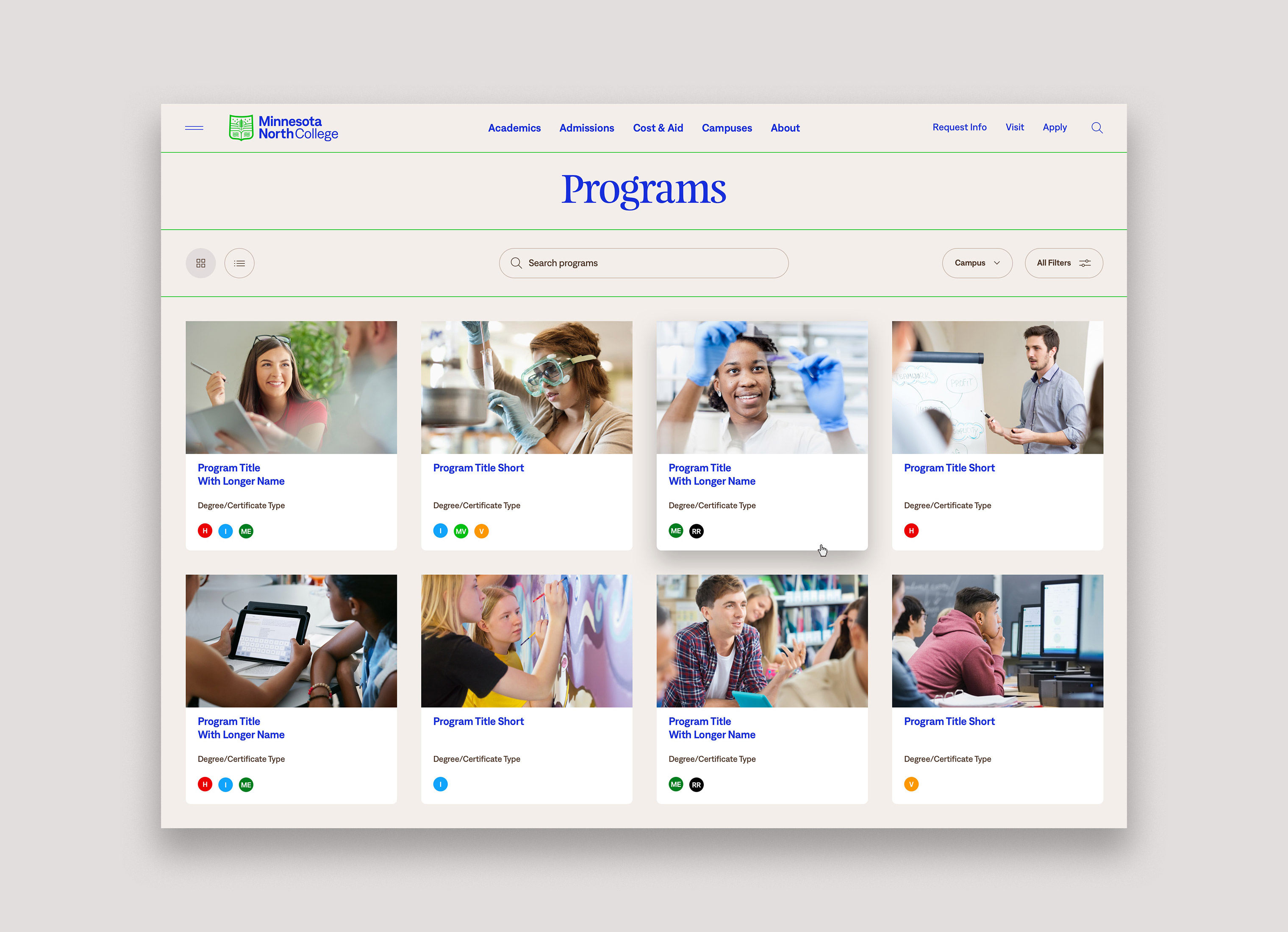
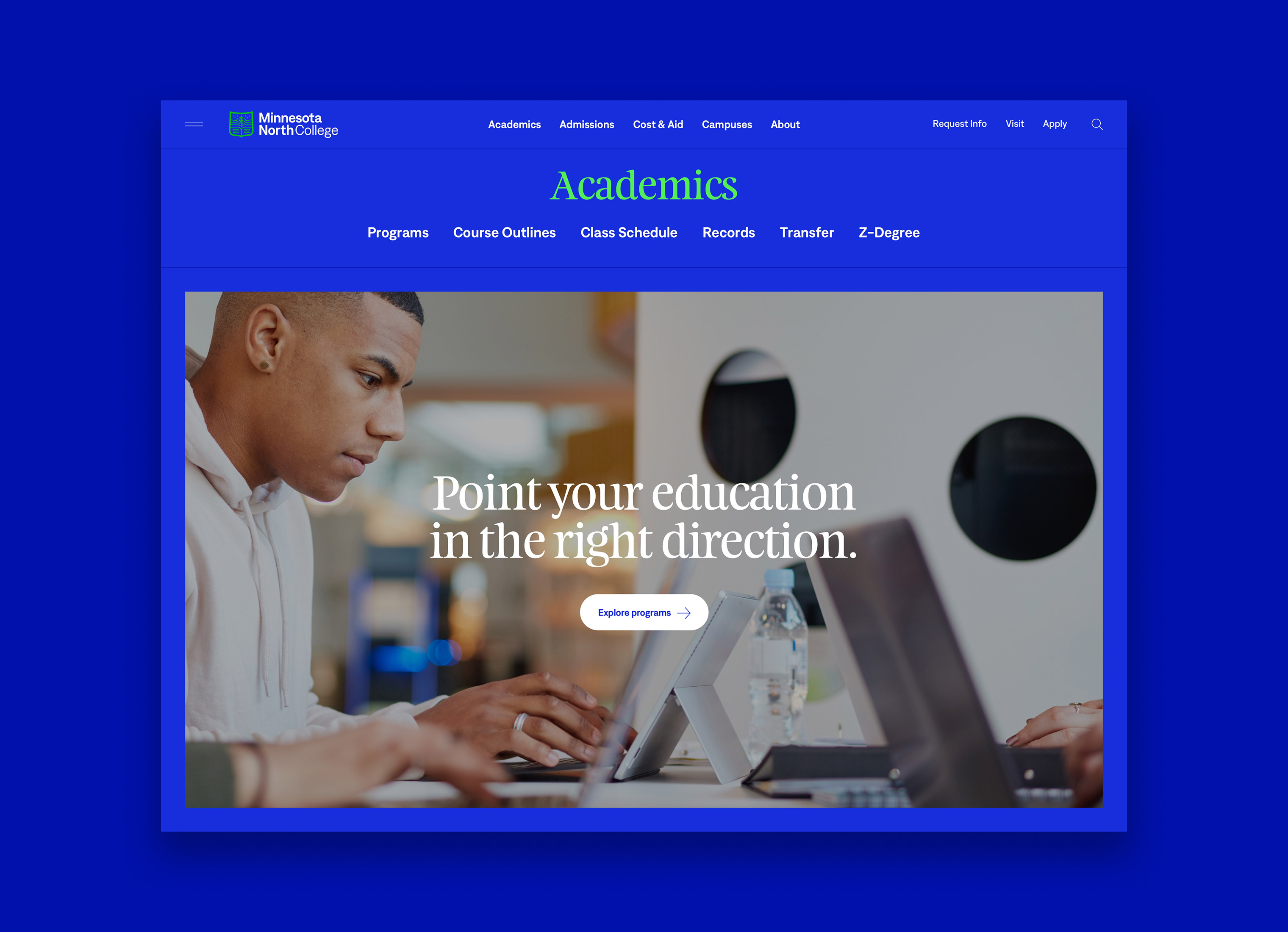
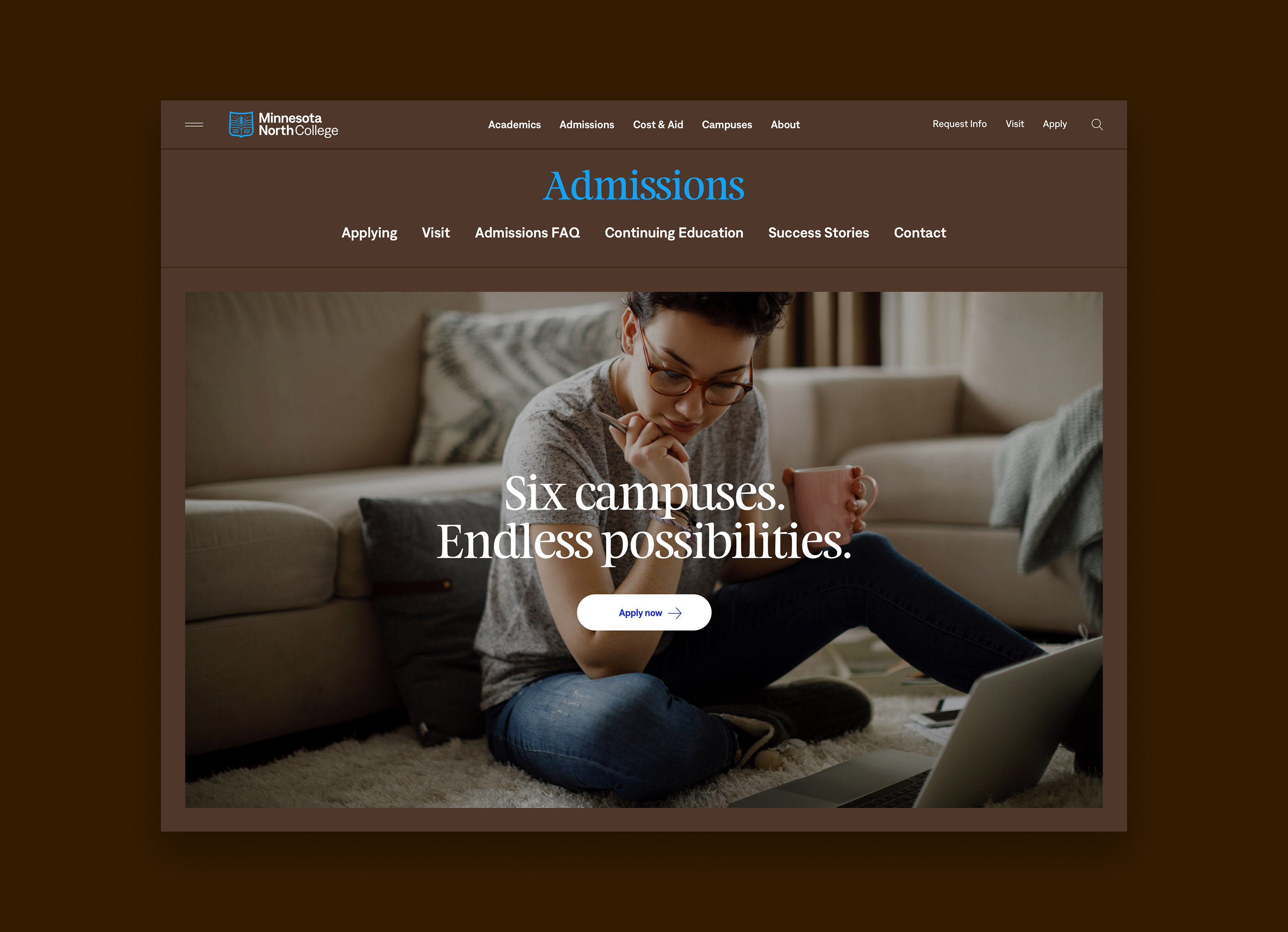
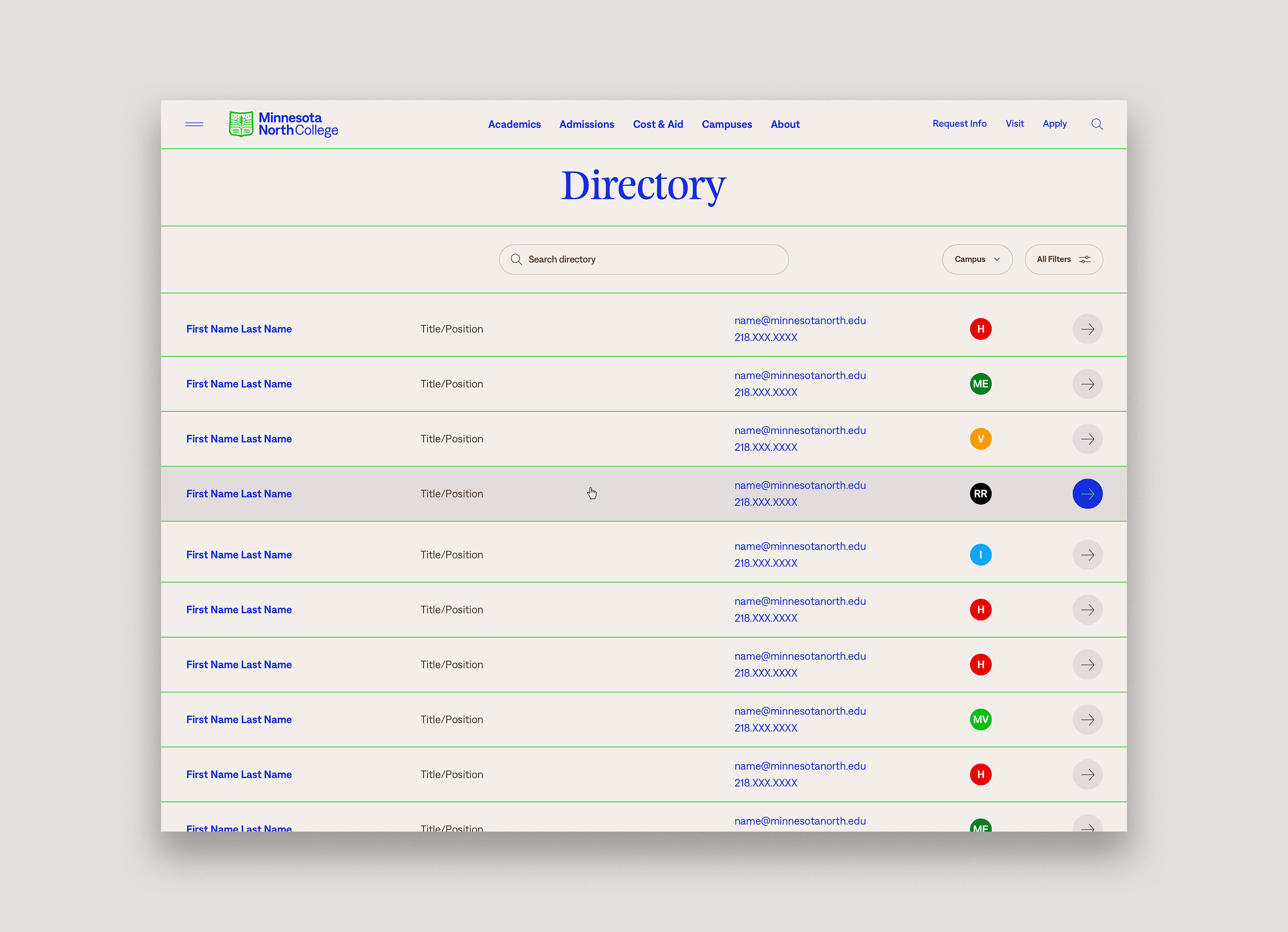
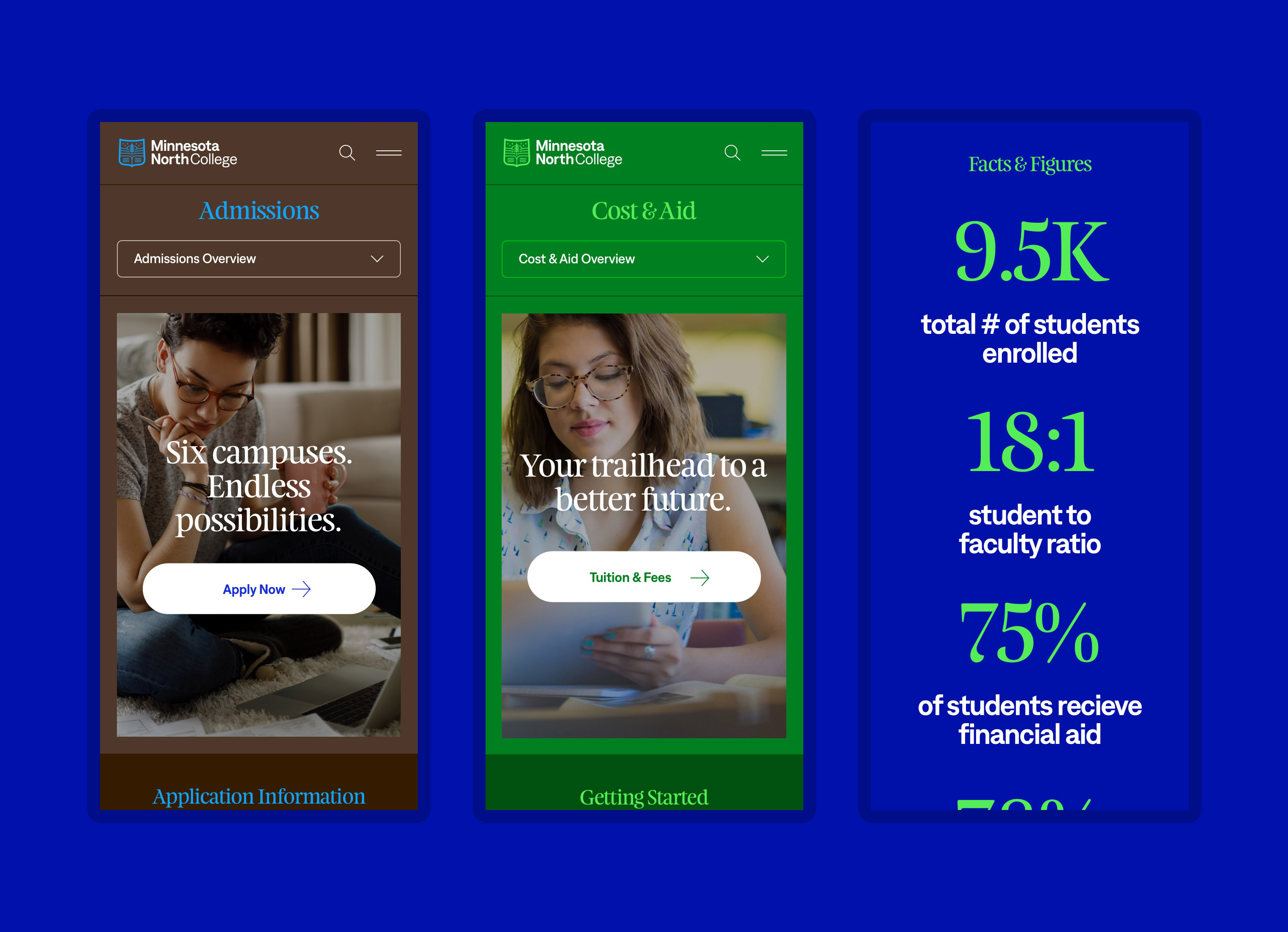
WEBSITE REDESIGN
We were also tasked with designing the college's first website. Our task was to create a design system compromised of templates, components, and modules so that the college could have a wide range of flexibility. With mobile users being a large portion of their website traffic, we designed a solution that is optimized for these experiences. The website is set to launch in the summer of 2022.
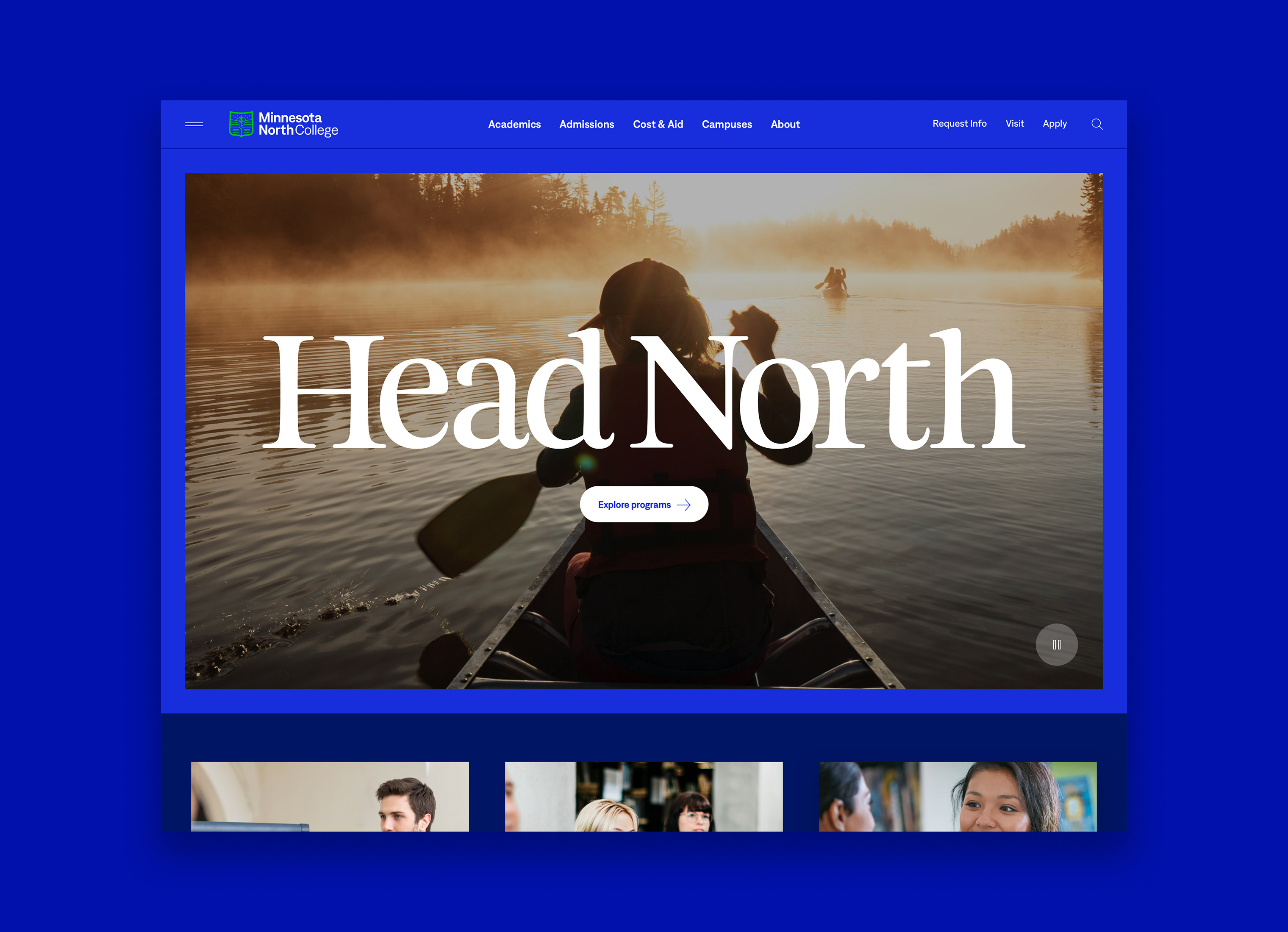
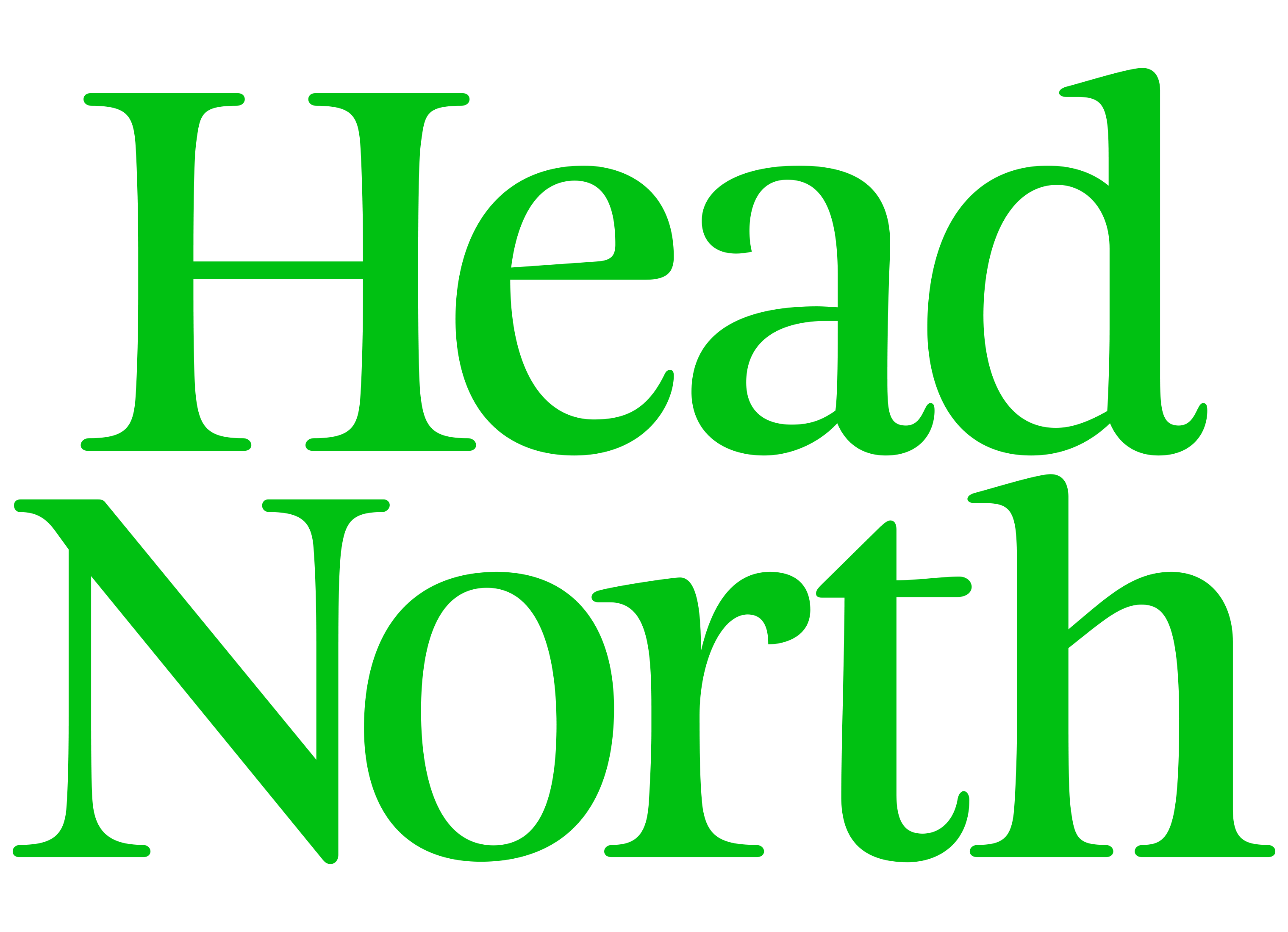
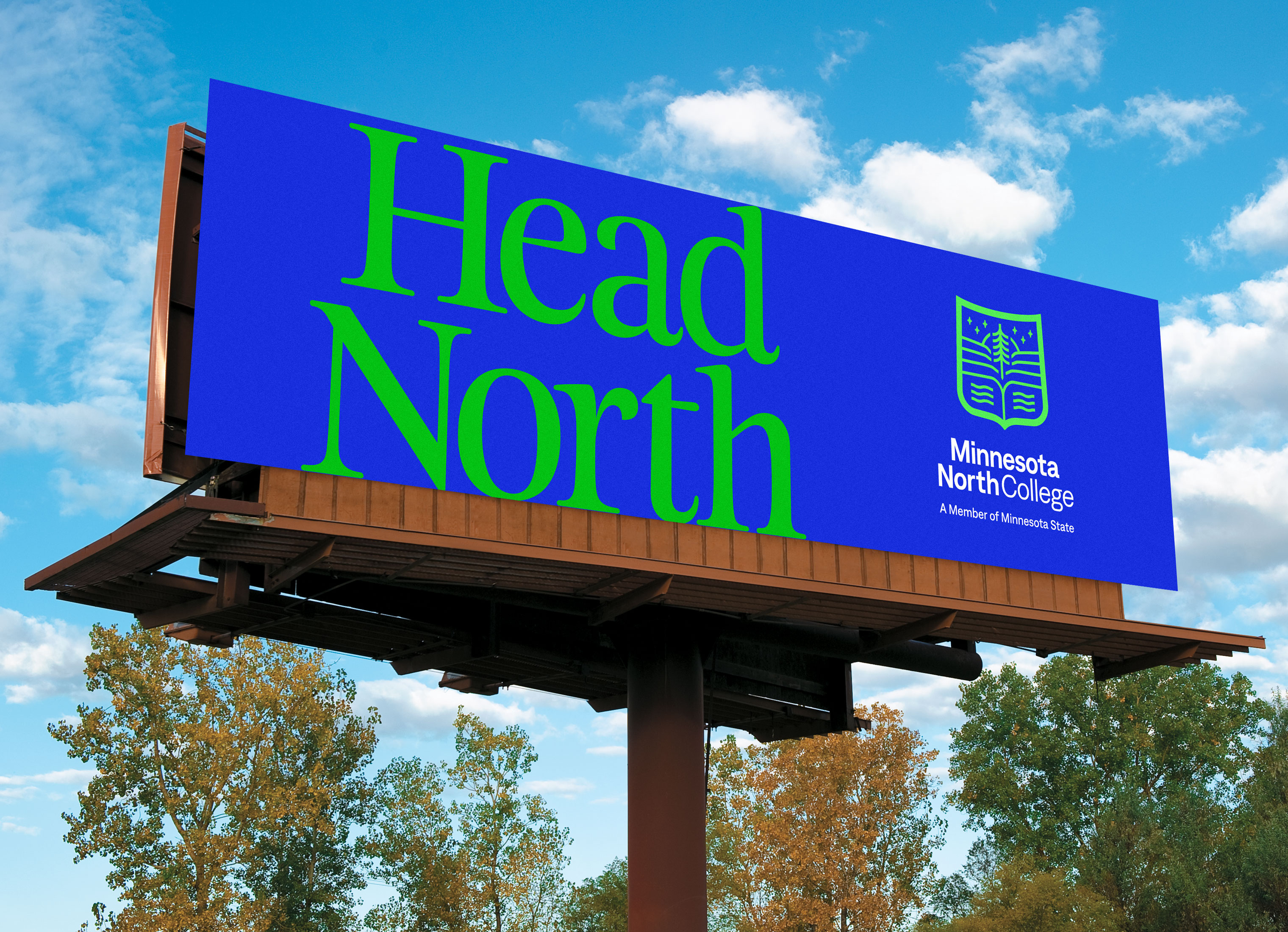
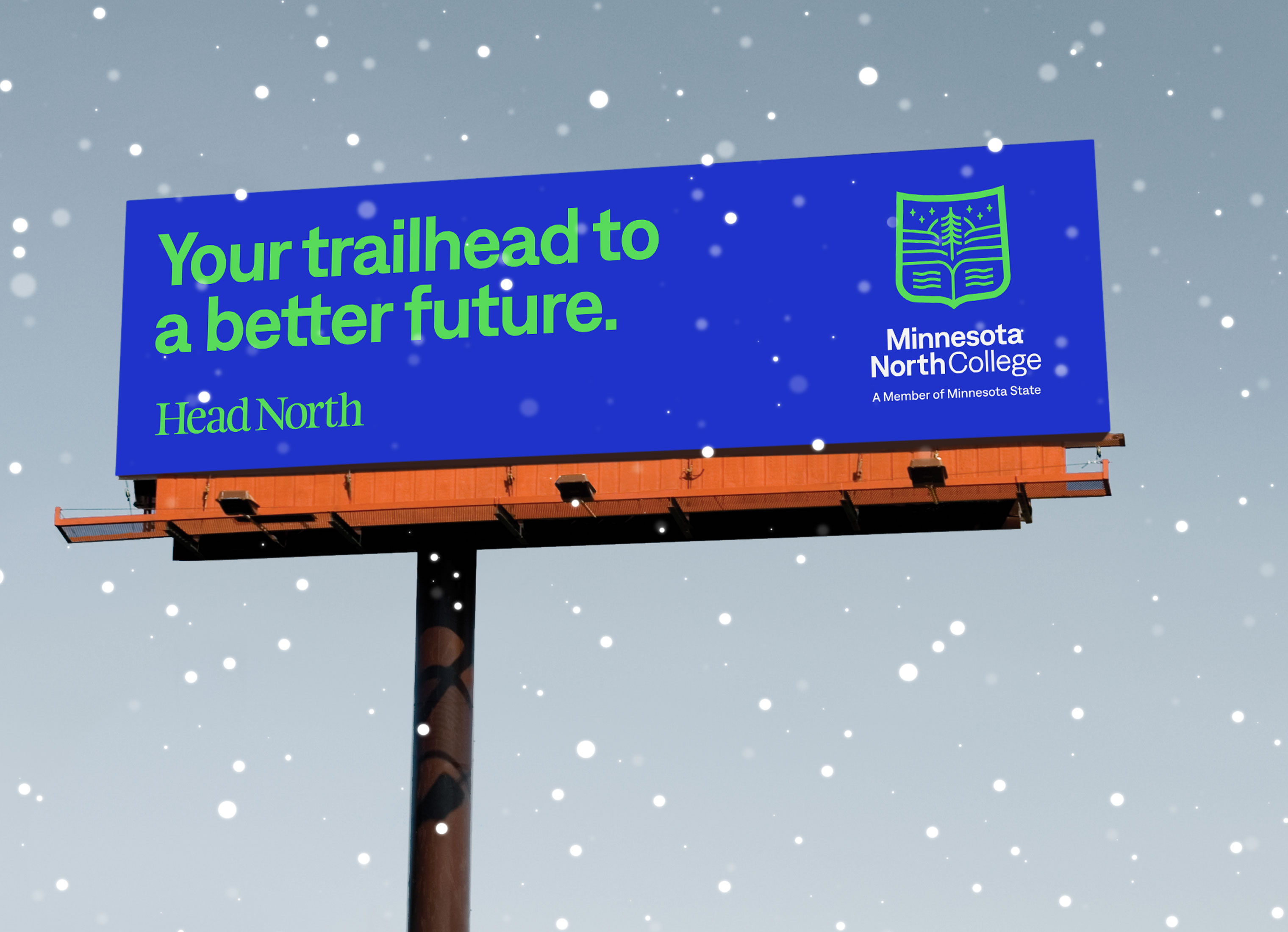
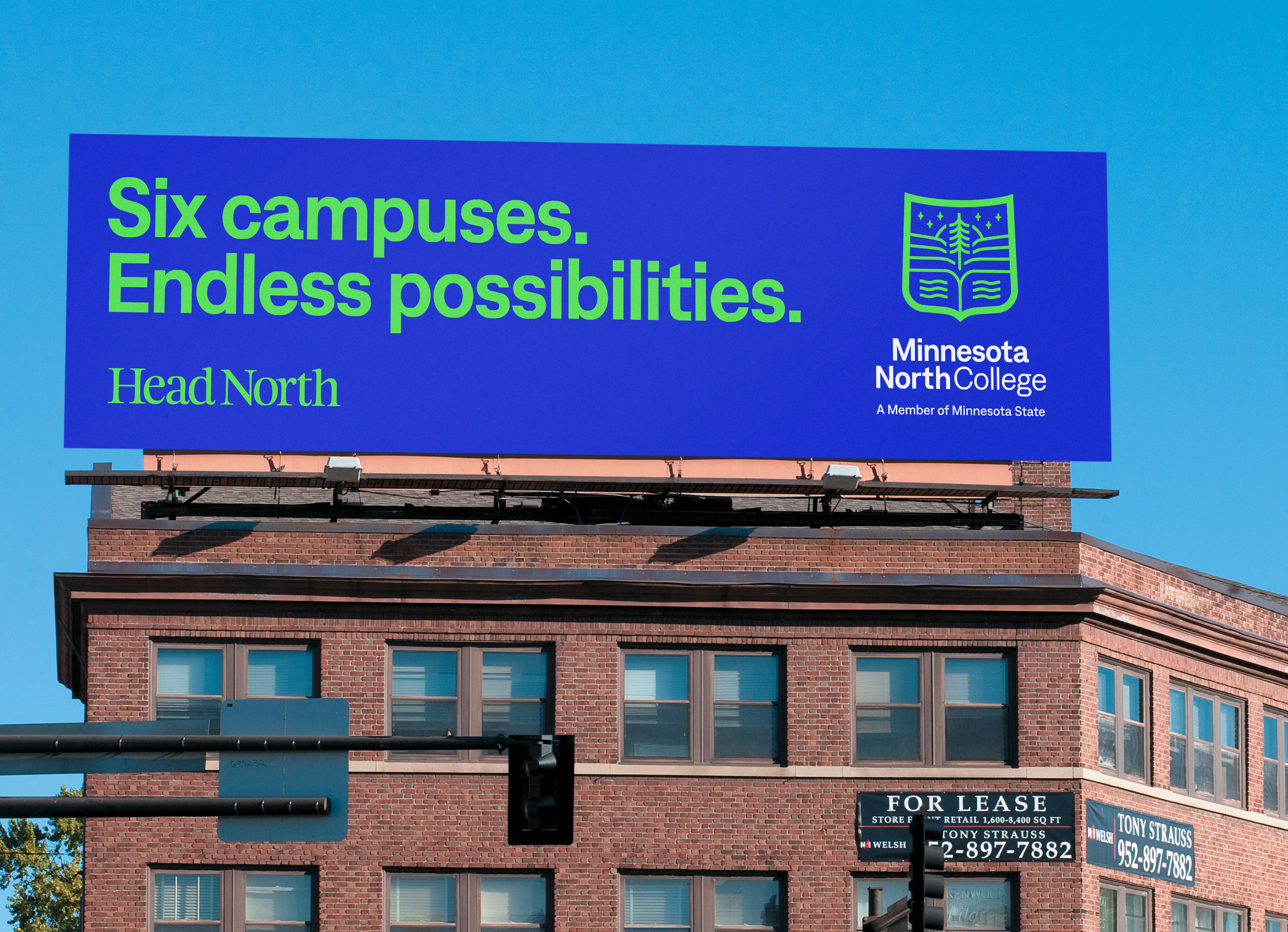
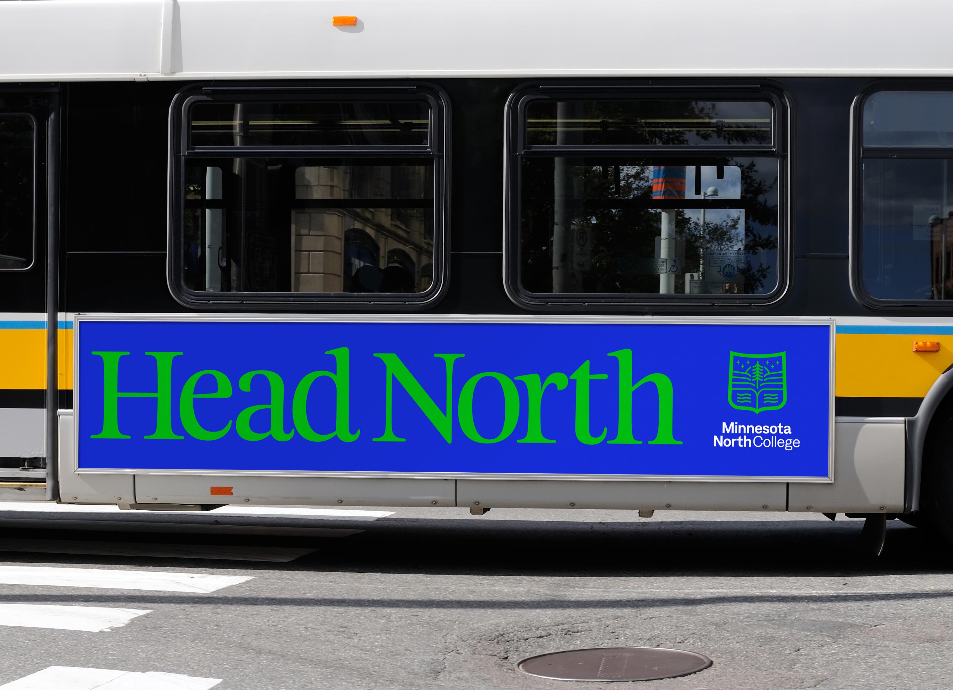
BRAND PLATFORM
We created a new brand platform for Minnesota North – Head North. With the college having a new name, we wanted to help bring more awareness and recall to the name by using "North" in the tagline. Head North also acts as a call to action, not just a geographical location, but to head towards a better future. The reference of "Head" is a nod to readying your mind through higher education. It's also a very commonly used phrase in Minnesota when referencing going to the north country of Minnesota.
Skills
- Brand Discovery & Research
- Brand Strategy & Positioning
- Voice & Messaging
- Visual Identity System
- Brand Guidelines
- Website Discovery & Strategy
- UX & UI Design
- Brand Campaign
Details
Team
- Garrick Willhite
- Bryn Bundlie
- Bill Gunter
- Anders Holine
- Jim McLarty
Client
- Minnesota North College
Project
- Visual Identity System and Website Design
Year
- 2022