Inver Hills Community College
is located in Inver Grove Heights, MN. We created their visual identity, brand platform, and website.
PROJECT DISCOVERY
Inver Hills Community College was initially looking to redesign their website. Through initial stakeholder meetings and focus group sessions with students and faculty, we discovered that there was a larger brand problem that needed to be addressed.
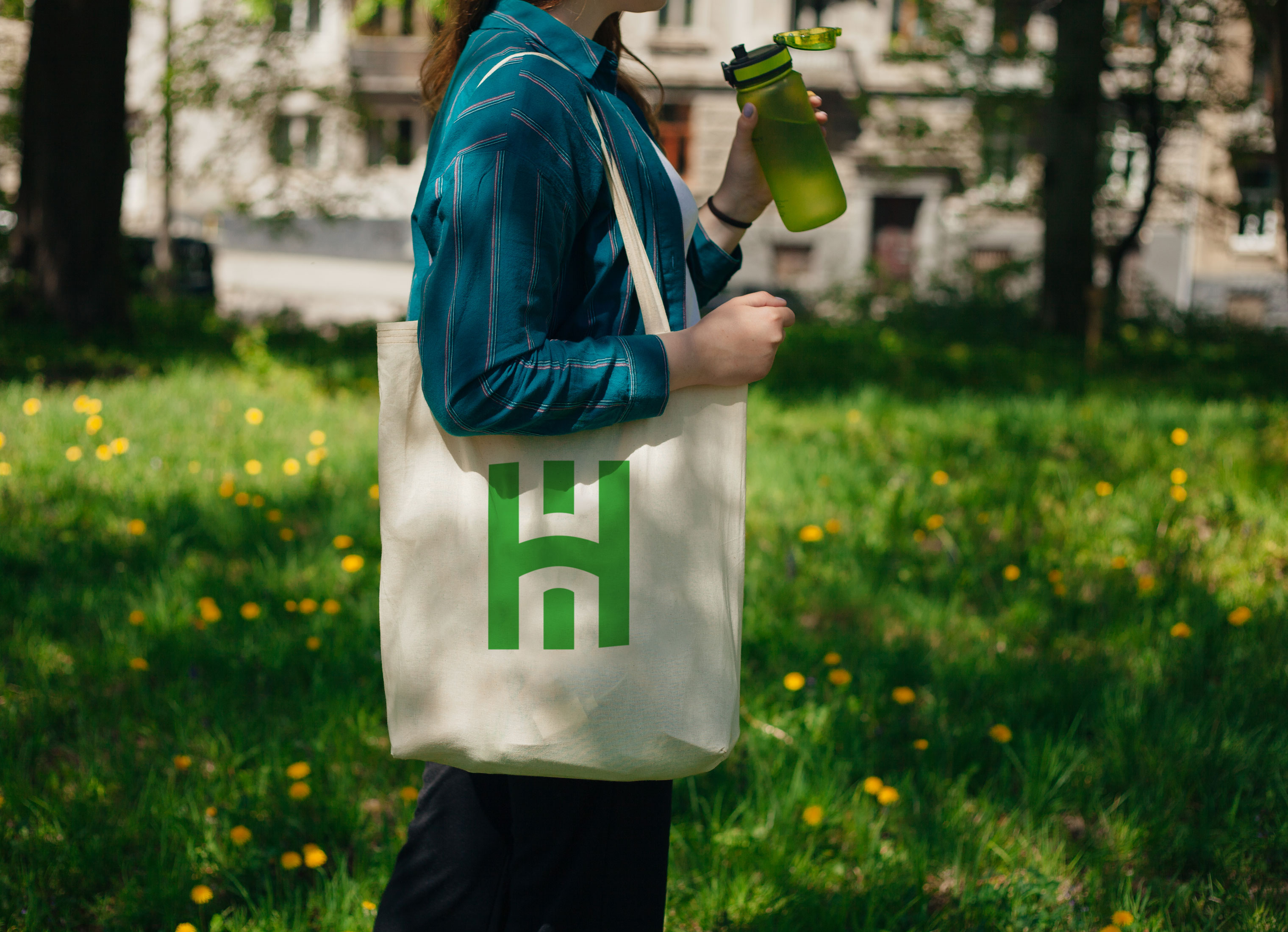
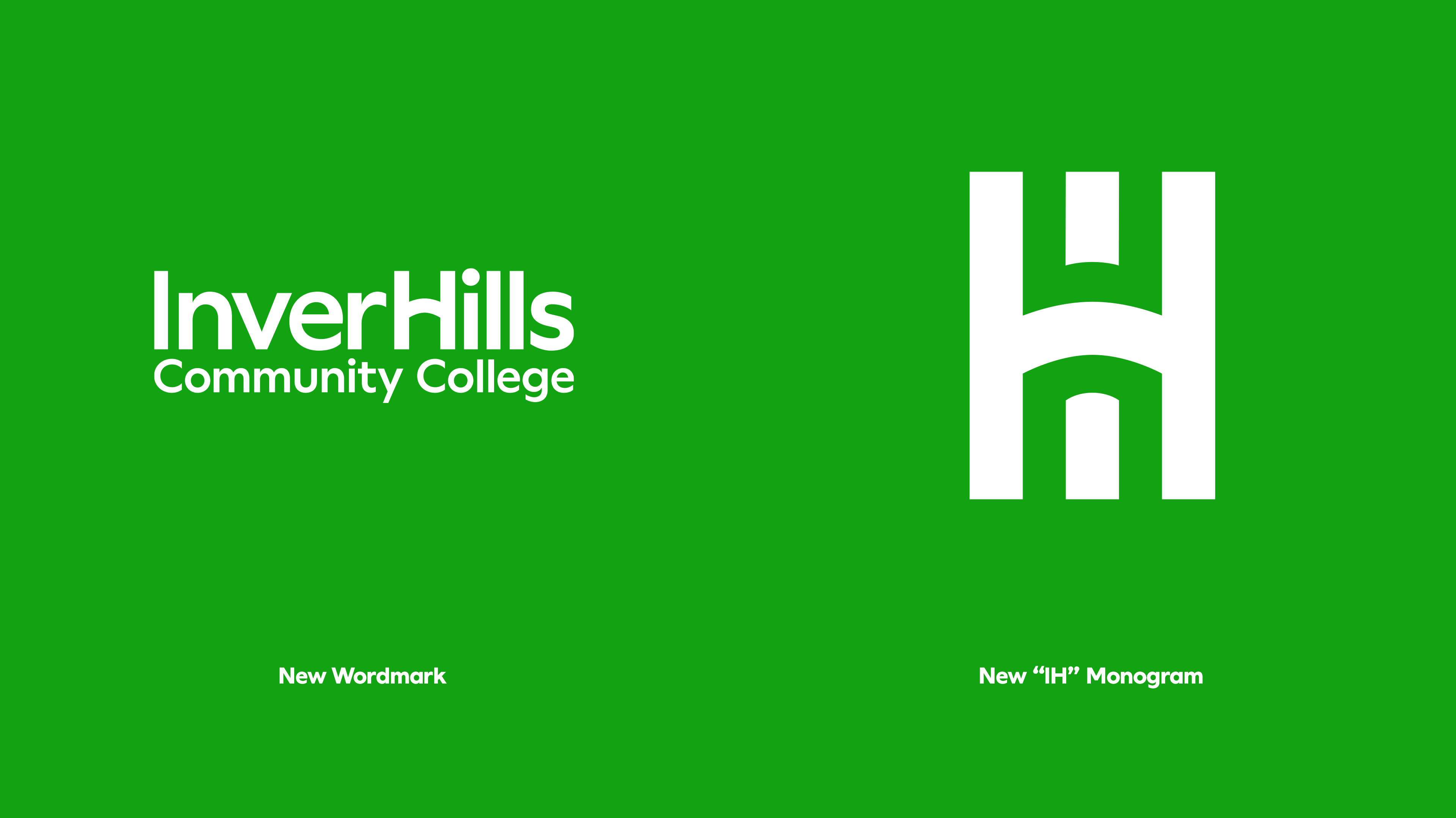
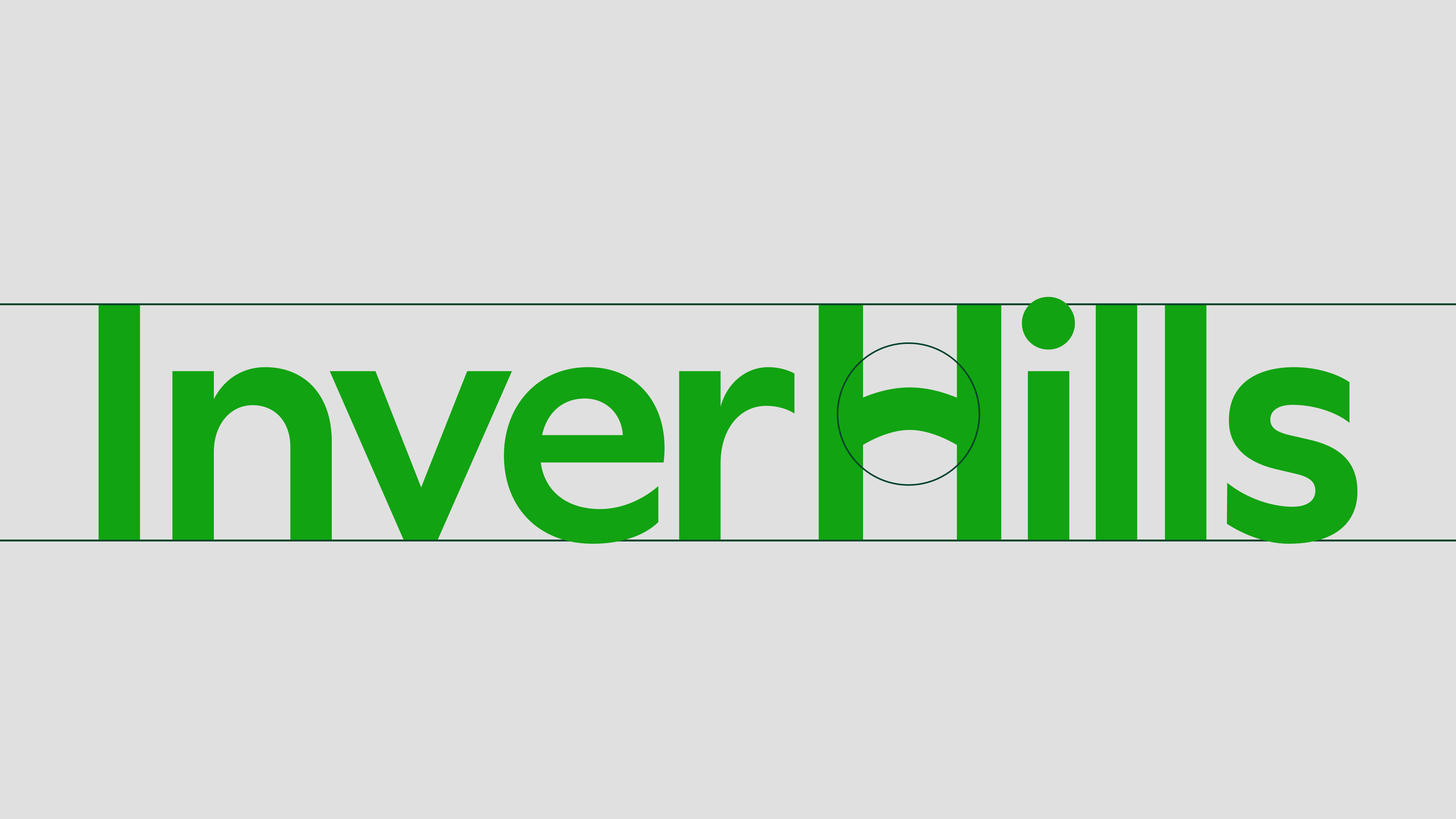
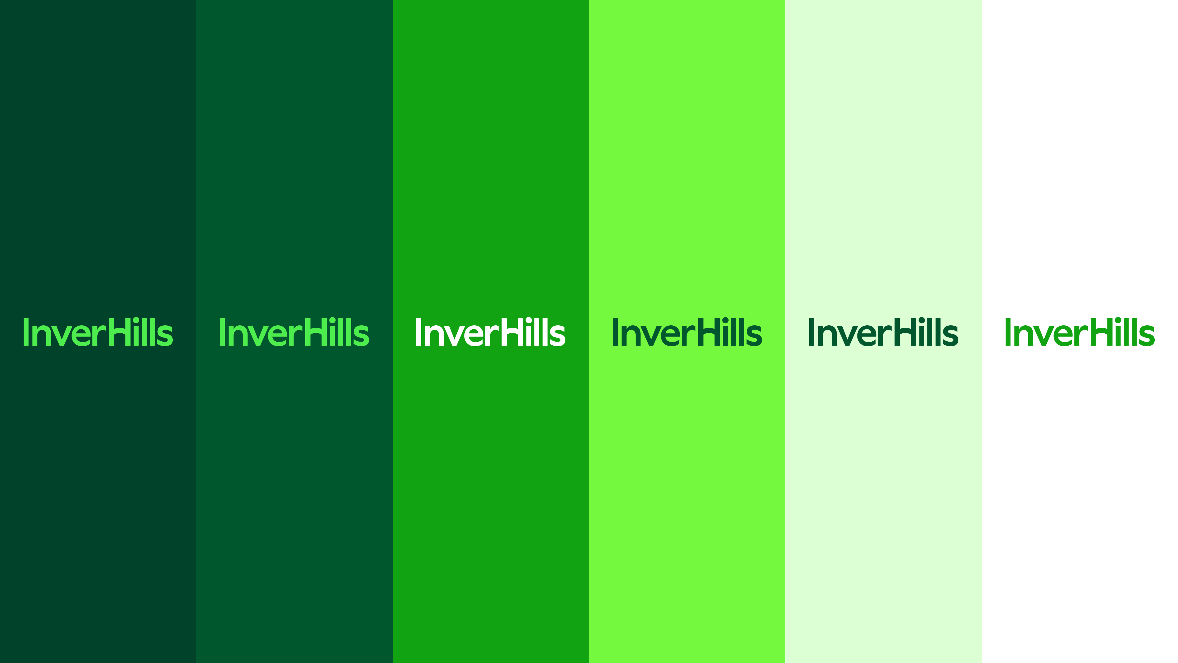
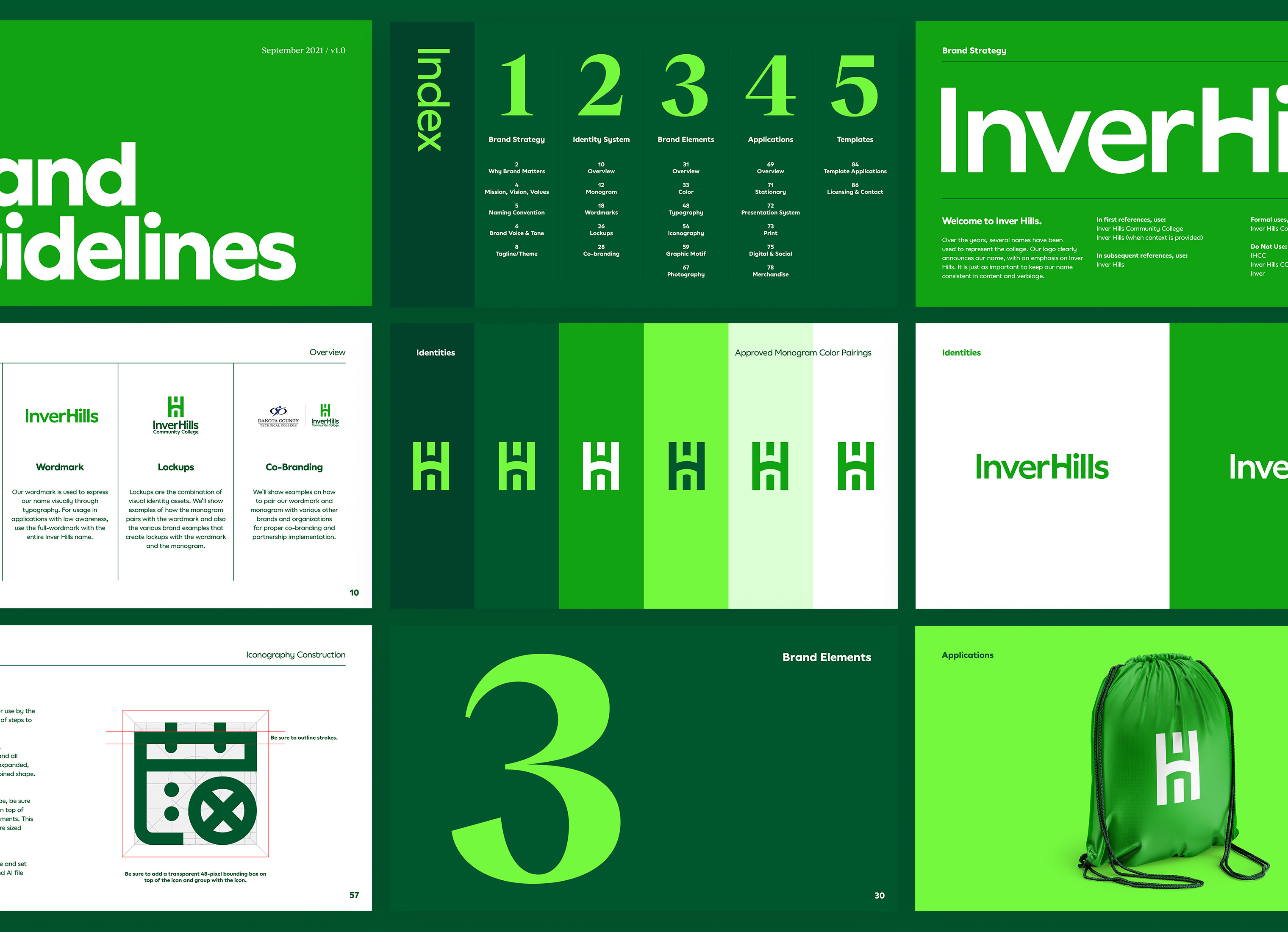
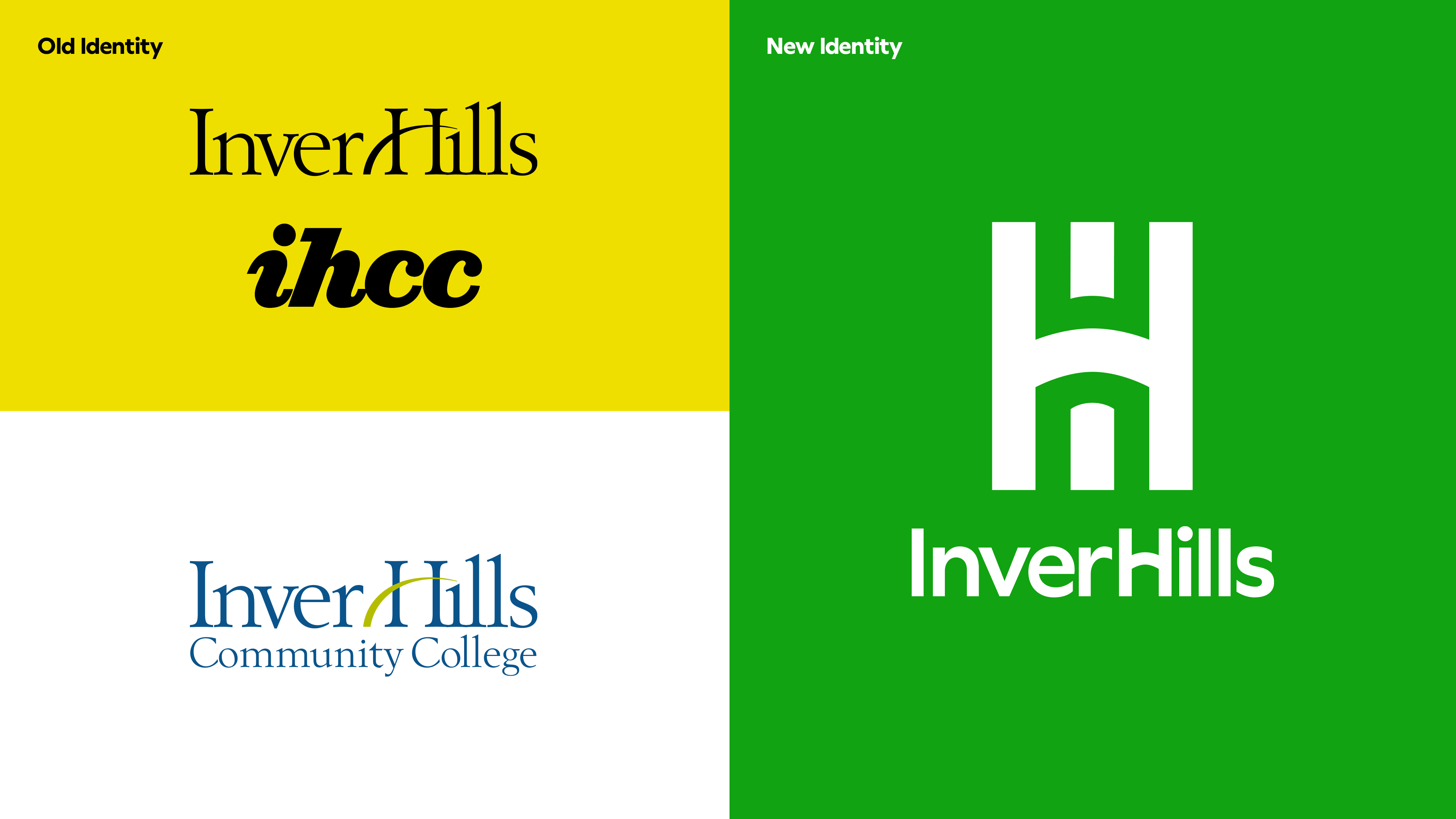
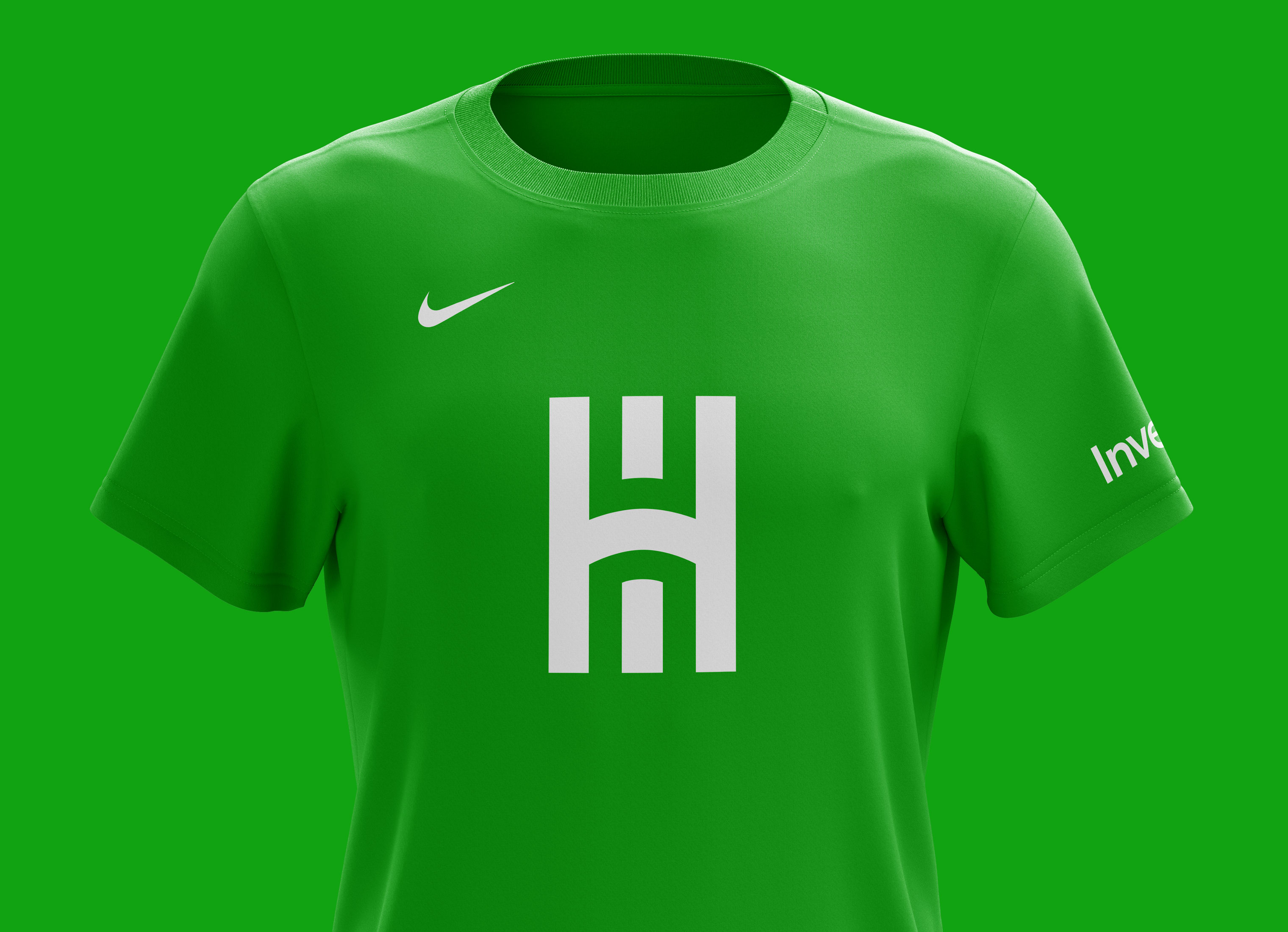
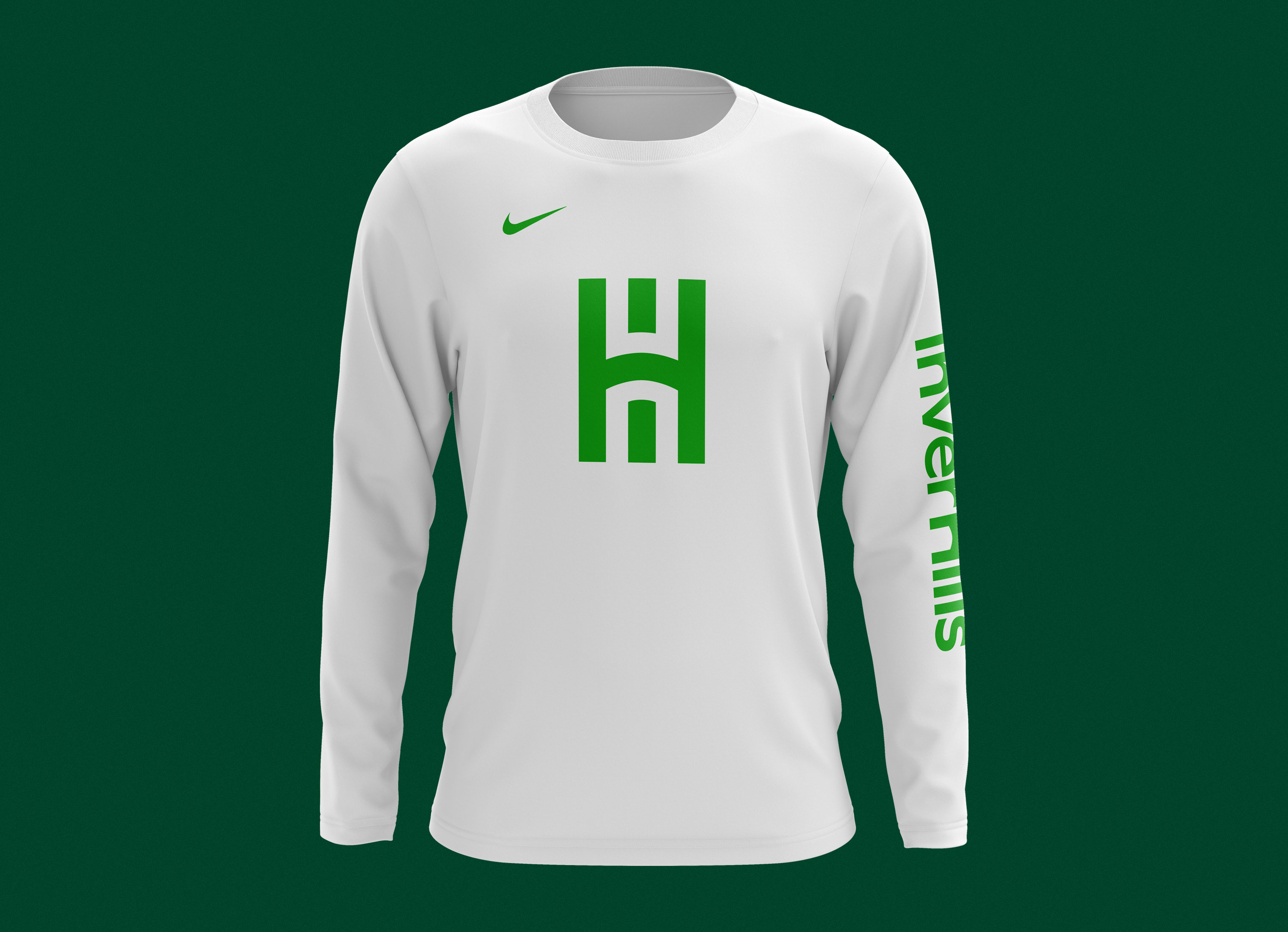
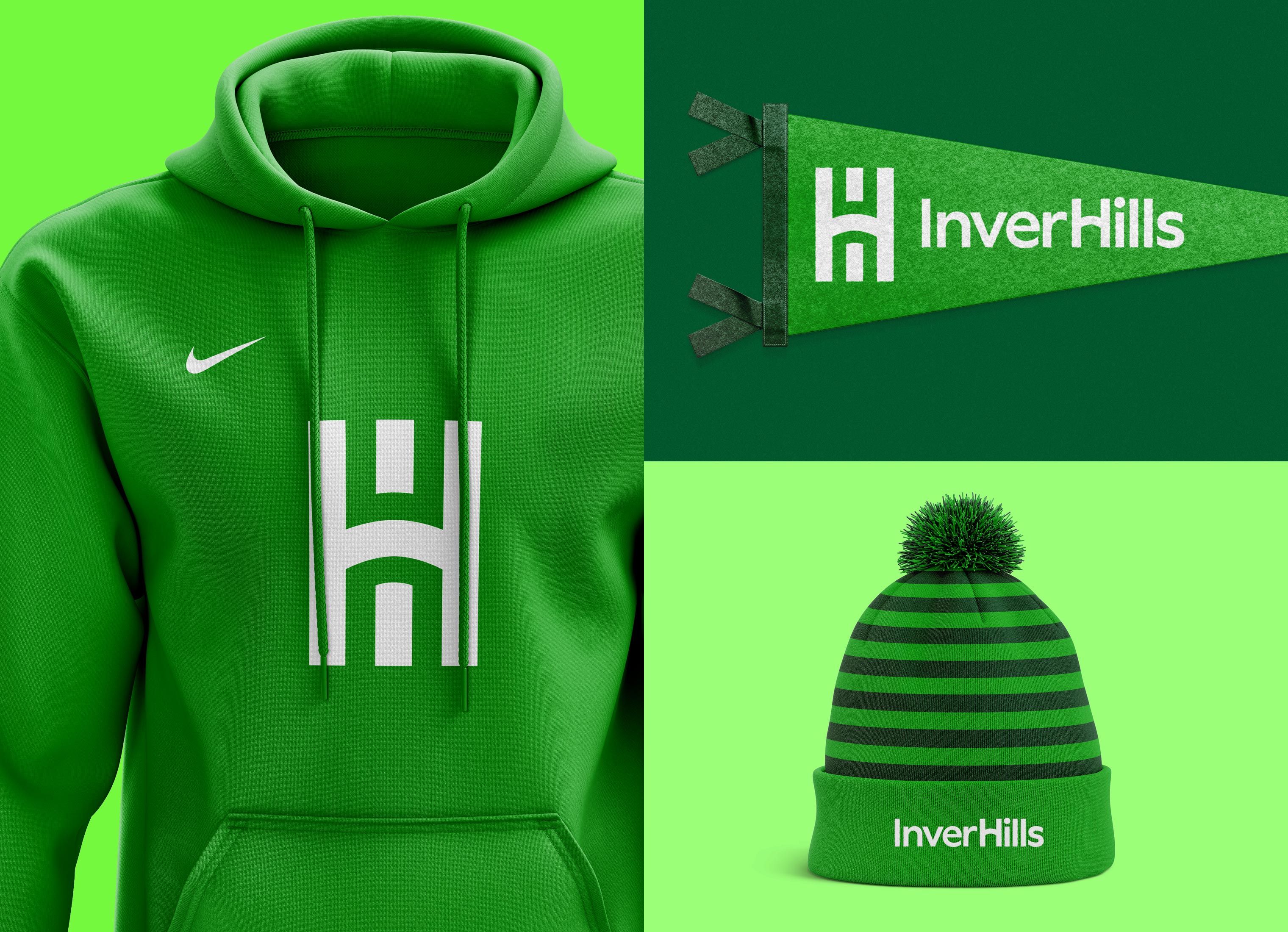
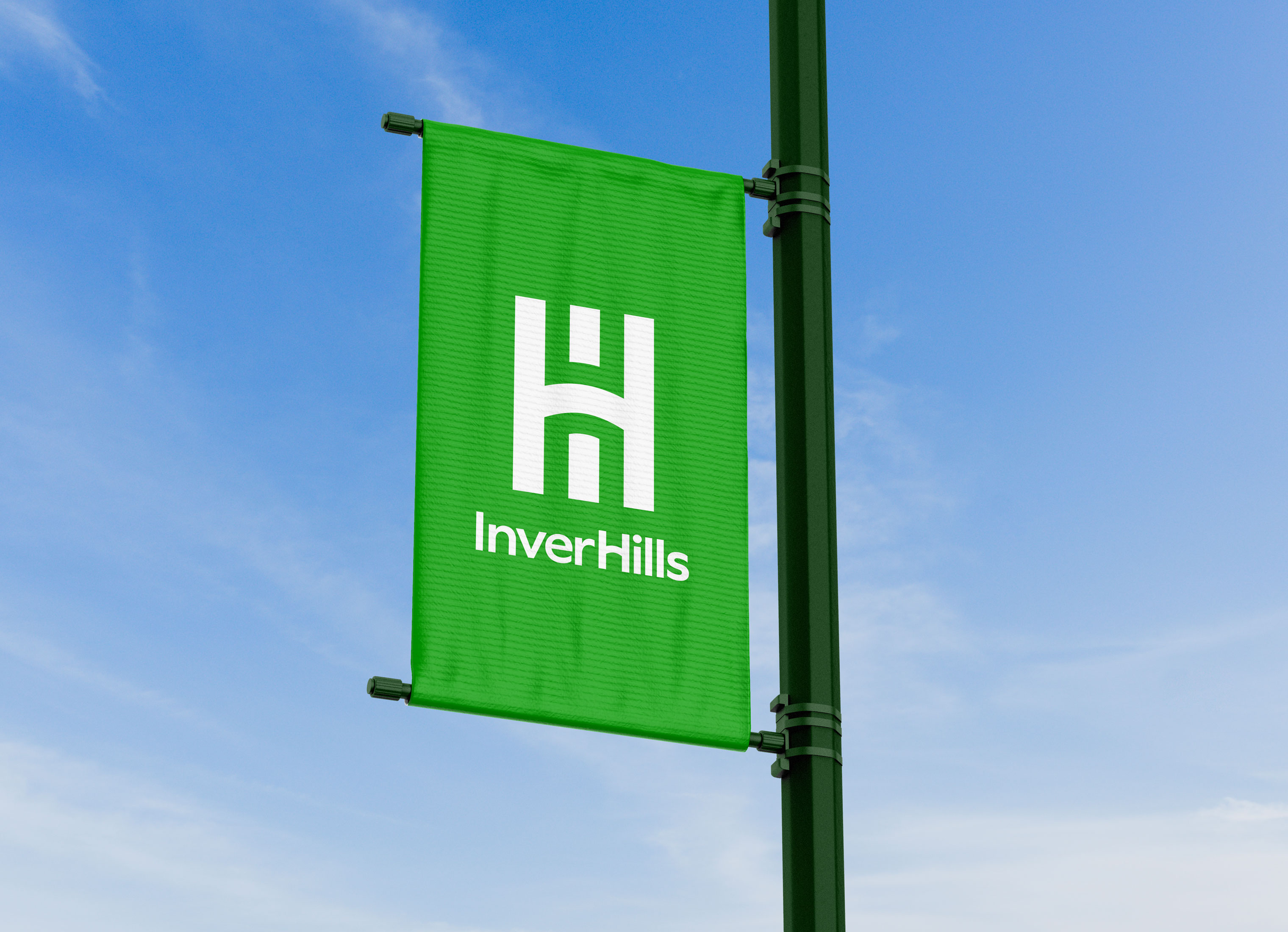
Students, employees, and faculty did not like the current brand with a lack of affinity for the logo, colors, and brand platform. "Our yellow-ish green color looks like puke." – opined one honest student. We realized that even if we updated the website, we still wouldn't be resolving one of the major pain points that we heard about the existing brand. Our objective then changed to update the brand first. Our wonderful client agreed. We introduced a new "IH" monogram and created a new wordmark, color palette, brand platform, and overall design language.

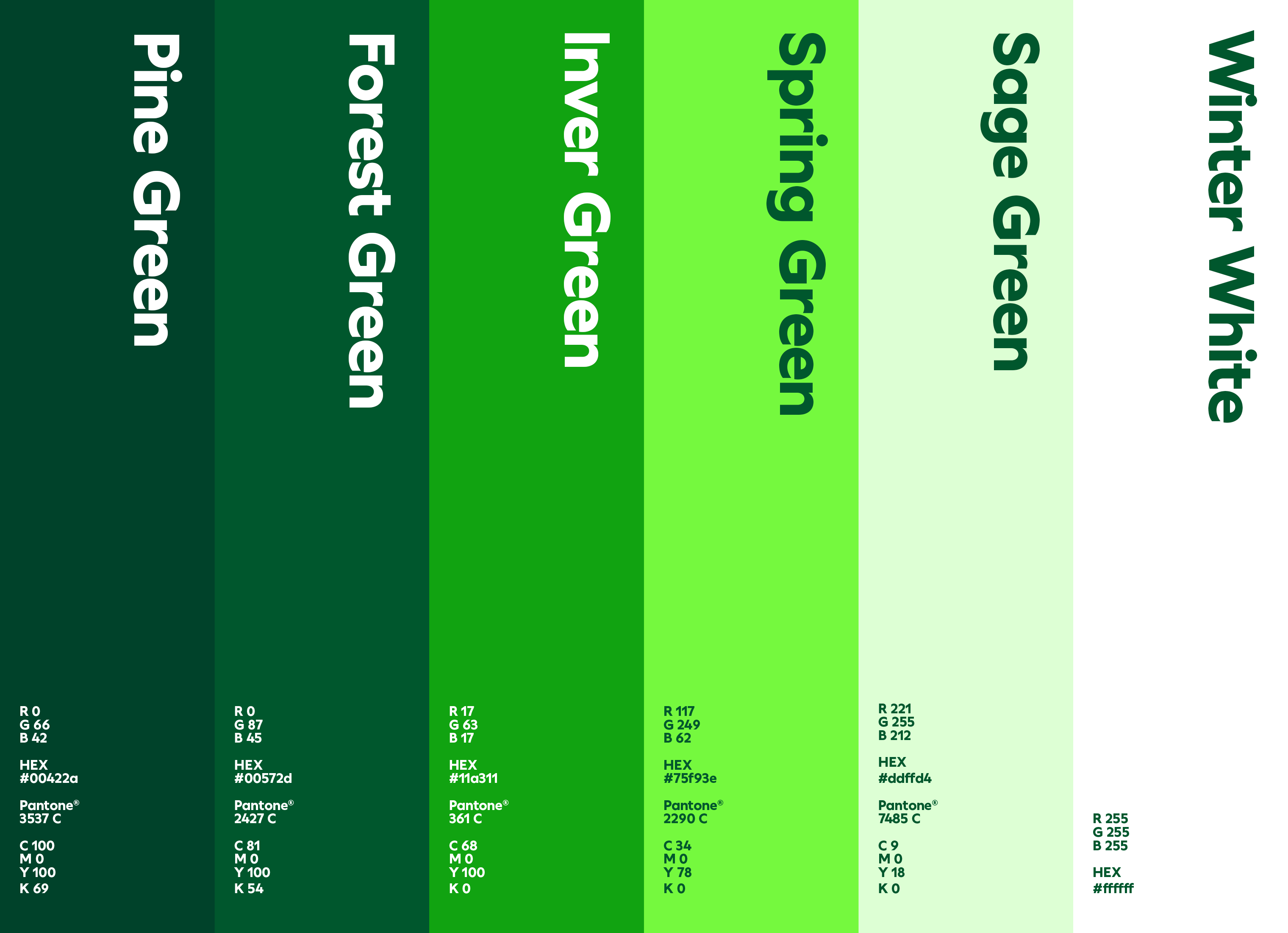
COLOR PALETTE
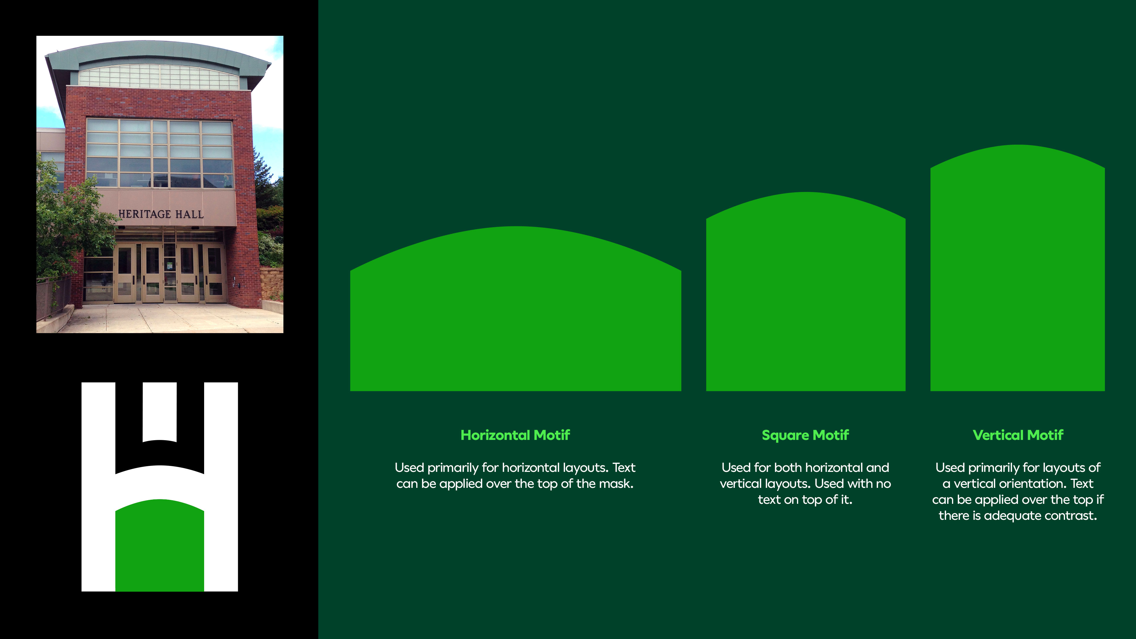
We created a new color palette made up of greens. This was influenced by the green grass hills associated with the Inver Hills name. The new "Inver Green" is the predominant color replacing a muted yellow-ish chartreuse color of the previous brand. The logo and monogram colors change based on what background green color is used, but it always appears paired with a green hue.
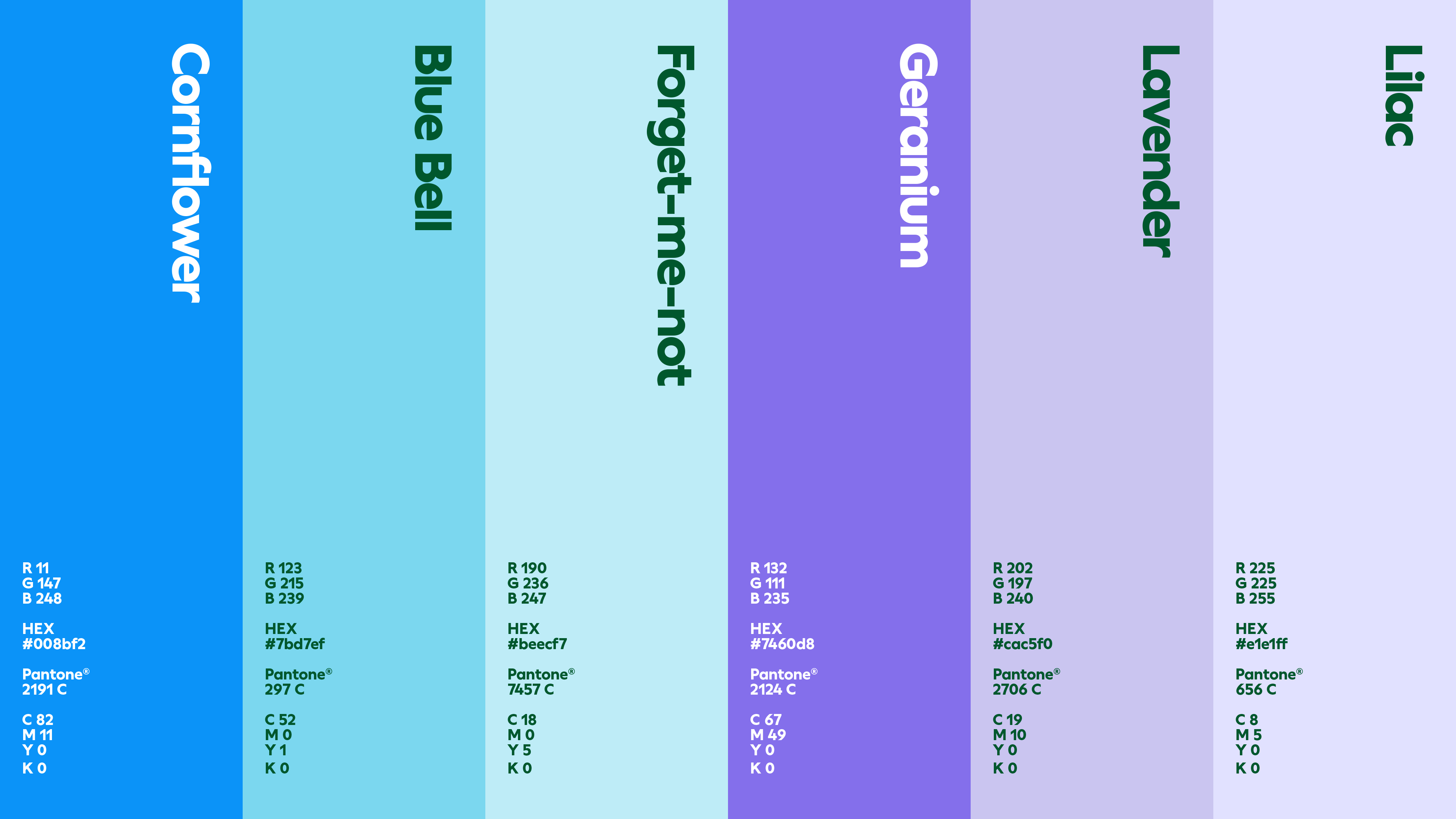
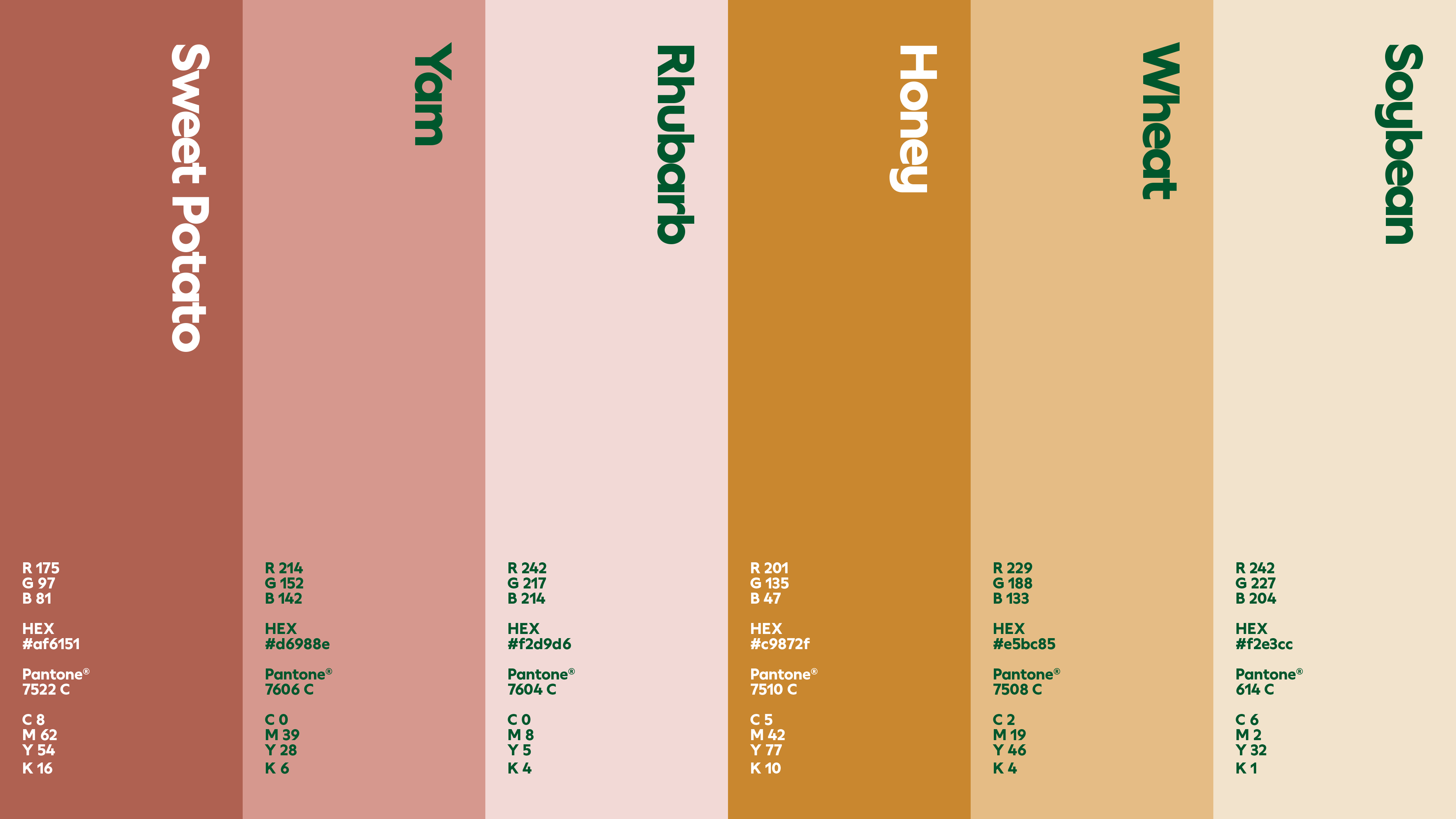
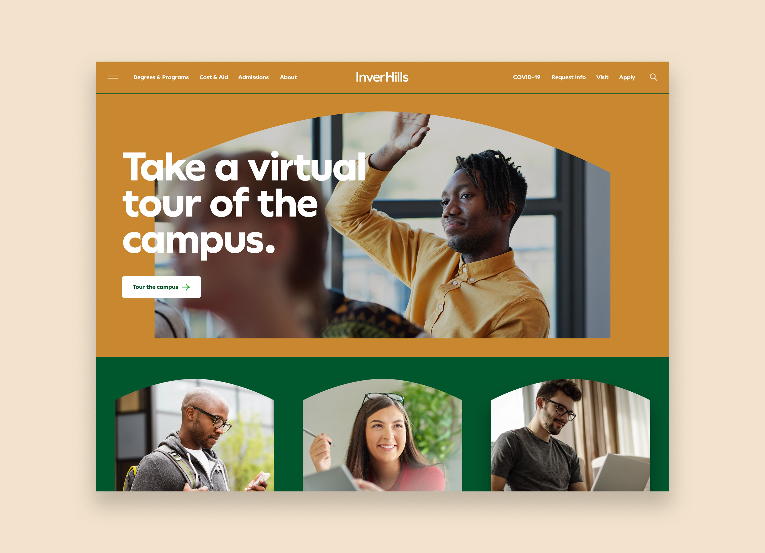
We also wanted to expand the color palette to match the need for variety and flexibility. We created a secondary color palette that is associated with each semester. Spring/Summer colors use blues and purples, while the Fall/Winter semesters use oranges and browns. The colors are named after Minnesota agriculture which have ties to some of the programs at the college. This secondary color palette is meant to be always paired with the green color palette.


WEBSITE REDESIGN
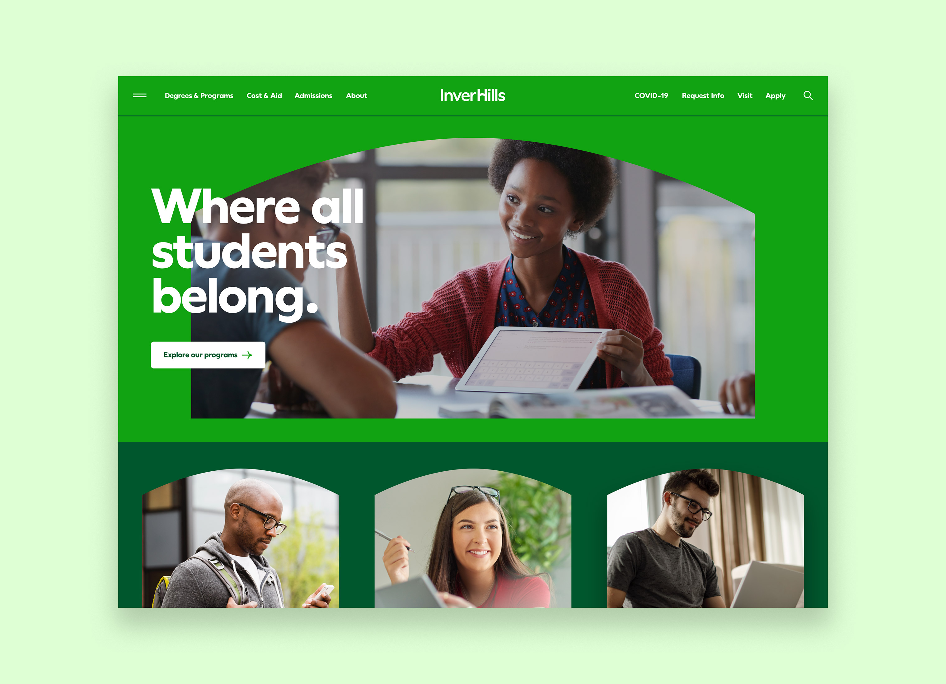
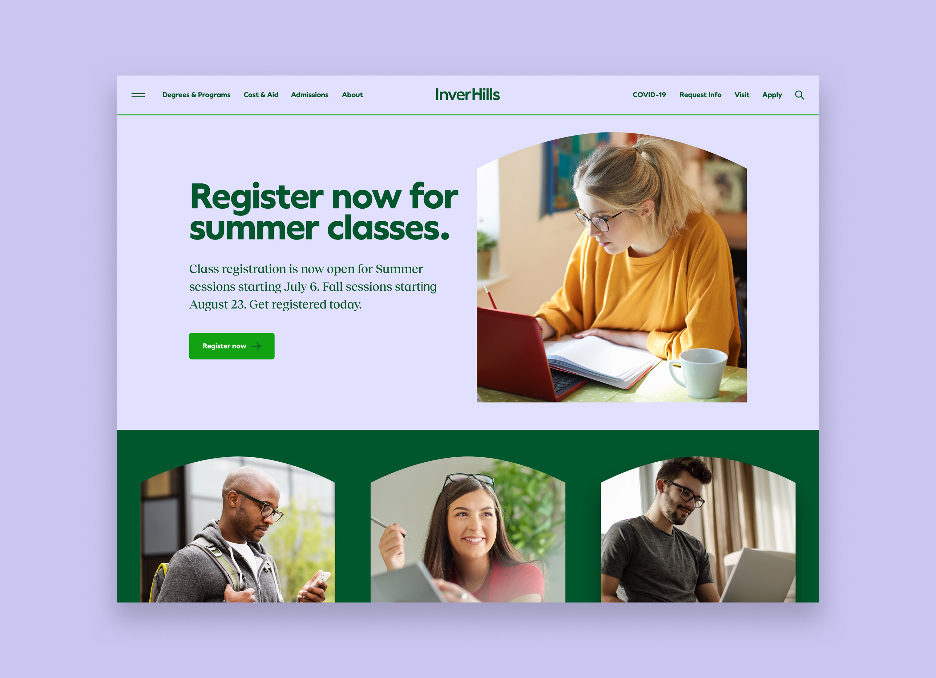
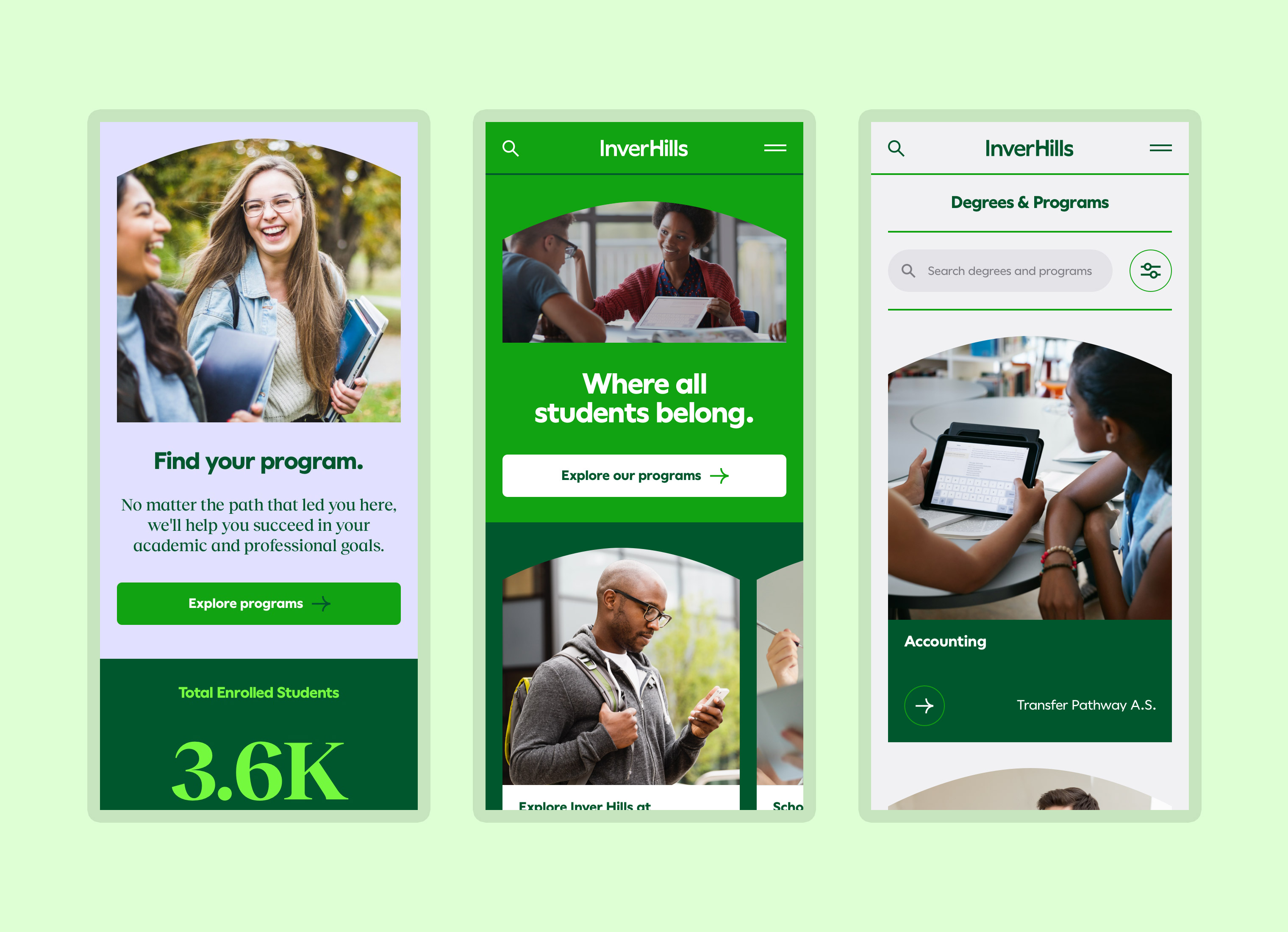
As stated earlier, the initial project was to redesign the Inver Hills website. We continued to make website progress while updating the brand. We revised the information architecture, wrote and developed content for key marketing pages, creating a UI component library and designed and built the entire front-end experience. The website is set to launch in spring 2022.
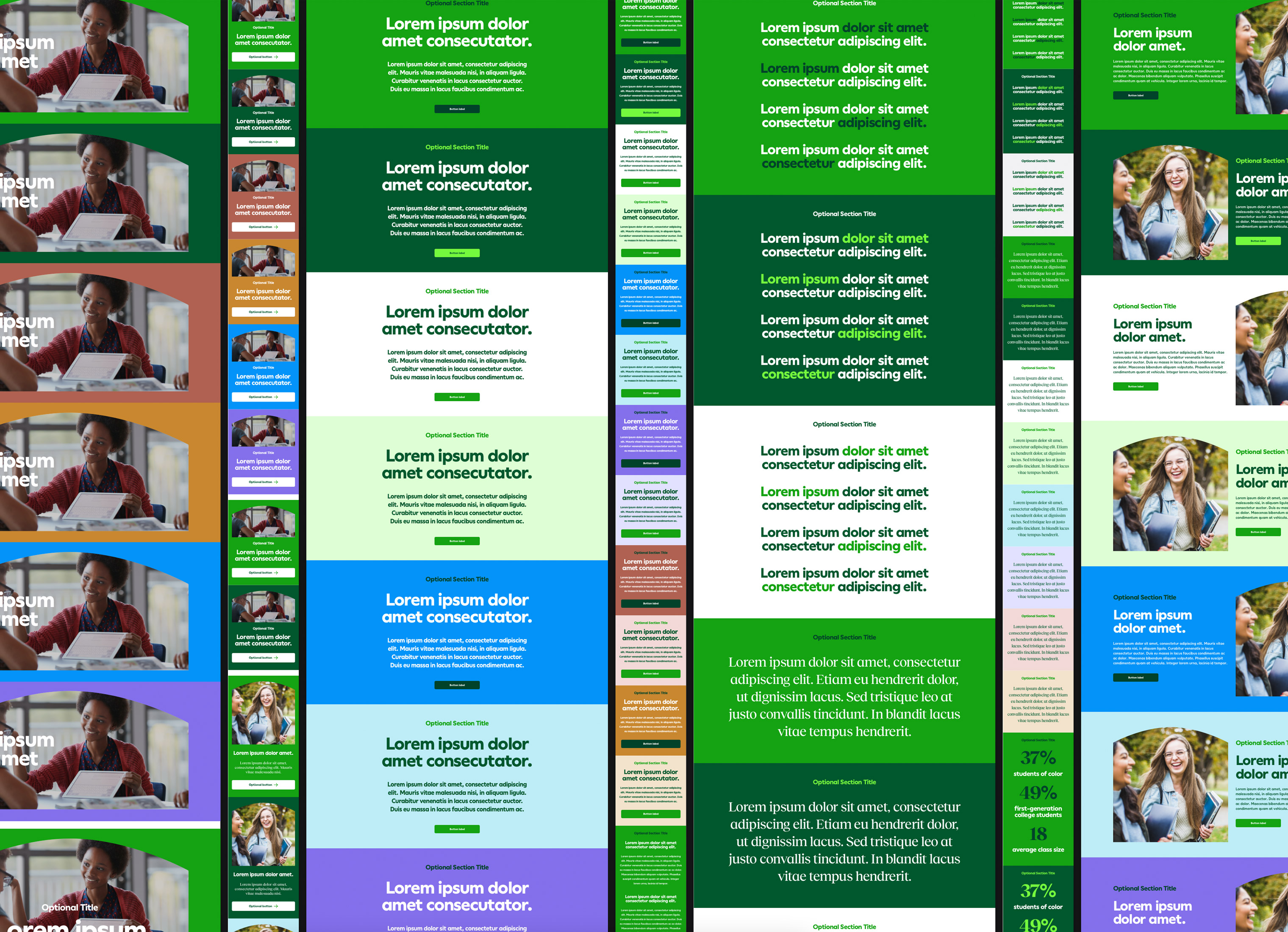
COMPONENT LIBRARY
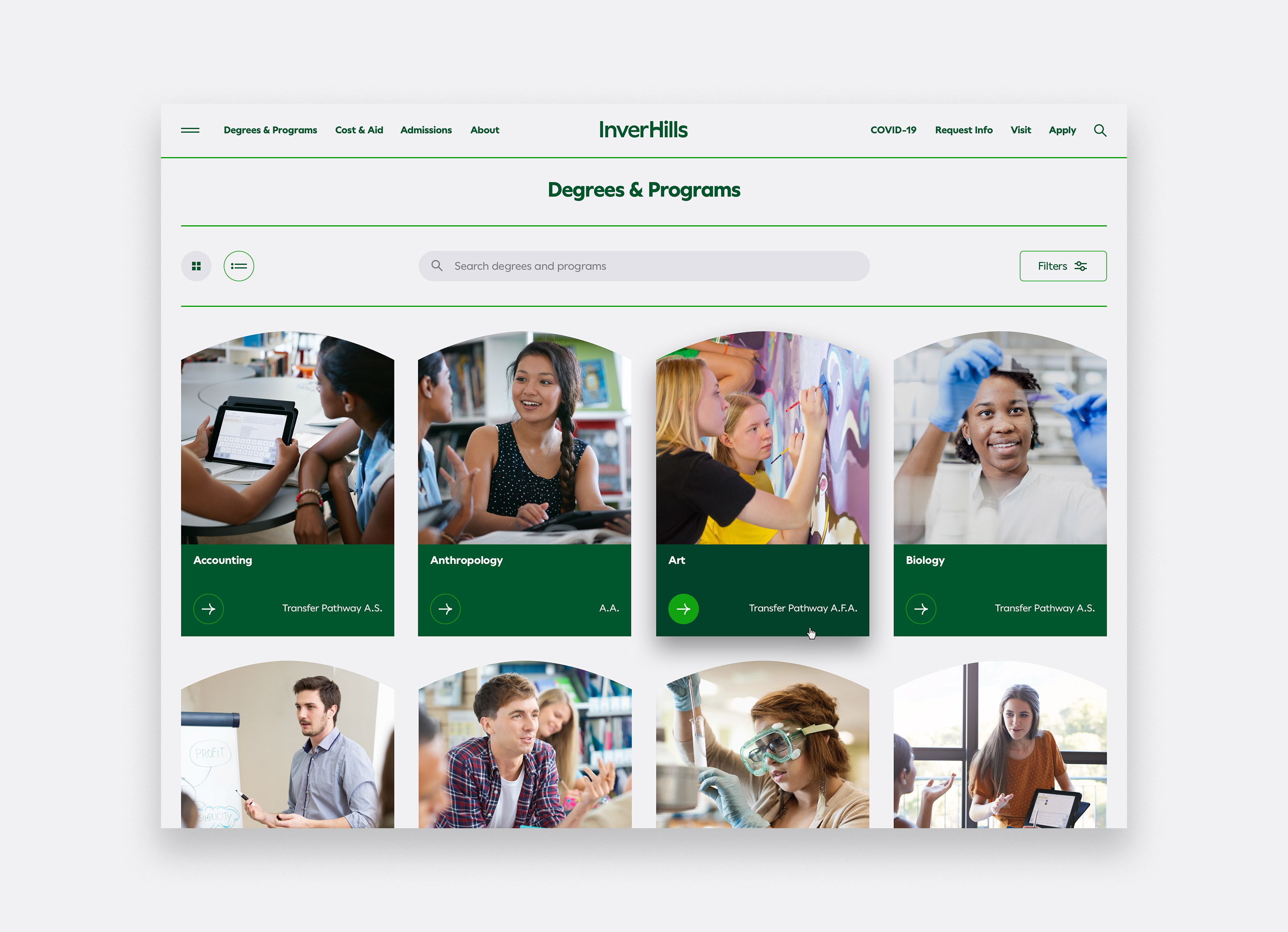
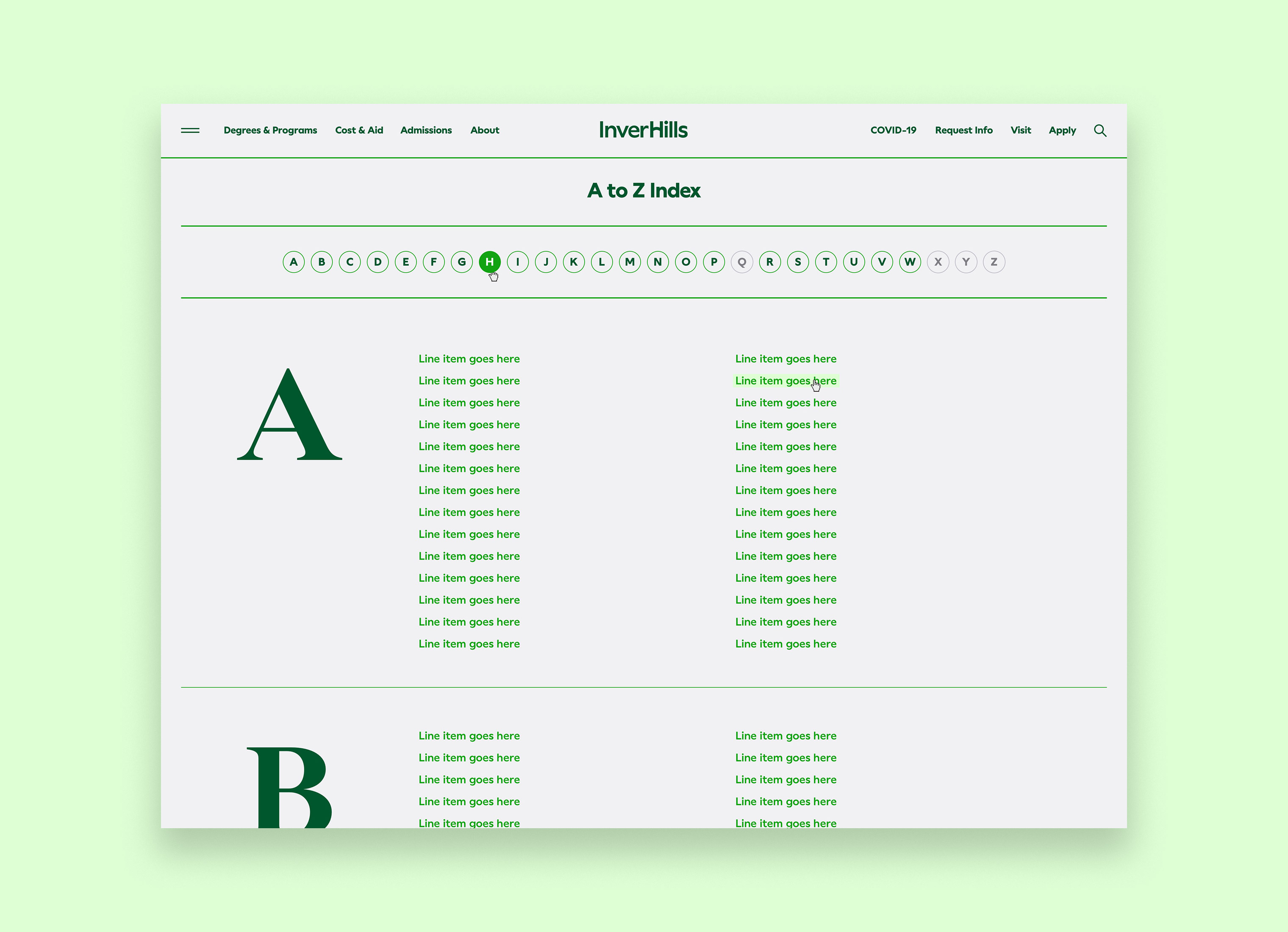
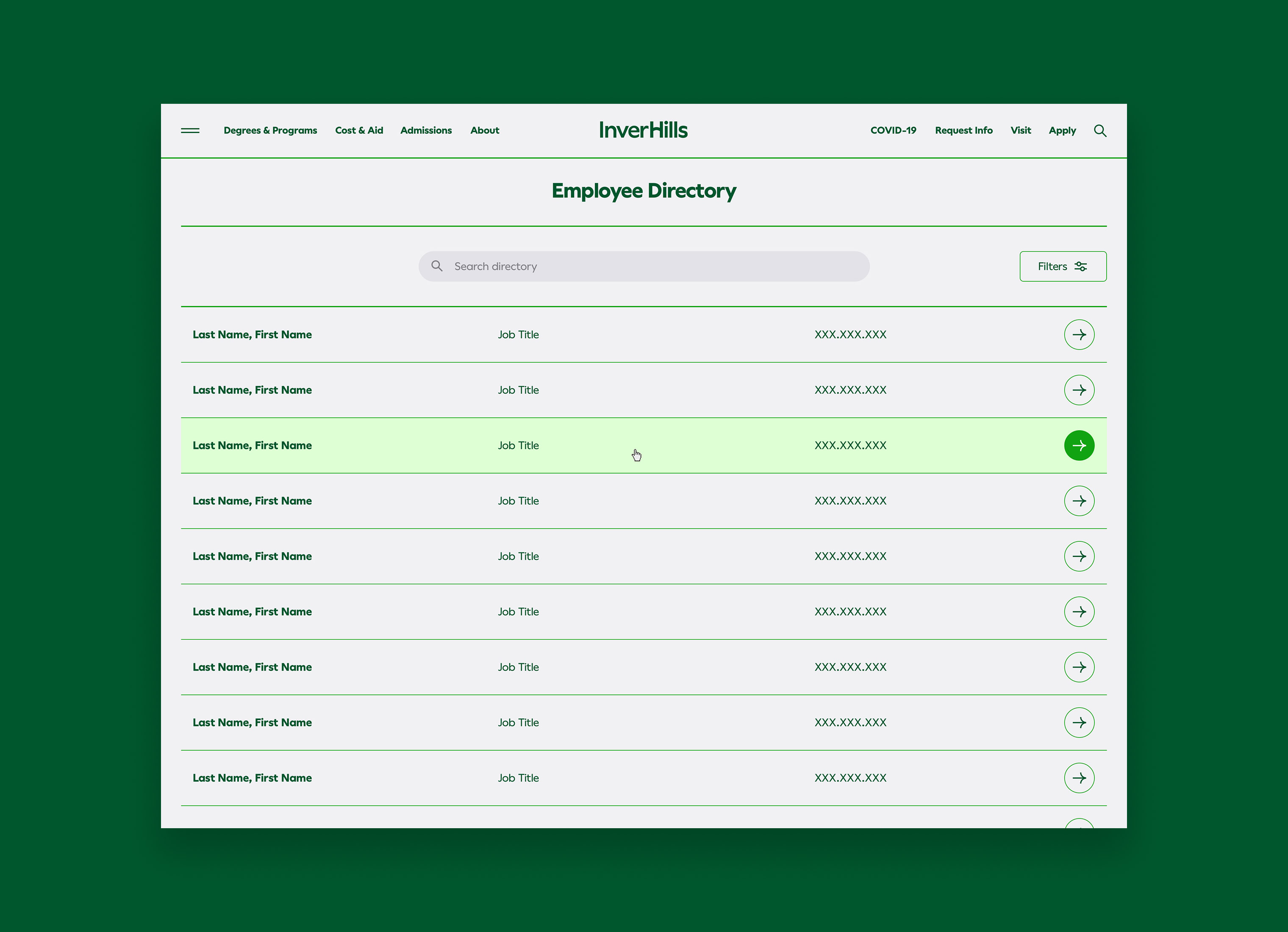
We designed the website with a series of templates and each template has a library of components and modules. Components are used for layouts and need to be populated by content in the CMS. Modules are global entries in the CMS and changes cascade throughout the site. In addition to creating the component library, we also designed and built the front-end for several utilities. This included a program finder, calendar, employee directory, glossary, and search.
BRAND PLATFORM
We also created a brand platform and tagline for Inver Hills – Where all students belong. This message to current and future students is to make them feel welcome in a sometimes intimidating space of higher education. Some prospective students are unsure if college is right or worth it for them. Some worry if they will fit in attending classes with others. This message is especially meaningful for the non-traditional students who make up much of their target audience and current students.
Skills
- Brand Strategy
- Discovery & Research
- Visual Identity System
- Brand Guidelines
- Campaign Development
- Brand Rollout
- UI/UX Website Design
- Front-end Website Development
Details
Team
- Garrick Willhite
- Bryn Bundlie
- Brenna Ruiz
- Josh Vadnais
- Michael Schwengel
Client
- Inver Hills Community College
Project
- Visual Identity System and Website Redesign
Year
- 2022