Misfit
is an offbeat coffee company that utilizes only the finest brewing methods. We designed the identity, brand & packaging.
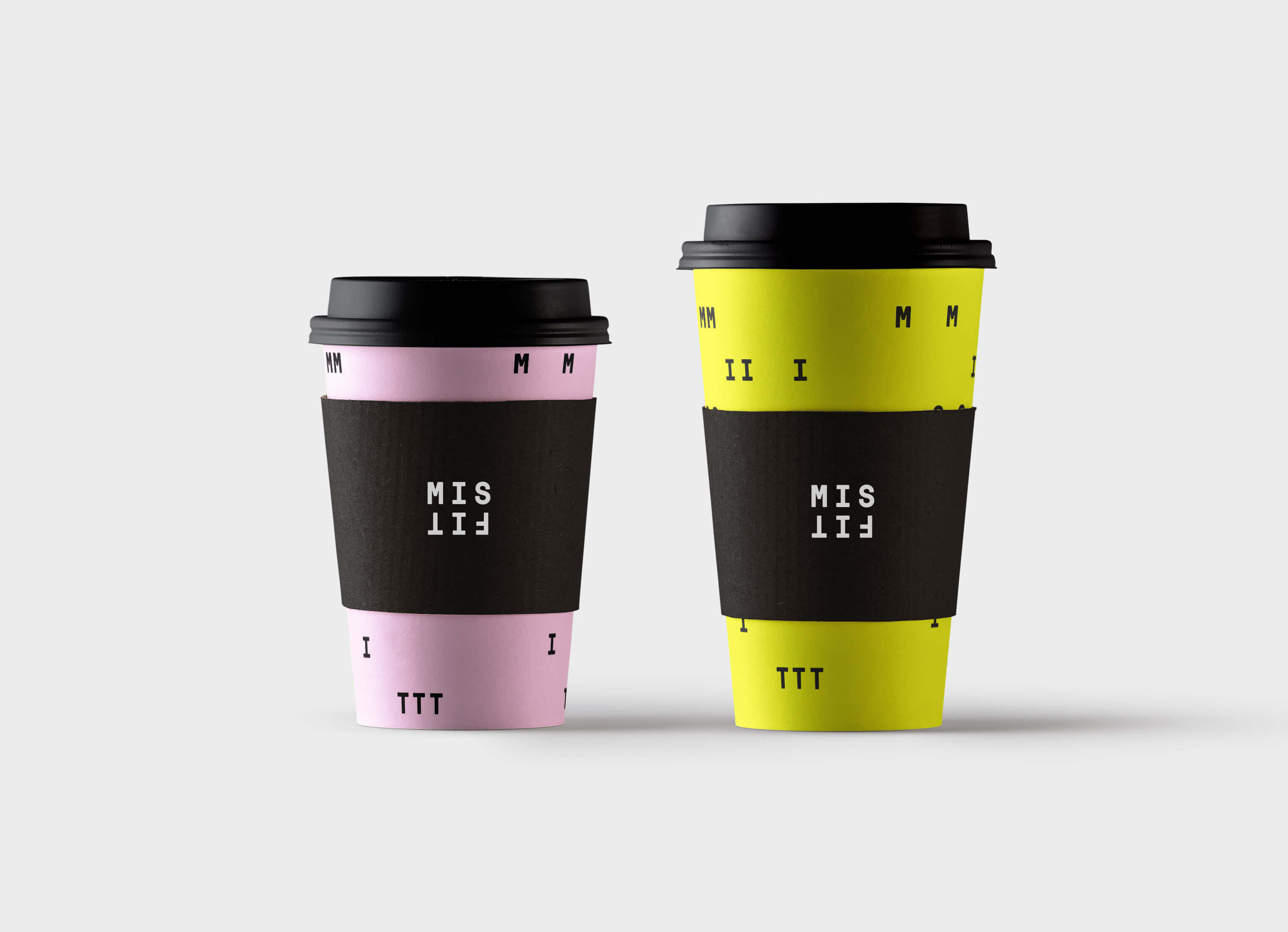
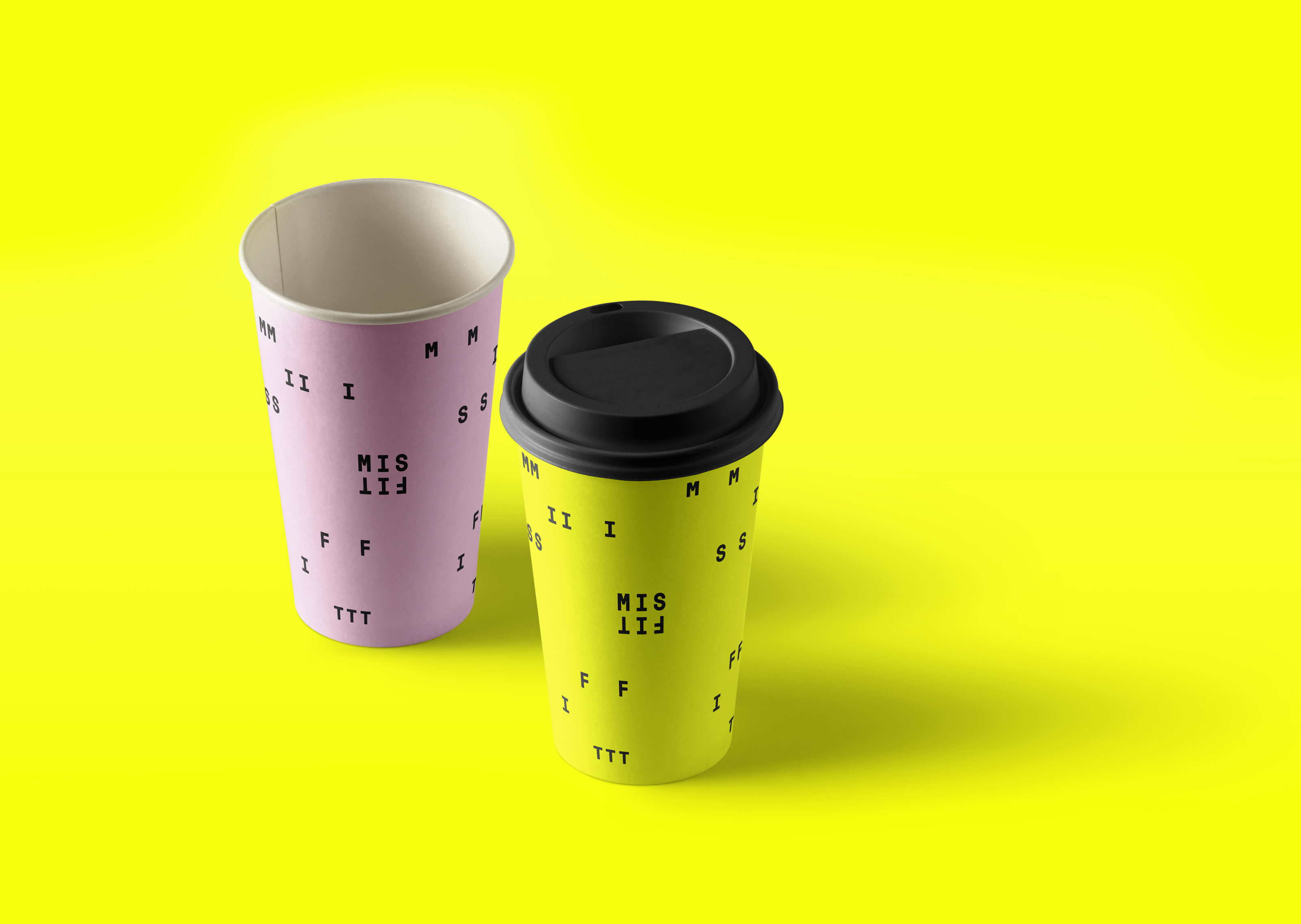
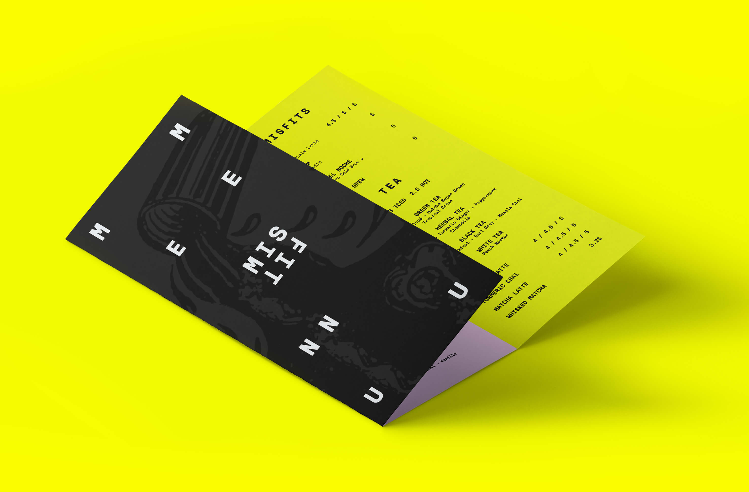
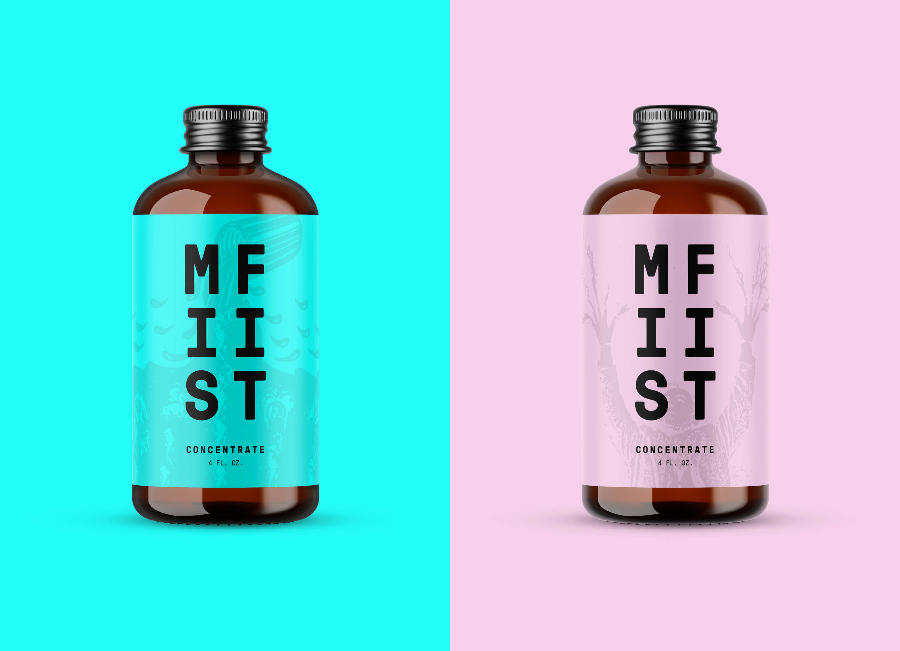
THE IDENTITY
The identity was designed to have the same crazy and offbeat vibe as MISFIT, a Minneapolis/St. Paul coffee company. The flipped and reversed "FIT" is a visual metaphor showing how MISFIT strives to do things differently. Another play on the word "FIT", we designed the identity to change and adapt for specific applications.
Fig 2.0
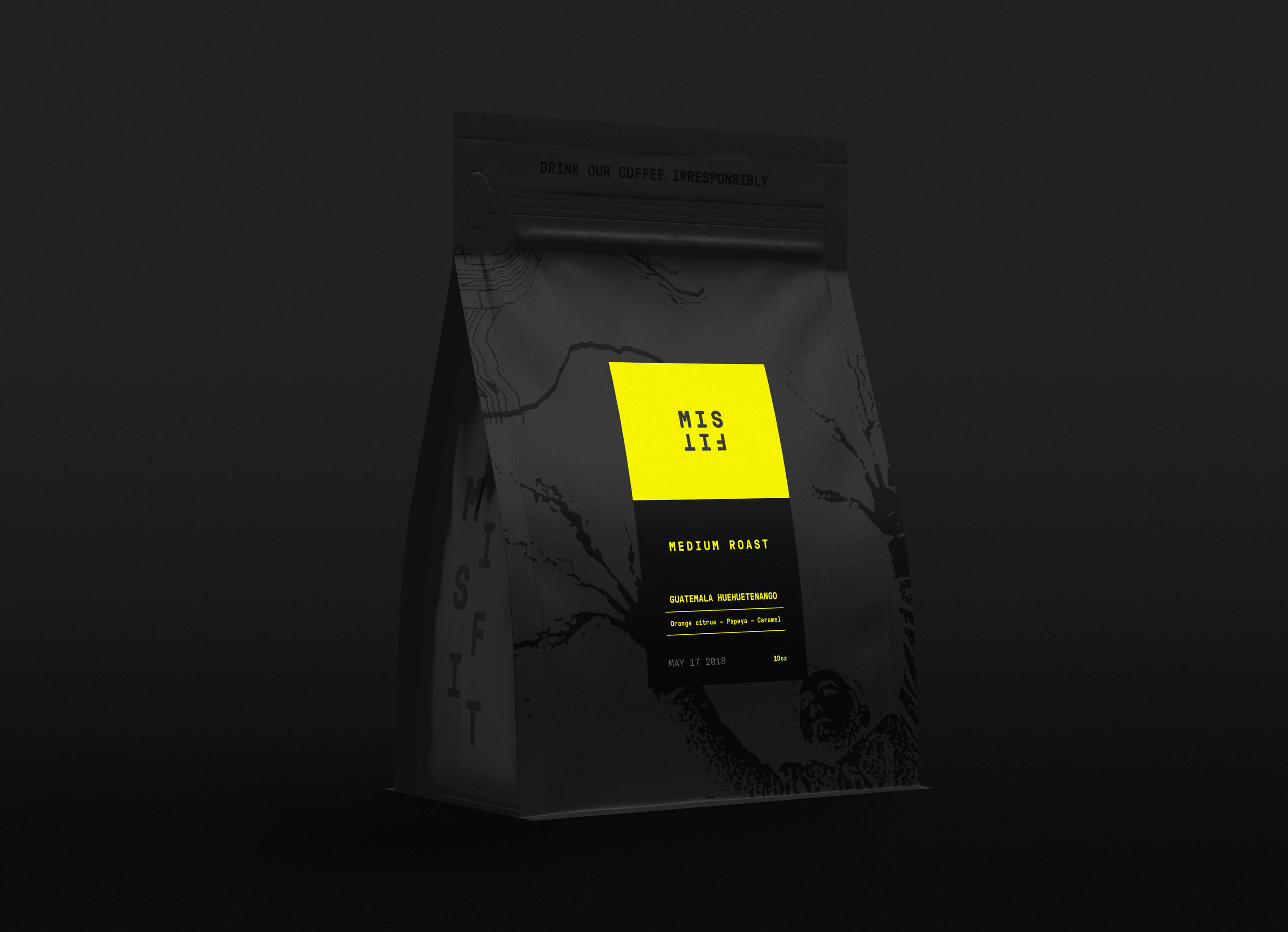
ILLUSTRATIONS
In creating the visual design system, we made several illustrations and patterns. MISFIT didn't want to visually feel too posh & clean like other premium coffee shops. The illustrations (by local artist/designer Ian Babineau) give some grit and texture to the design language.
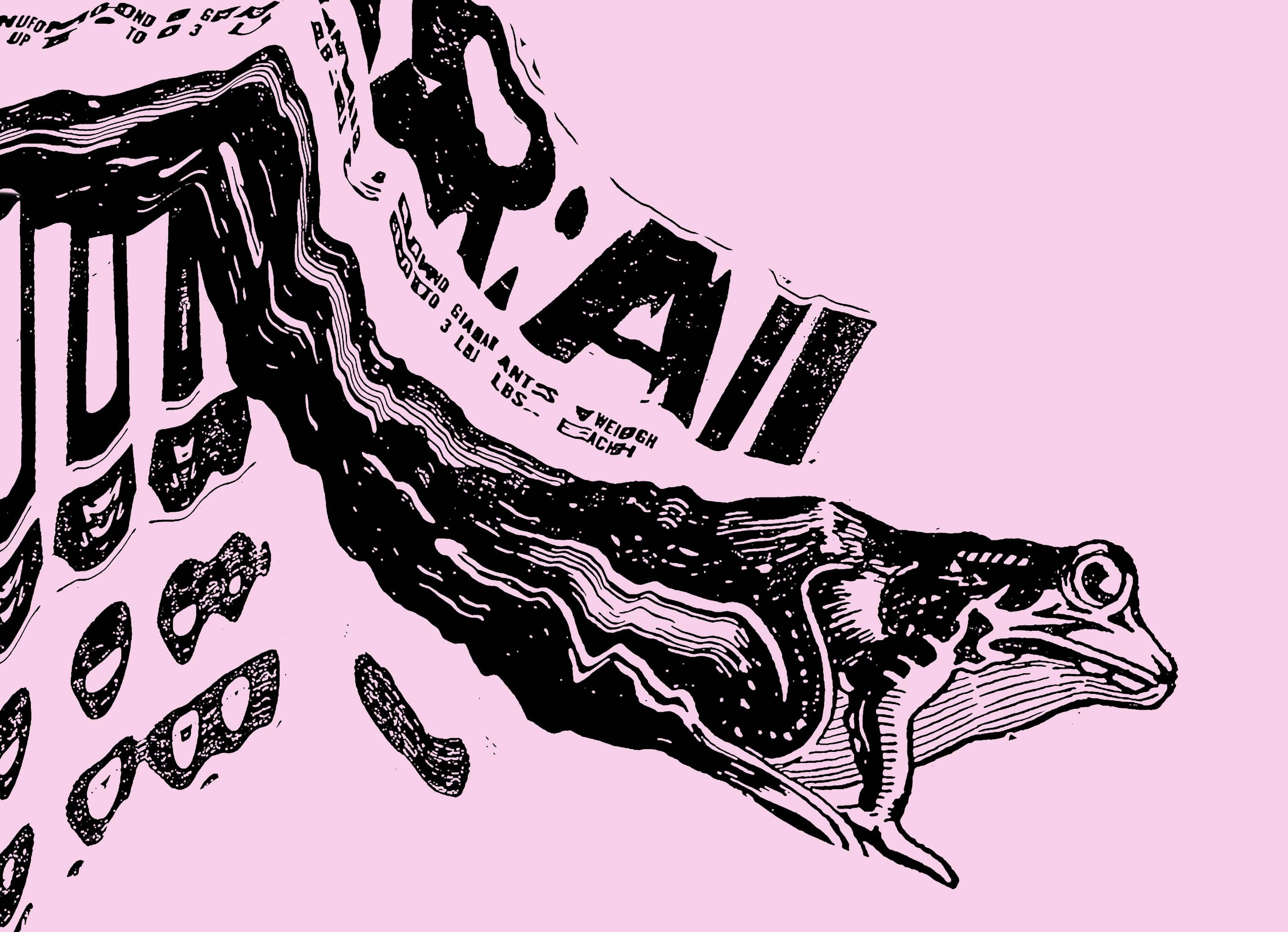

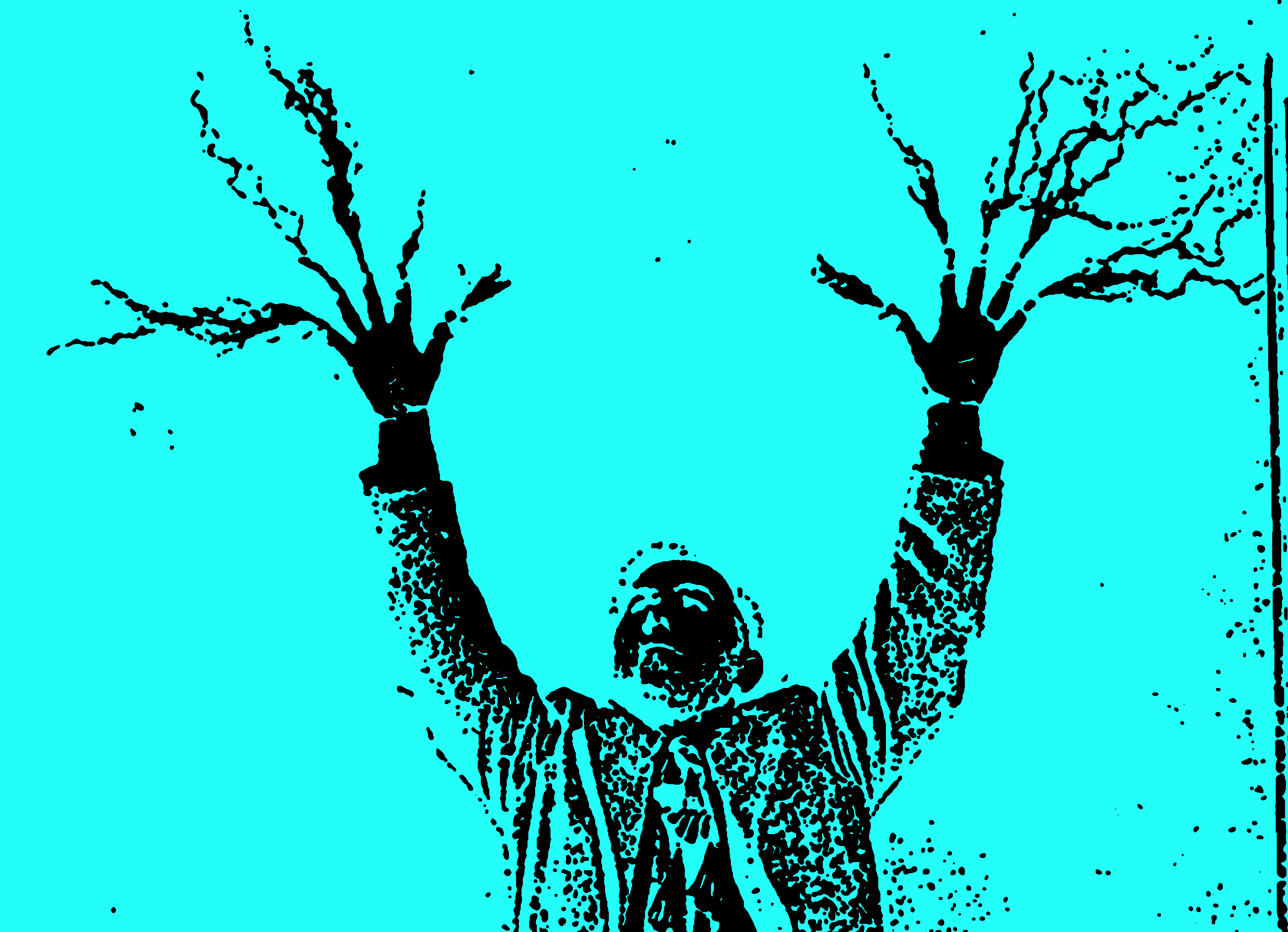
Fig 4.0
Skills
- Brand Strategy
- Identity Design
- Visual Design System
- Package Design
- Environment Design
- Illustrations
- Latte Art
- Excessive Coffee Drinking
Details
Team
- Garrick Willhite
- Eric Drommerhausen
- Ian Babineau
- Rob Prochnow (Video Editor)
Client
- Misfit
Project
- Identity, Brand, Packaging
Featured
- AdFed Show Gold
Year
- 2019