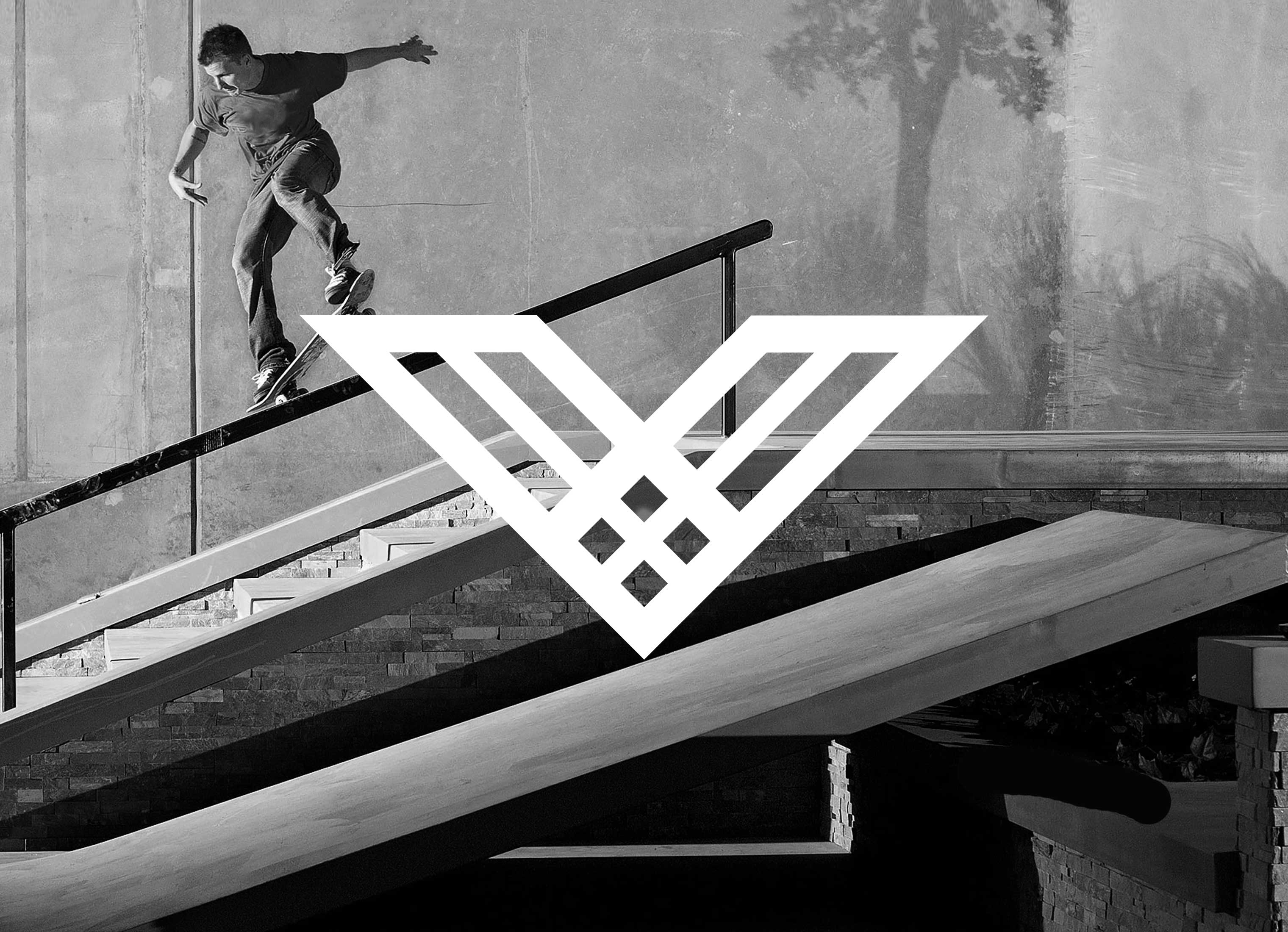
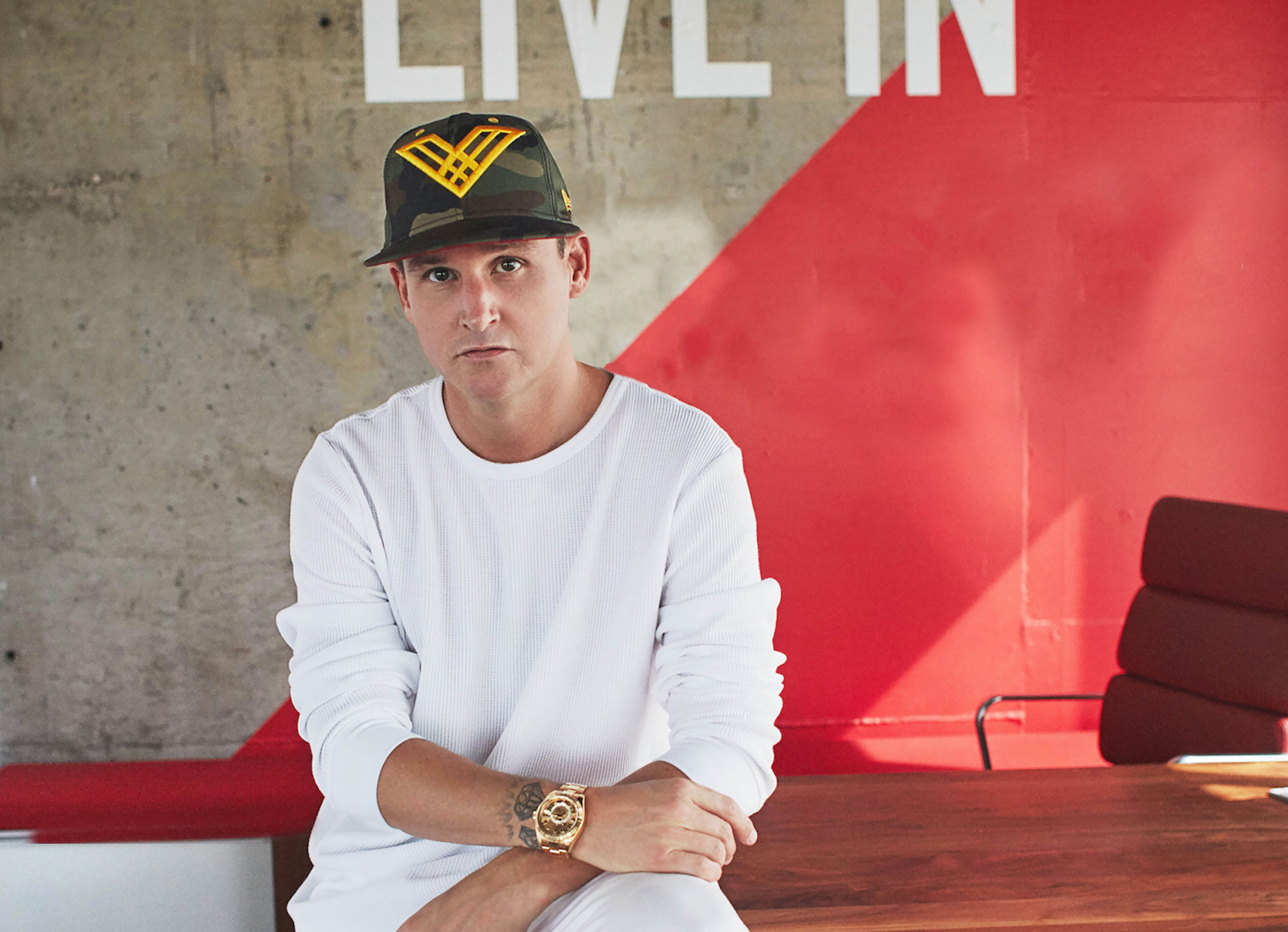
Rob Dyrdek
is an ex-pro skater, entrepreneur and pop-culture celebrity. We designed his personal brand and his additional sub-brands.
ASSIGNMENT
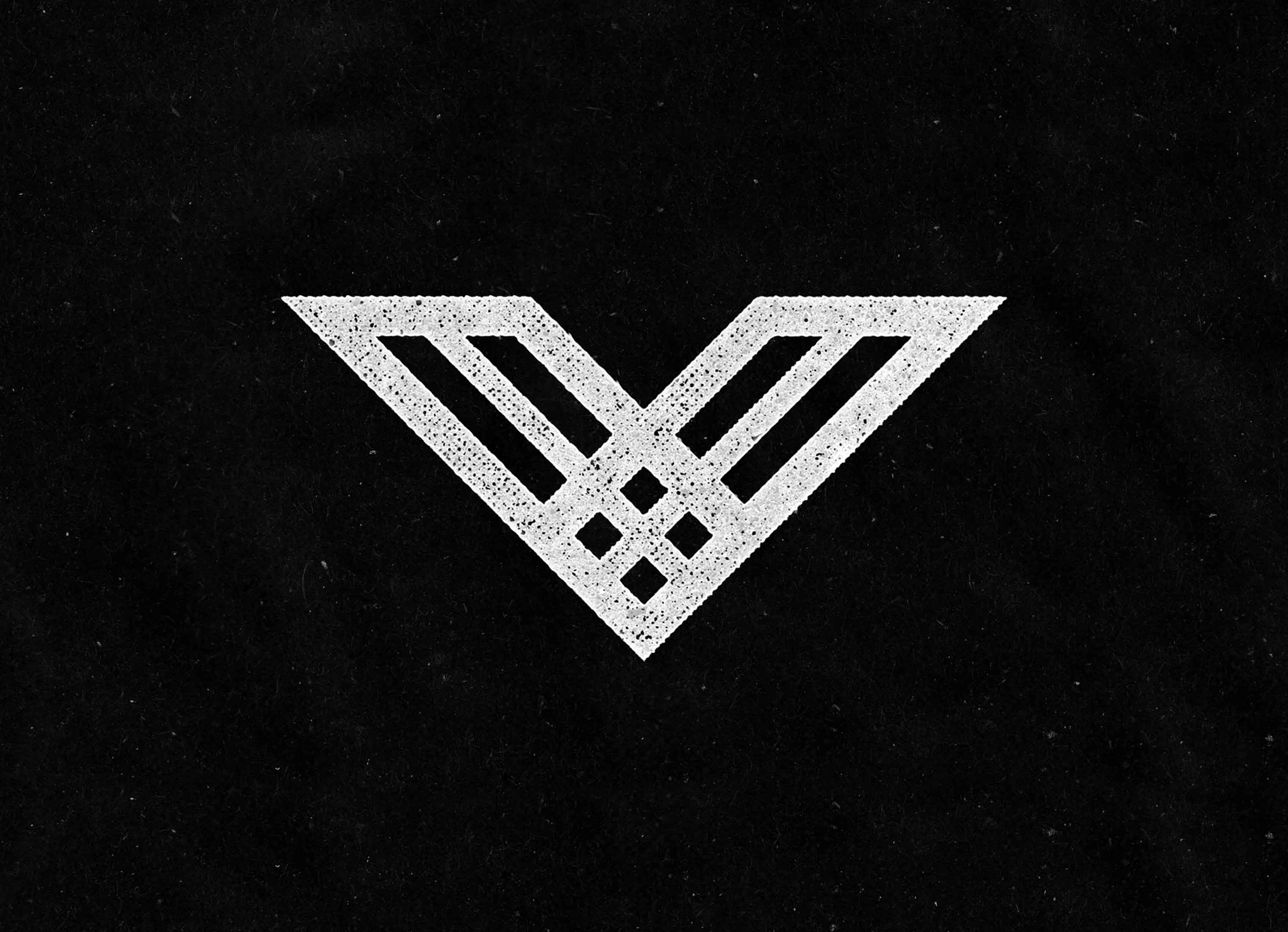
While looking for inspiration for a brand redesign, Rob Dyrdek's team across our Football As Football project. Rob liked the crests and was looking to create a crest for his own brand. Rob's team reached out to us to create a crest with elements based on his core strategy of passion & progress. We made a "V" logo representing his core strategy and used the "V" mark in the crests for his sub-brands. With the many requests we've received, if you're looking for apparel with the "V" logo, visit the Dyrdek Machine Store.
DYRDEK SUB-BRANDS
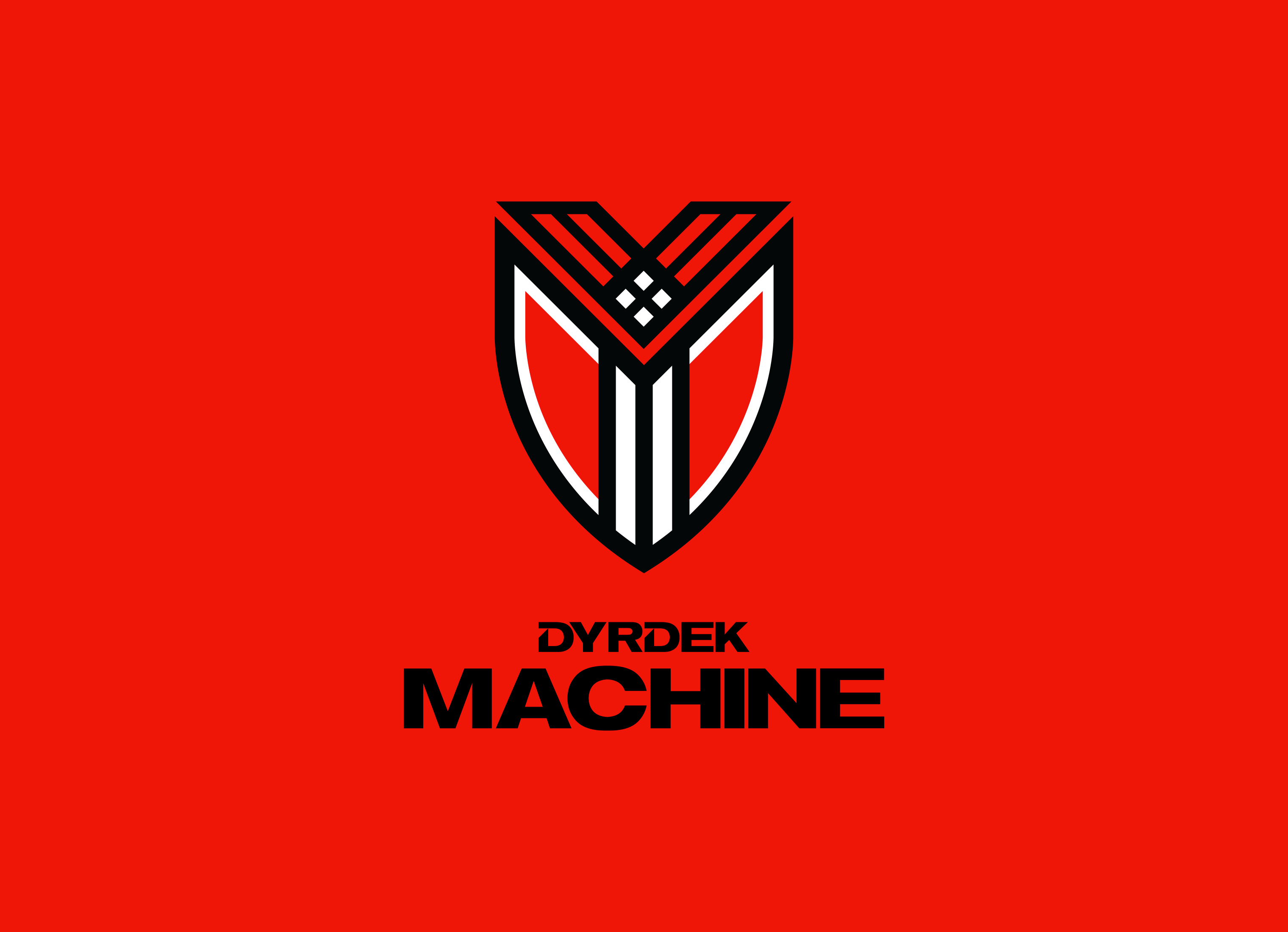
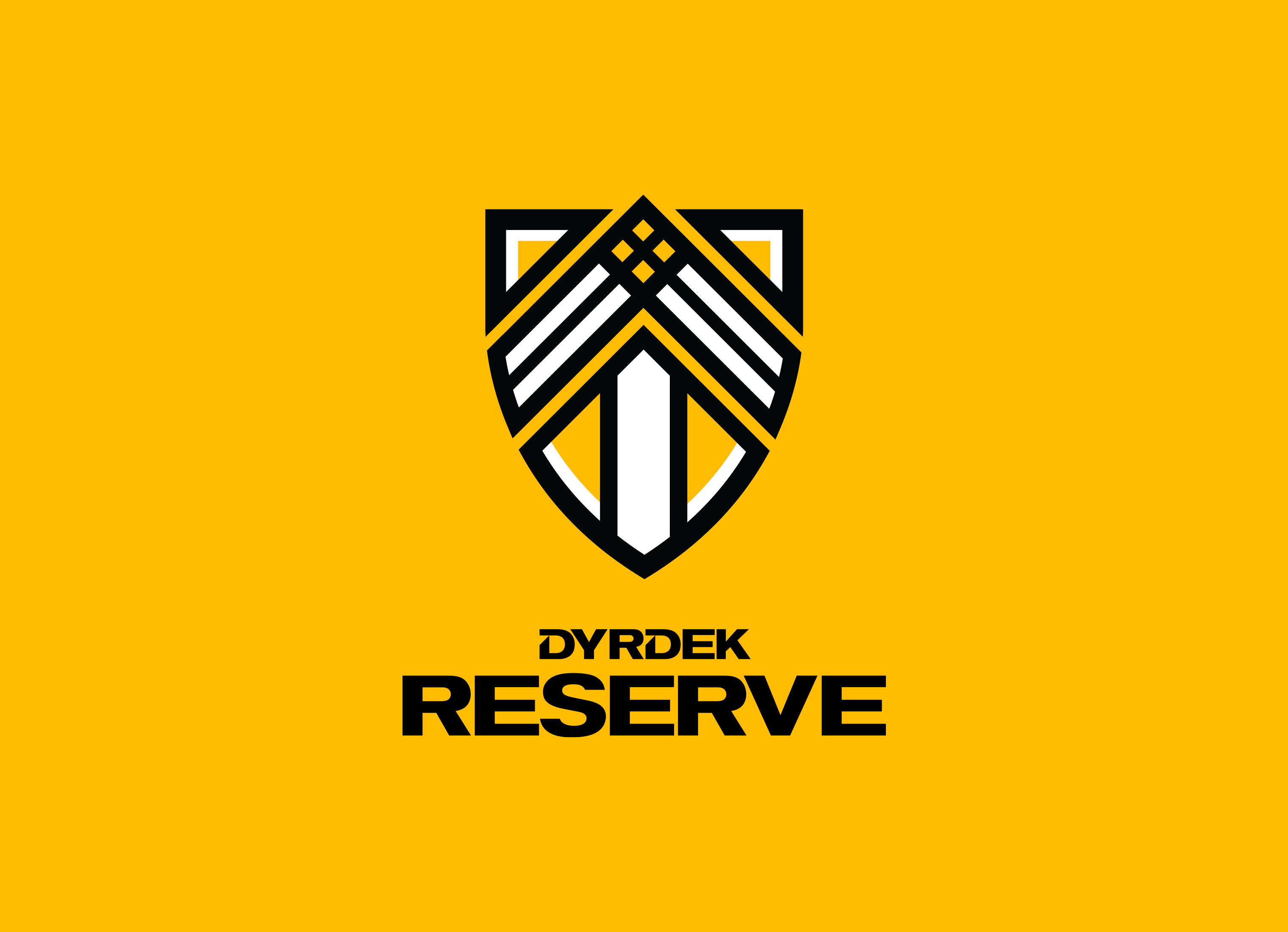
Dyrdek Machine is a venture studio that invests in product ideas and helps bring those ideas to reality. The crest incorporates Rob's symbol within its design. Red is used as the primary brand color. Dyrdek Reserve is Rob's charitable organization...we think? We're not quite sure what the Reserve is, but hey this one is yellow and different looking.
Skills
- Brand Strategy
- Identity Design
- Visual Design System
- Brand Guidelines
- Iconography
- Kick Flipping
- Gigantic Skatedeckboarding
- McTwisting
Details
Team
- Garrick Willhite
- Alec Lindsey
- Bill Gunter
- Eric Drommerhausen
- Nikki Meyers
Client
- Rob Dyrdek
Project
- Brand Identity, Brand Guidelines
Year
- 2016