tech.mn
serves Minnesota's technology industry with resources, news, podcasts and more. We designed their visual identity system.

ASSIGNMENT
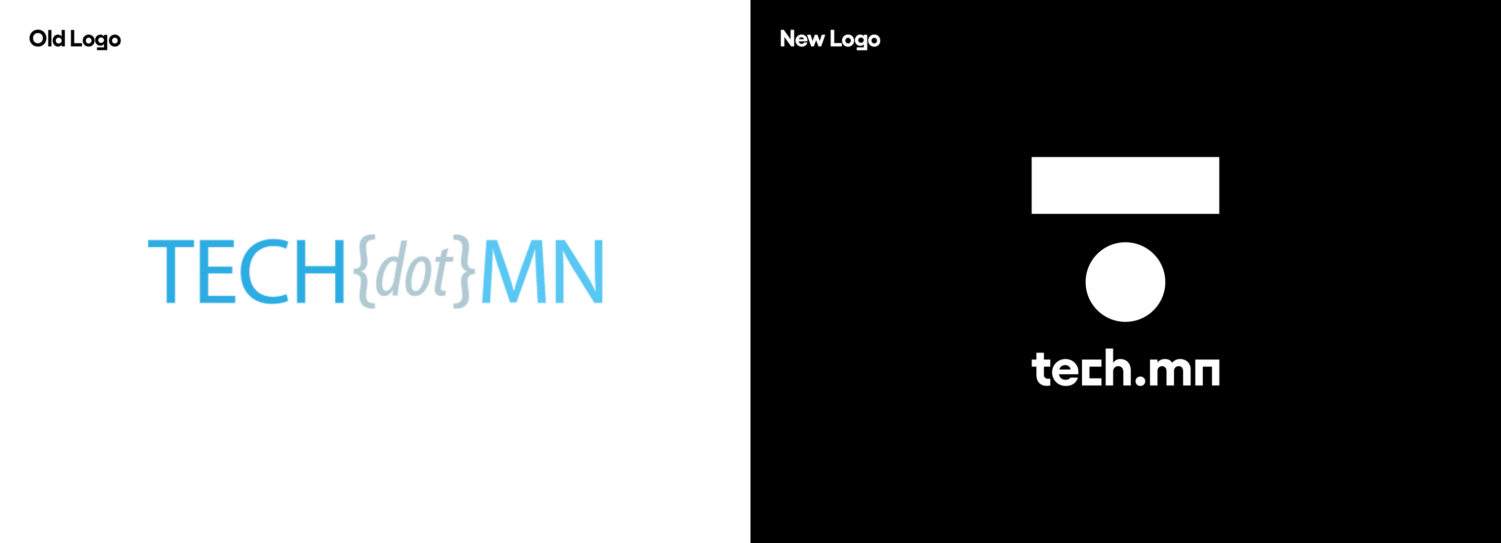
tech.mn's purpose is to help bring Minnesota's technology community together. With a change of leadership (and some past PR issues with the previous leadership), they were looking to reinvent their brand and expand to a broader community. The old brand was essentially just a wordmark (FIG. 2.0) and lacked personality. The goal was to create a new identity and visual system that signified change in the organization and infused creativity as one of its core values.
APPROACH
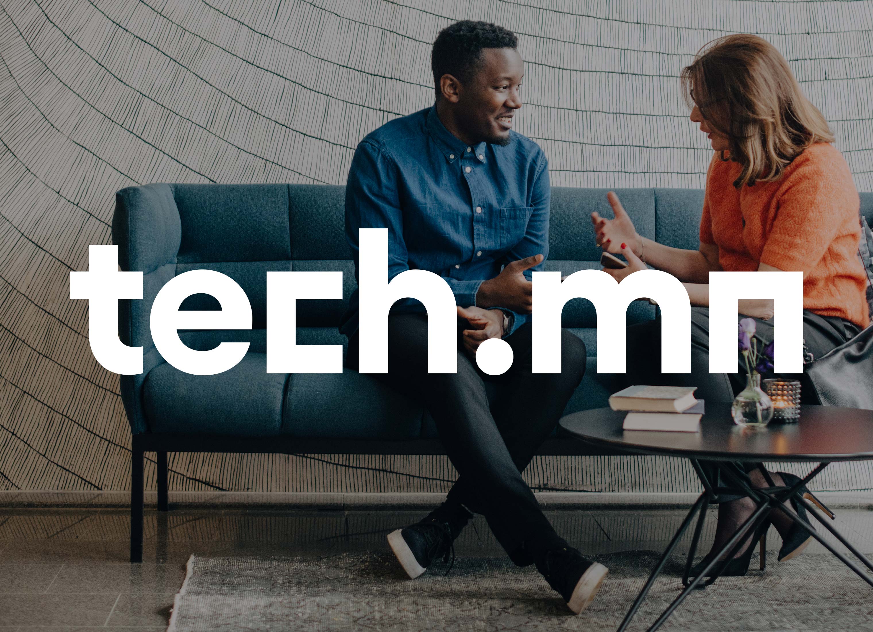
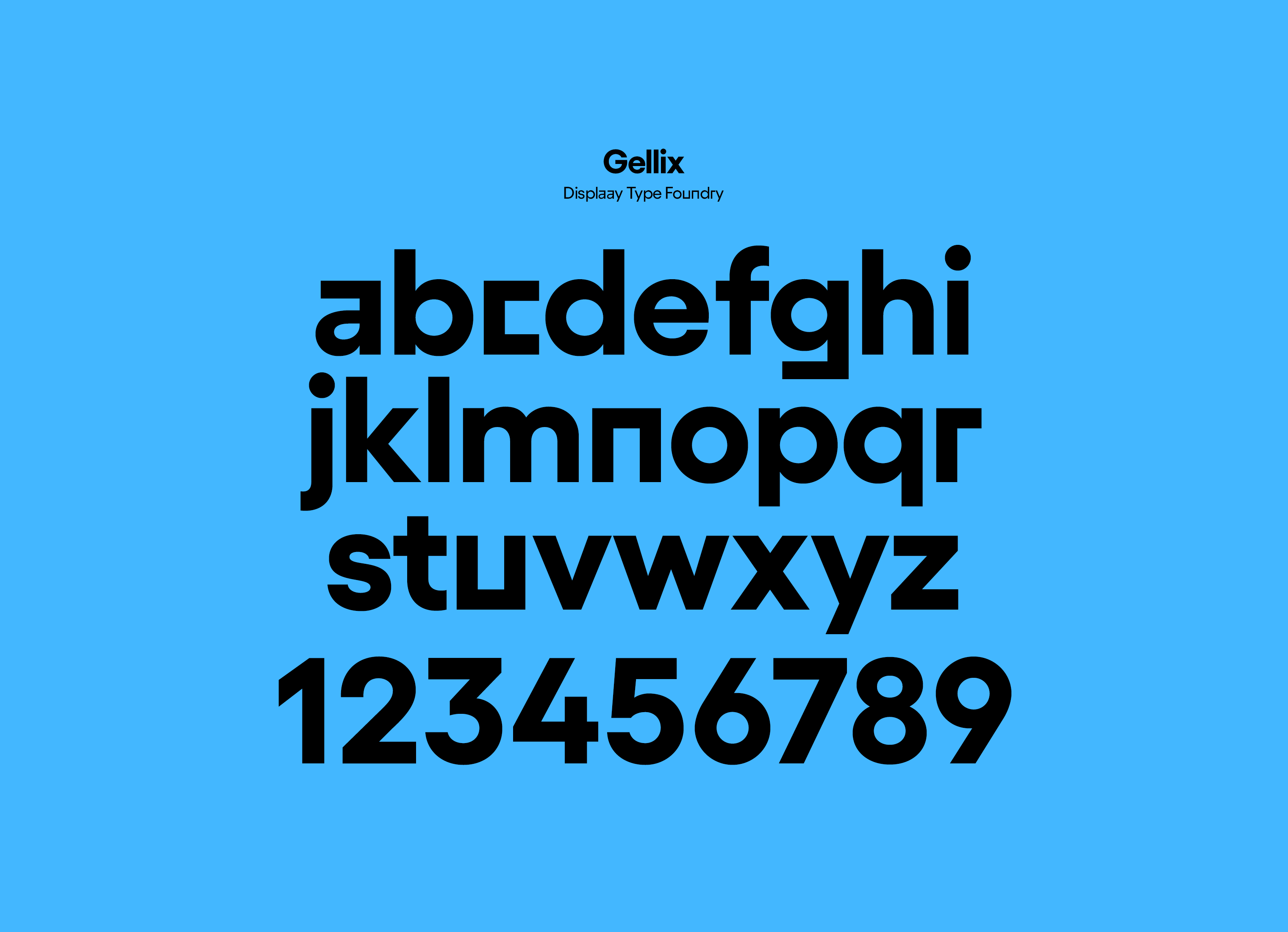
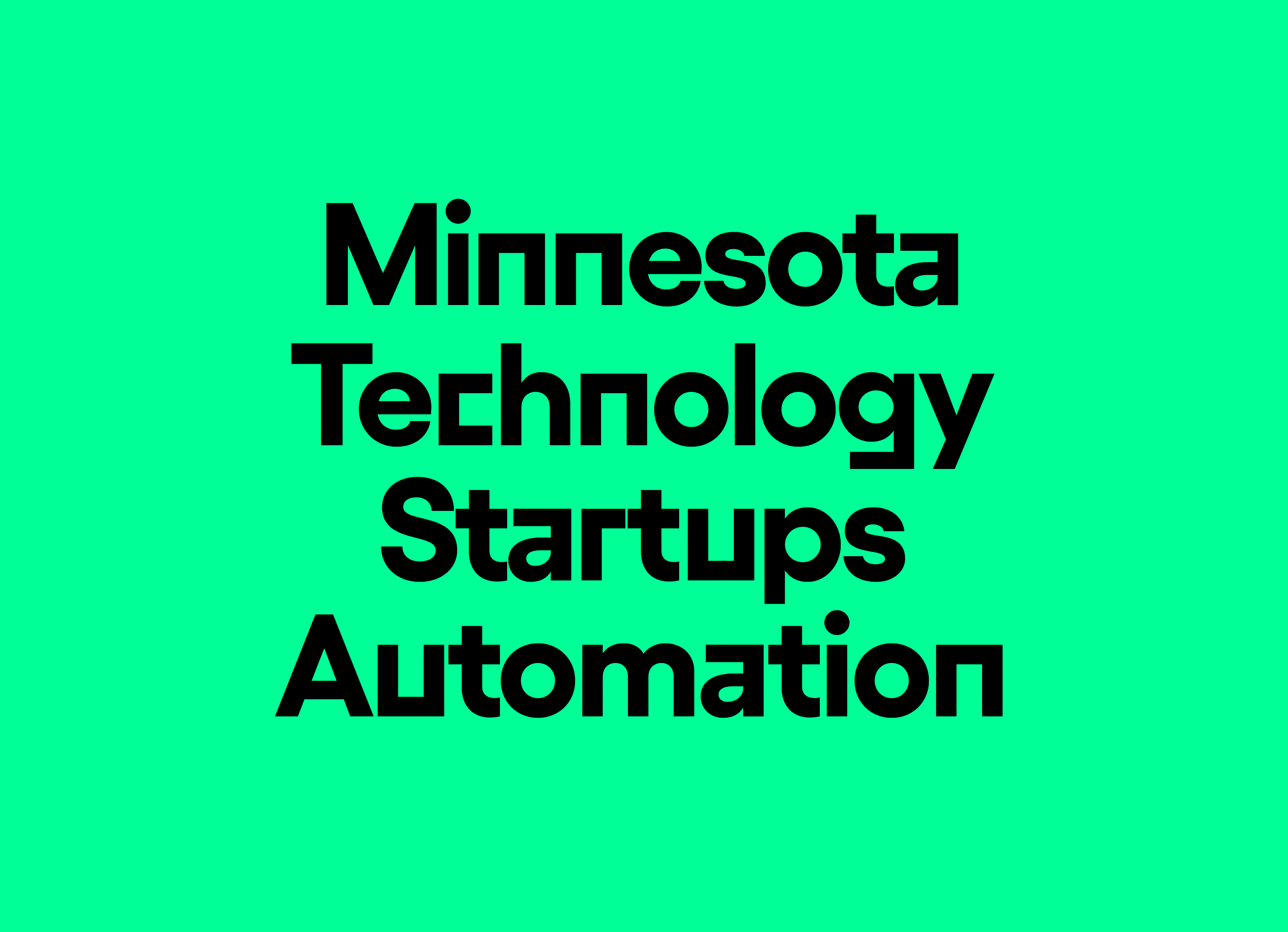
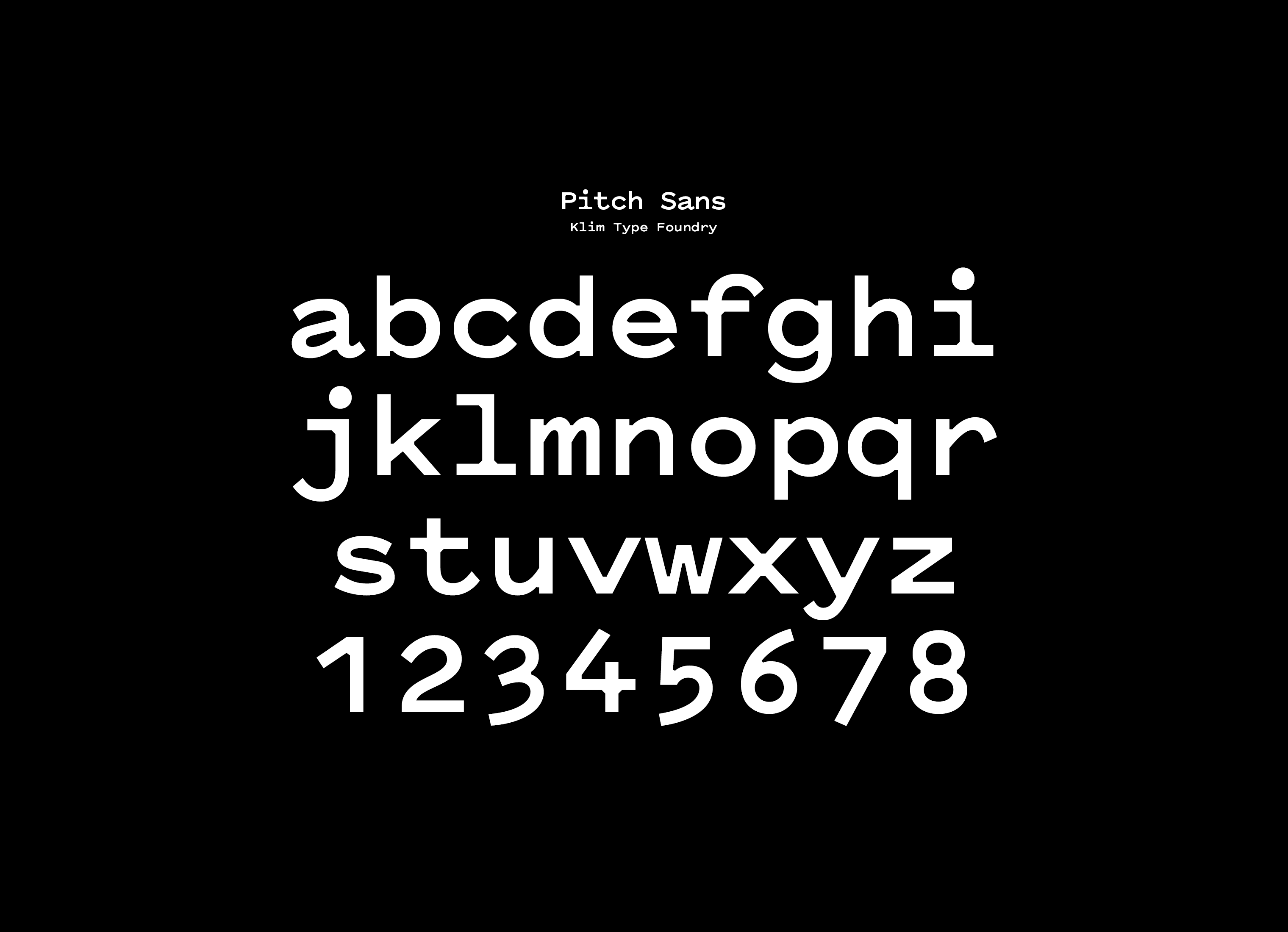
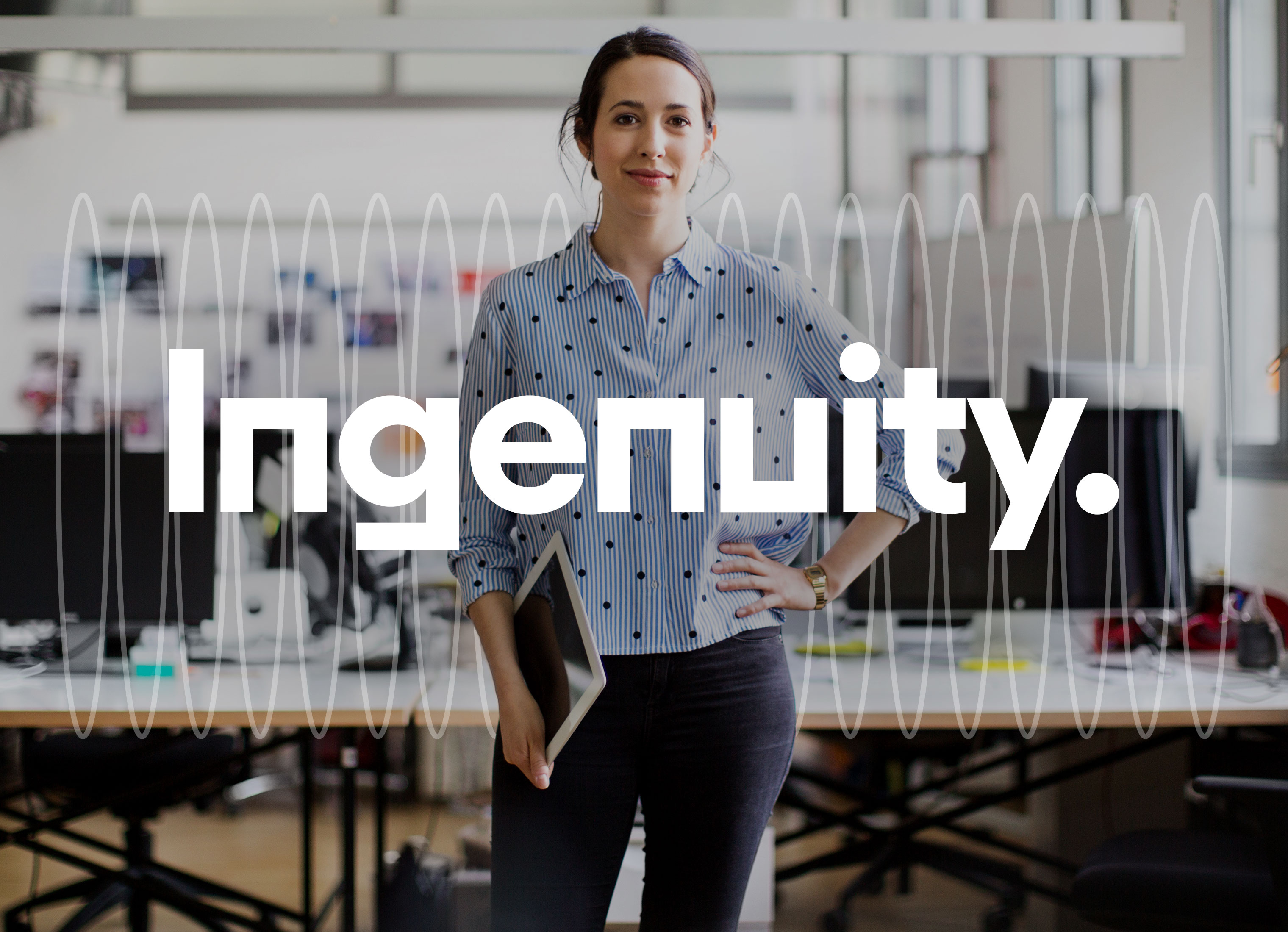
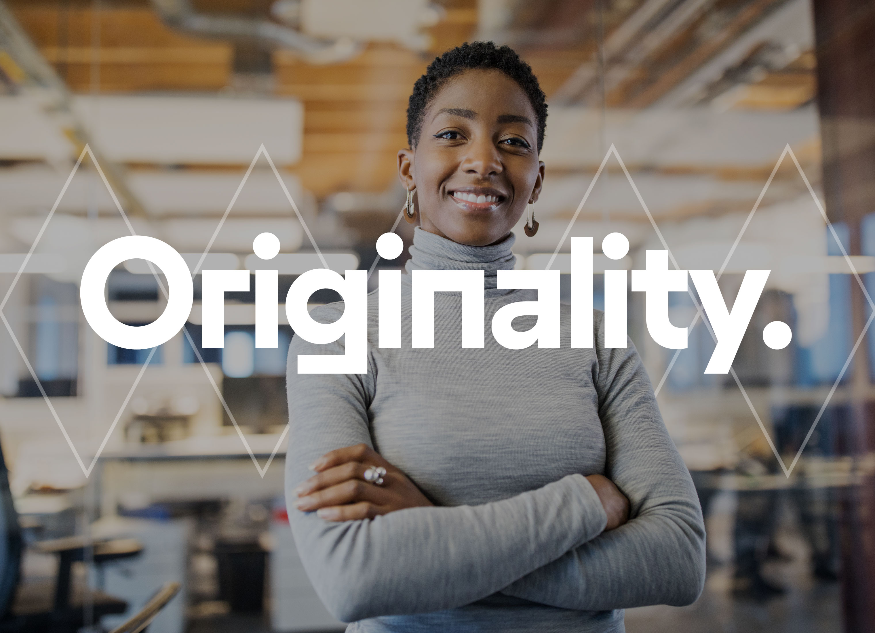
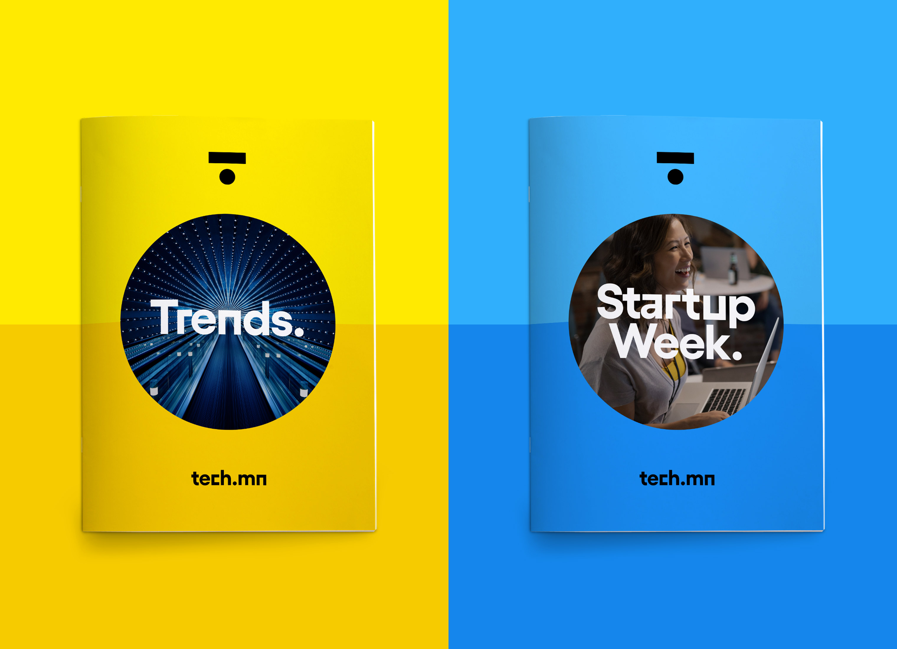
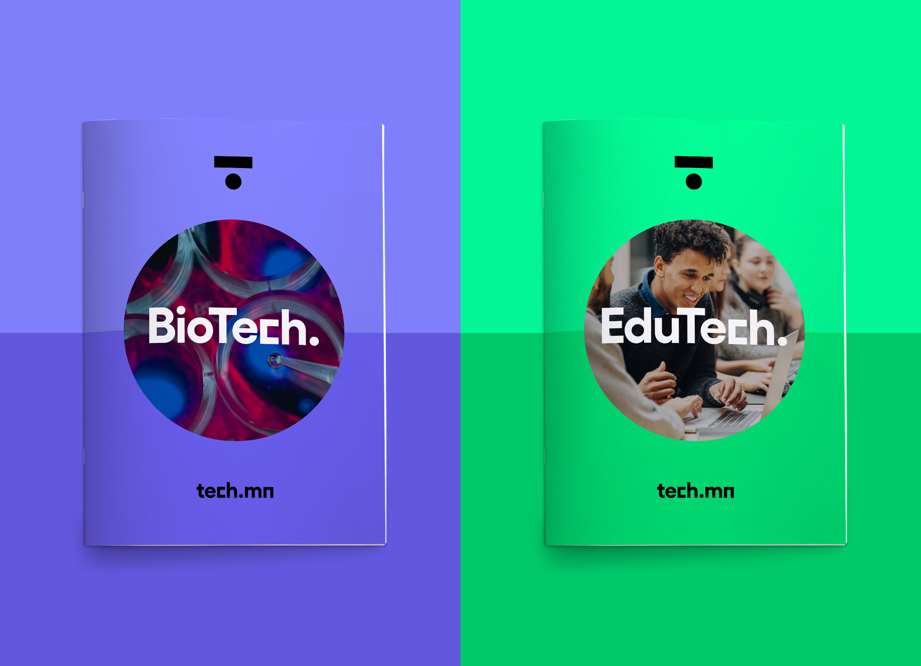
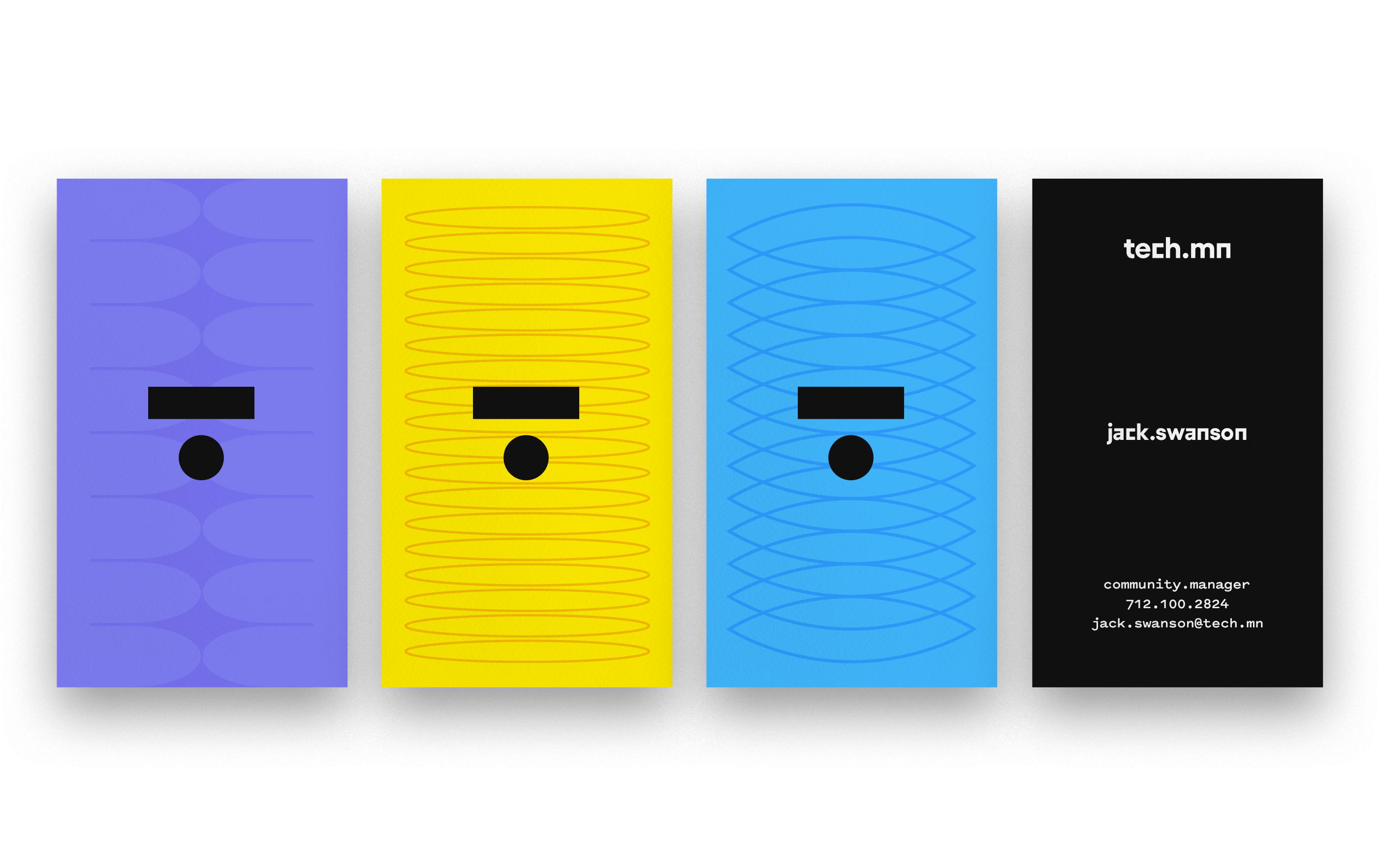
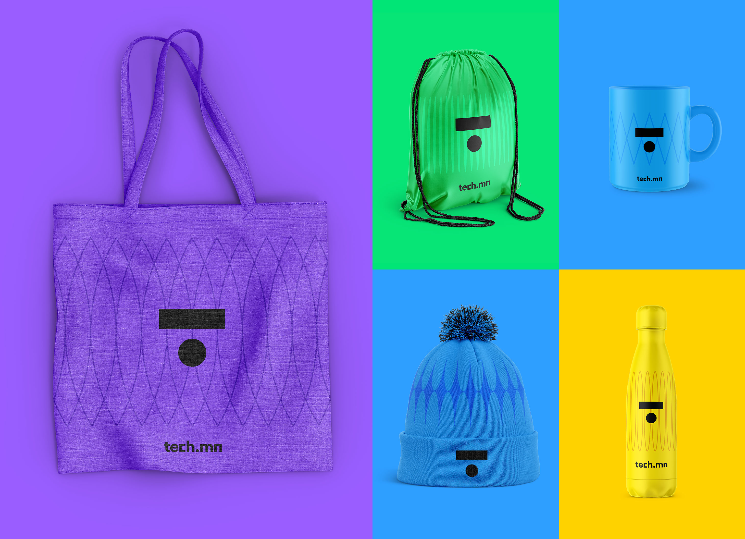
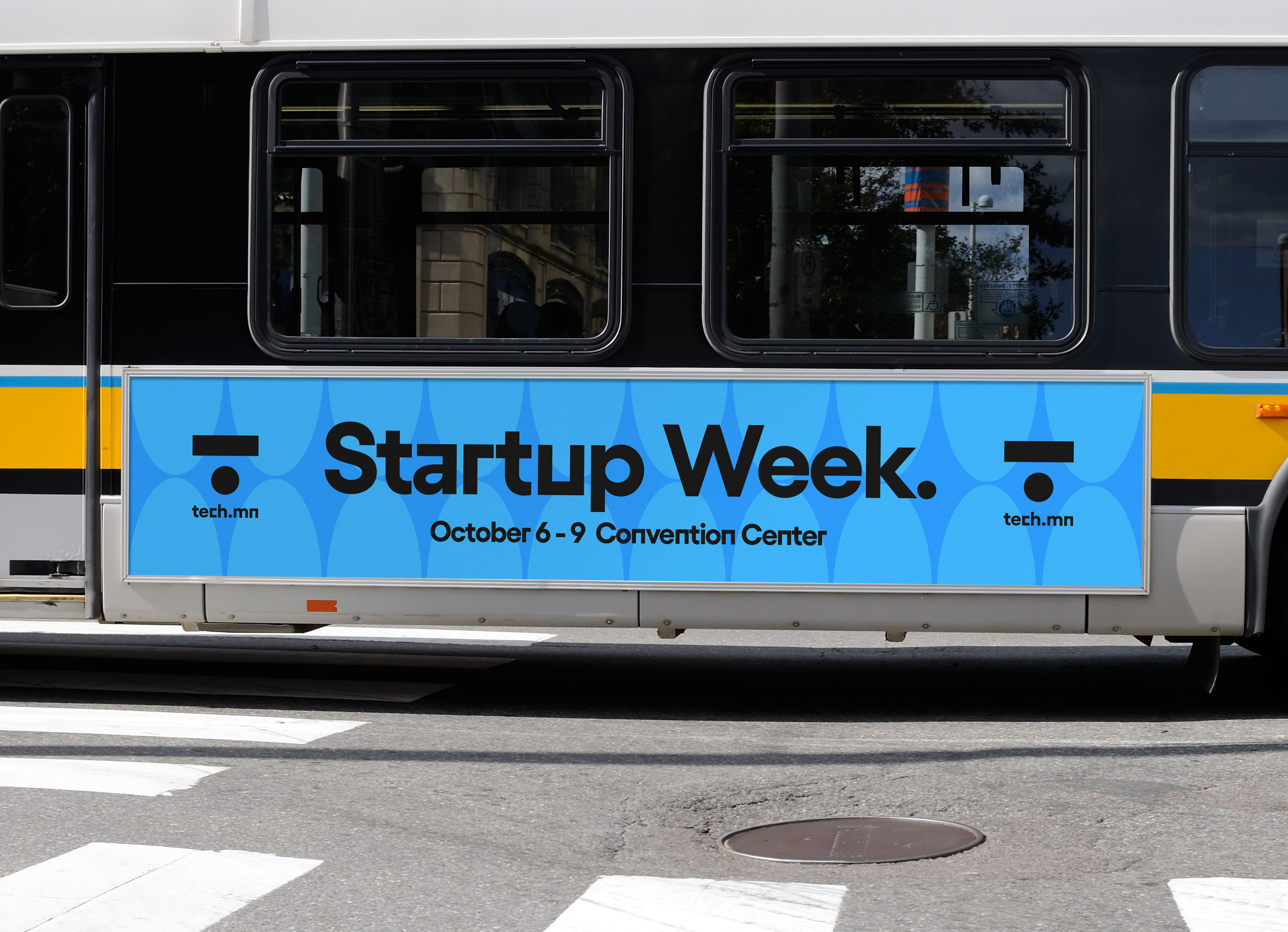
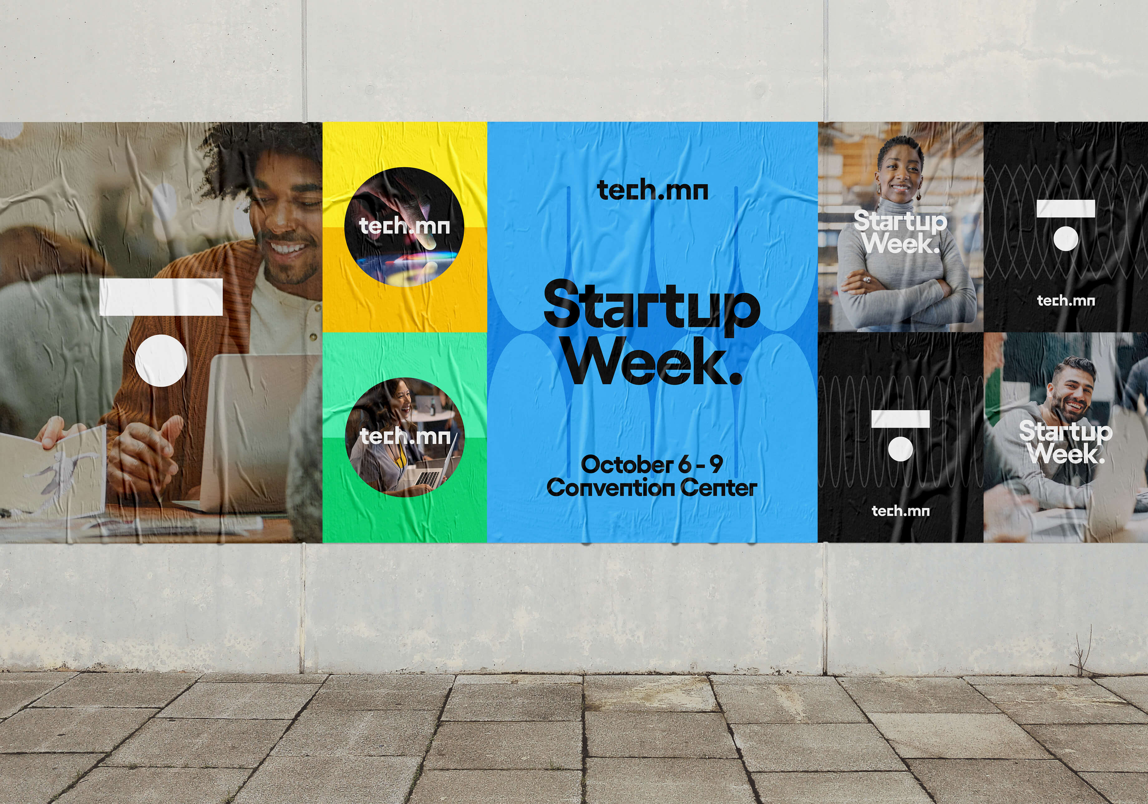
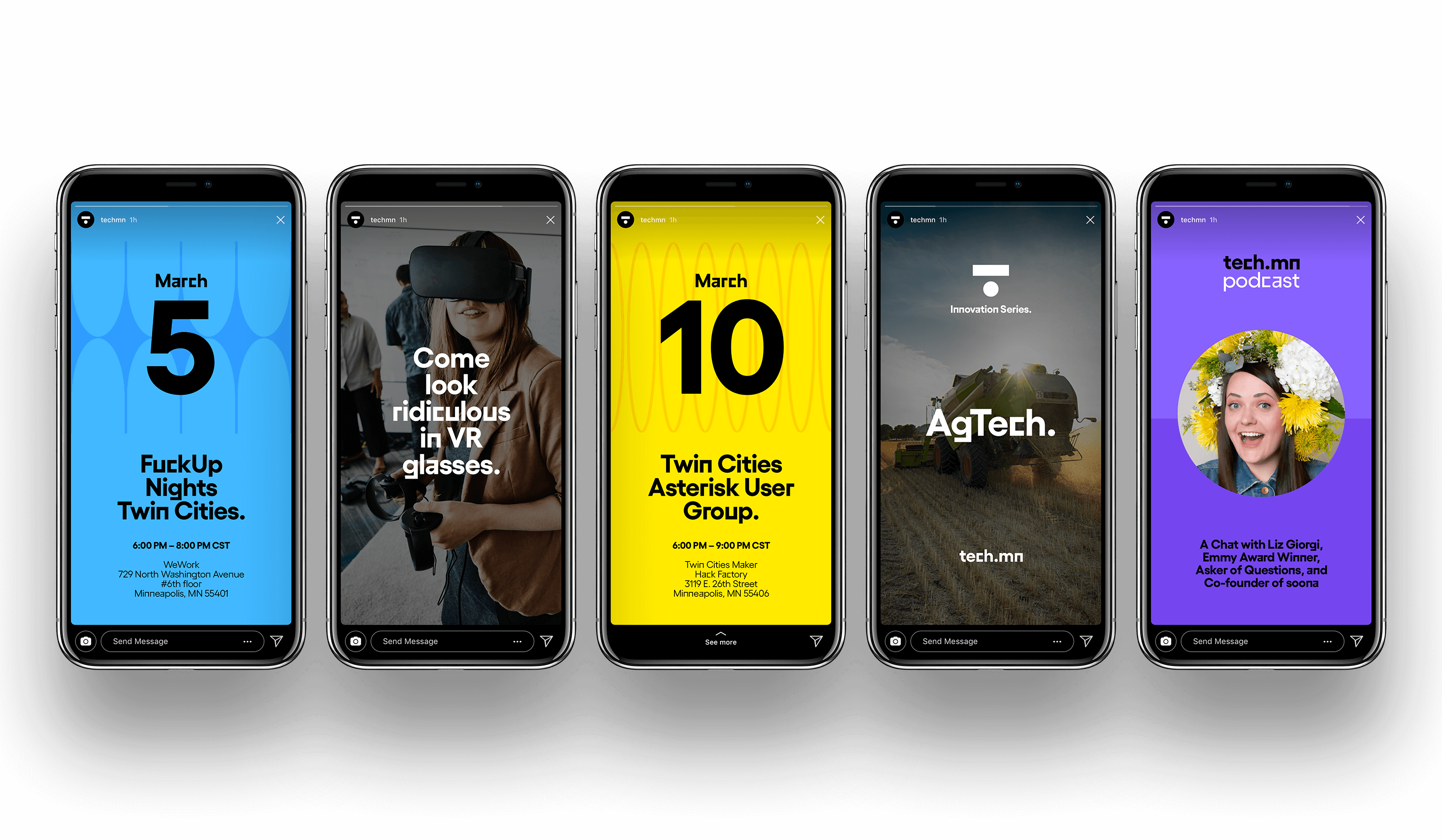
Technology is a result of human ingenuity. Technology is the product of creative output & ideas of individual's curiosity to problem solve or innovate. Our approach to the rebrand was to highlight the originality & creativity within the tech community. We visually express originality with bold, vibrant colors, and unique graphic patterns. The abstract "T" symbol comes from the "dot" URL name. Displaay Type Foundry's Gellix was chosen as the typeface because of its quirky alternate character set that speaks to individuality and has visual characteristics that mimic the "T" symbol. The designs together create something playful, personable and expressive that better aligns with who tech.mn is as an organization.


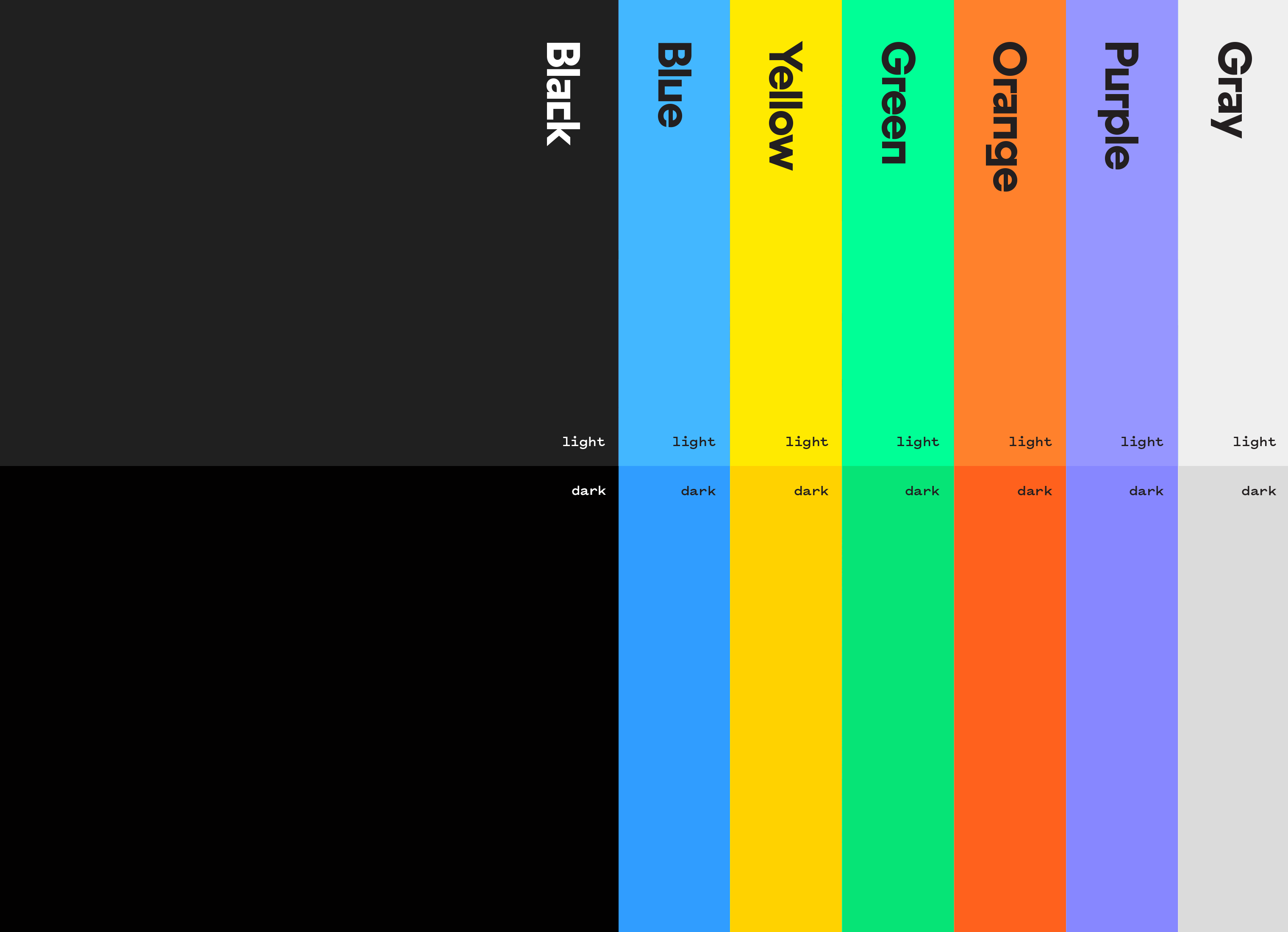
COLOR PALETTE
The color palette is meant to add vibrancy and energy. All colors were selected to be WCAG AA accessibility compliant for use with the website. The color hues are paired with light and dark values for application use. Patterns on color use this pairing system with black type or logo treatment to not obstruct visibility.
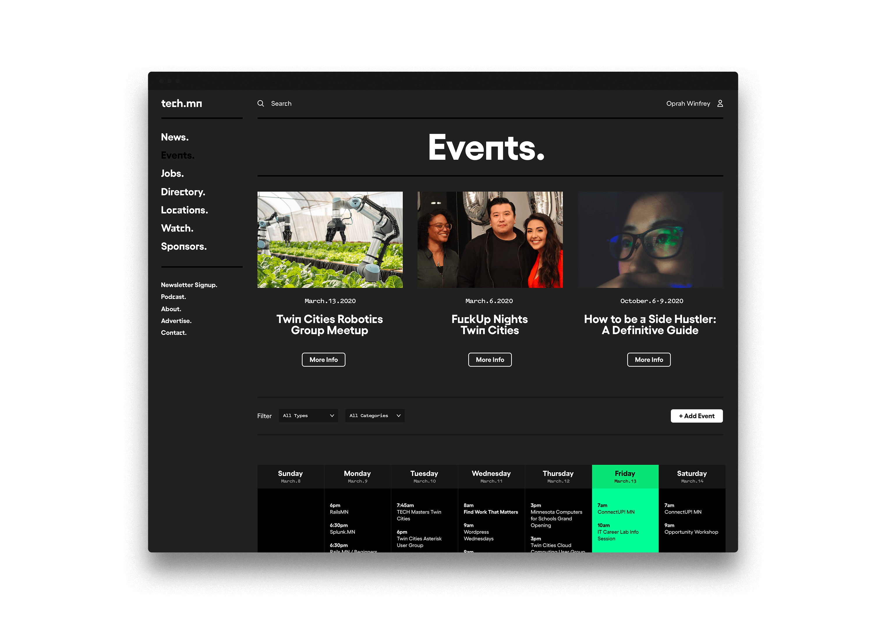
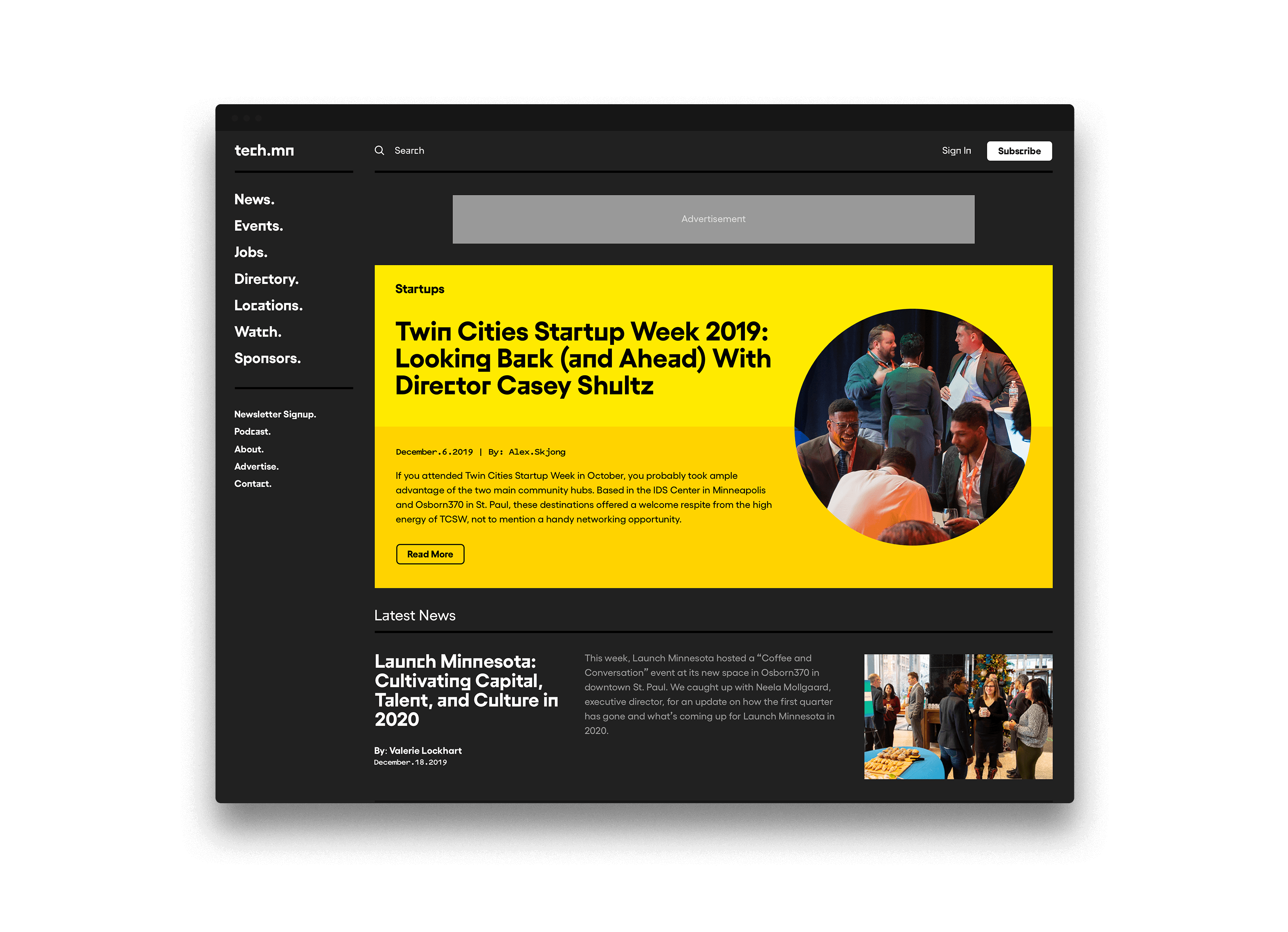
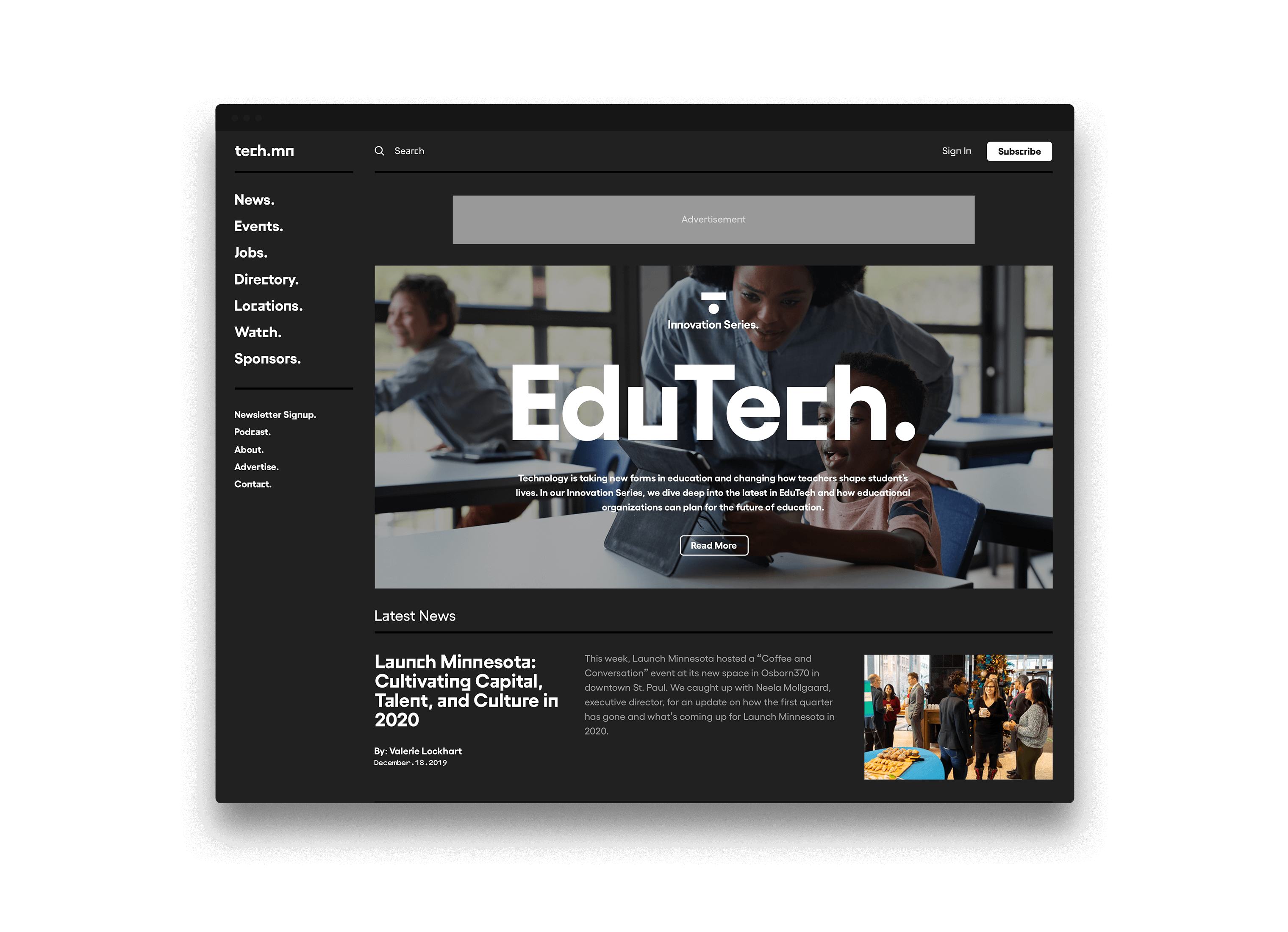
WEBSITE
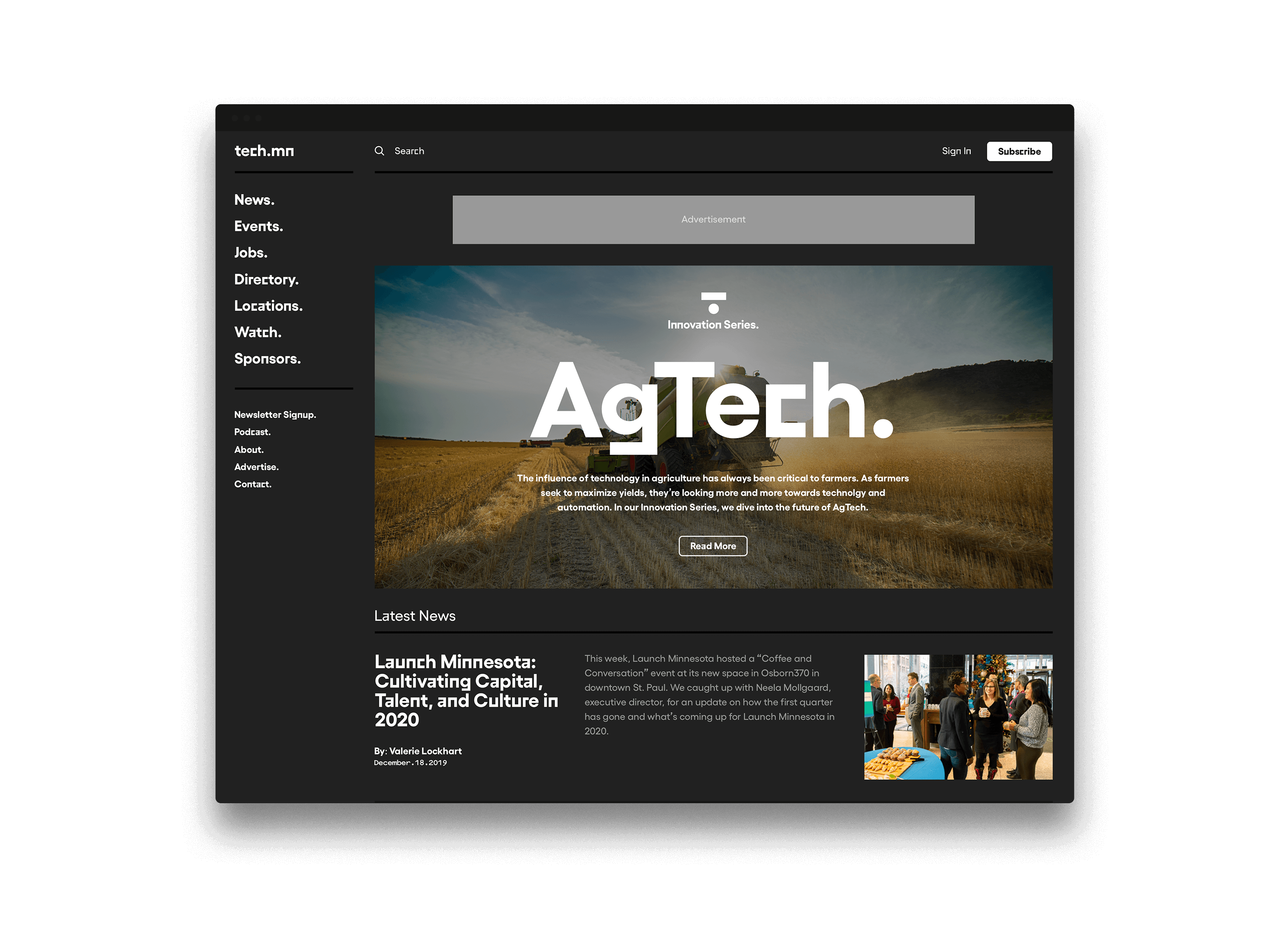
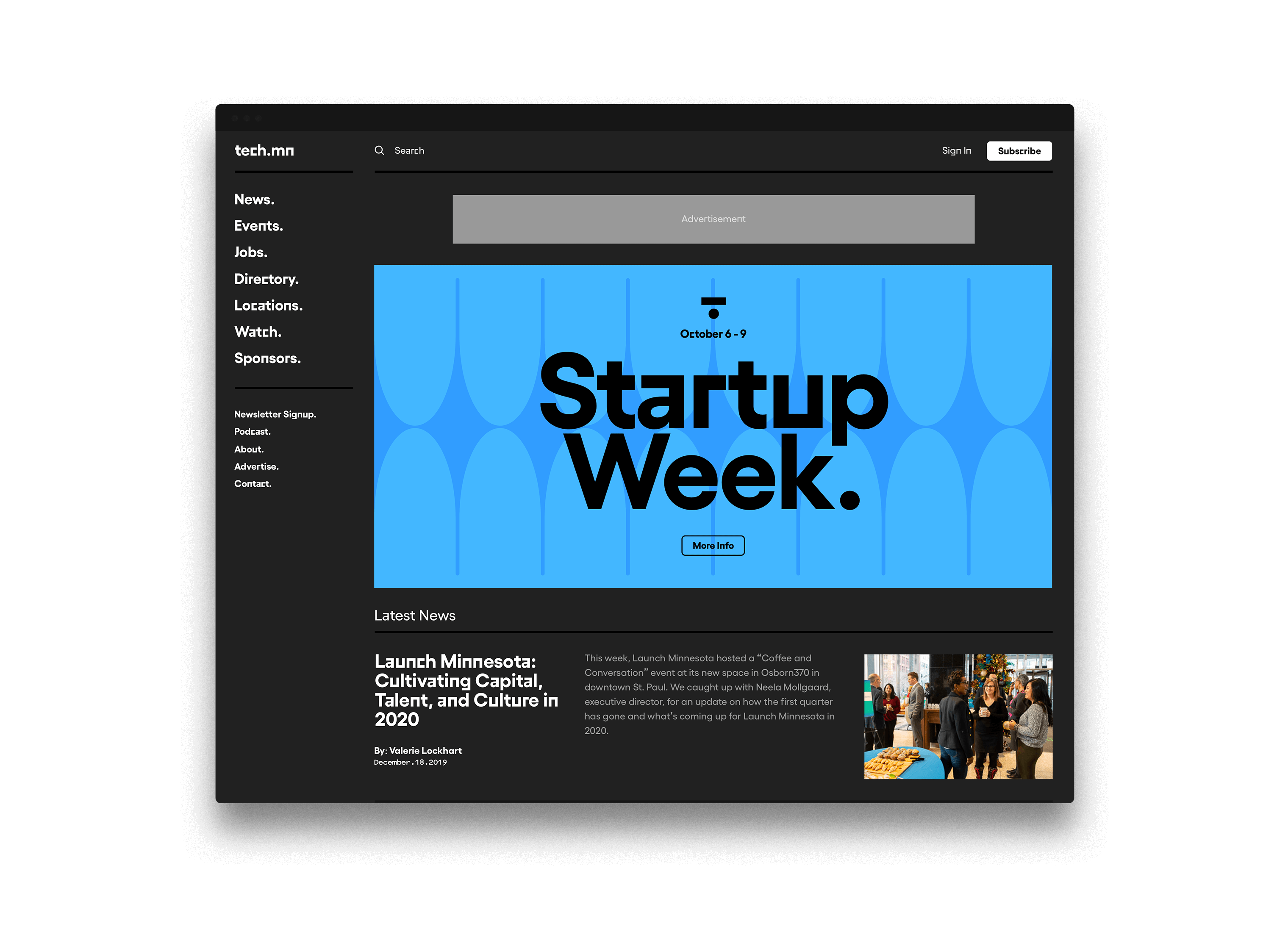
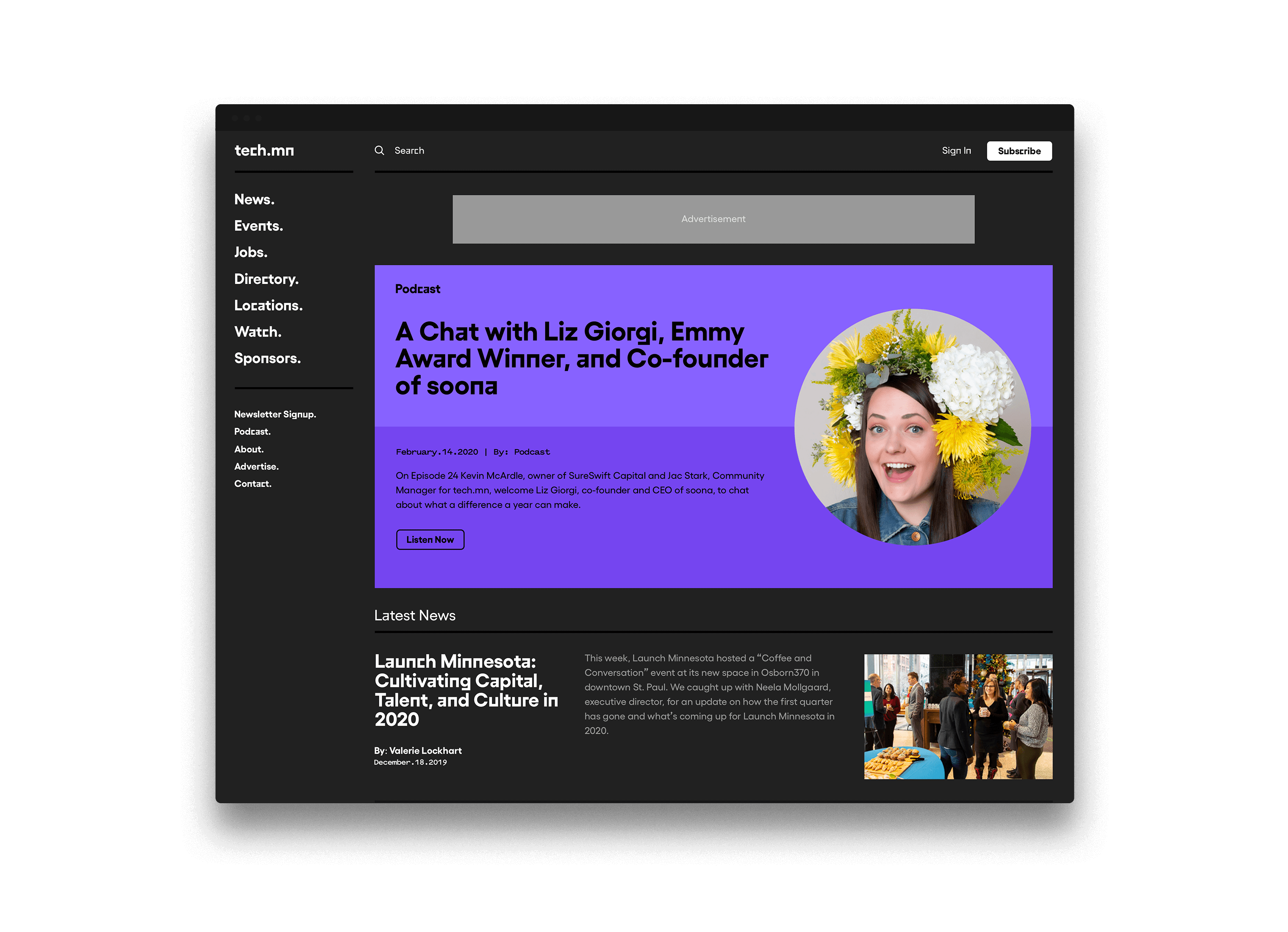
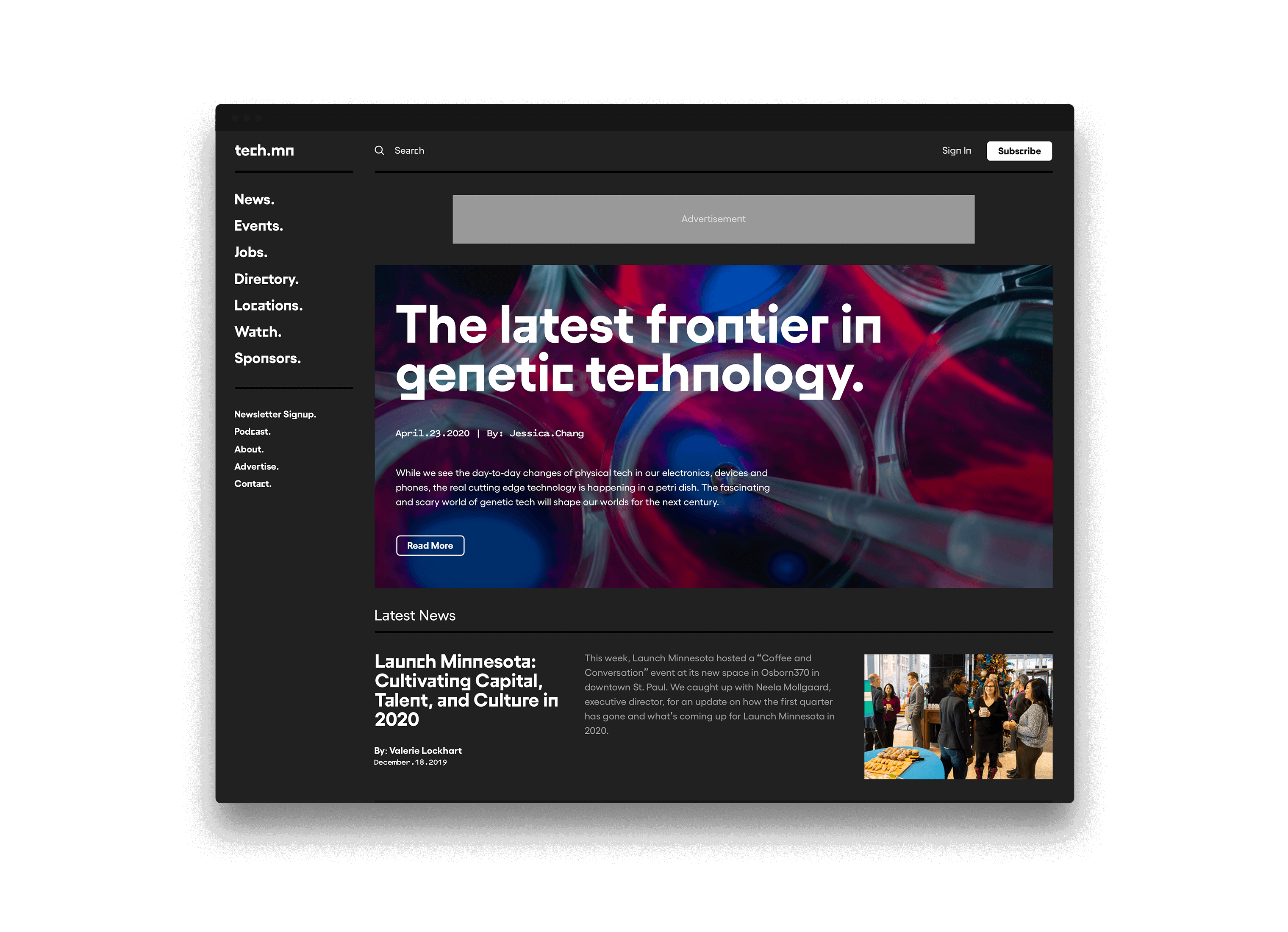
We helped consult with tech.mn to redesign their website. After reviewing the existing website and audience types we gave recommendations on information architecture and overall experience. We also wanted to show how the design language could apply to the user interface. These designs were intended to help guide their team as they created the new website.
Skills
- Brand Strategy
- Discovery & Research
- Identity System Design
- Brand Guidelines
- Product Design
- UI/UX Design
- Iconography
- Digital Strategy
Details
Team
- Garrick Willhite
- Bryn Bundlie
- Kelly O'Halloran
Client
- Tech.mn
Project
- Tech.mn Rebrand
Featured
- The Minneapolis Egotist
Year
- 2020