Northland Pioneers
are the sports team for Northland Community & Technical College. We designed their new visual identity system.
BRAND STRATEGY
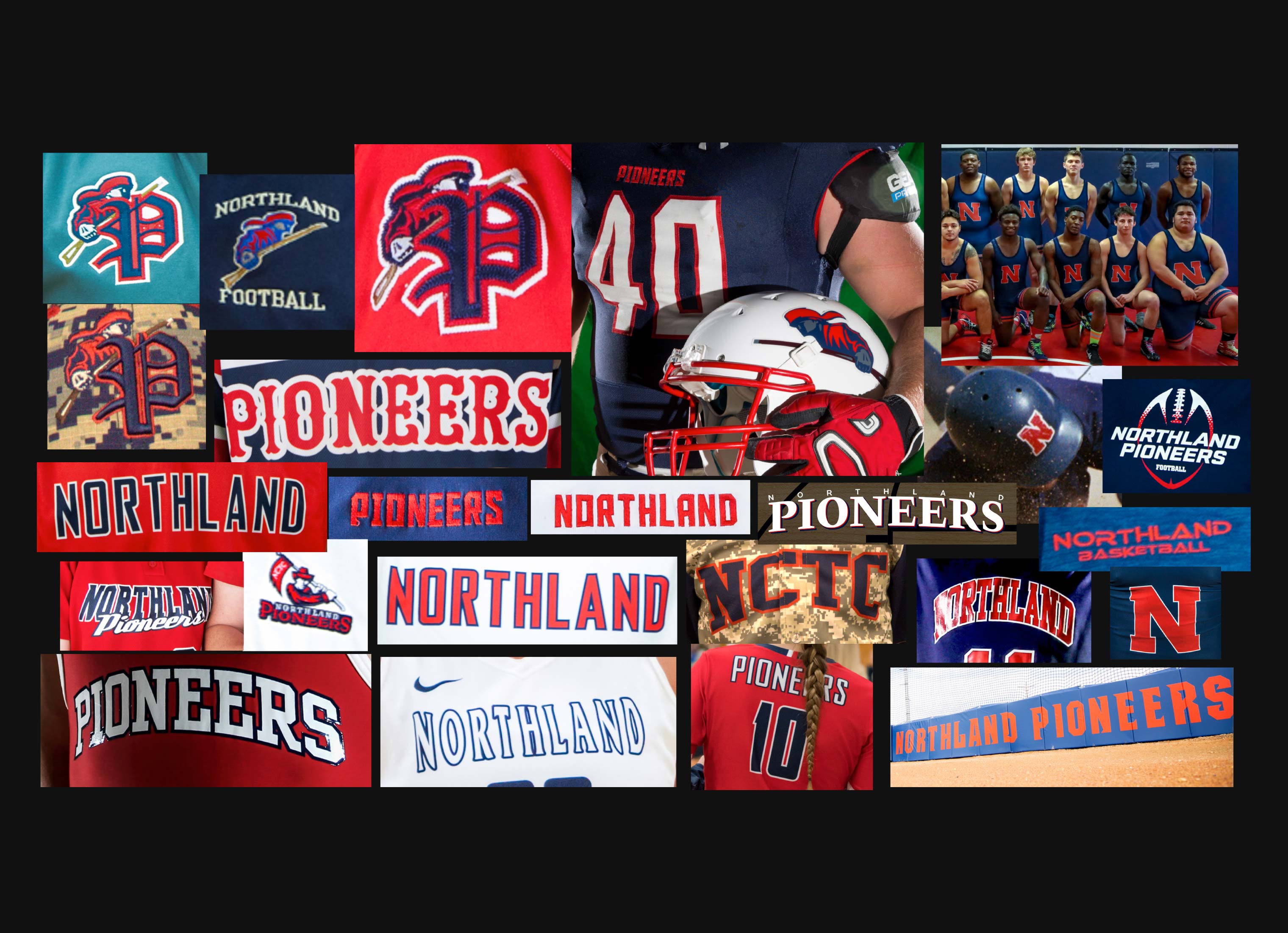
Northland contacted us to update the visual brand for their athletics program - the Pioneers. Before jumping into design we explored if they should keep the name or not. The outdated settler interpretation of a pioneer from the past didn't resonate with students & faculty and was not inclusive to race or gender.
In order to keep the name, we needed to redefine what a pioneer is. We set out to reimagine the old settler pioneer into something that was more innovate, inclusive, and forward-thinking – an astronaut, the space pioneer. We also wanted to create a solution that would fix the consistency problems from the past. (see FIG. 1.0 below)
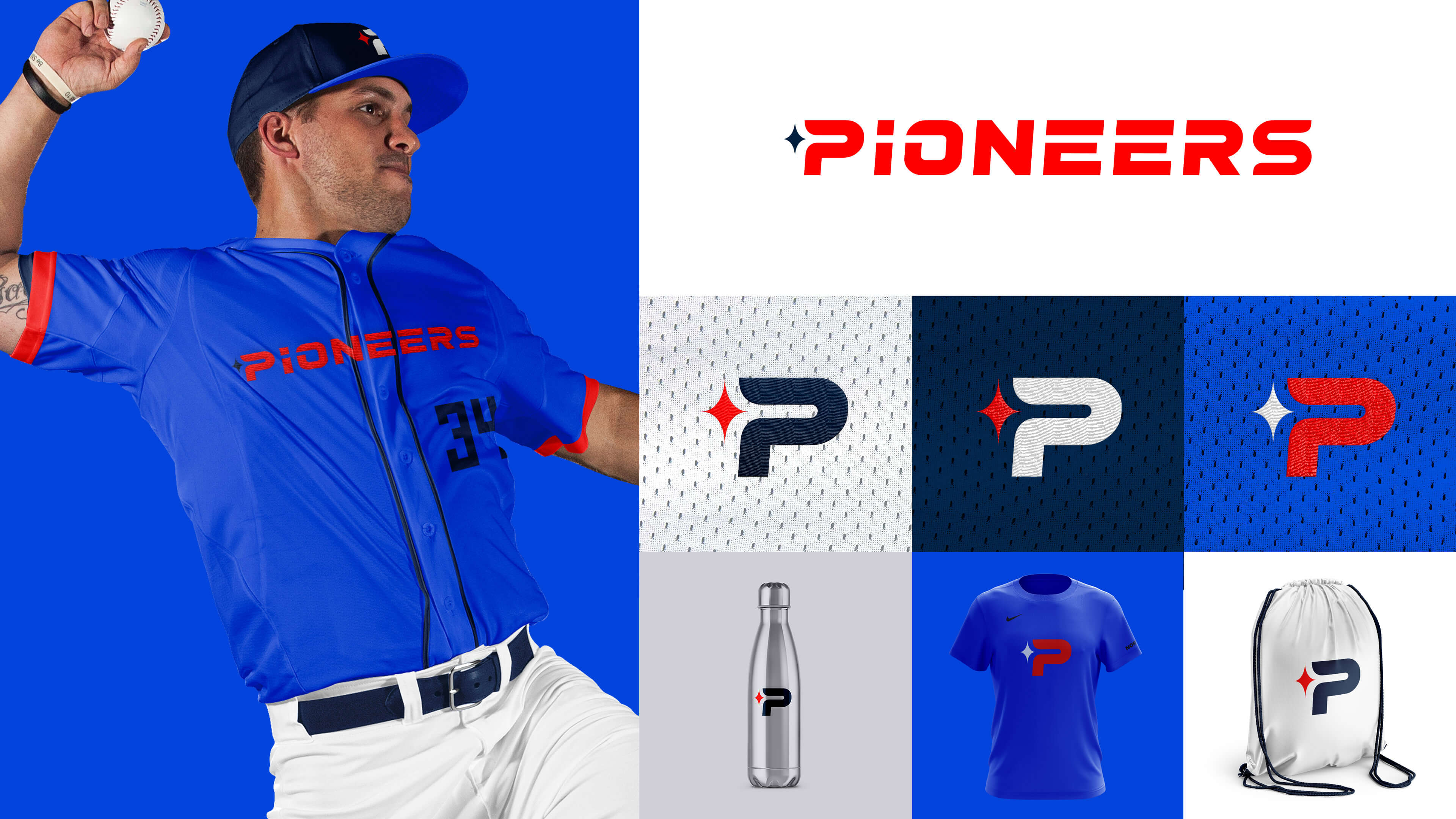
IDENTITY STRATEGY
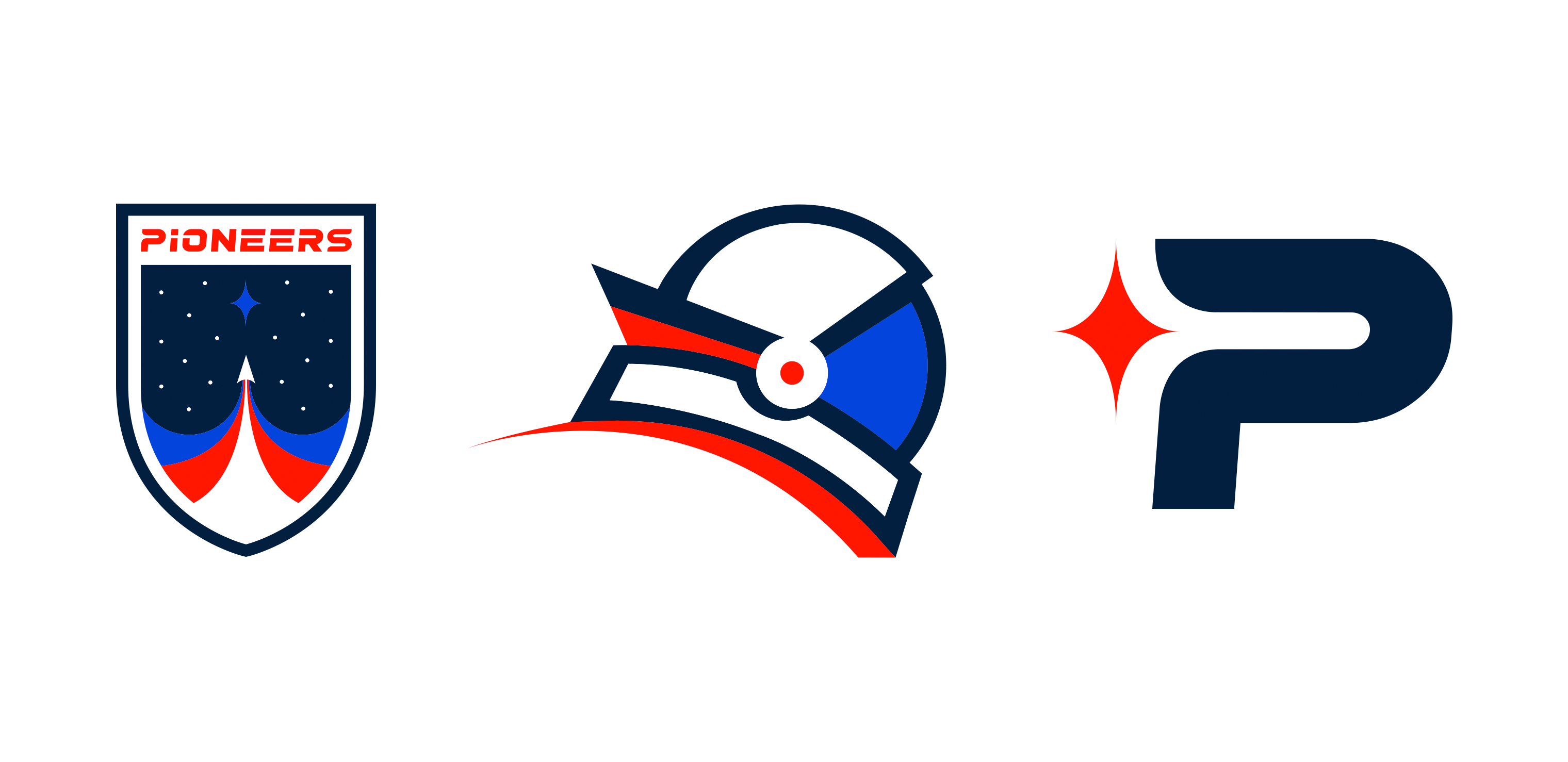
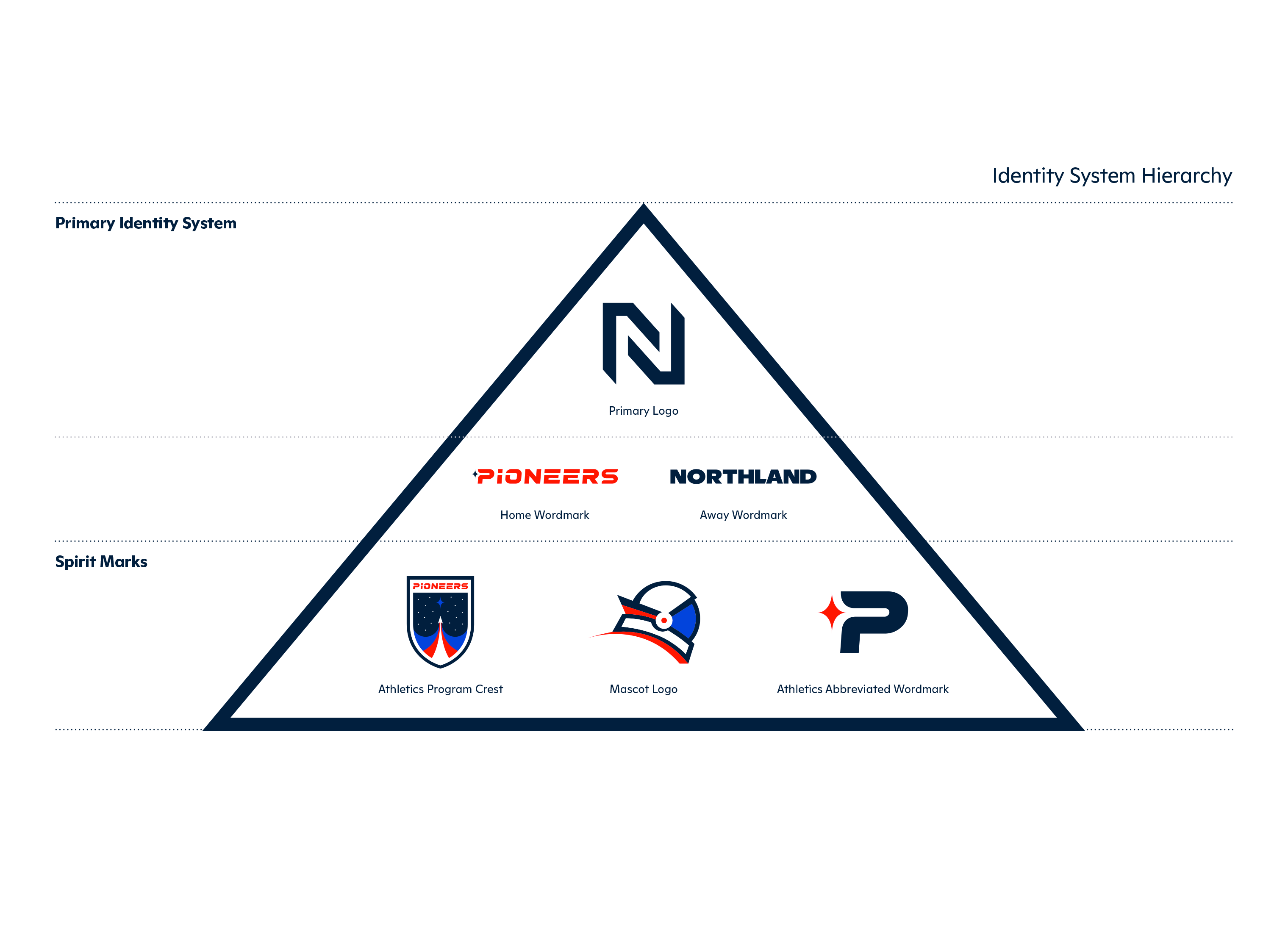
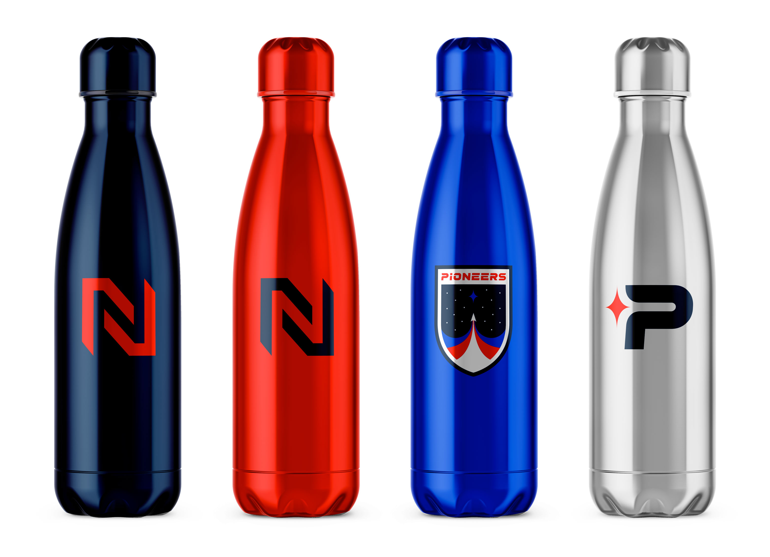
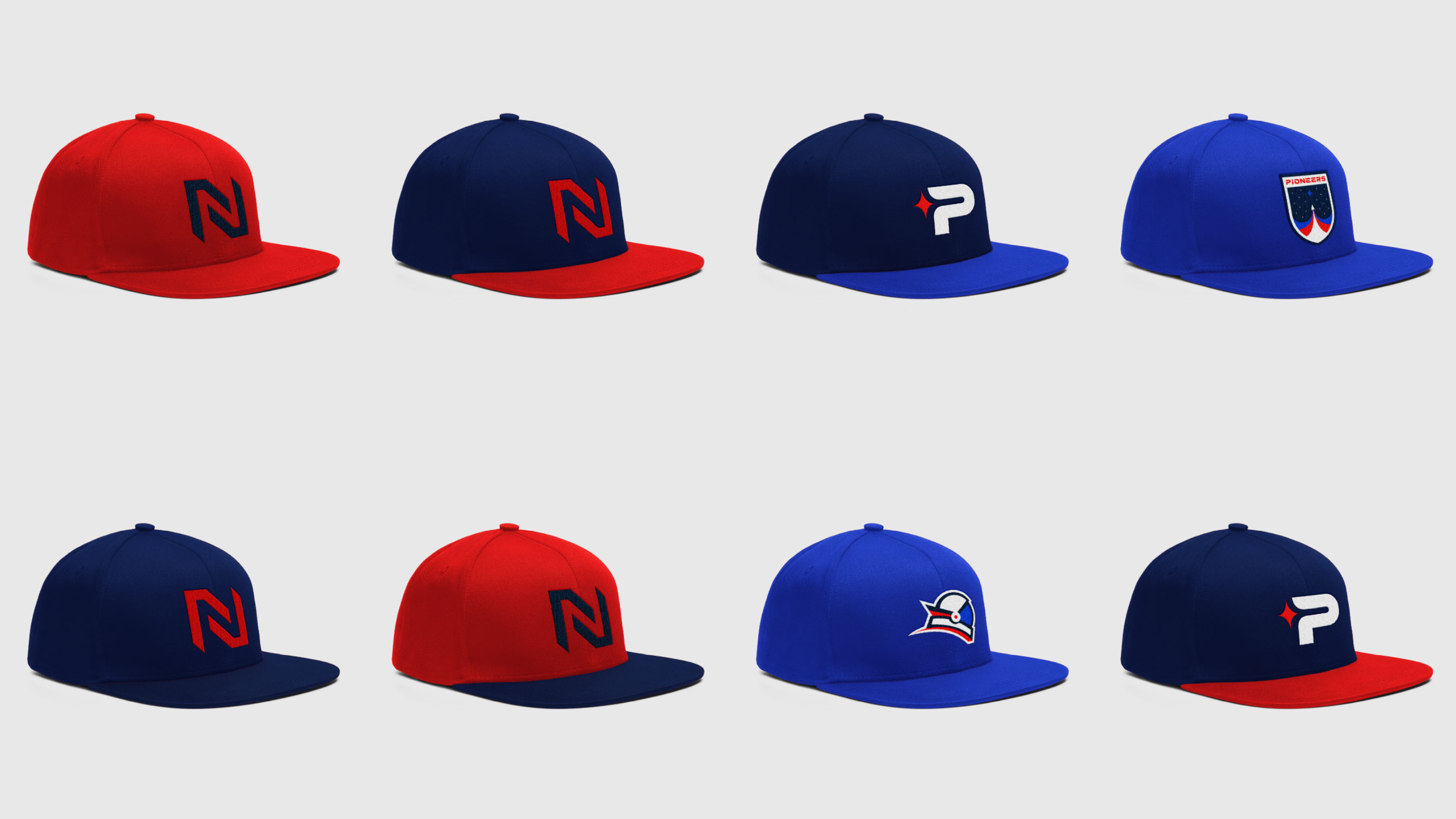
With a newly updated college visual identity system, we wanted to use this as an opportunity to bring more equity and affinity to the the new monogram. The monogram becomes the primary logo for all athletic teams as well.
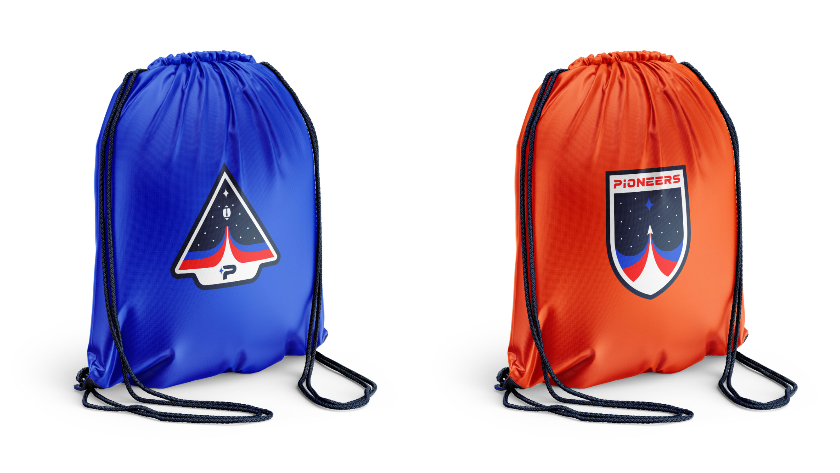
While the monogram works on bringing cohesion between the academics and athletics departments, it doesn't address the need to change the meaning of what a pioneer is. So we created several spirit marks to help redefine the Pioneer name with space motif visuals.
JERSEY DETAILS
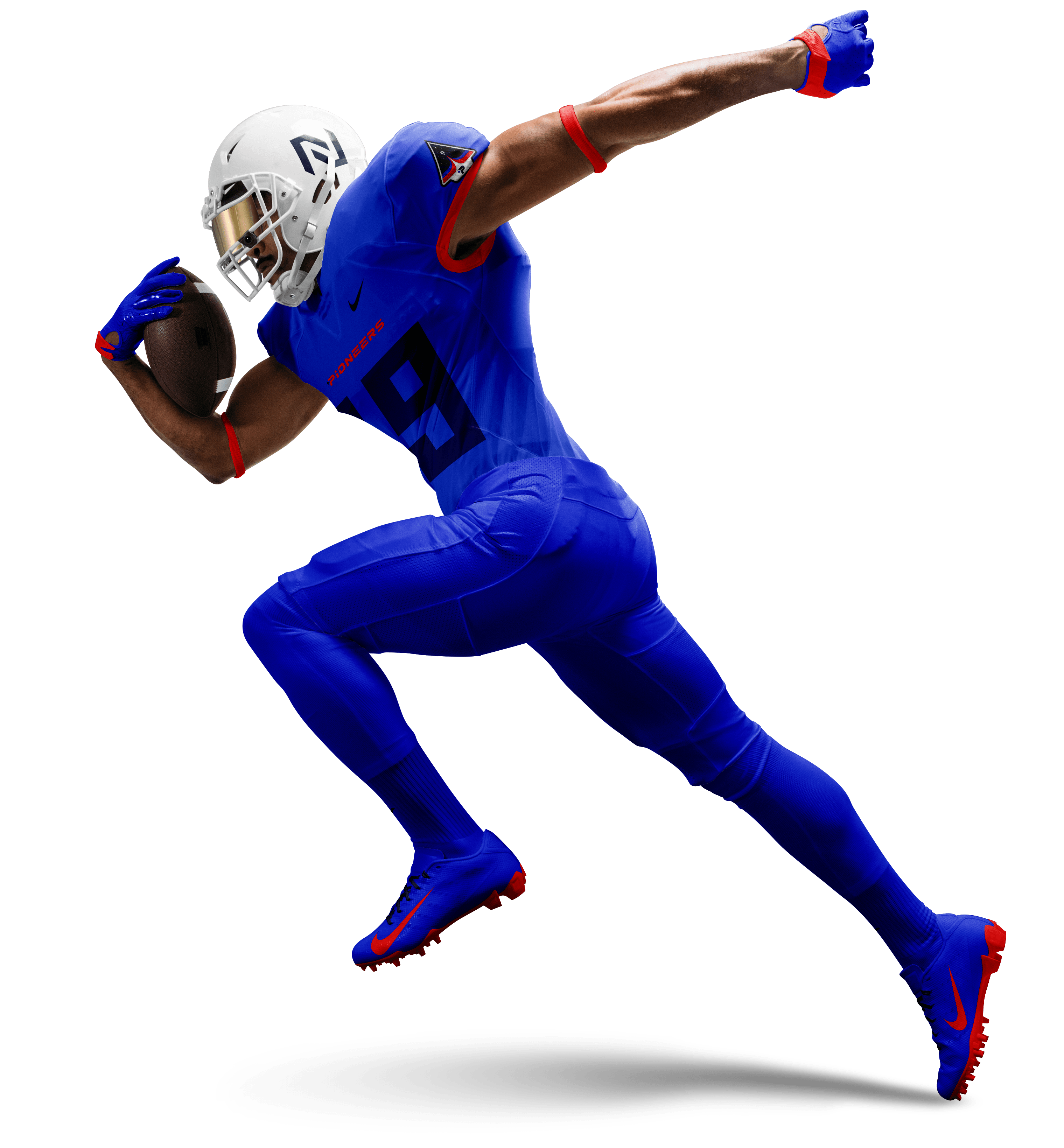
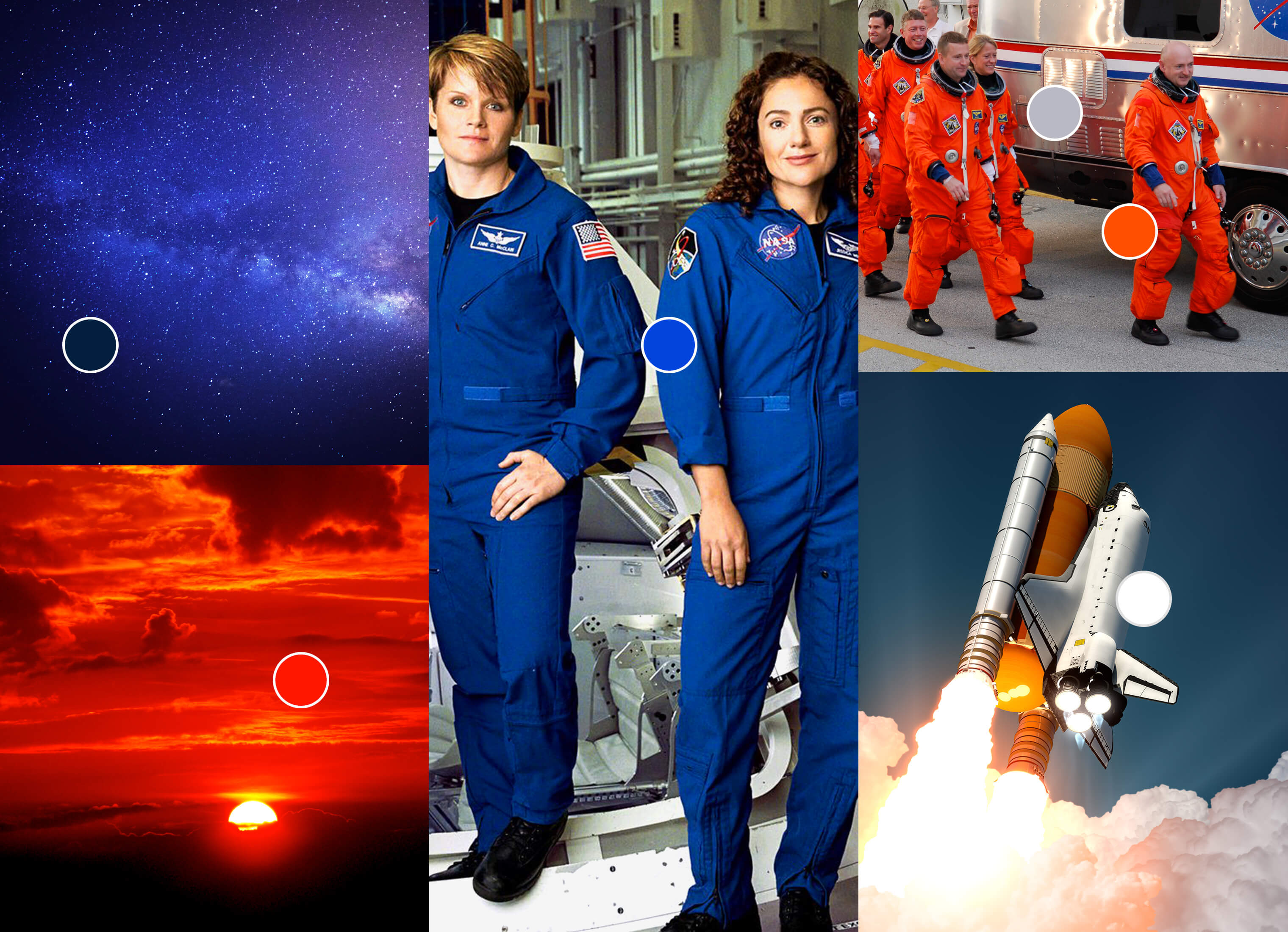
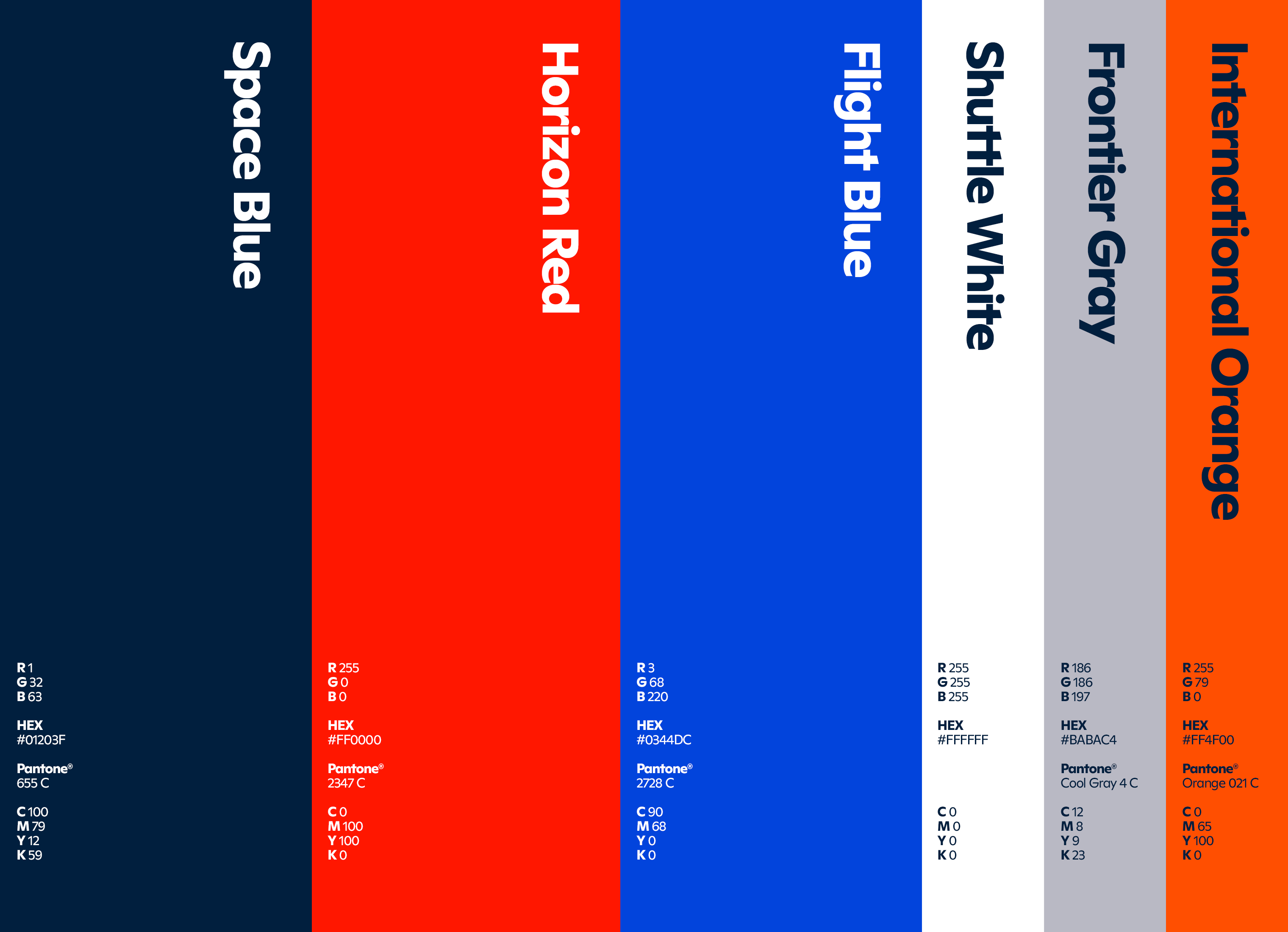
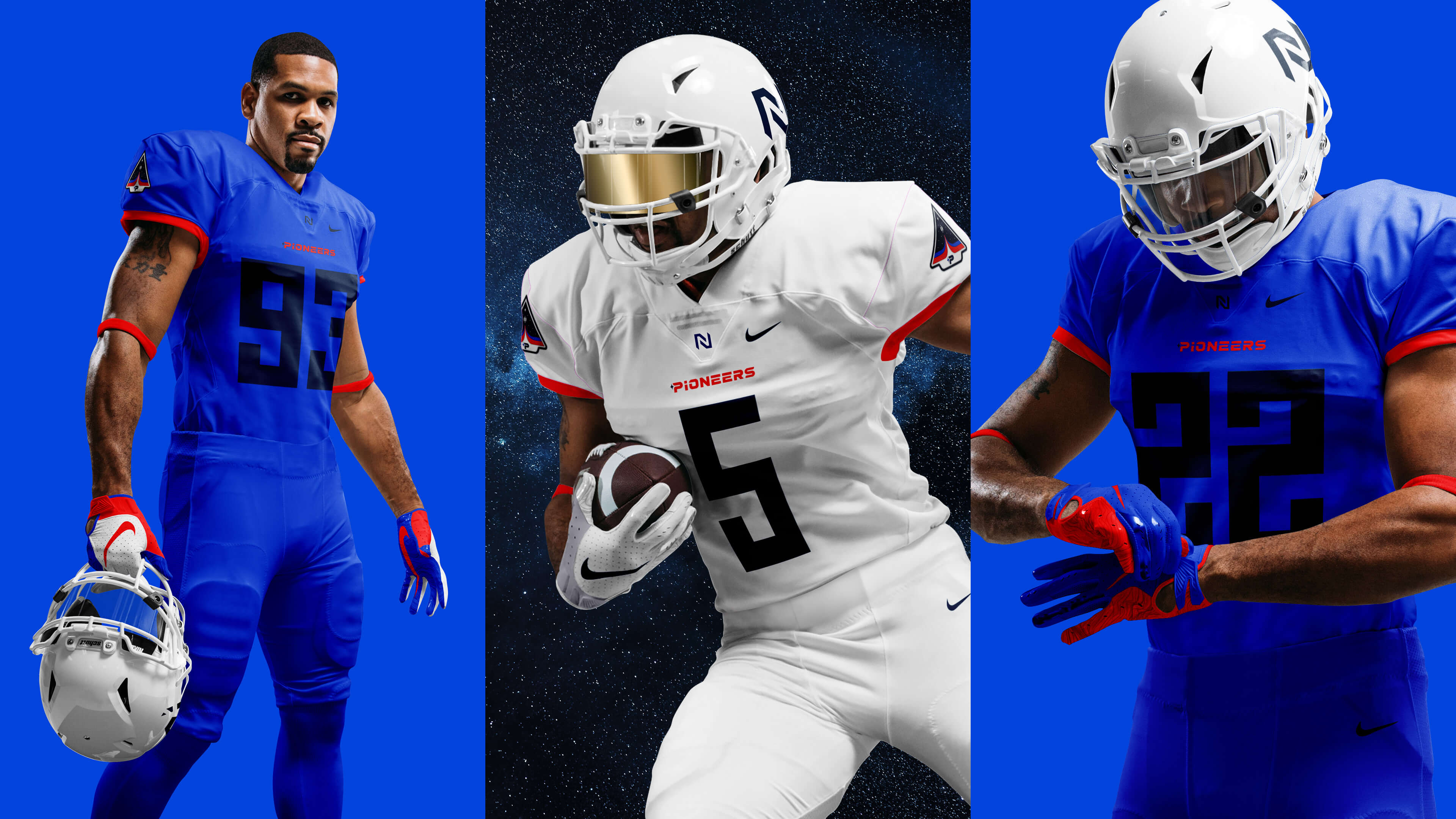
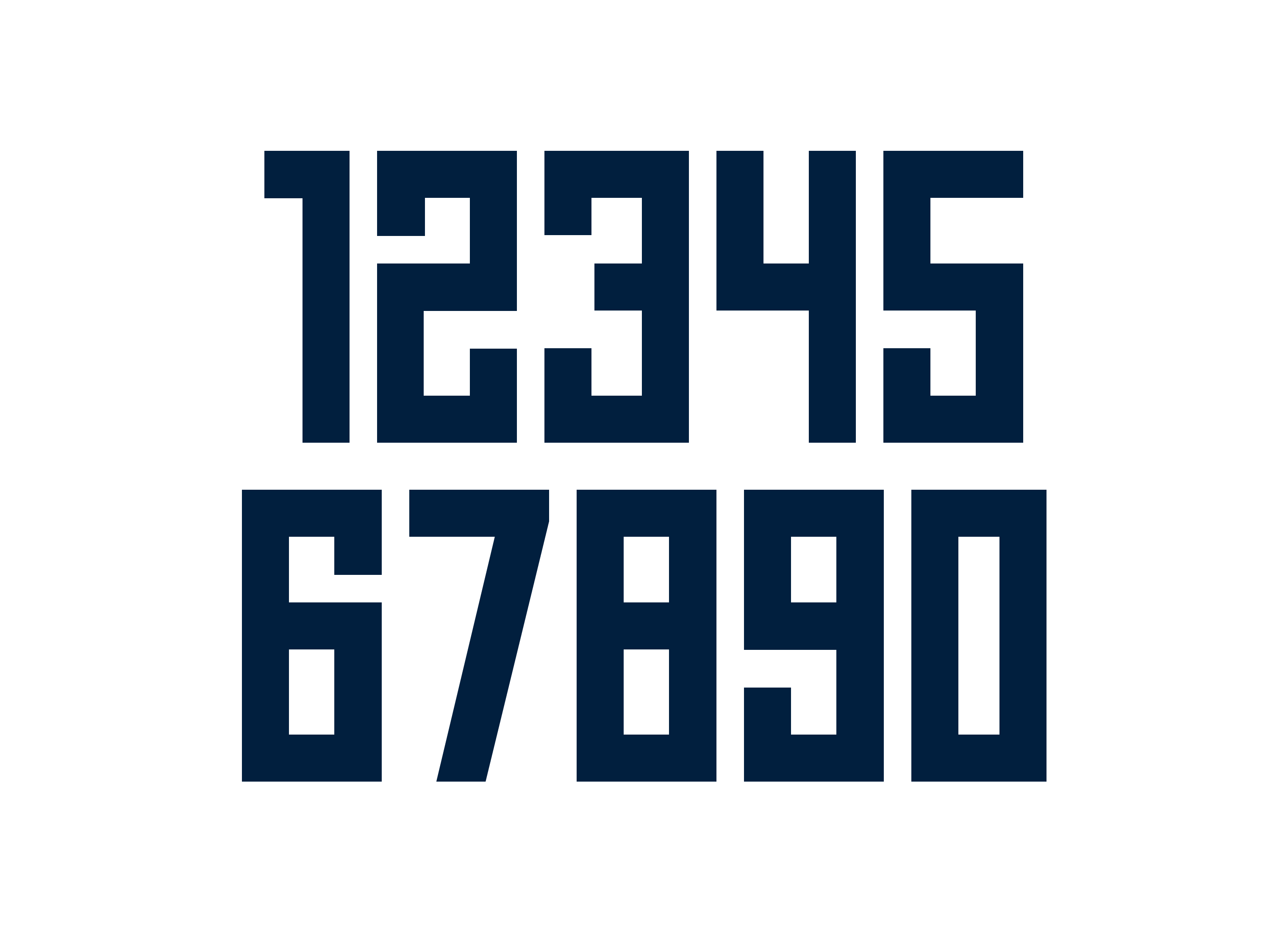
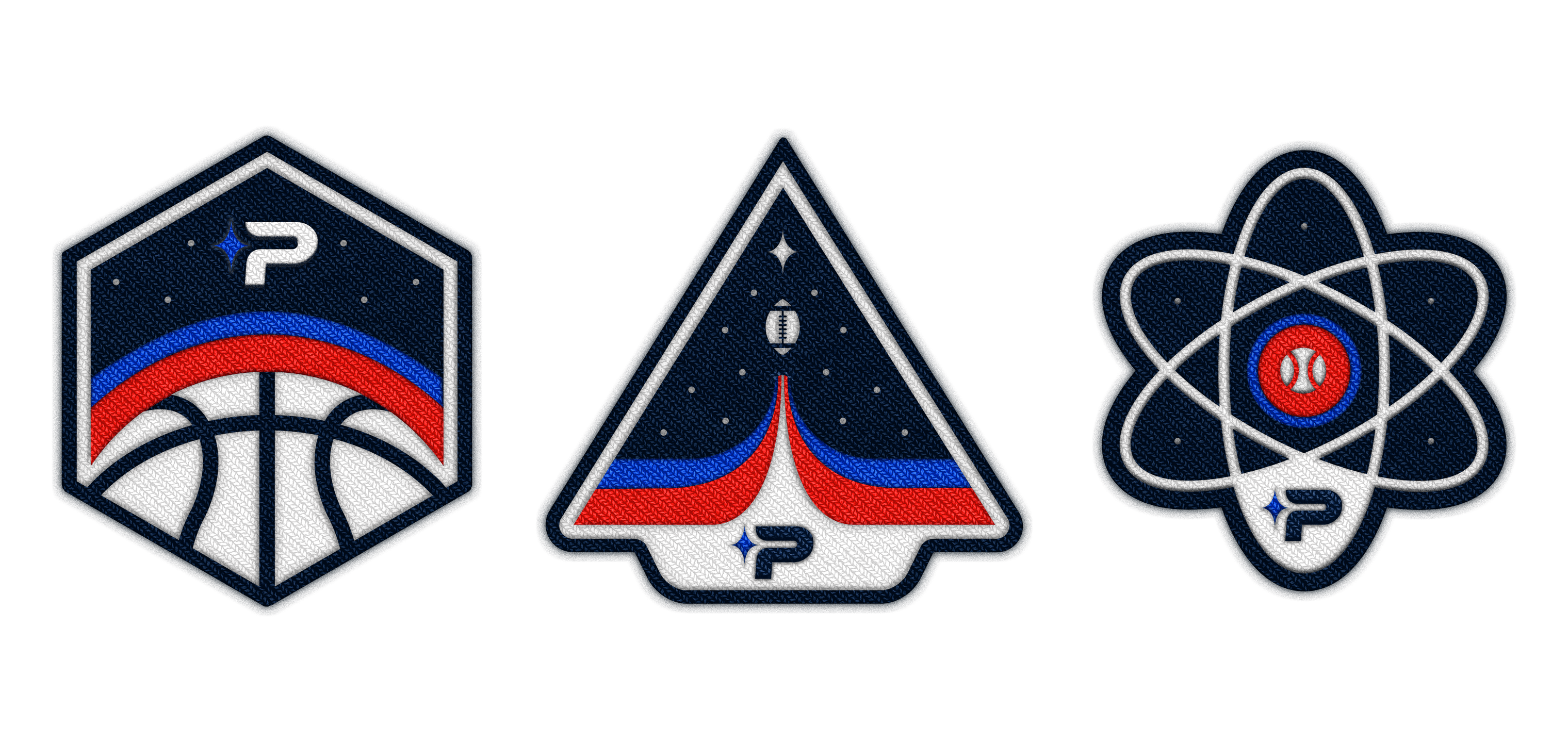
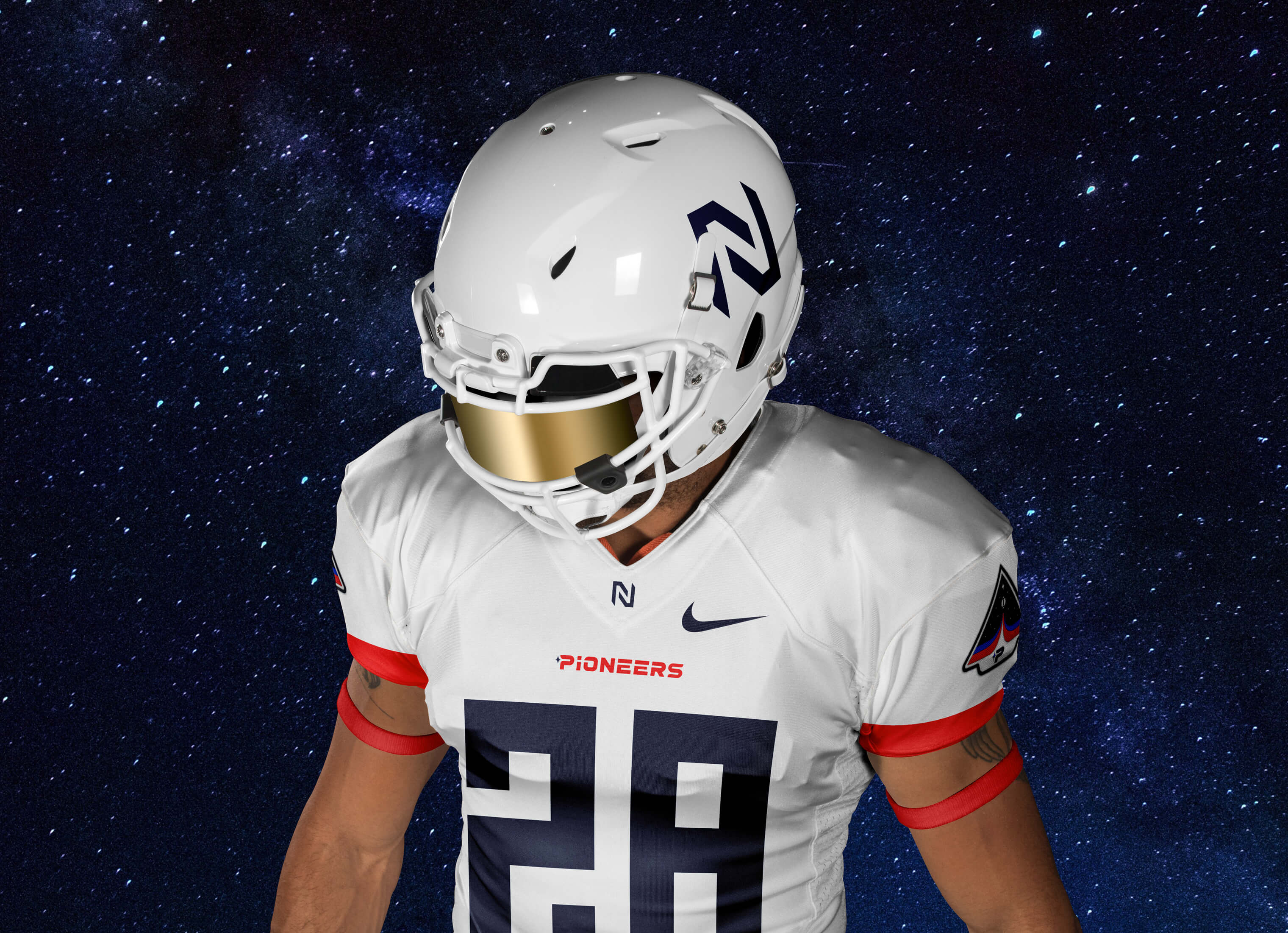
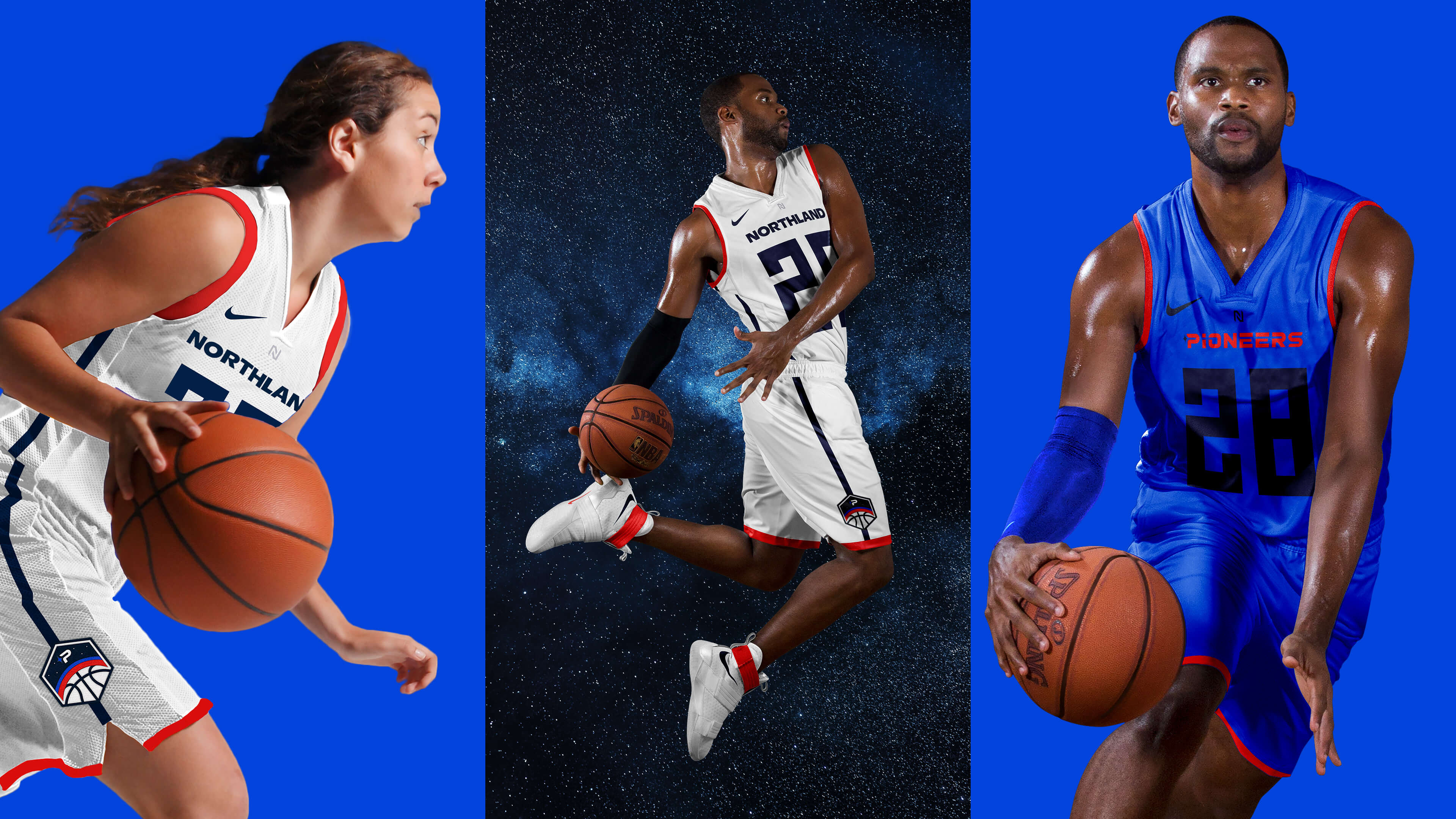
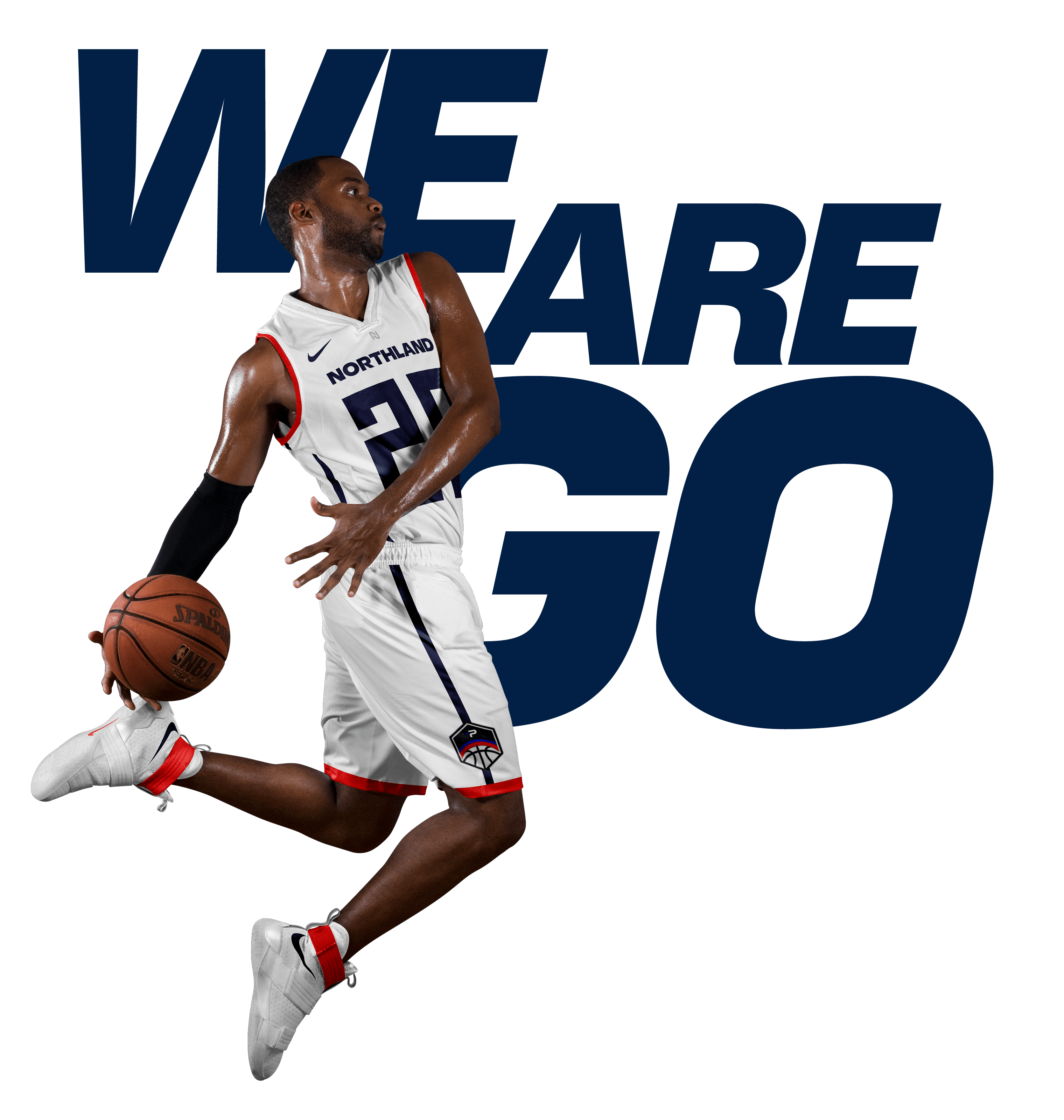
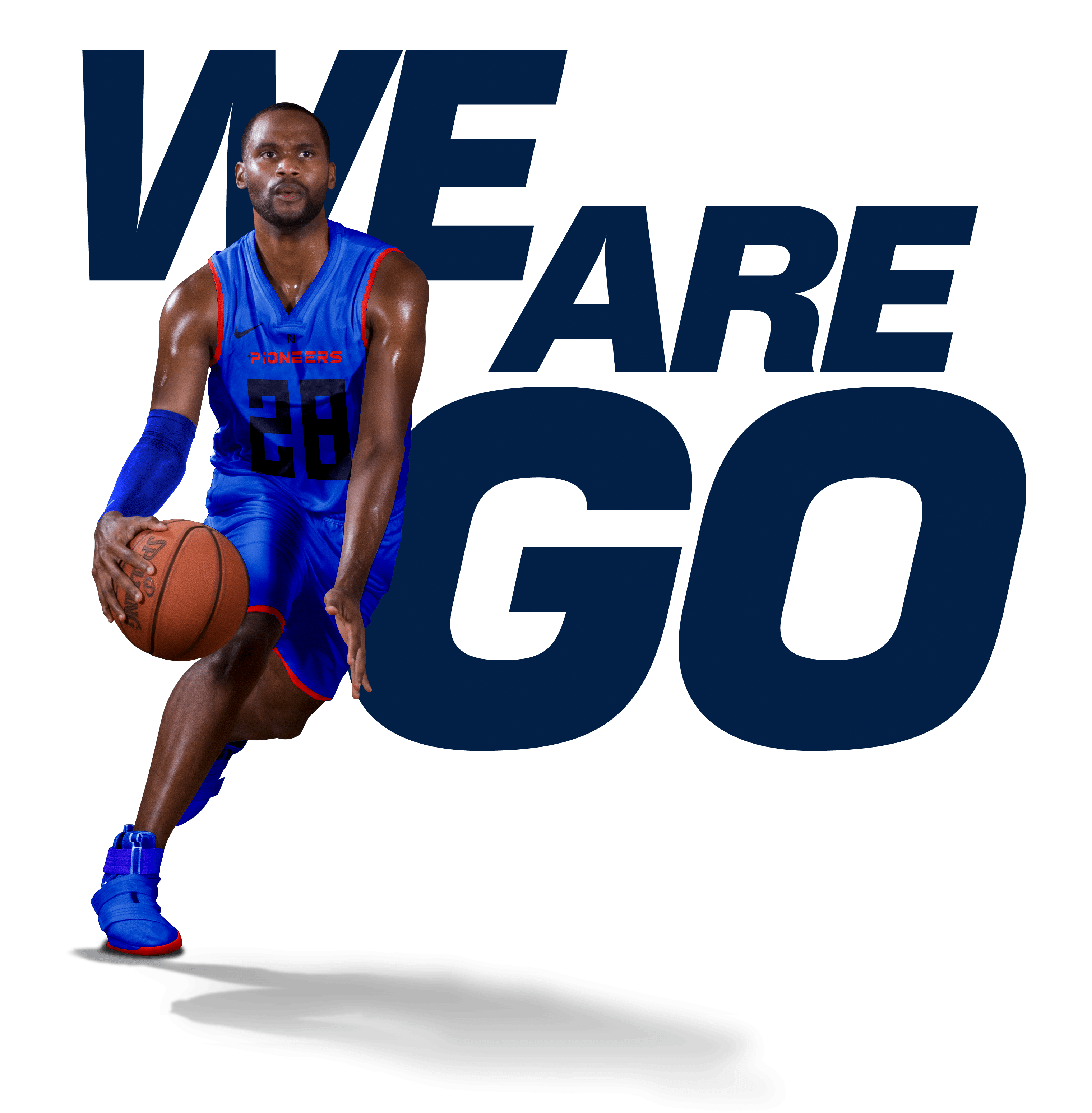
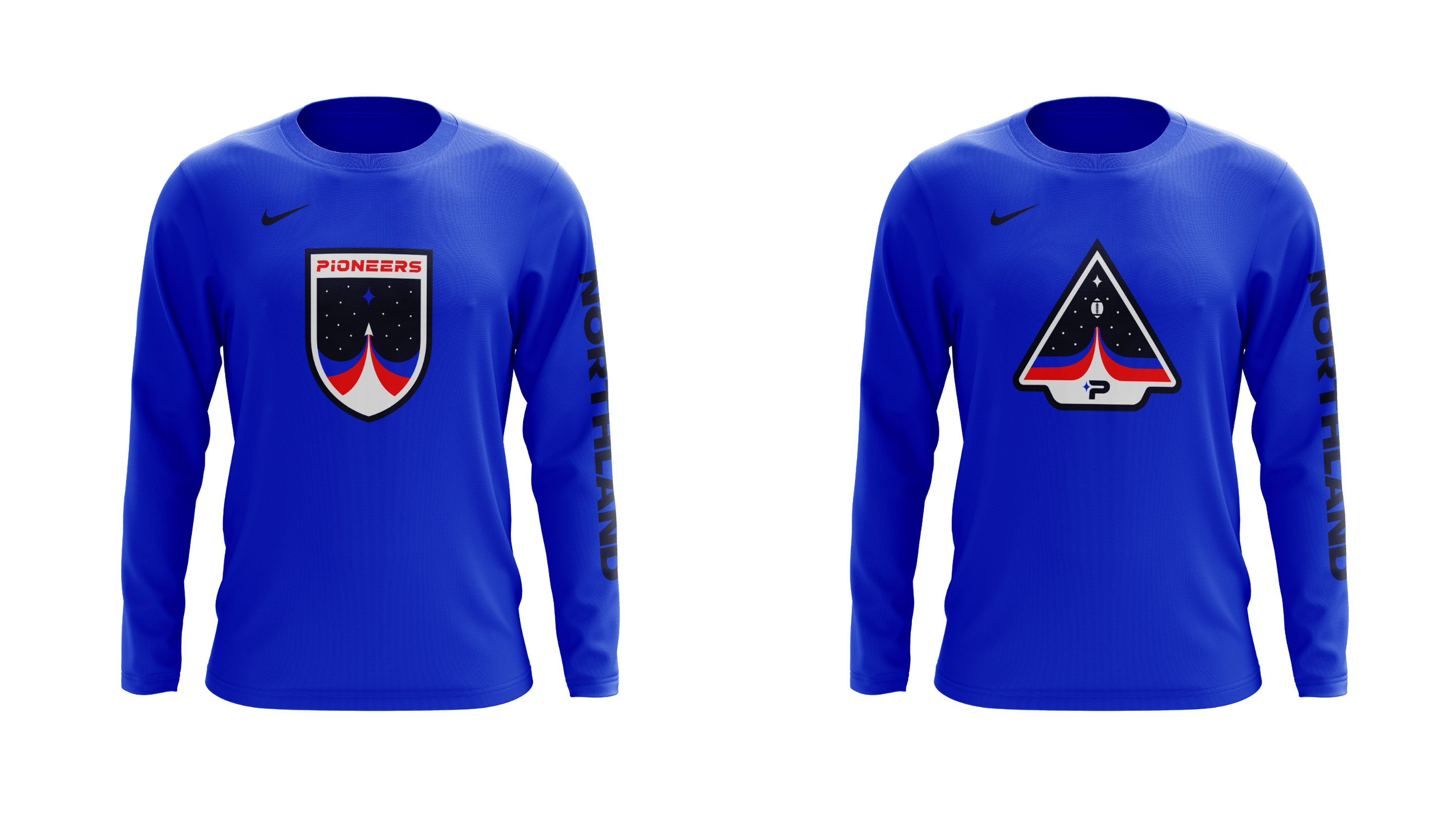
In addition to updating the brand, we also updated the teams' uniforms. We modernized the jersey numbers using a blocky, digital-looking typeface that had a space-instrument vibe to it and exaggerated the size of them. We created sport specific patches (FIG. 4.0) as a nod to space mission patches used by astronauts. Each sport's unique patch is embroidered onto their jersey and is also used for fan merchandise. For home uniforms the team wears Flight Blue as a reference to the flight blue suits astronauts wear (FIG. 6.0). For away games, the teams wear white as a nod to the Extravehicular Mobility Unit suits worn by astronauts (FIG. 5.0).
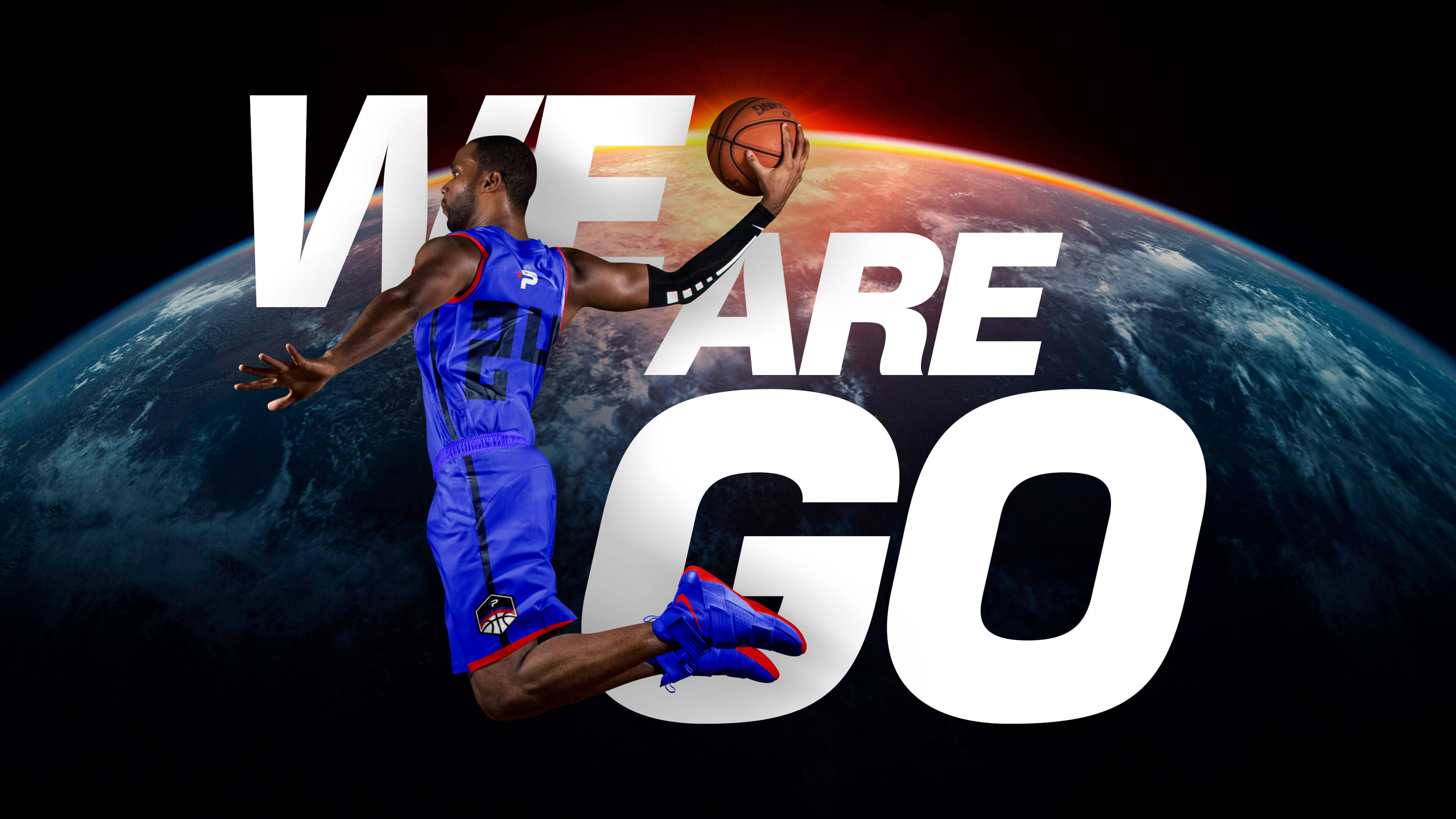
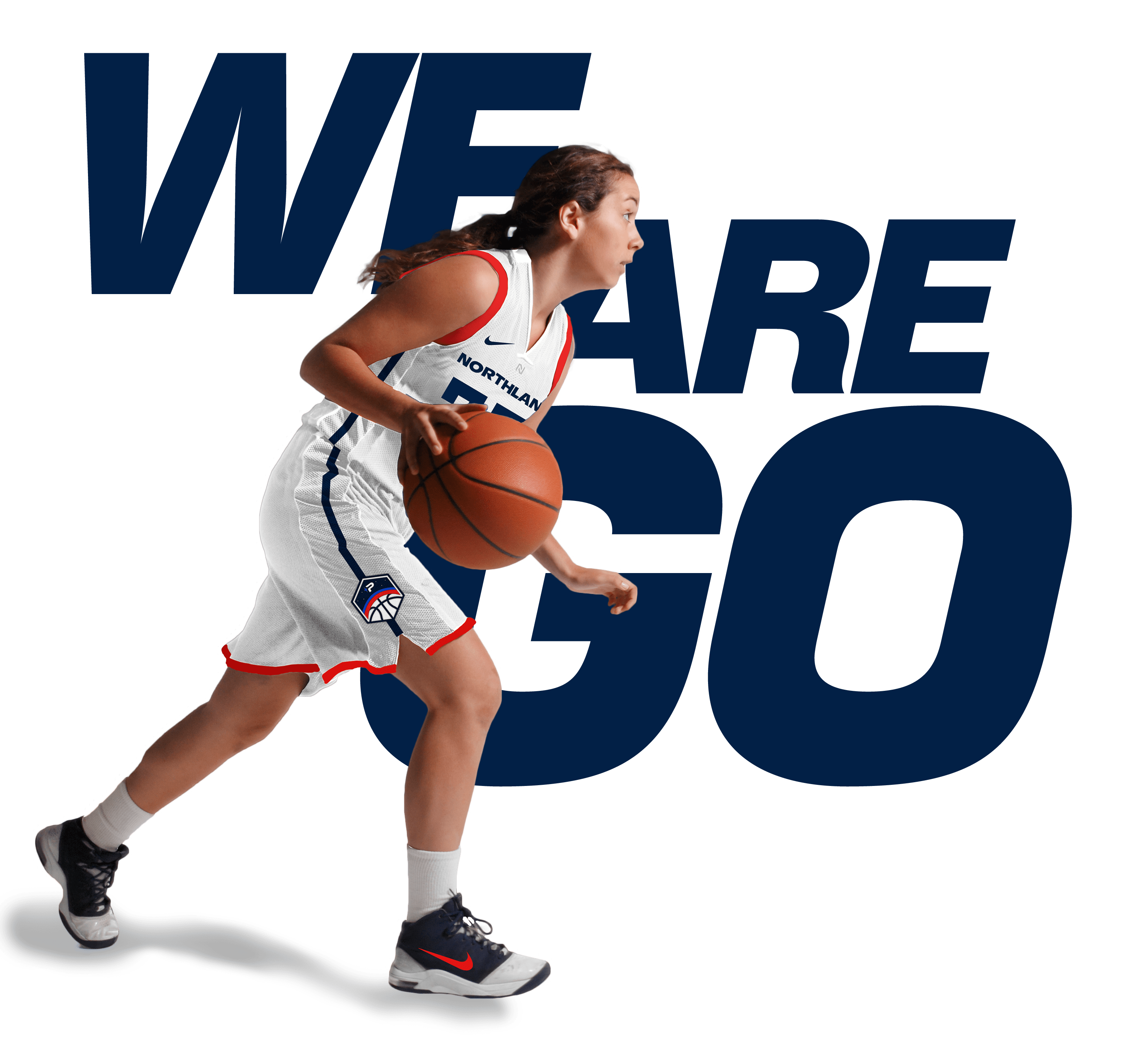
NEW SLOGAN
To help increase engagement and excitement for sporting events we created a slogan for the Pioneers. The new slogan, "We Are Go" is a shortened version of the phrase "We are go for take off" used for space flight launches. This helps further build the new meaning behind the Pioneers space direction and gives fans a phrase to chant and student athletes a phrase to embrace.
MERCHANDISE
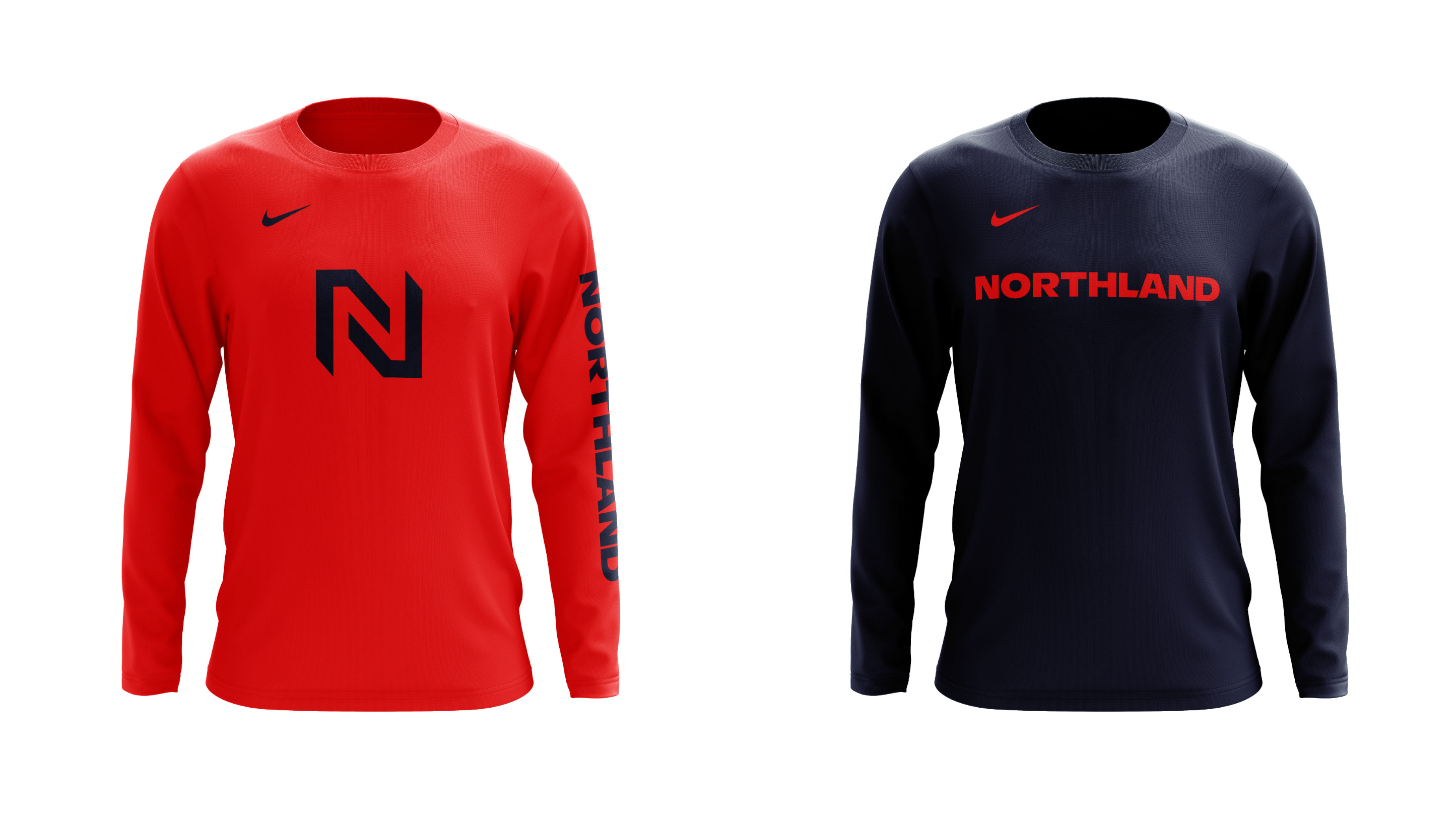
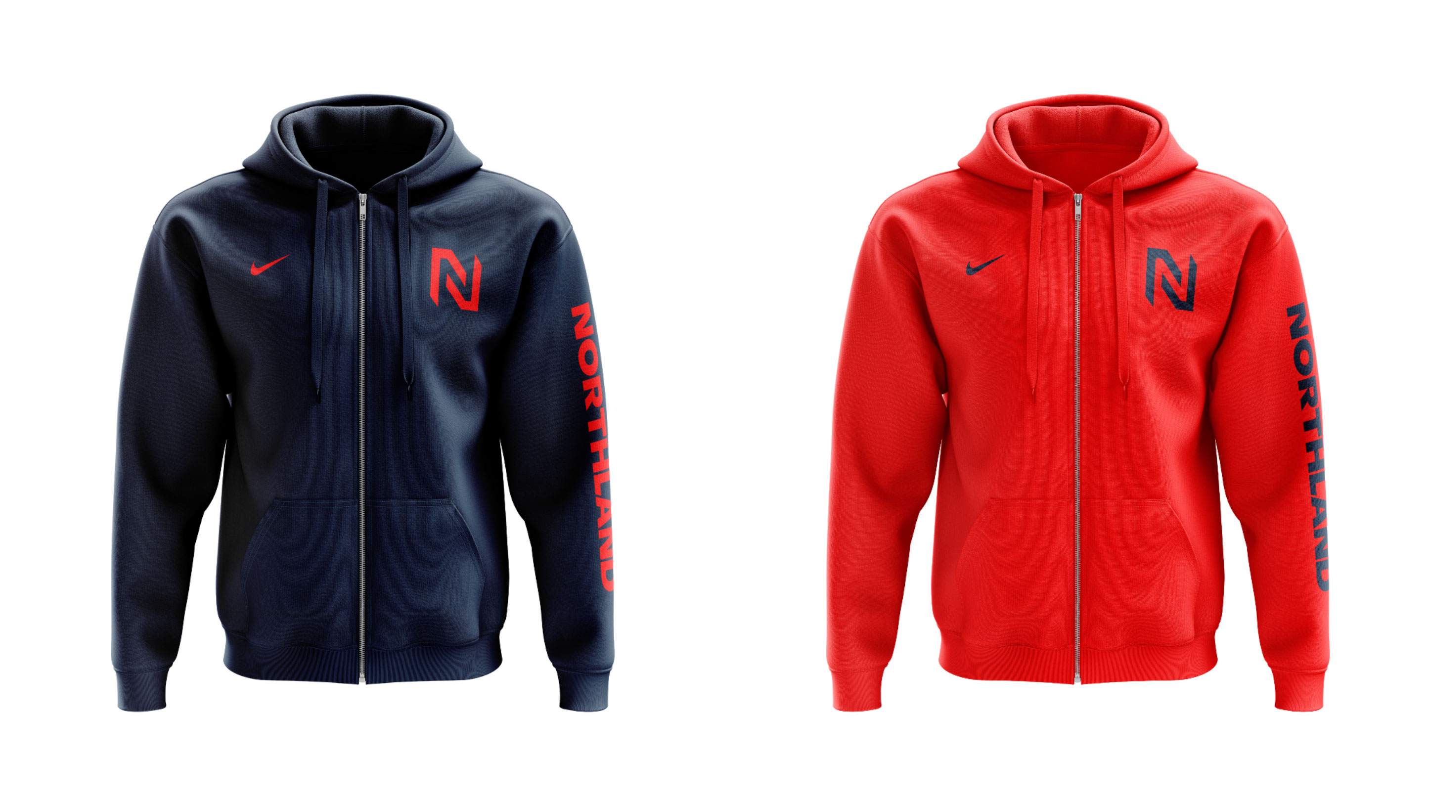
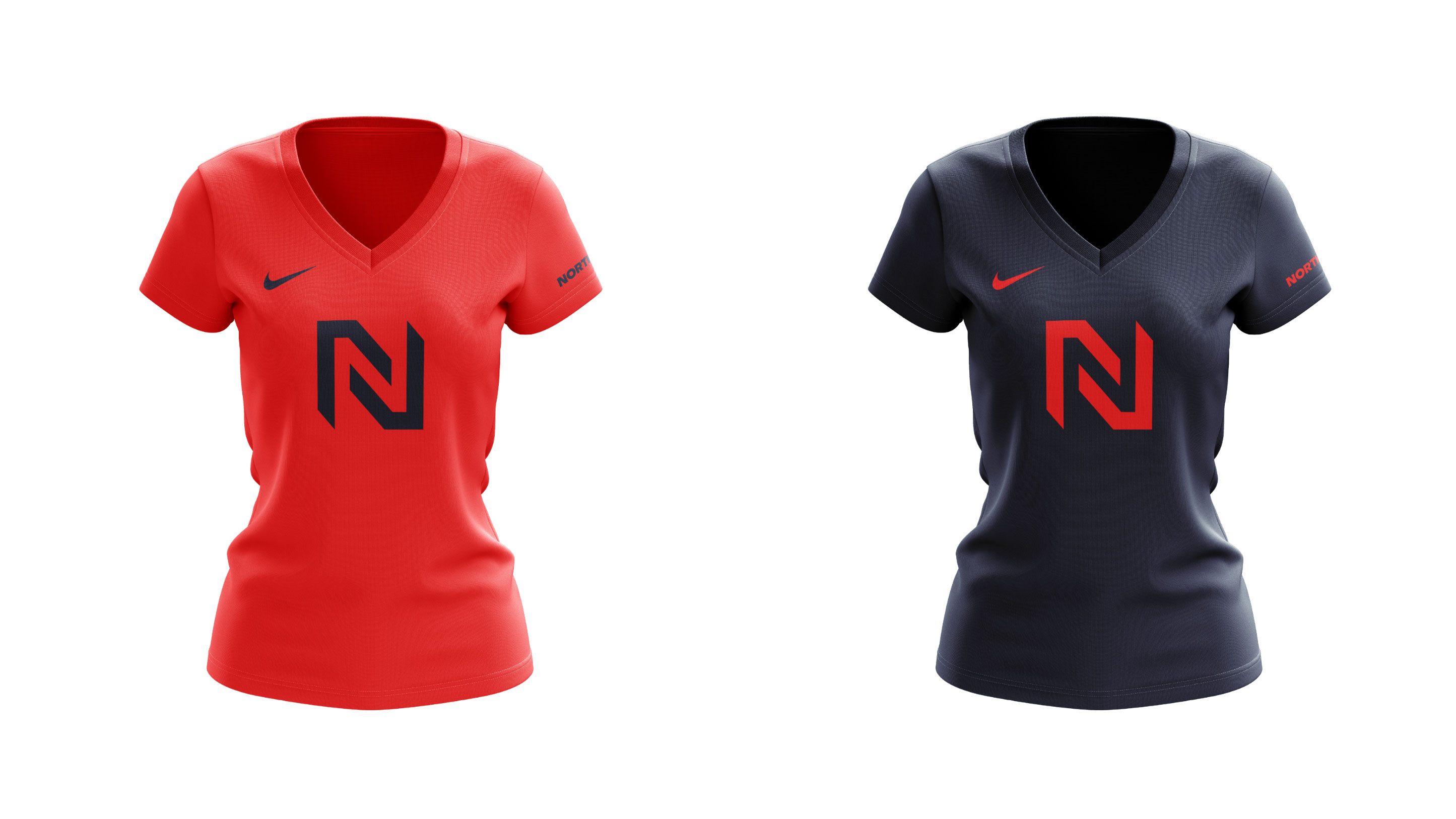
We also have been collaborating with the Northland team to produce new products for the bookstore. The new visual identity allows the college to sell the academics brand and athletics brand in a cohesive set with allowing flexibility and expression.
Skills
- Brand Strategy
- Discovery & Research
- Identity System Design
- Brand Guidelines
- Uniform & Jersey Design
- Merchandise Design
- Brand Campaign
- Brand Launch & Rollout
Details
Team
- Garrick Willhite
- Bill Gunter
- Nikki Meyers
- Bryn Bundlie
Client
- Northland Community & Technical College
Project
- Northland Pioneers Visual Identity & Rebrand
Featured
- Underconsideration: Brand New, The Minneapolis Egotist, Adfed Show Gold
Year
- 2019