Northland
is a community & technical college located in northwest Minnesota. We designed and launched their new visual identity system.
ASSIGNMENT
Northland contacted us to refresh their visual brand presence for both the academics and athletics programs. Our approach was to identify current challenges and clearly define areas of opportunity to either evolve the brand or completely redesign it. The Northland marketing team had clearly defined areas of concern with the brand – lack of consistency and a lack of guidance with the absence of a style guide. To view the work we created for their athletic's program, check out the Pioneer's project page.
OUR APPROACH
We conducted surveys, focus groups and held several discovery sessions with: students, faculty, community members and alumni. The discovery sessions were informative to what the current sentiment of the brand was. Overwhelmingly, what we heard was that people wanted change. There was little affiliation with the existing logo & wordmark and there was an appetite for something innovative and expressive. Our challenge was to reimagine the brand with a new logo and holistic design language.

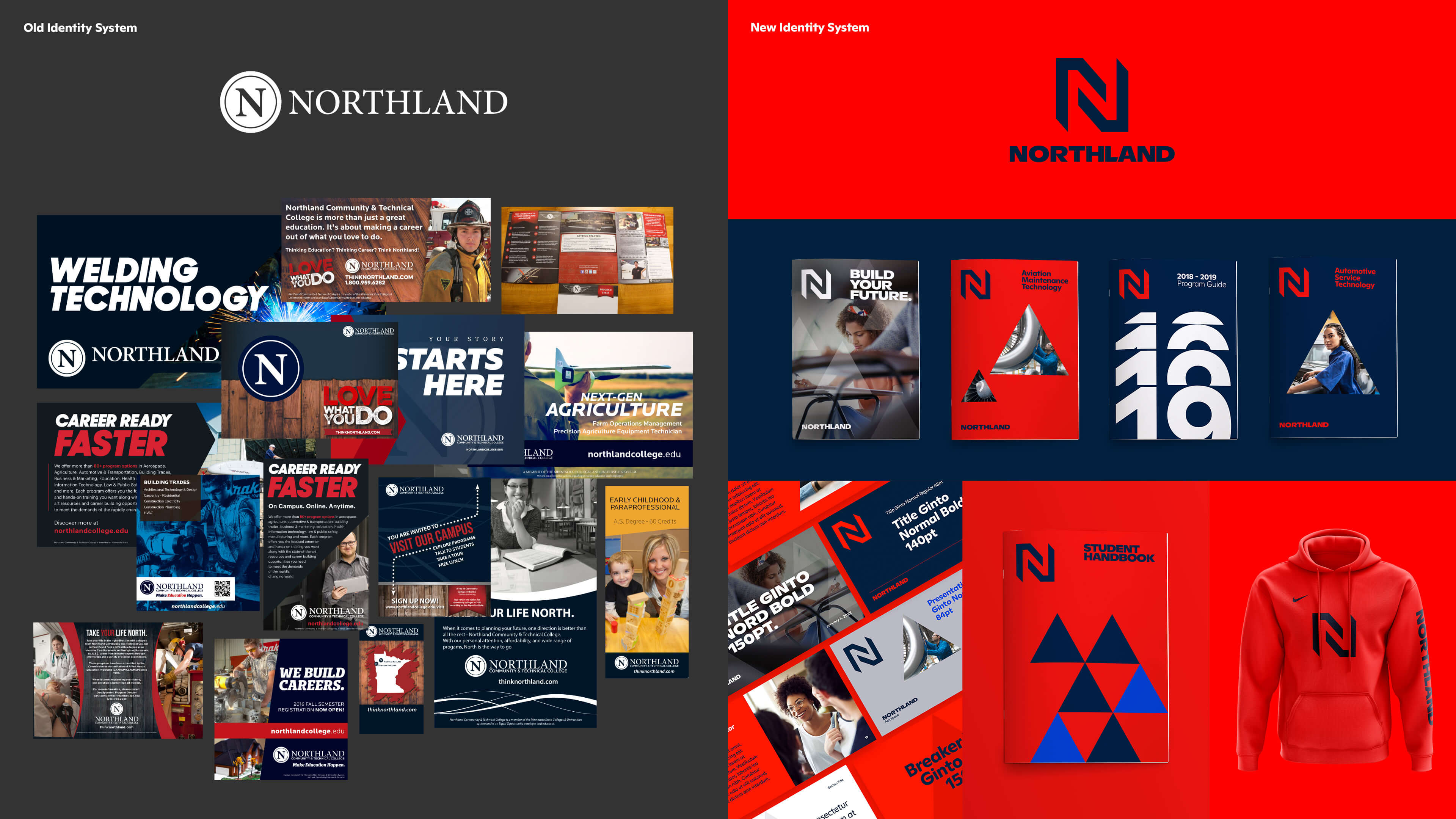
PAST MATERIALS
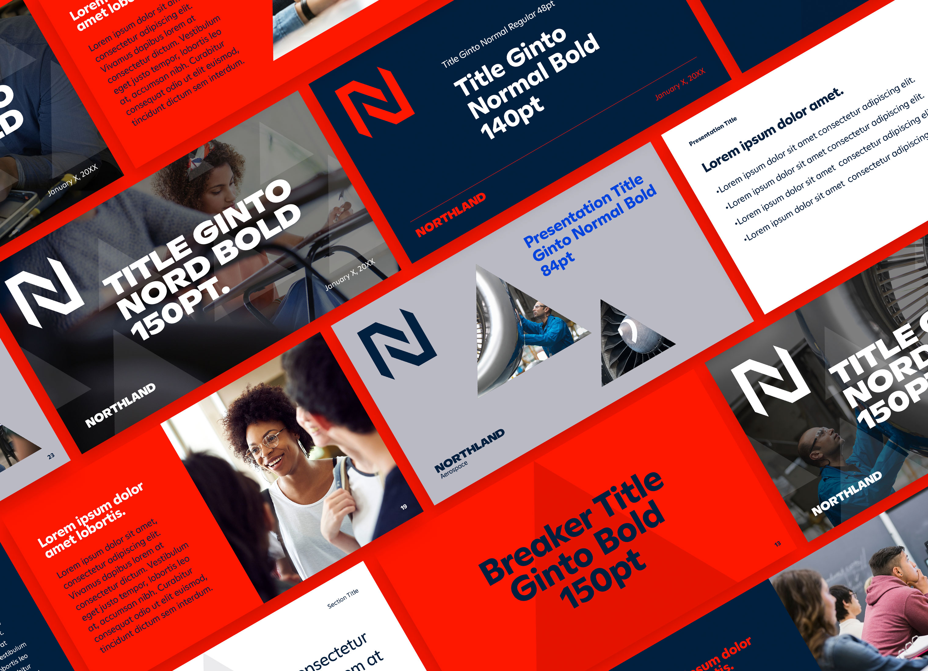
The old brand (FIG. 5.0 see below) had issues with consistency partly due to the fact that there was no existing brand guidelines to help advise agencies, vendor partners and marketing team members. Various typefaces and colors were used and there wasn't a design system to connect the pieces. Our goal was to create a robust set of guidelines and create templates to increase uniformity without sacrificing flexibility.
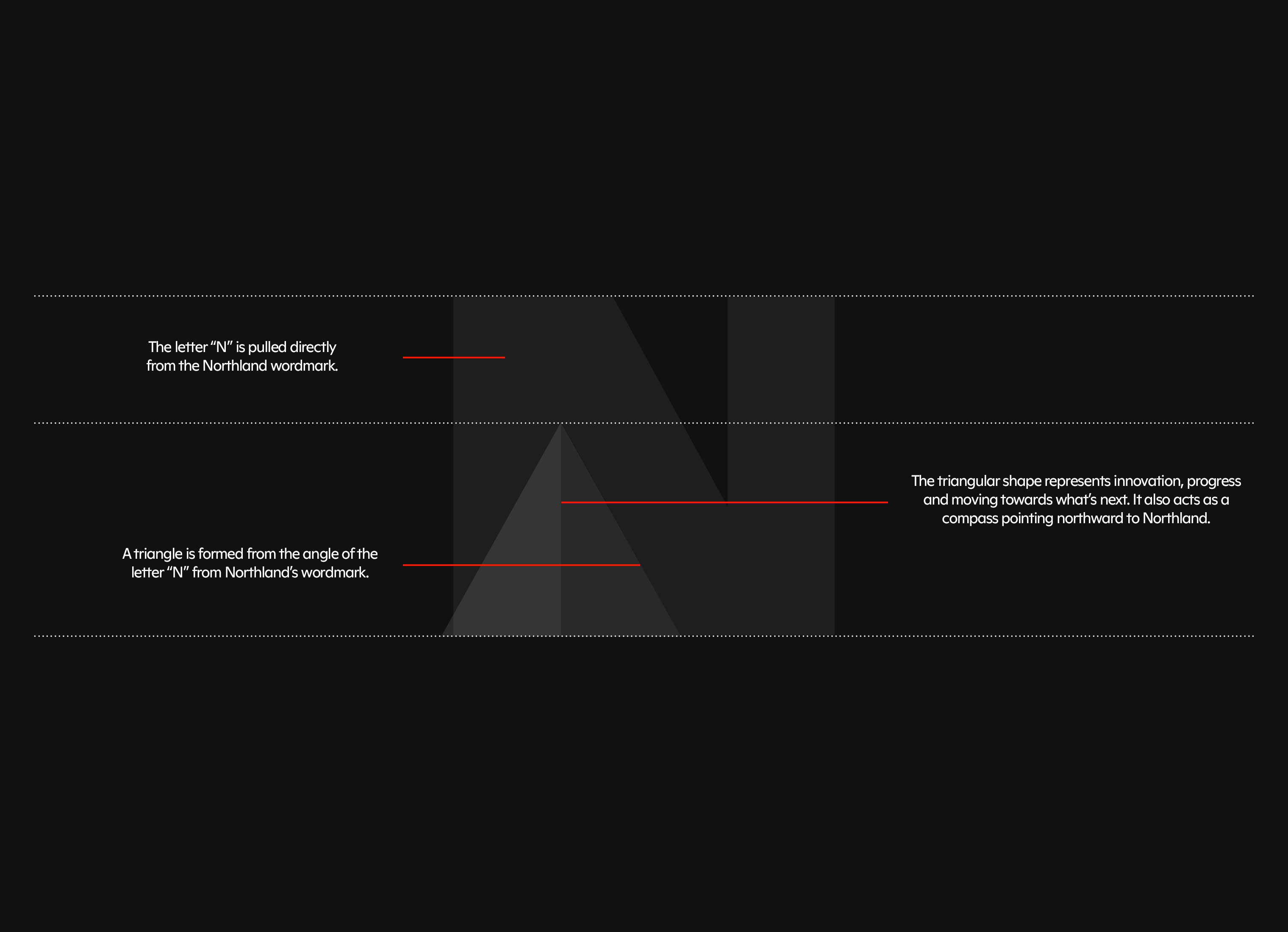
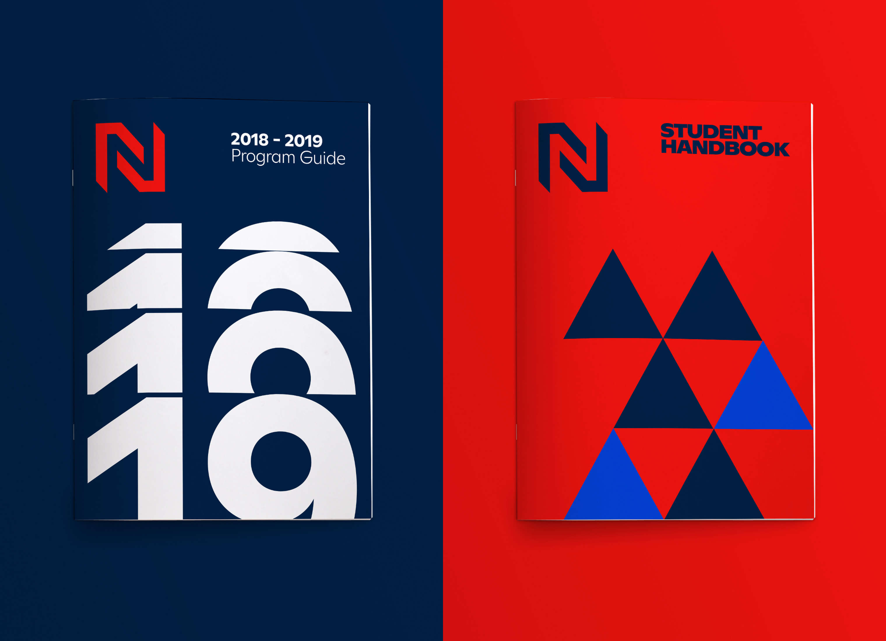
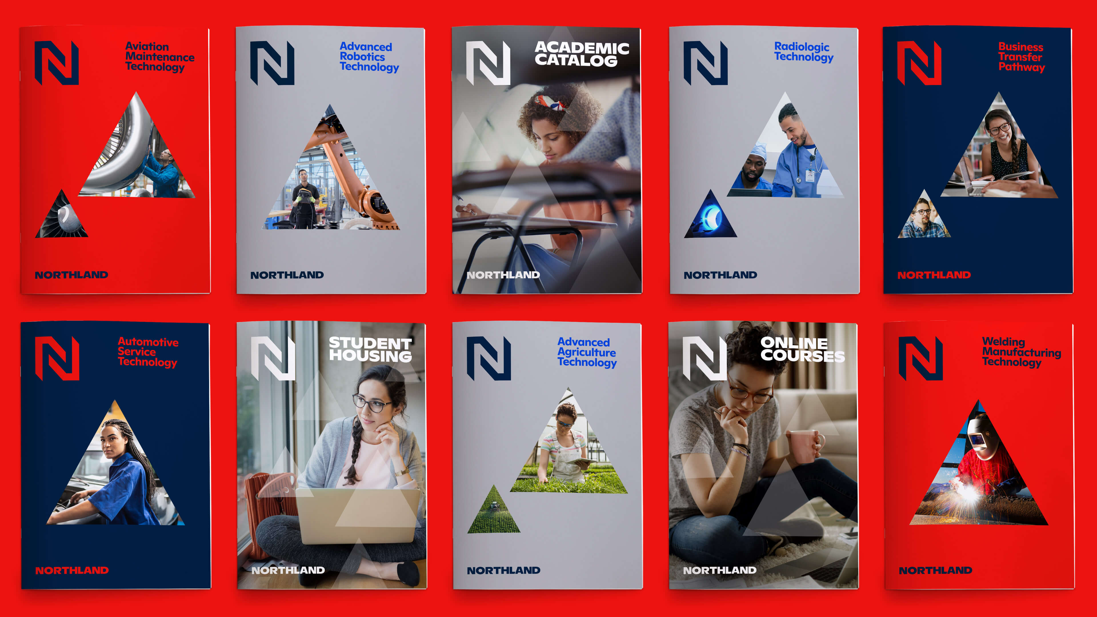
GRAPHIC MOTIF
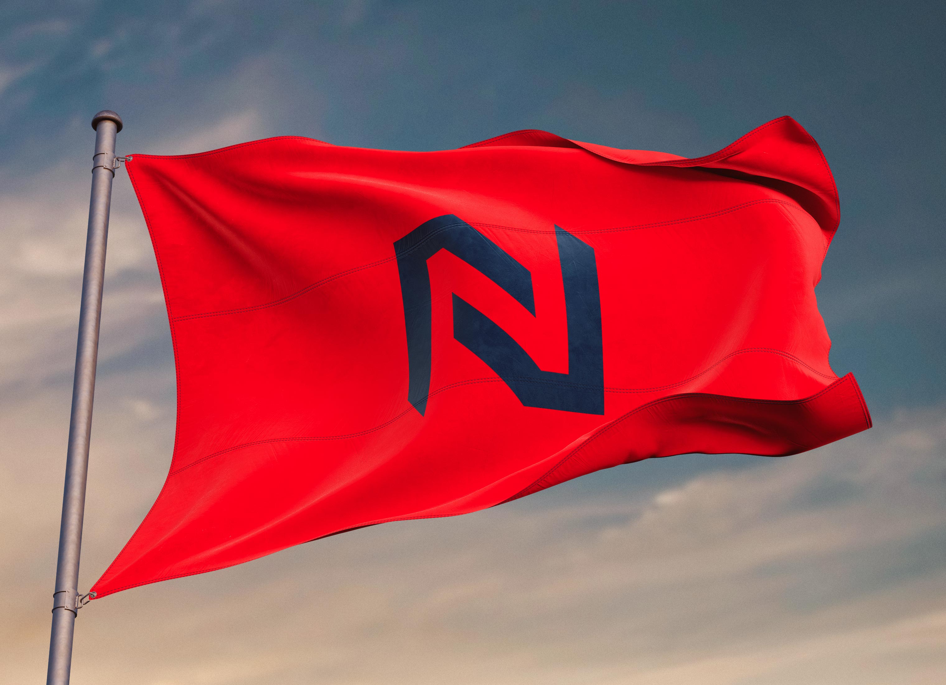
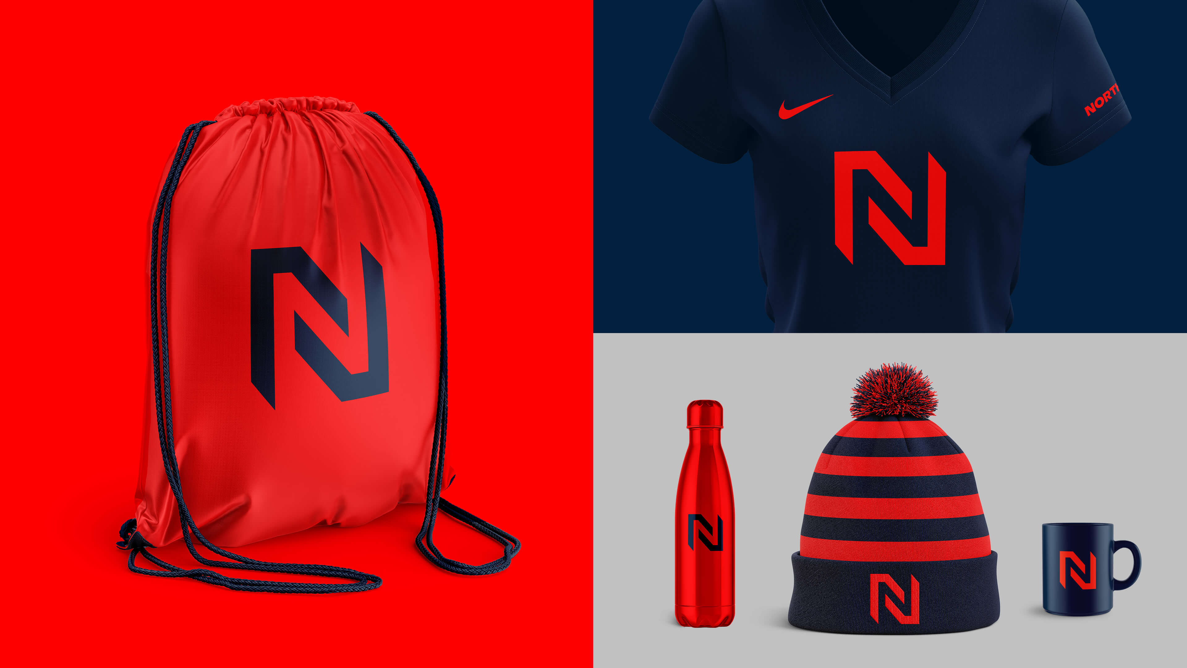
We used a simple triangle based off the letter "N" from the wordmark as the graphic motif for the brand. The triangle is a nod to the logo and also represents looking upward to the north. The triangle is used in various ways – a pattern on photography, a mask for imagery and expressive color usage.
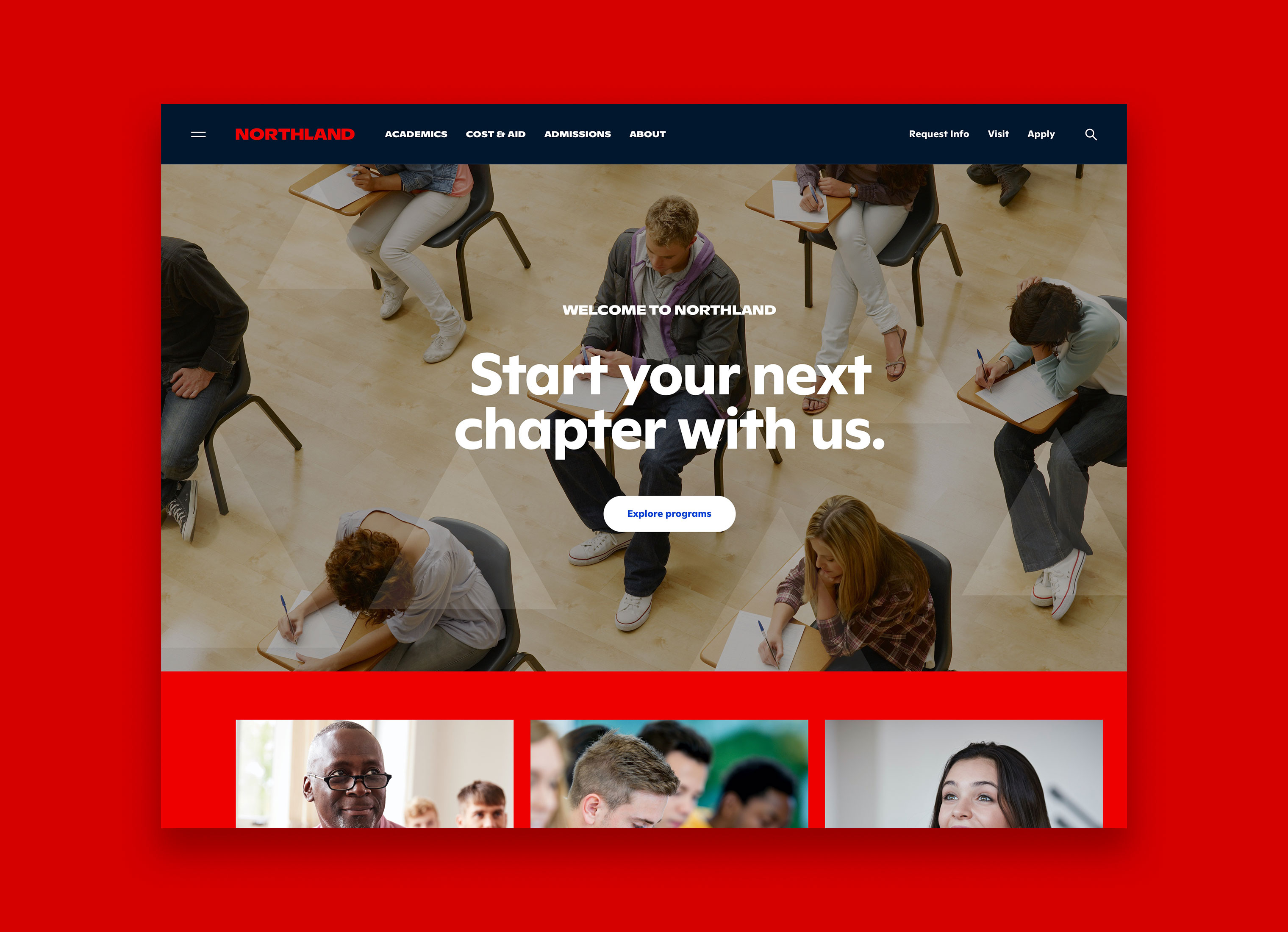
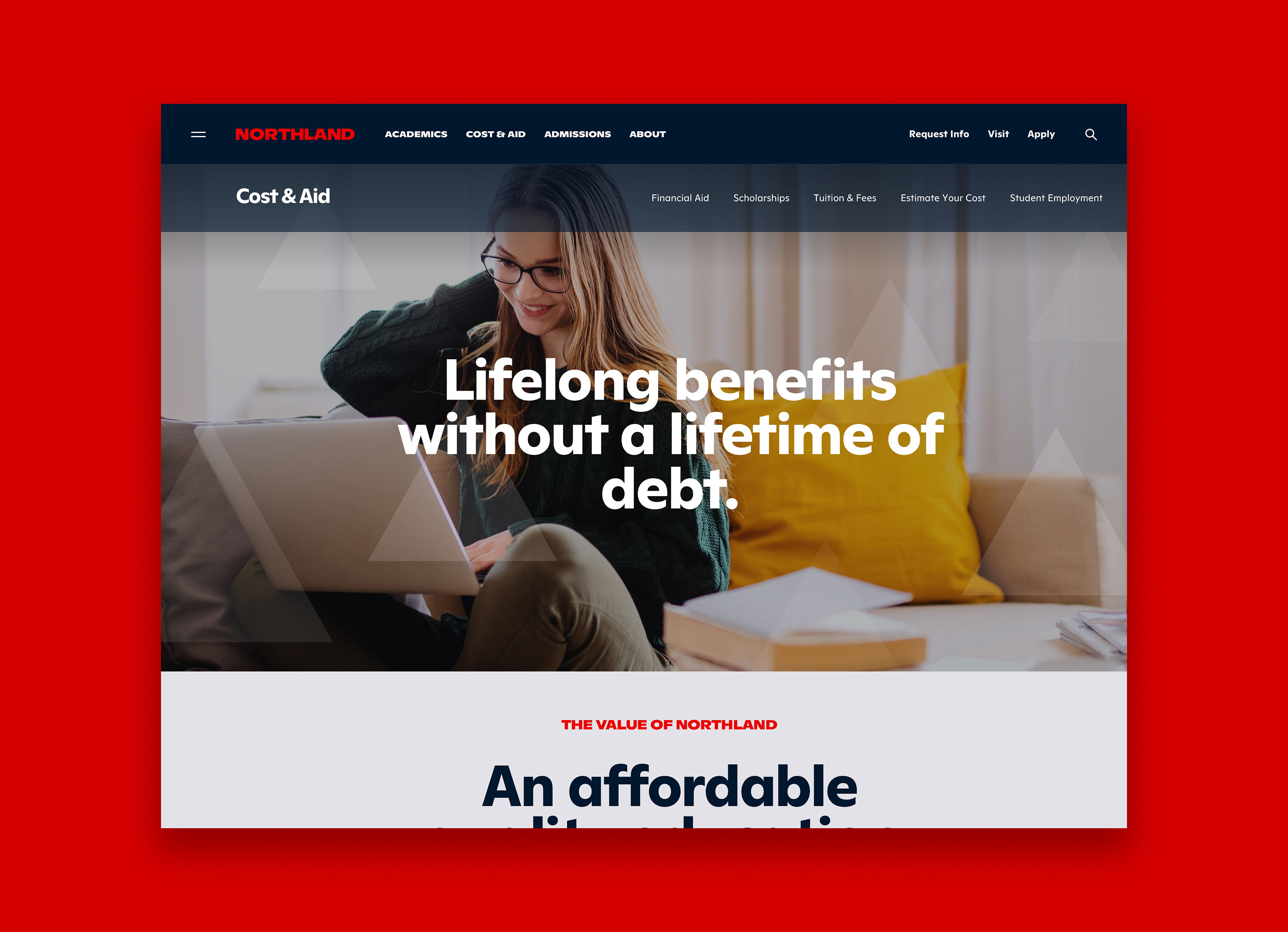
WEBSITE REDESIGN
We also created the new design system for the Northland website. This meant creating a robust set of templates, components, modules, and utilities. Each template has a series of components and modules associated with it. We designed and wrote content for 25+ key marketing pages.
We started the project with a discovery phase where we interviewed key stakeholders for website insights. We held several focus group sessions with faculty, staff, and students to better align on the key challenges with the existing website and areas of opportunity with a new site. We conducted audits of competitors and aspirational examples. We reviewed analytics to help inform strategy as well. We created user personas to highlight wants and needs for the various types of users of the website and to align on project objectives to meet those needs.
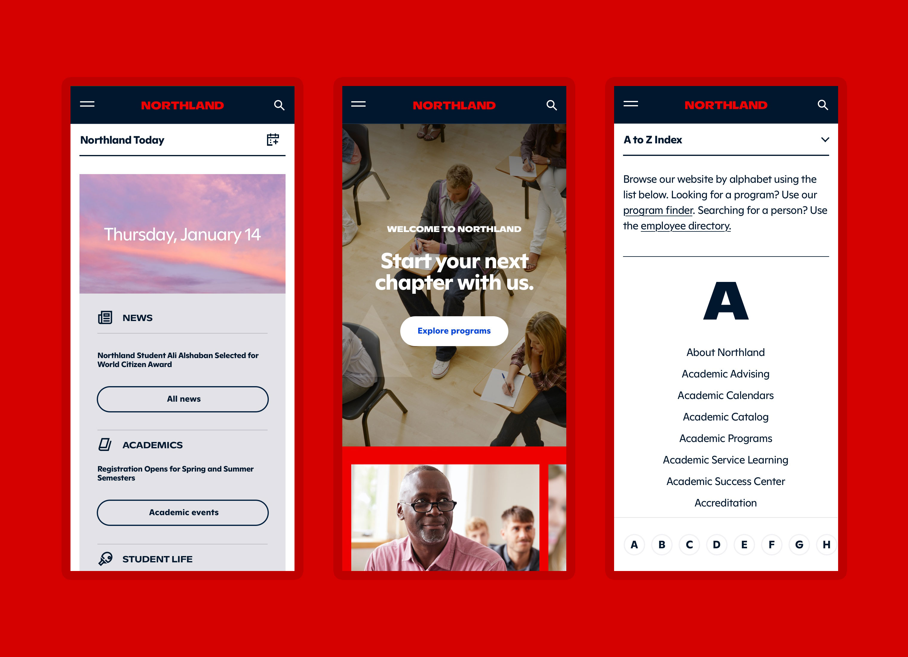
DESIGNED FOR MOBILE
It was critical to make sure the website performs well within a mobile experience with visitors roughly at 60% visiting the site on mobile device. We designed the entire component library with mobile screens in mind and modified utilities and interactions from desktop to mobile views for a better user experience.
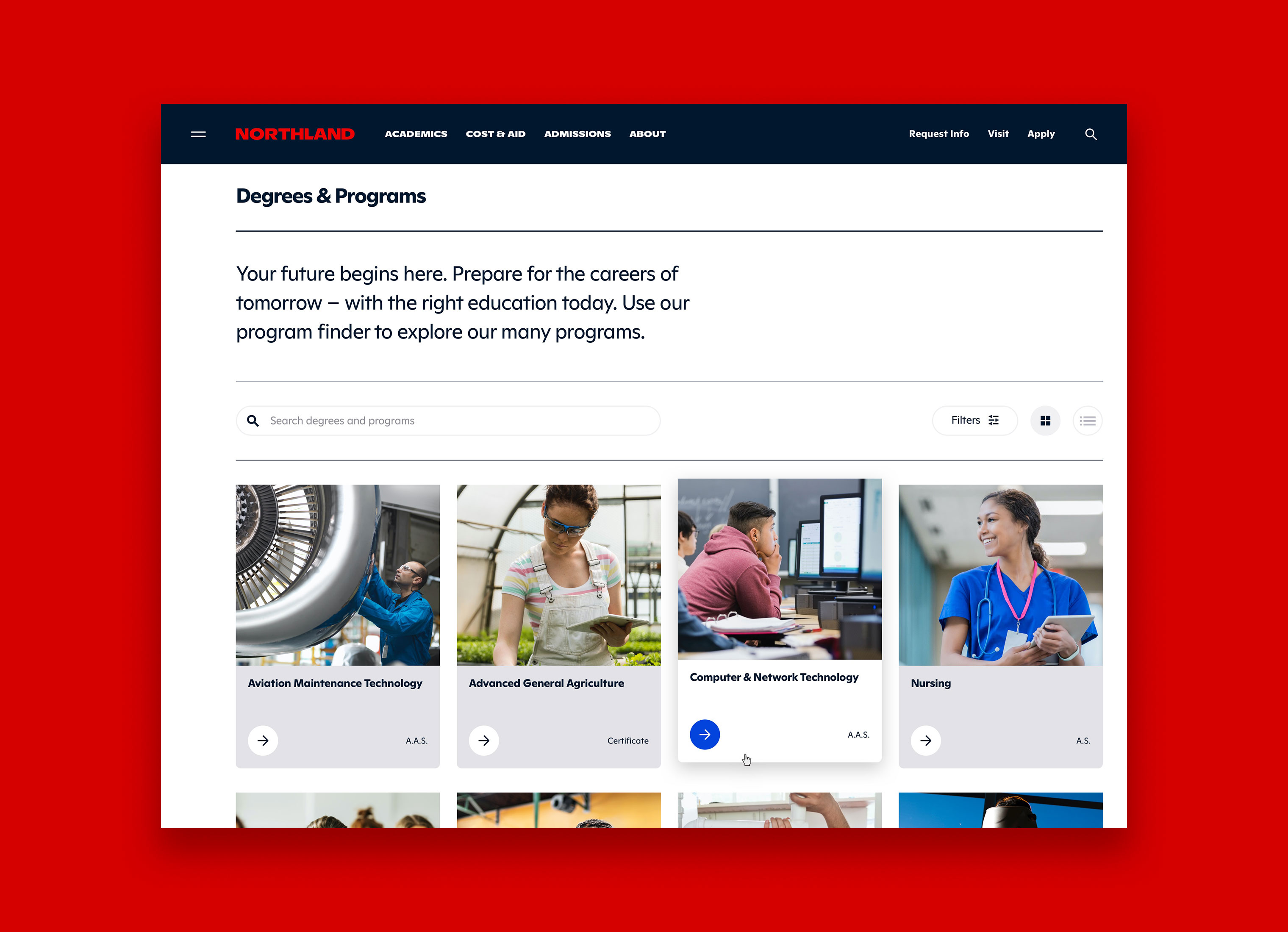
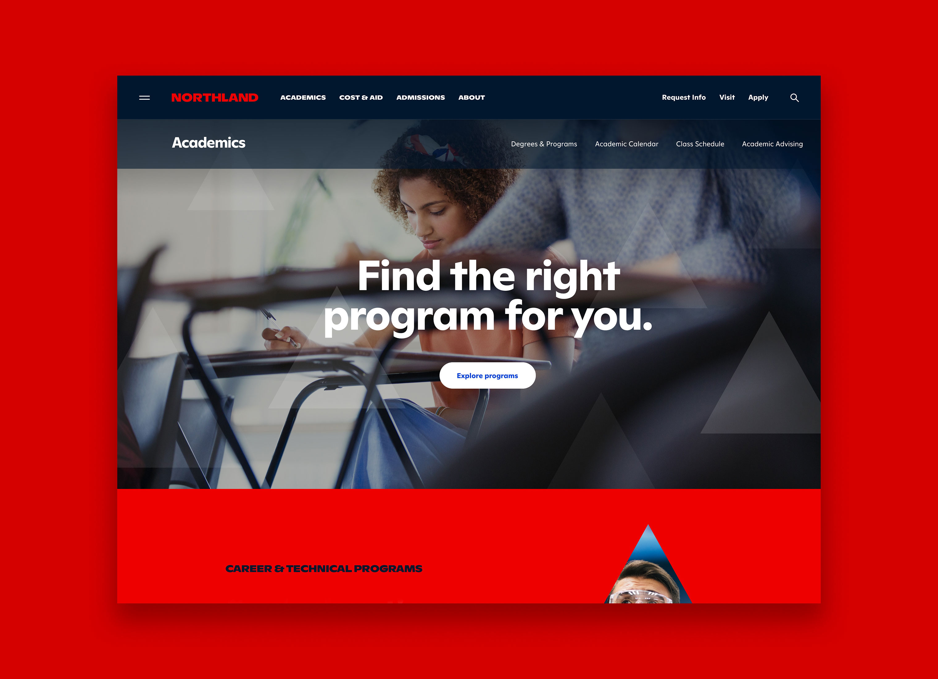
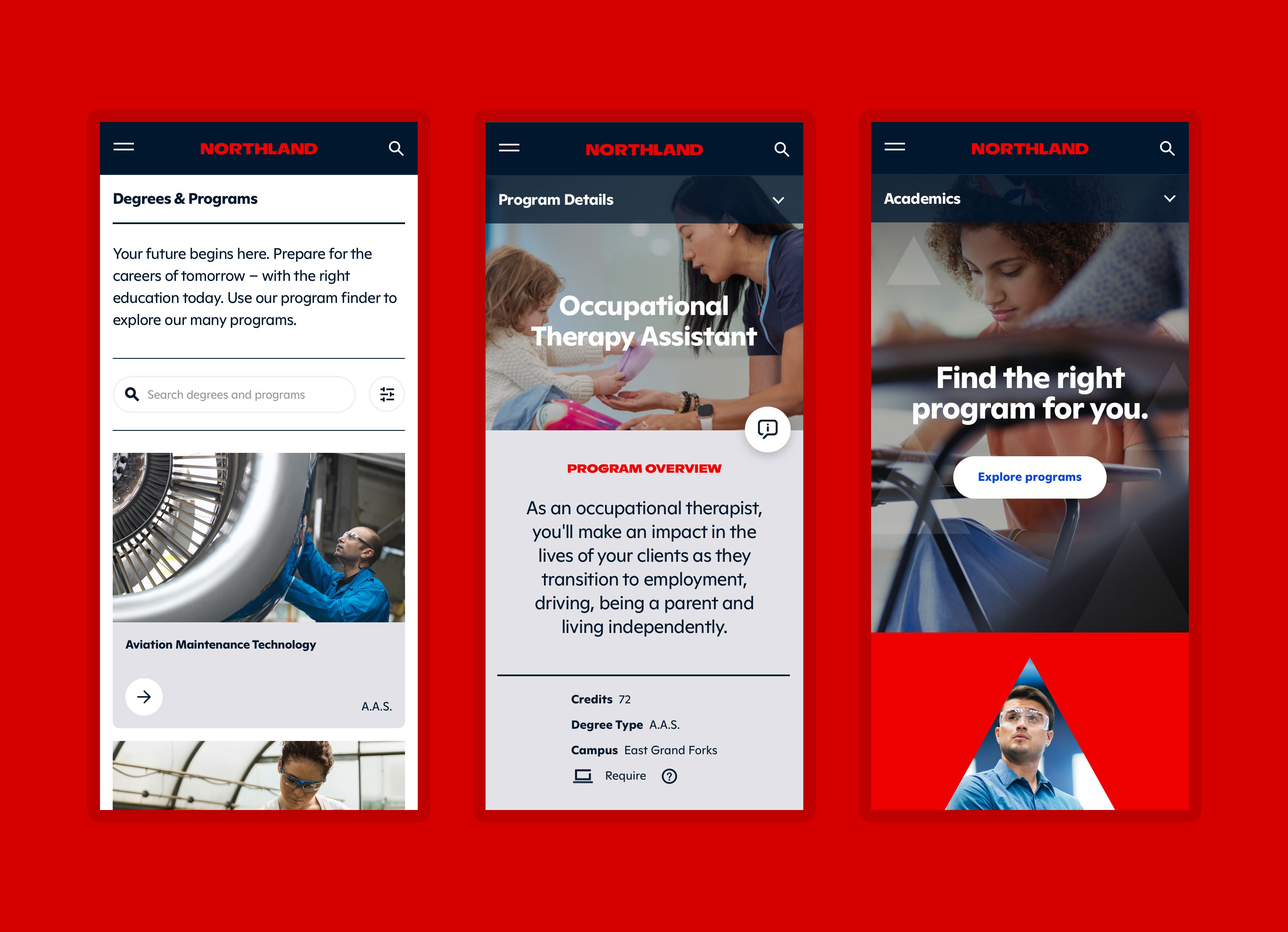
PROGRAM FINDER
Prospects and students consistently stated that finding their program and program information was the single most important piece of information on a college website. We designed this solution to easily be able to search programs and use filters to locate their program or area of education interest.
PROGRAM OVERVIEW
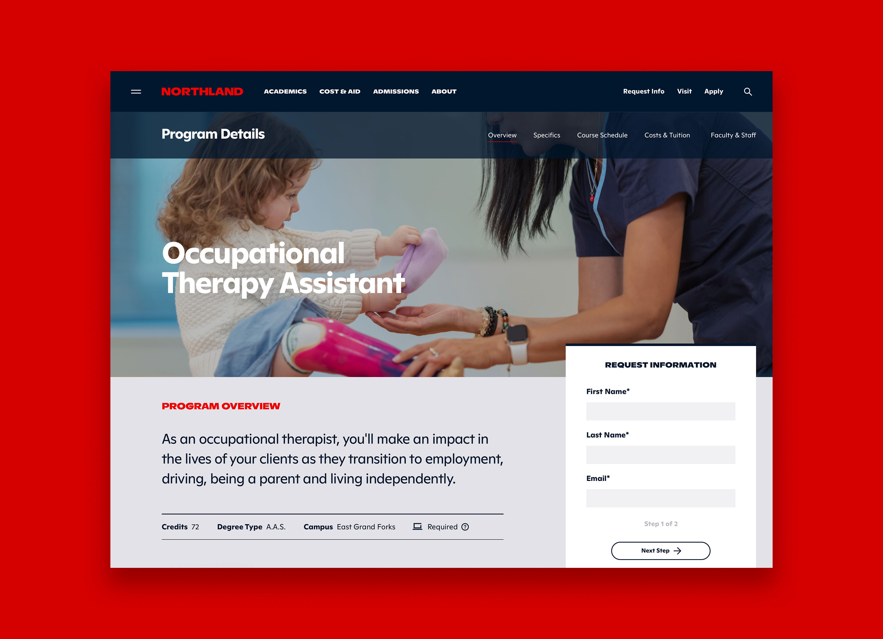
The individual program pages were completely overhauled. We created a new overview or landing page of each program with the content being more high-level marketing language listing out key benefits and information. The additional more detailed or specific information is part of the navigation of that specific program. This allows people to dig deeper for program specific information all in one area. We also added a request information form on the overview to help drive acquisitions.
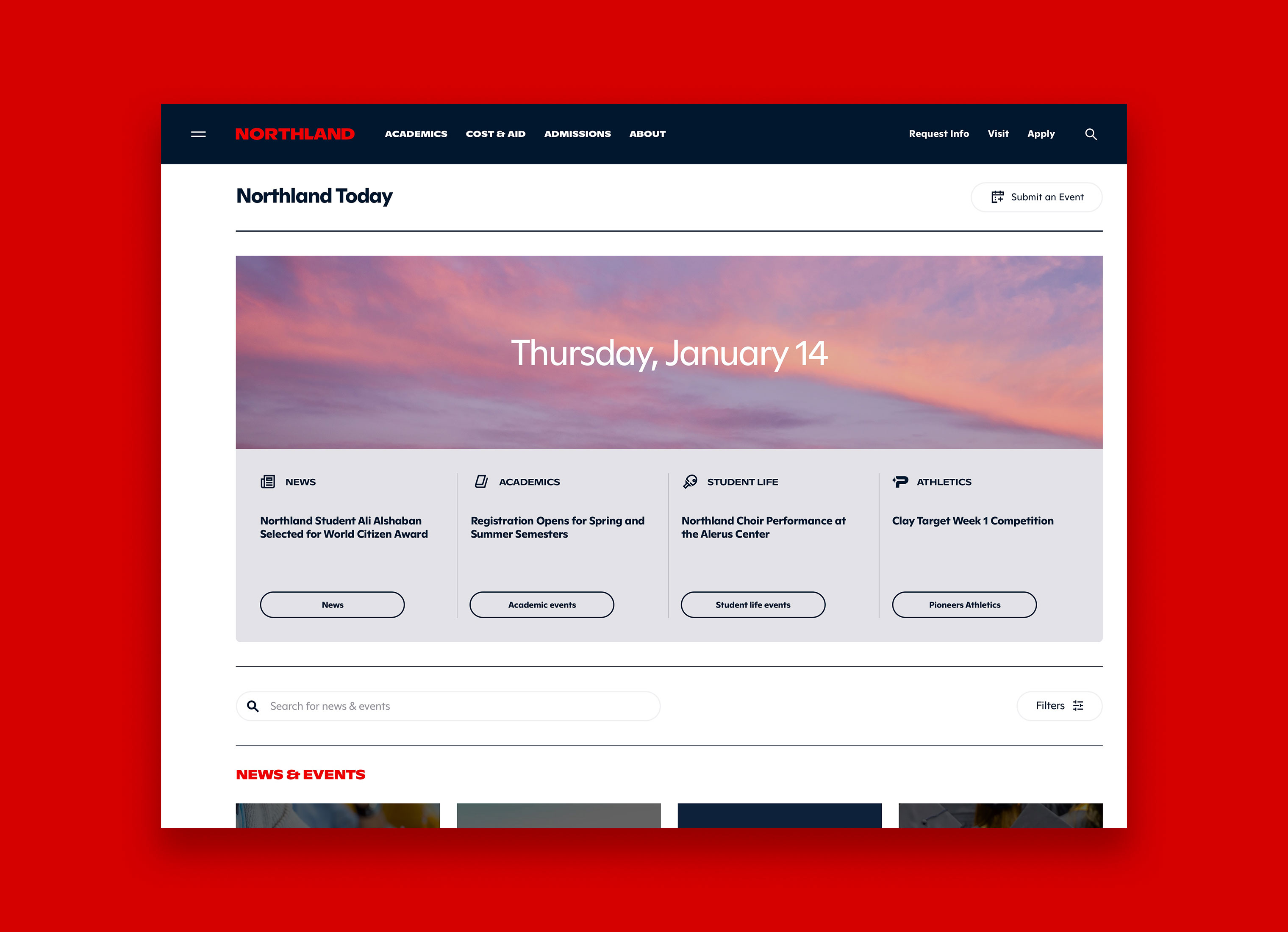
NORTHLAND TODAY
Another paint point that was expressed during discovery, was that people couldn't find event information in a clear way and that pageviews for the event calendar was low. Because the event information wasn't being adding regular or consistently, people stopped viewing the calendar. We created a new event calendar approach to add content and the addition of Northland Today which is a snapshot of what's happening on that given day. The time and weather of the day is displayed in the visual at the top of the page.
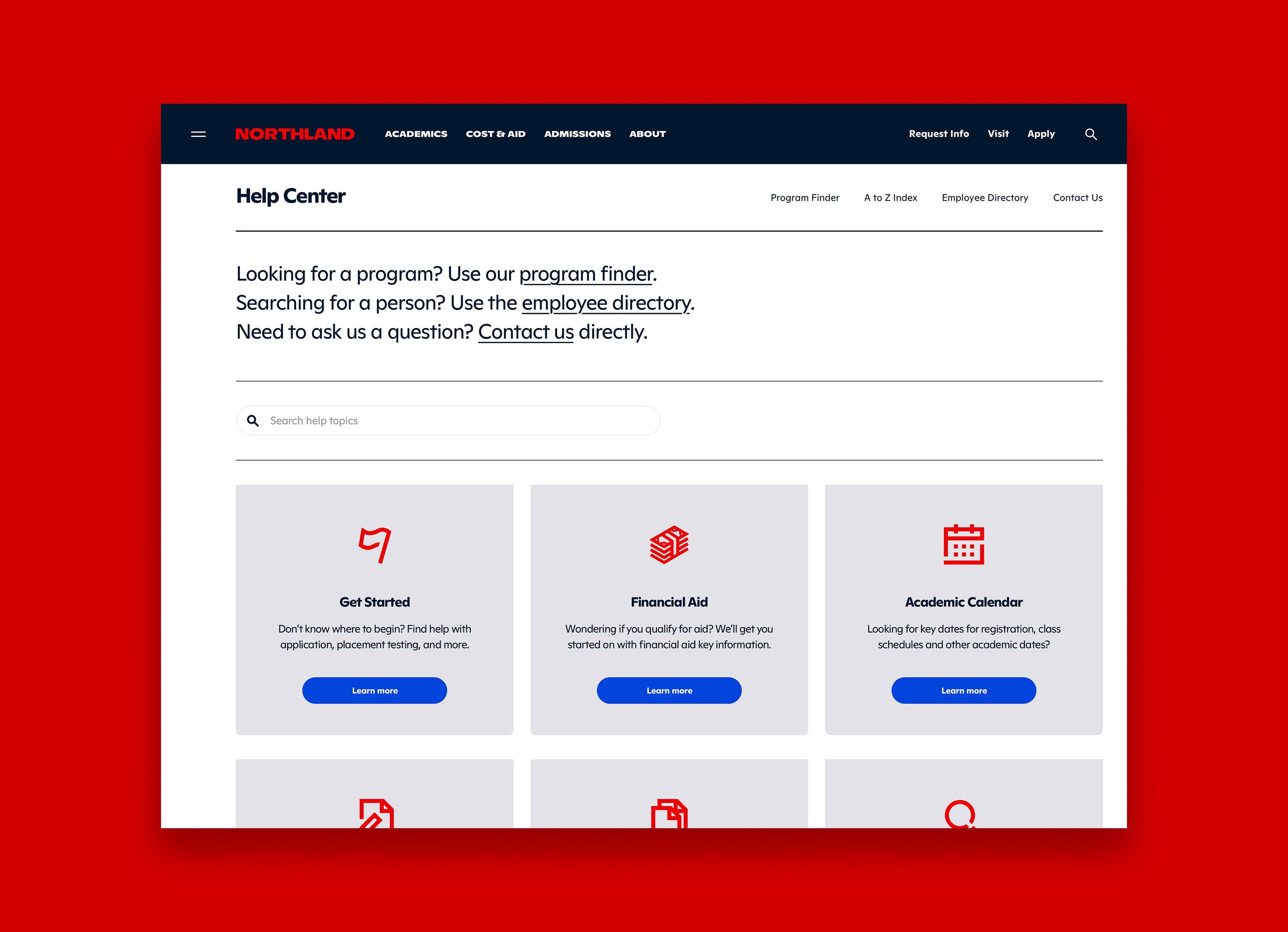
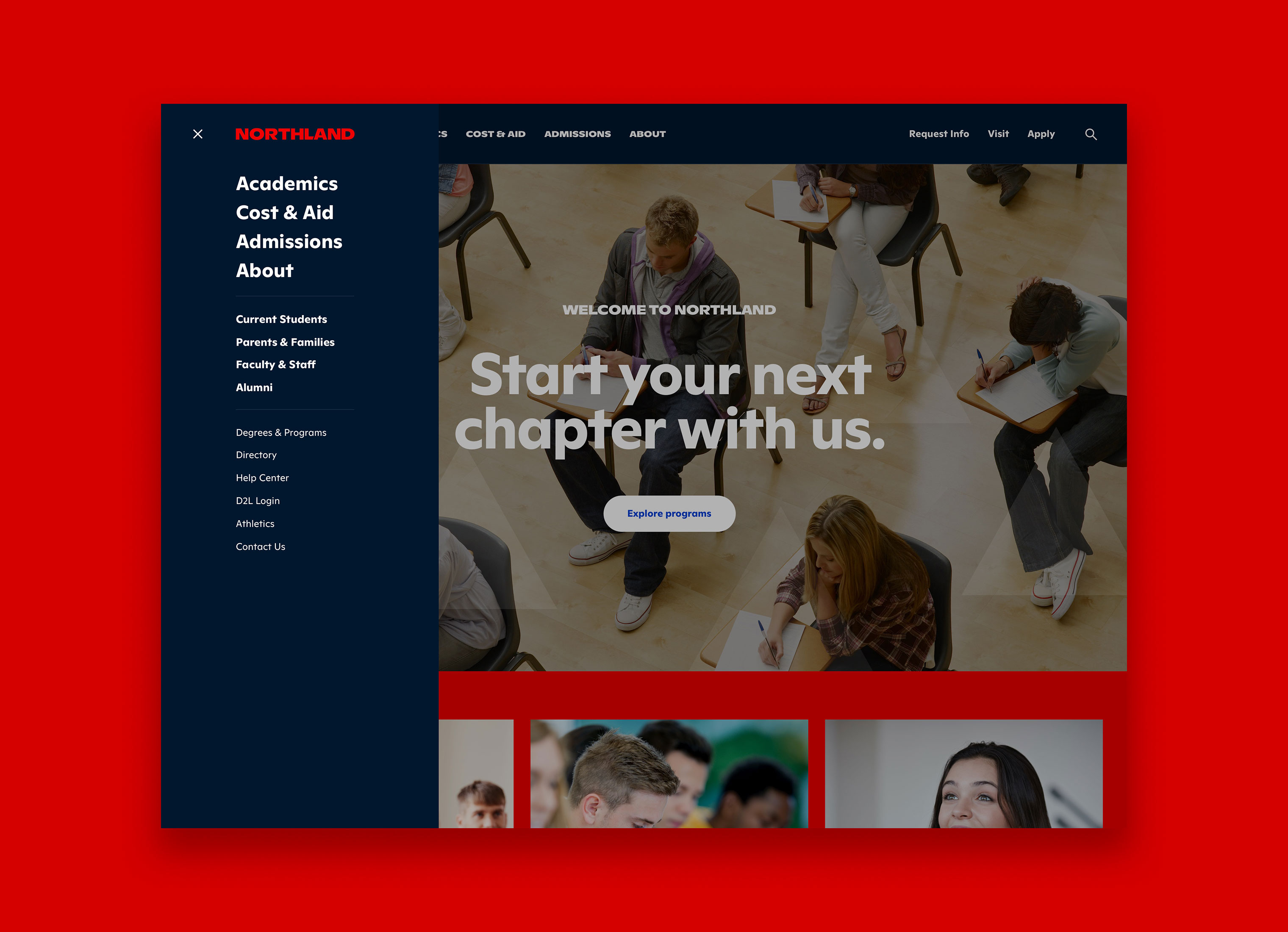
IA & NAVIGATION
One of the most complicated challenges with a college website is information architecture and creating navigation systems to accommodate many users. Through discovery, we created user personas and prioritized prospects. One student in a focus group session said, "The ease or use of finding content on a college website, makes think that's how easy or difficult it would be at that college." This insight led us to create a primary navigation geared towards first-time visitors/prospects.
Repeat visitors will learn navigation behaviors of where to find what they're looking for, but with limited time and attention spans, we wanted prospects to move more easily and quickly find what they were looking for. The global fly-out menu delivers navigation that is structured in tiers.
Skills
- Brand Strategy
- Discovery & Research
- Visual Identity System
- Brand Guidelines
- Advertising
- Campaign Development
- UX & Digital Strategy
- UI Design
Details
Team
- Garrick Willhite
- Bryn Bundlie
- Anders Holine
- Tom Kordonowy