Blue Cross and Blue Shield of MN
is one of the leading health insurance providers in MN. We helped create their campaign & design system.

ASSIGNMENT
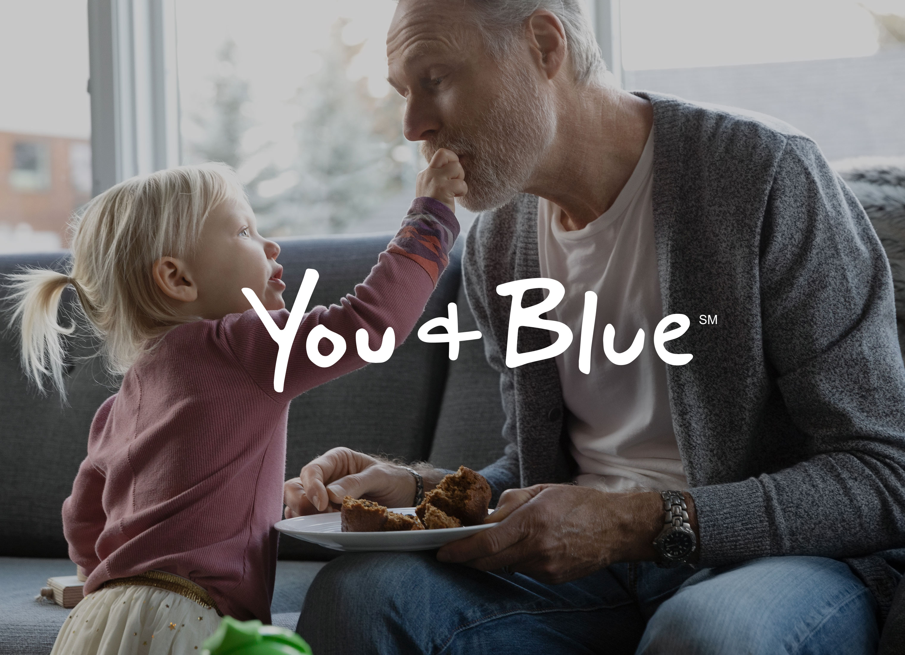
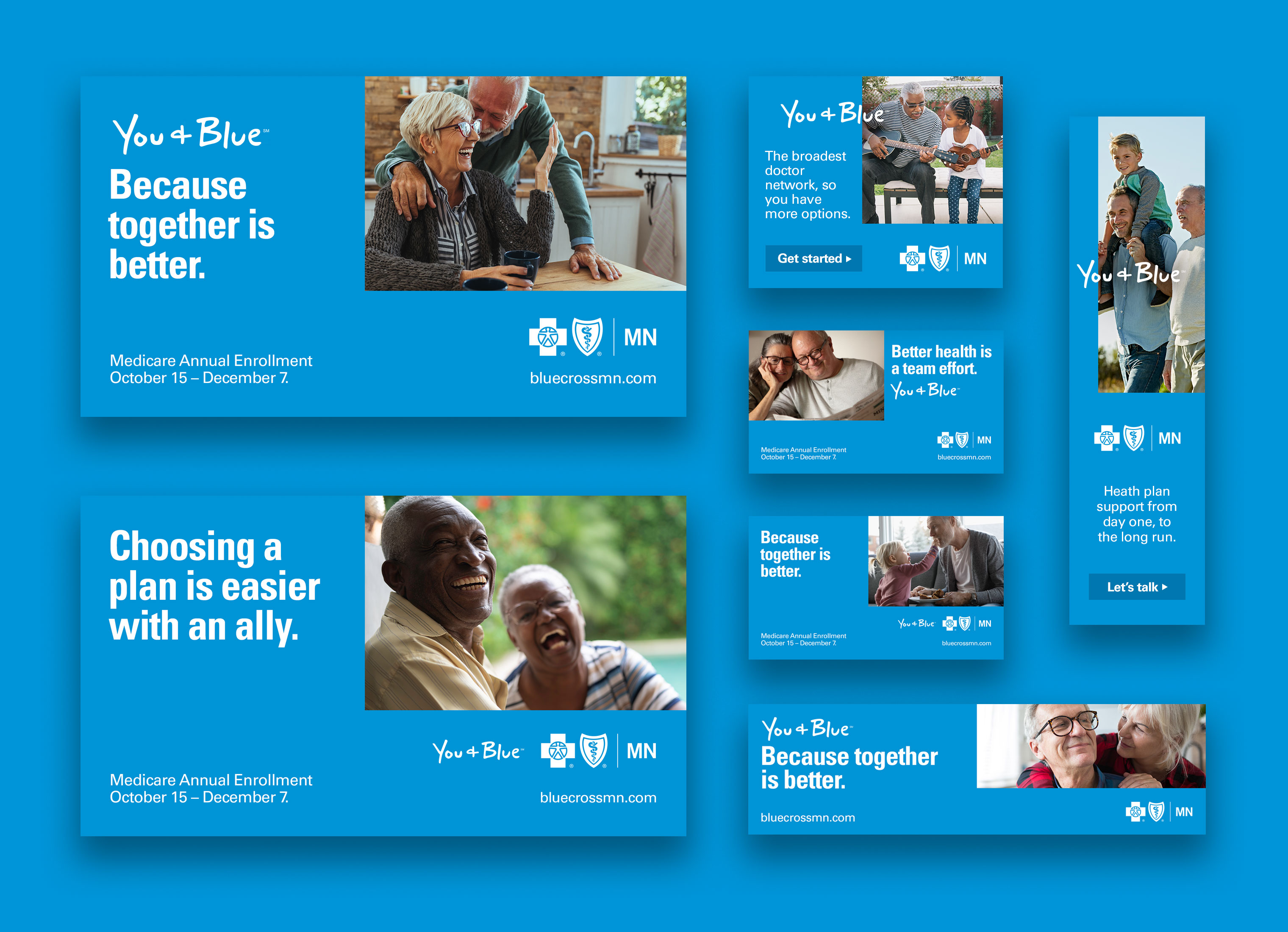
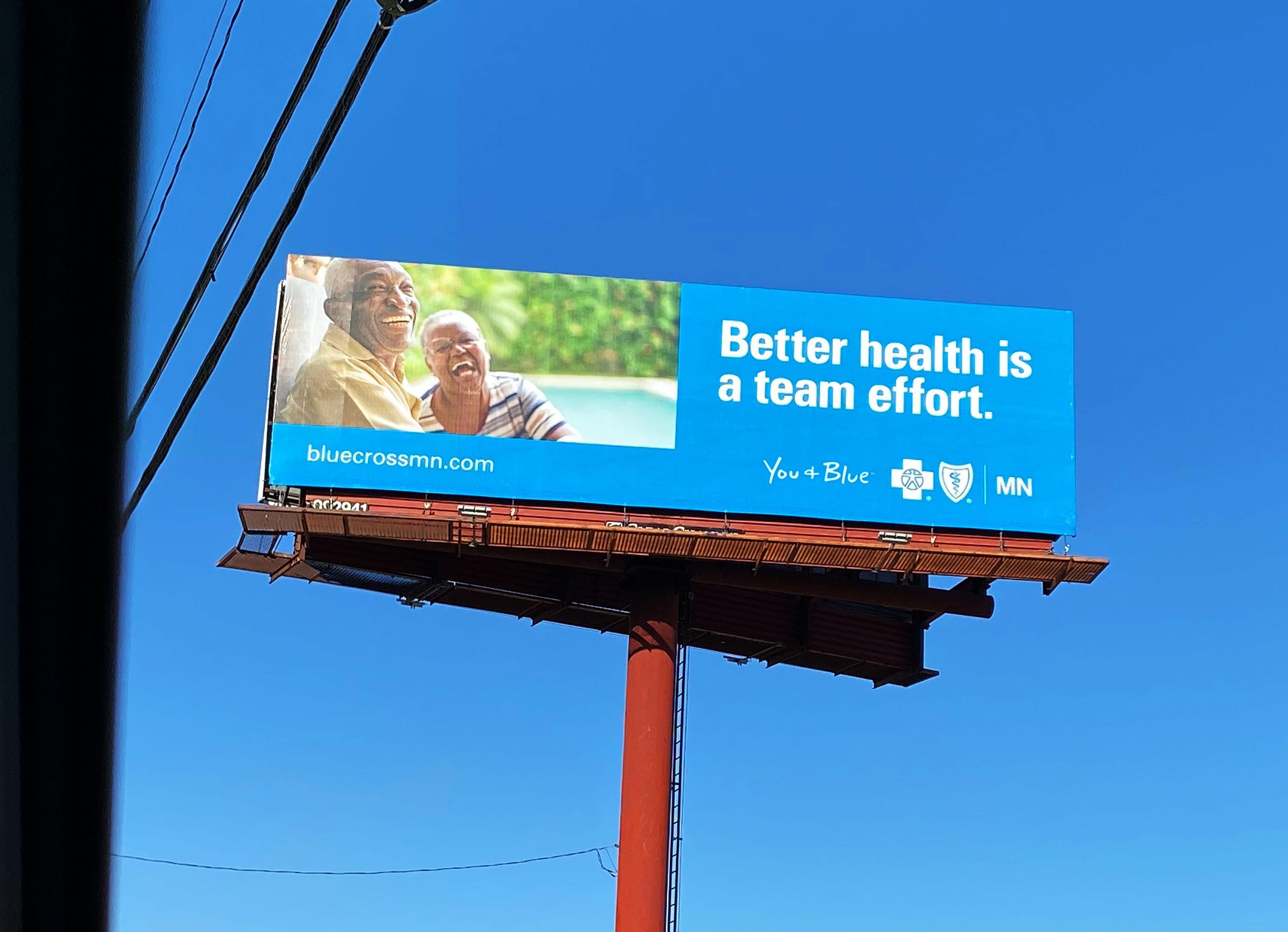
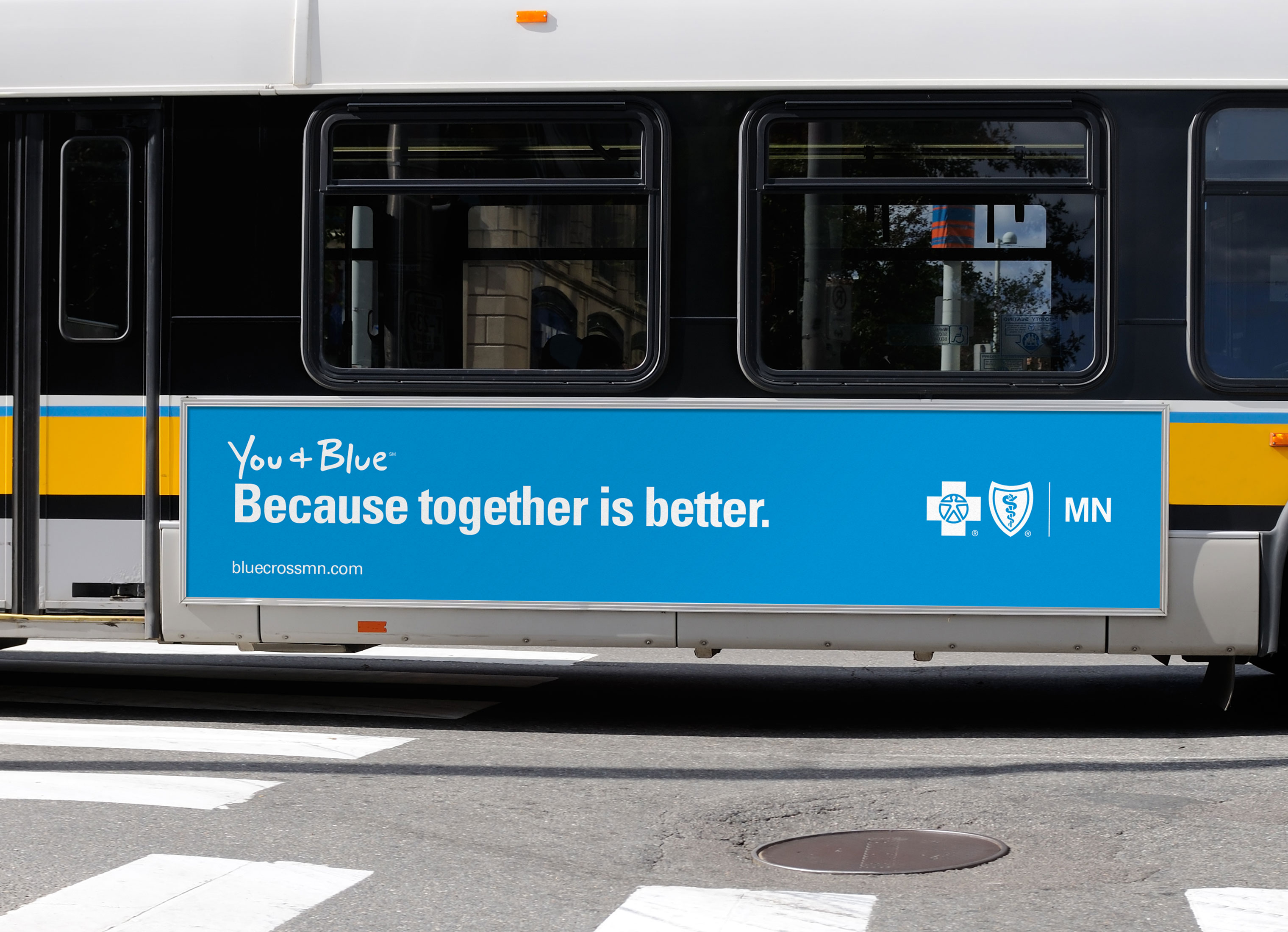
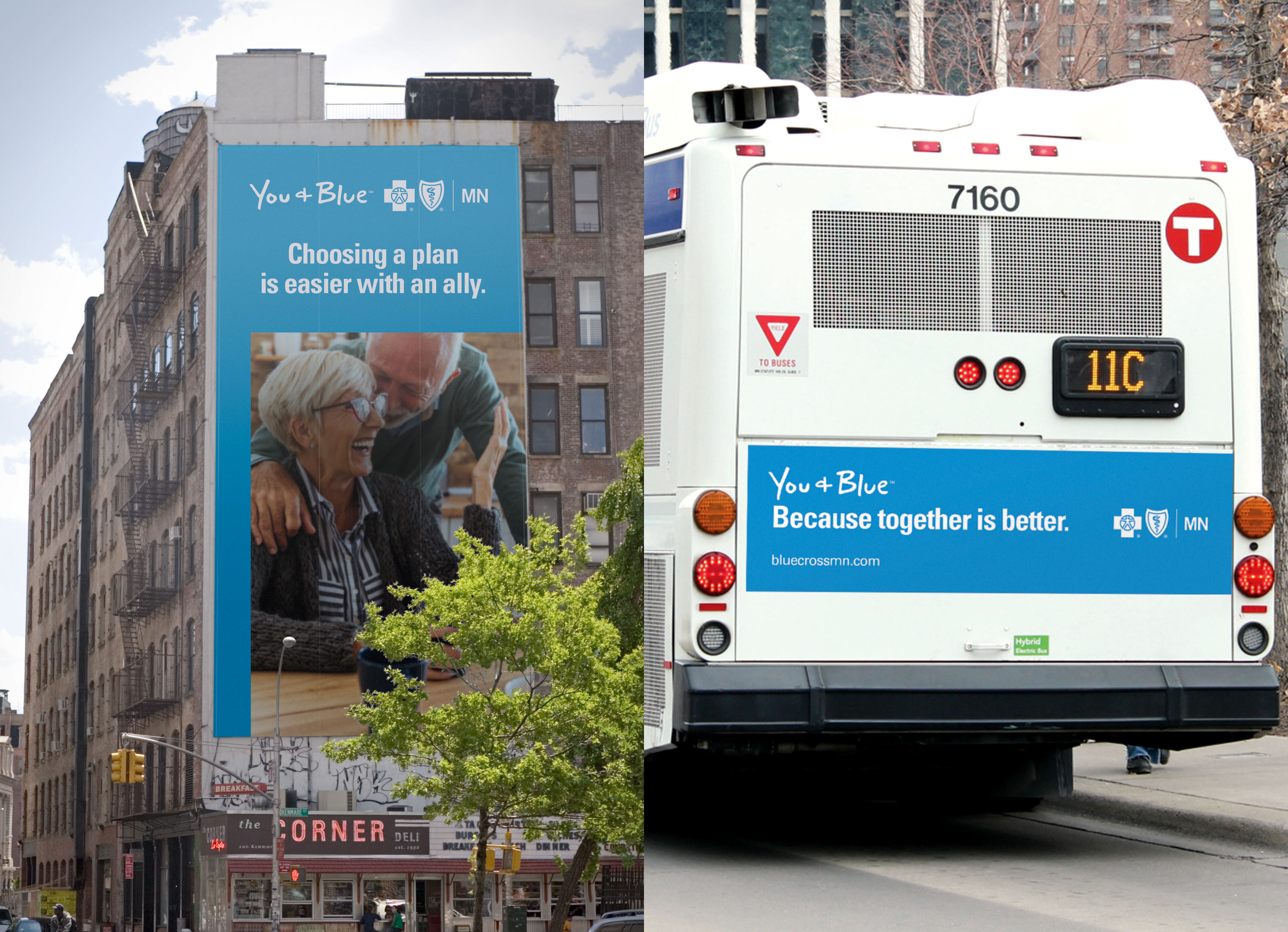
We partnered with Blue Cross and Blue Shield of Minnesota to create a new campaign for their Medicare audience. The client wanted to reimagine their existing "You + Blue" campaign. This meant redefining the messaging and also creating a cohesive visual language that was unique to the campaign but didn't break current overarching BlueCross and BlueShield brand standards.
OUR APPROACH
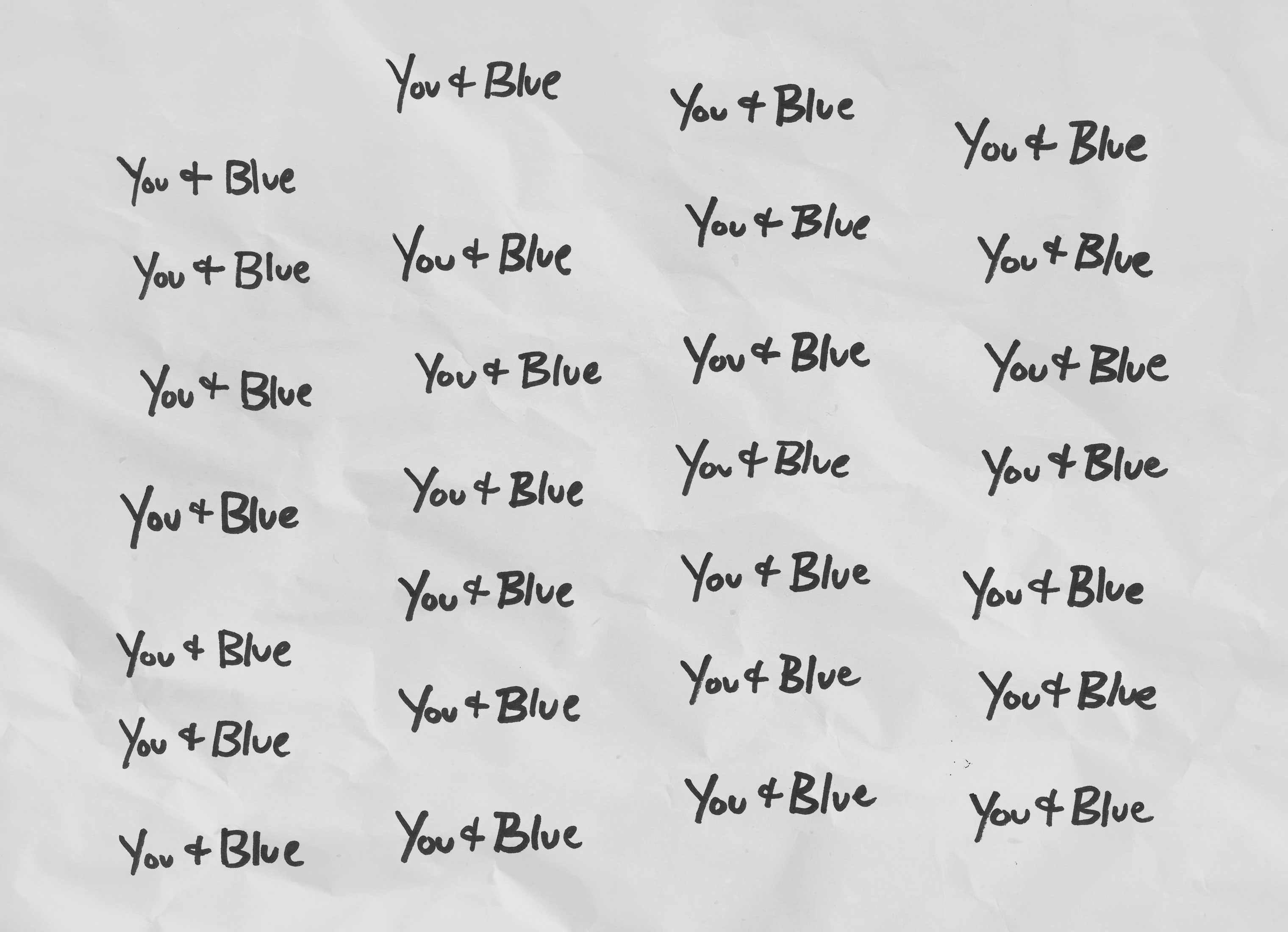
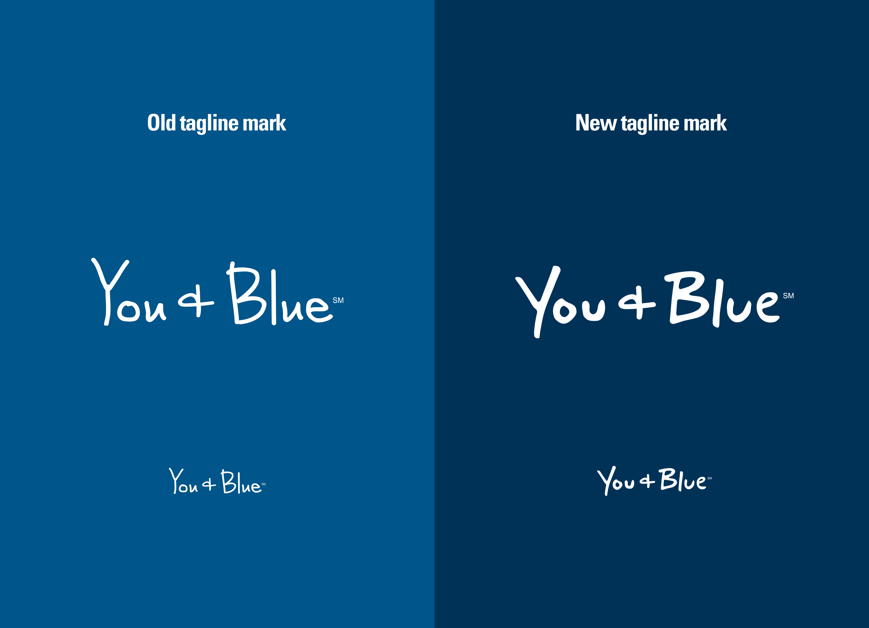
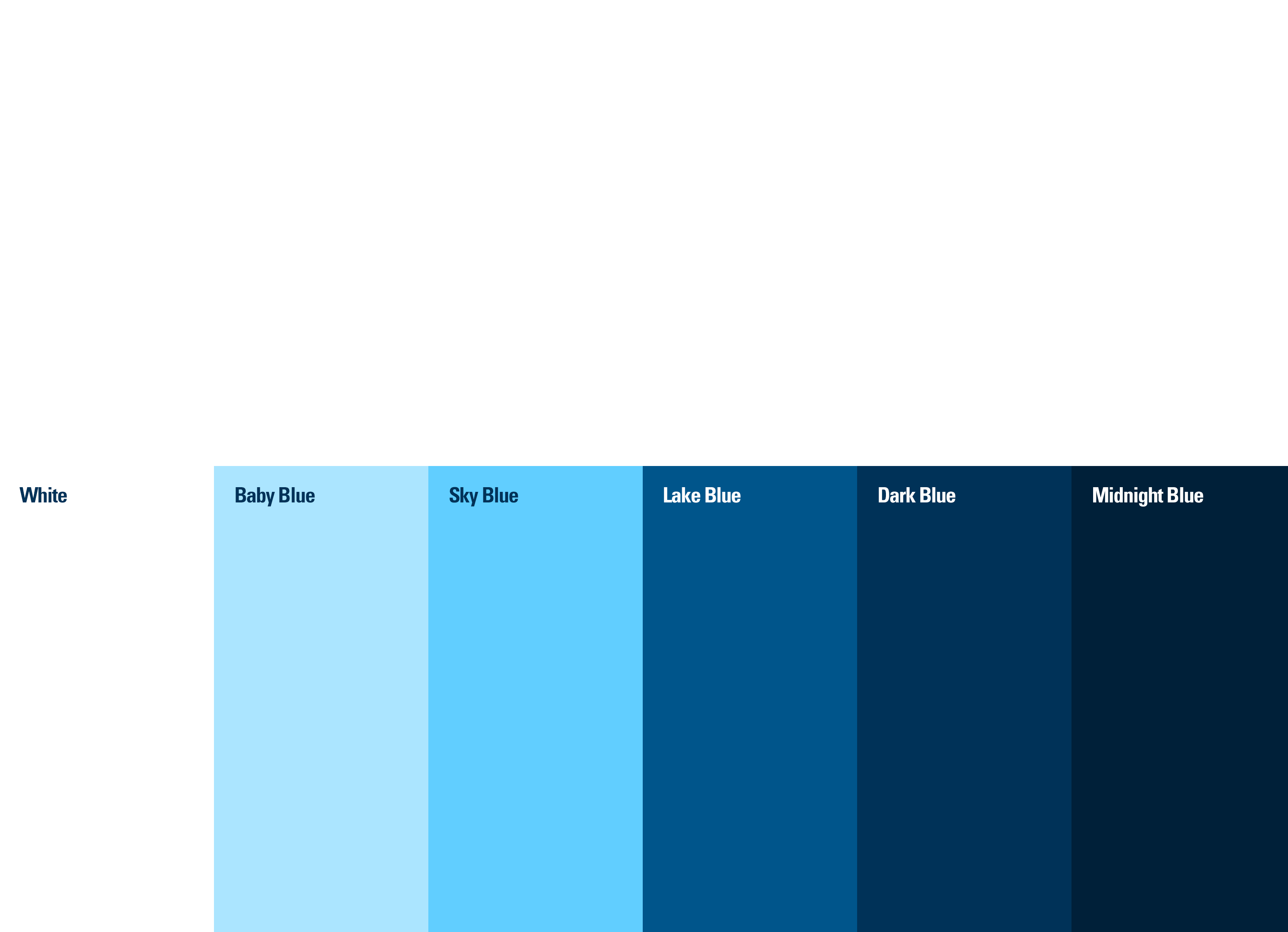
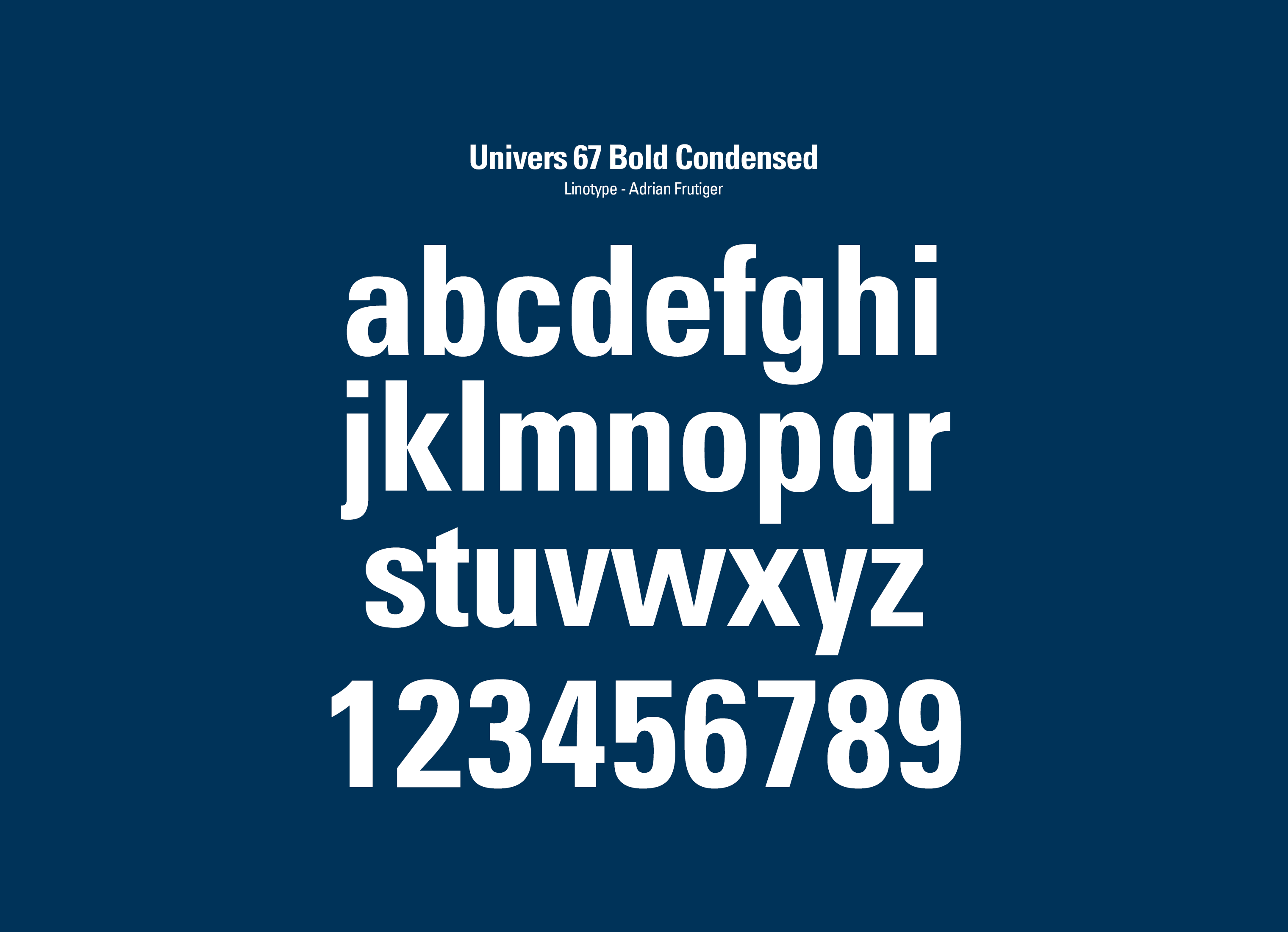
From a design and art direction standpoint, we needed to fine tune the brand elements and create a new design language. We updated the "You + Blue" tagline mark to look more authentically written. We added some vibrancy to the secondary "blues" color palette and removed the use of tertiary colors that created a rainbow effect. Instead of using all weights of the brand typeface Univers, we selected 67 Bold Condensed to the be the primary campaign typeface.

DESIGN LANGUAGE
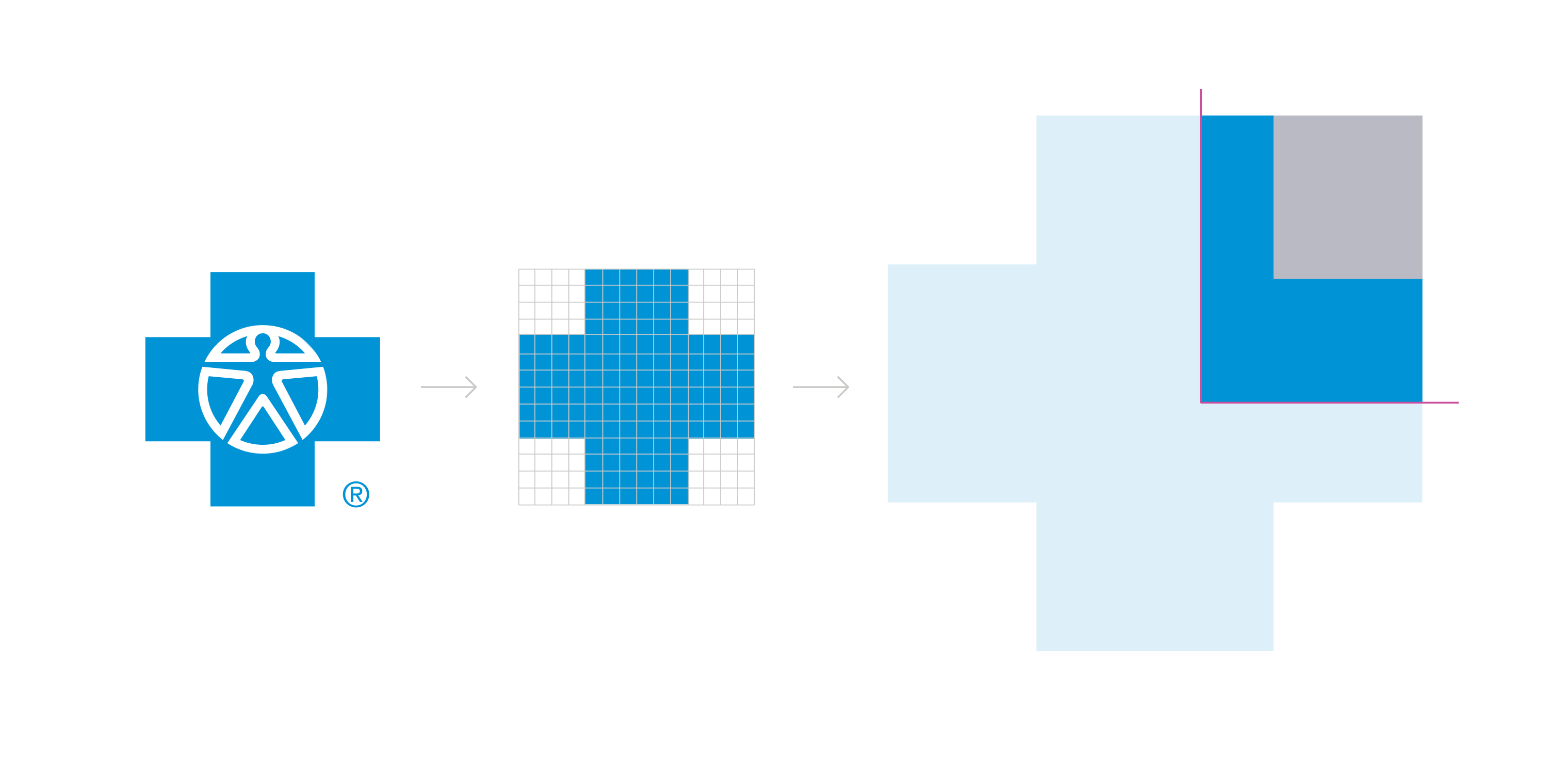
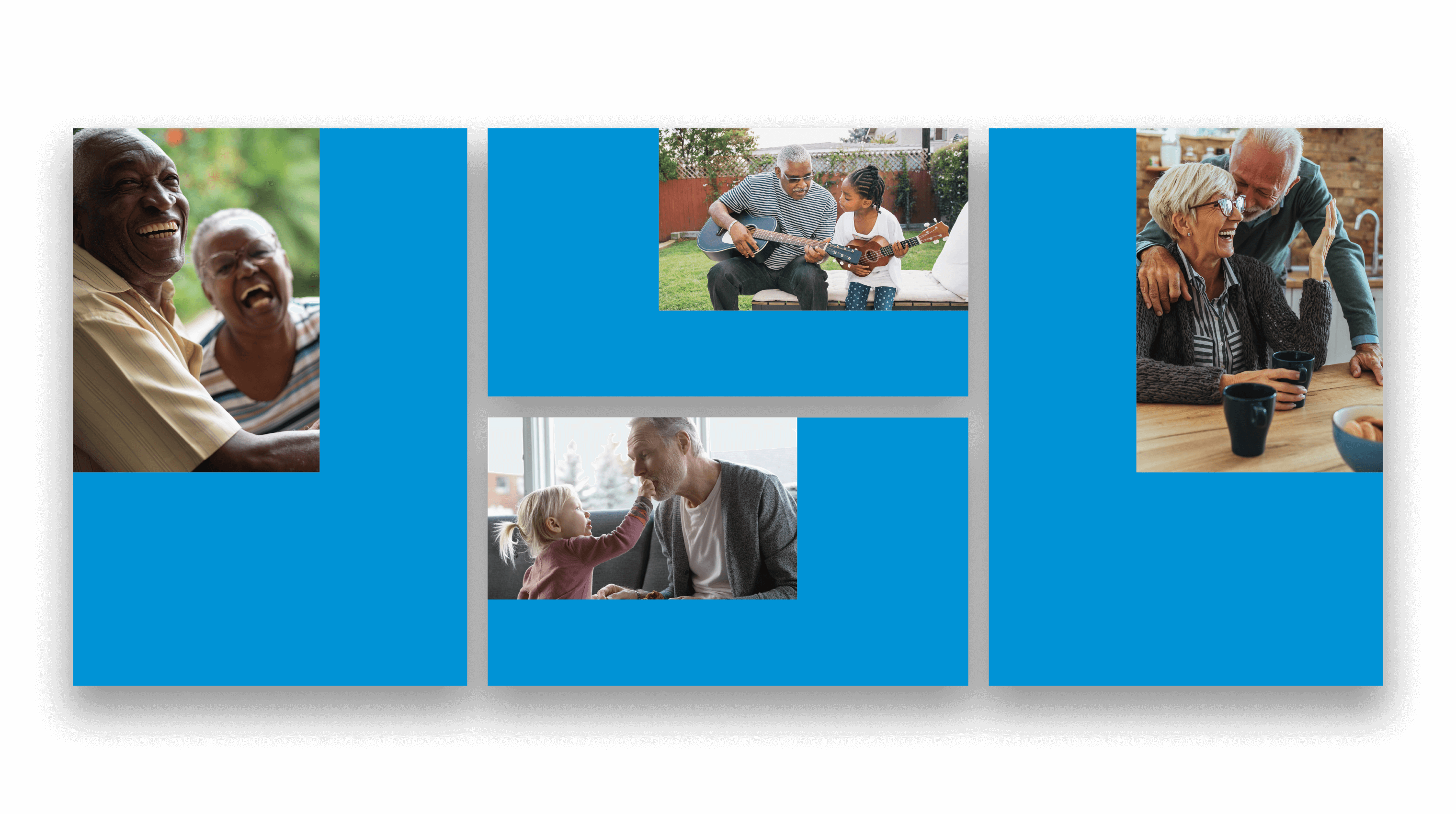
We created a design language that is derivative of the "blue cross" element of their logo (FIG. 6.0). The zoomed in cross shape acts as a framing device for photography that creates a visual metaphor for "You + Blue". We created several different orientations of the framing/cross motif to maximize flexibility with the various marketing applications.
Skills
- Brand Strategy
- Brand Design
- Visual Identity
- Iconography
- Art Direction
- Style Guide
- Campaign Development
- Design Production
Details
Team
- Garrick Willhite
- Patrick Clifford (Yamamoto)
- Vincent Koci (Yamamoto)
- Sarah Koster (Yamamoto)
Client
- Blue Cross and Blue Shield of MN/Yamamoto
Project
- You & Blue Campaign & Brand Design Language
Year
- 2019